Blink, and you might miss 2017’s subtle updates to the Royal Oak Chronograph collection, but to eagle-eyed Audemars Piguet fans, these could be considered significant edits that bring a healthy dose of modernity and maybe just a touch of controversy to the classic spirit of the Swiss watchmaker’s most popular sport watch – and we’re not just referring to the sweet new bi-color ‘panda’ style dials.
All images by Ariel Adams
Let’s back up a bit though to SIHH earlier this year, when AP had not one, but a slew of new additions to the Royal Oak line – including the show-stopping Royal Oak Perpetual Calendar with a full ceramic bracelet. But there was a method to the Royal Oak madness this year, as the Gerald Genta-designed icon happens to be celebrating its 40th anniversary since being first introduced in precious metal, and its 20th anniversary since coming to life in three-register chronograph form in 1997.
In its two decades of service, the Royal Oak chronograph has understandably seen a small number of iterations over the years (most recently back in 2012), but this time around, the edits in question are all about simplifying the dial, boosting contrast and returning to the visual aesthetic that made the Royal Oak Chronograph a winner with fans in the first place. Most notably, this refers to 39mm references dating back to 2008 – at which time, homage was being paid to even earlier vintage Royal Oak references, making these new chronographs almost an homage to an homage, but that’s probably besides the point.
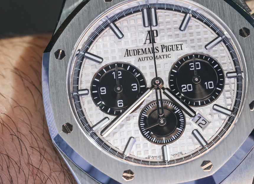
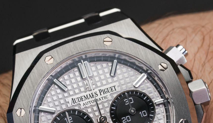
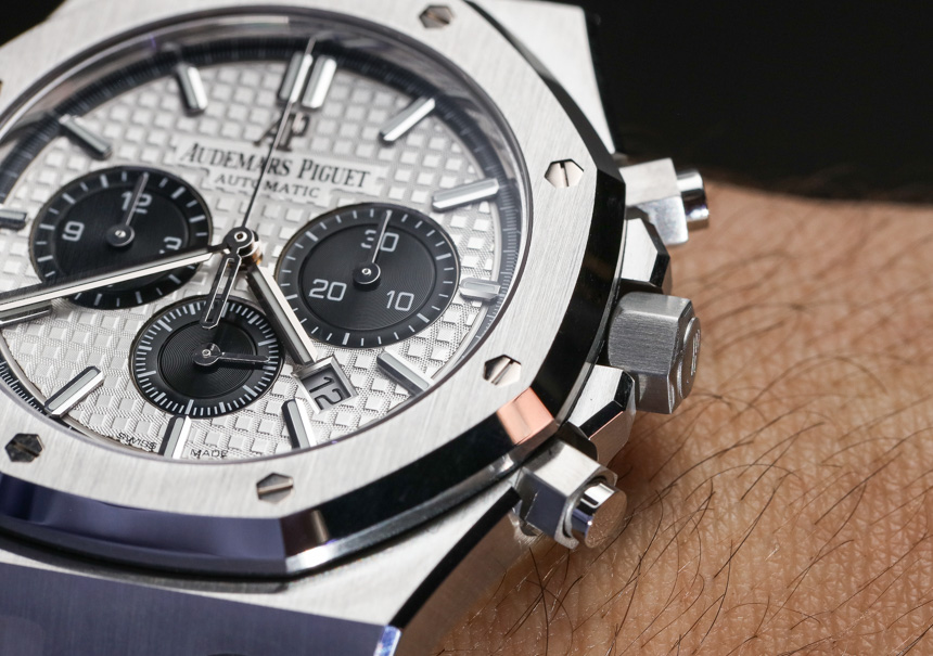
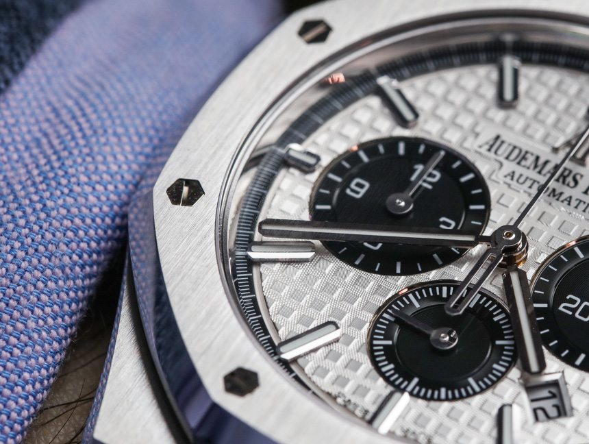
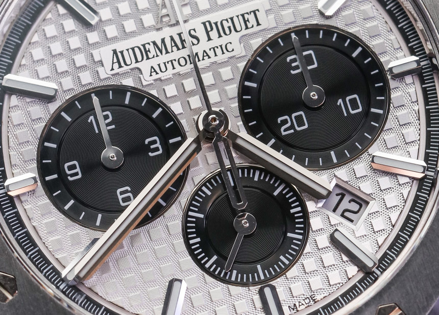
These throwback touches start with the registers which have been slightly edited – most notably the 6 and 9:00 sub-dials which have been enlarged for better legibility. There apparently wasn’t quite enough room on the dial to enlarge all three, so the running seconds sub-dial at 6:00 has been left the same size as before, while losing its Arabic numerals, resulting in a cleaner distinction of information between all three registers.
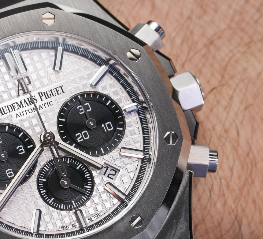
If you’ve already noted the new position of the date window, consider yourself among an extreme minority that noticed its subtle shift closer to the 5:00 index – a forced relocation as a result of the larger 3:00 sub-dial, and a further disruption to the overall symmetry (if the outgoing variant’s date window at 4:30 could ever be called ‘symmetrical’). Thankfully though, it’s subtle at worst, and likely to go unnoticed by all but a few.
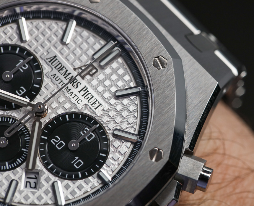
The popularity of the Royal Oak Offshore diver is likely to blame for the third change in question, which introduces a slightly wider, more luminous applied hour markers. Just like the larger registers, this update aimed to boost overall legibility, and create a sportier, more dynamic aesthetic. Unfortunately, this also comes perhaps partially at the expense of the understated elegance that’s defined the Royal Oak Chronograph for the last two decades. Furthermore, the collective tweaks ultimately introduce a greater degree of asymmetry that might be a bit jarring to fans who favor the sleek indices and balance of the Royal Oak Chronograph’s current iteration.
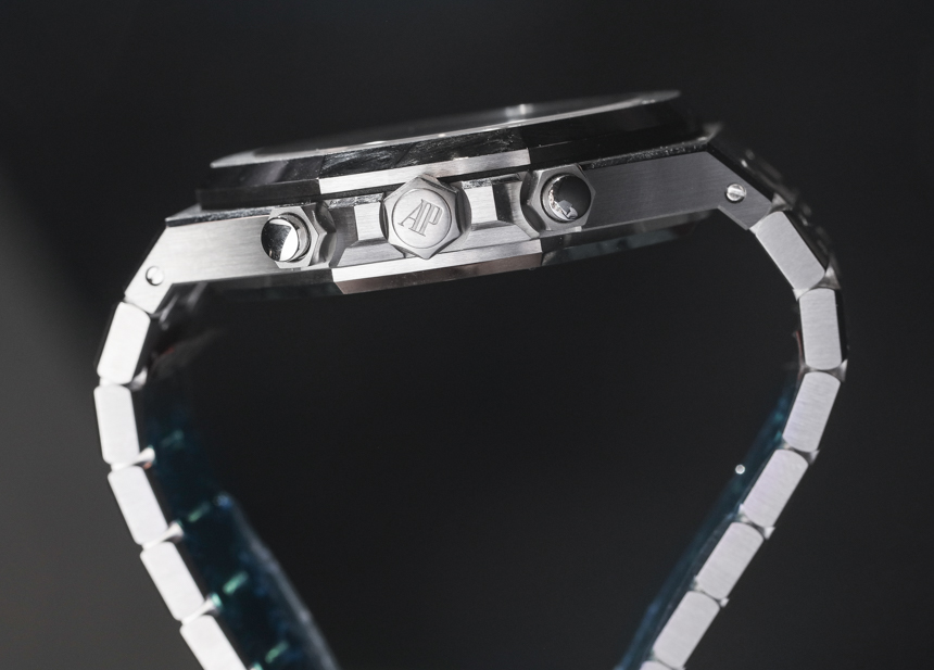
Dial aesthetics aside, from a size and functionality standpoint, the incoming Royal Oak models are still 41mm, and are still fitted with the Caliber 2385, a column wheel chronograph movement with a long history deployed inside AP chronographs. However, the fact that both the movement and the case dimensions are exactly the same as the predecessor further the mystery as to why AP would tweak a winning formula, seemingly without clear rhyme or reason. If a sportier aesthetic were the goal, these alterations feel more like meddling, than a truly purposeful update. If the latter were the goal, it seems like a tonal sub-dial at 6:00 and a re-balancing of the date window would have granted a cool, “bi-compax” aesthetic that would have been a better means of celebrating the collection’s new contrasting sub-dials – but then again, that particular look is reserved for the nautically-driven Offshore chronograph, and so here we are – arguably “neither here nor there.”
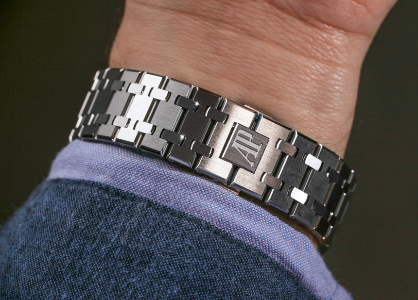
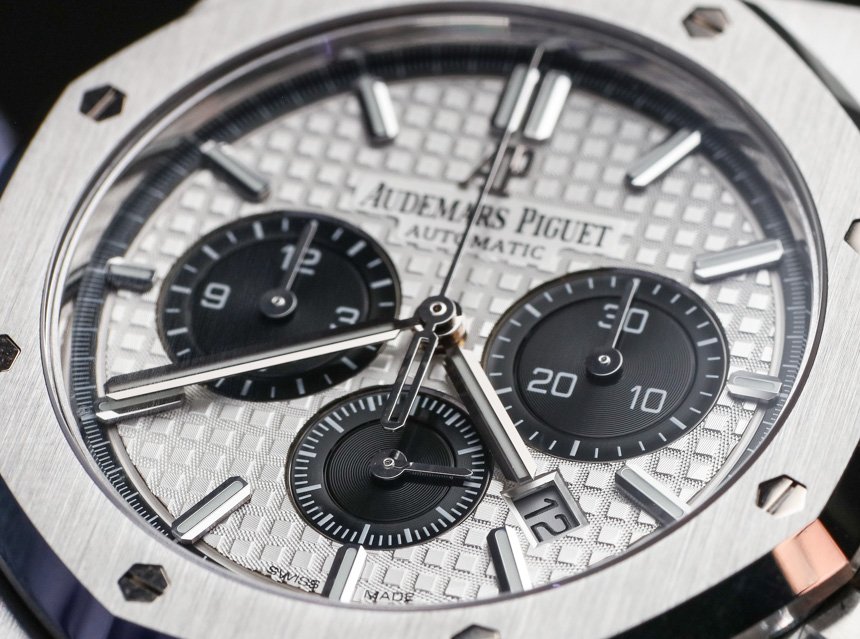
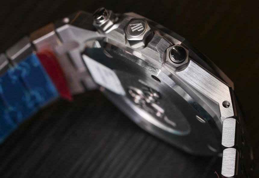
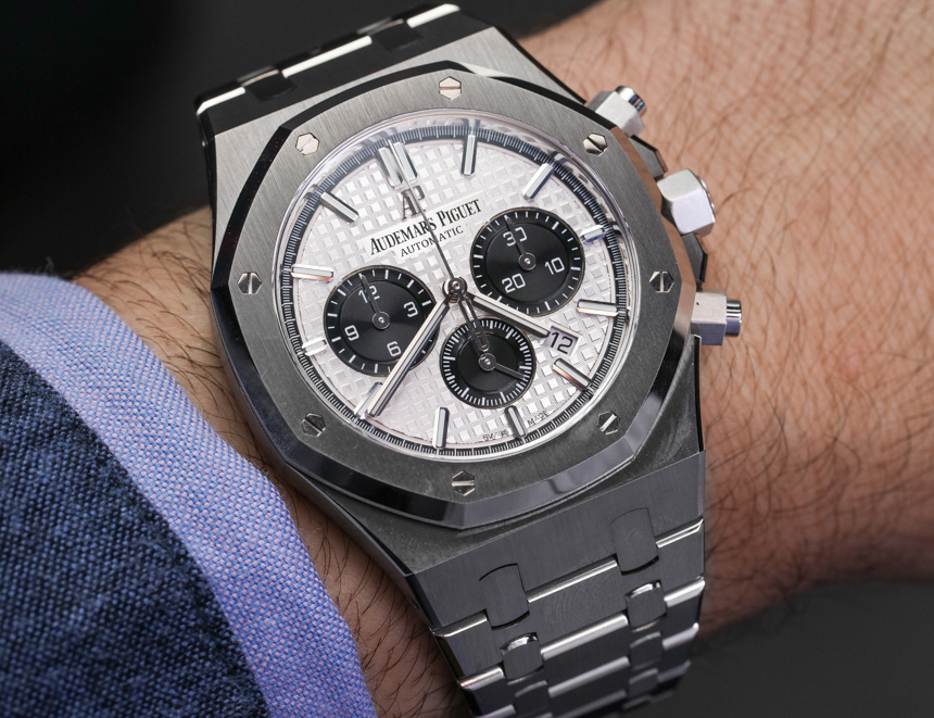
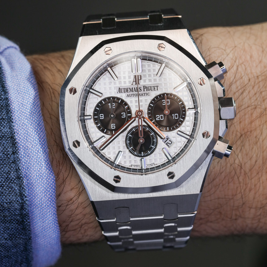
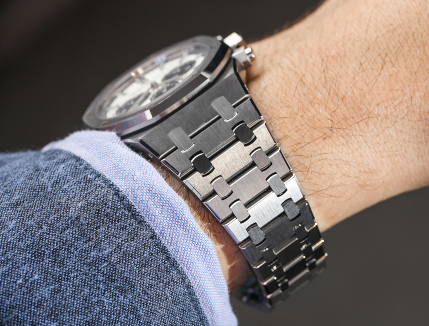
But speaking of that look, as expected, the cases themselves exhibit Audemars’ exemplary finishing (an eight-stage process which includes many hours of cutting, sandblasting, lapping, polishing, and varnishing), and are fitted with that “Grand Tapisserie” waffled dial, still cut using a century-old pantograph machine. Now, unless you had them both together in the same room, on the wrist, the general aesthetic and wearing experience of the 2017 chronographs is consistent with the outgoing variants, which are a pleasure to wear. Ultimately, the most immediately noticeable change is the new ‘panda’ look, which is an undeniably excellent update, and one that should otherwise prove quite popular with Royal Oak fans new and old.
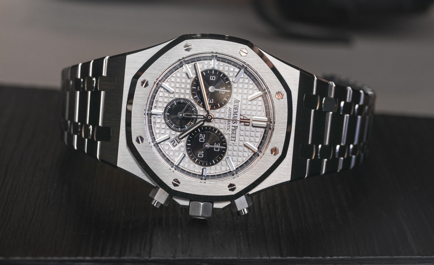
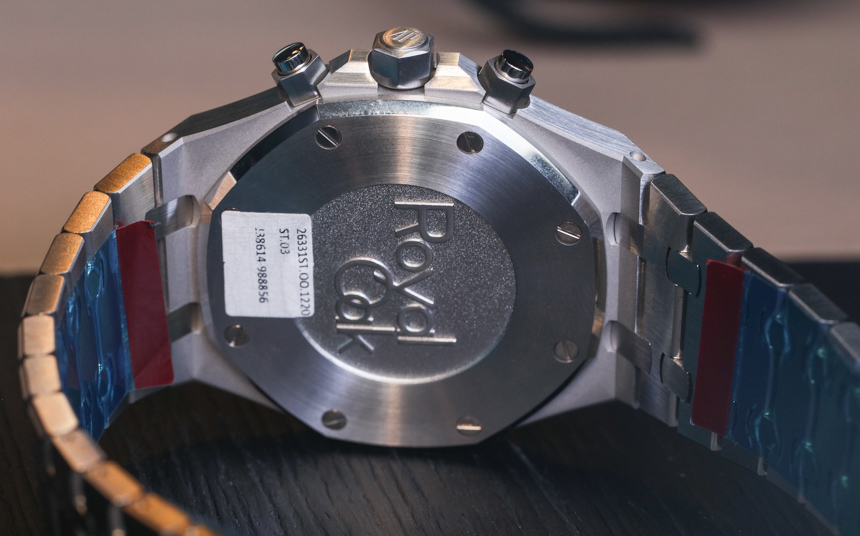
Stainless steel case variants (like this reference 26331ST.OO.1220ST.01) are available with black, blue, or this silver dial – each with contrasting registers, for a price of $24,300 on a stainless steel bracelet. For those who think the Royal Oak is best presented in precious metal, Audemars Piguet is also producing the new chronographs in solid rose gold, which are available in two dial options: brown or blue, each with the option of a solid gold bracelet or matching alligator leather strap. audemarspiguet.com