This is a good example of why a hands-on article makes a lot more sense for curious watch lovers than relying on marketing images provided by the brands. Perhaps I should discuss what that is all about first. Excuse the tangent, but let me share something with you about the watch industry (and many others as well). Have you noticed how most watch publications just use the same images of watches? You could read three magazines, and each has the same pictures. It is often the same thing on the internet. We call these marketing images and brands produce them and give them away as part of press kits. Brands hire expensive photographers or use computer renders to make sexy looking doctored images for both advertising and press purposes. Because they are free and easy, most people use them when writing about watches. Much of the time people never even get to see what they are writing about, so the press images are all they have.
You’ll see lots of marketing images right here on aBlogtoRead.com as well. It isn’t possible to photograph everything, and sometimes when there is a scoop or hot news item, it makes sense to publish what you have. At the same time, we try to publish original photographs of watches as much as possible. That goes for myself and any contributors that regularly or occasionally produce content for aBlogtoRead.com. The reason we do that is because marketing images simply don’t give you a good idea of what watches (or anything else) really looks like. Brands clean them up and enhance them so much, they are more art than reality. If your idea is to actually buy something (which is the intent of most aBlogtoRead.com readers), then you probably want to know what something actually looks like. Especially since most of these things aren’t easily accessible unless you live in a few special parts of the world.
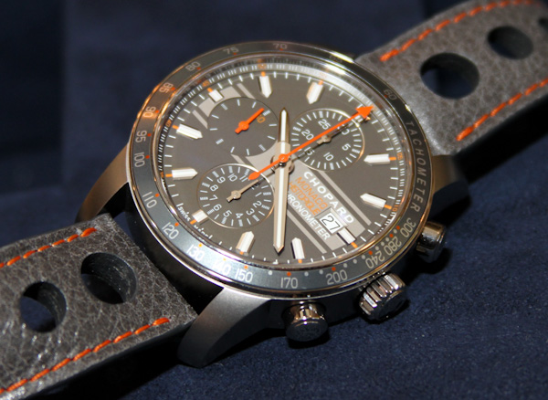
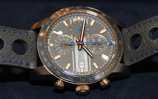
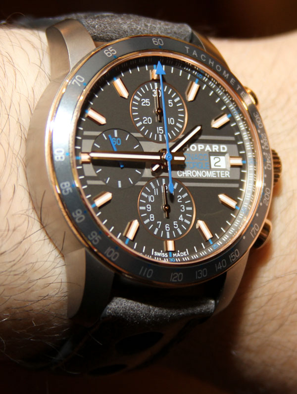
Anyhow, the Chopard marketing images of these new 2012 Grand Prix de Monaco Historique limited edition watches are beautiful, but don’t really convey the true colors of the watches for some reason. If you place the marketing images next to the real images, the colors actually aren’t that far off, but something about the lightness is lost. These are a couple of rather light gray watches – and the marketing images seem to make them feel darker than they are.
Gray is an interesting color – because it is rare in watches. “Like hell” you are probably thinking. Sure steel, titanium, and lots of metal tones are inherently gray. But we associate them more with metallic colors like silver, etc… Colors we look at and think “that is gray” on watches aren’t that common. But they are becoming more common because in the fashion world, gray is very popular. Gray is a good color in fashion because it goes well with many other colors. You can mix gray with just about anything it seems. Go to a clothing store these days and chances are you’ll see a lot more gray than you’d expect.
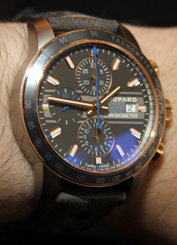
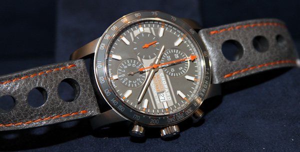
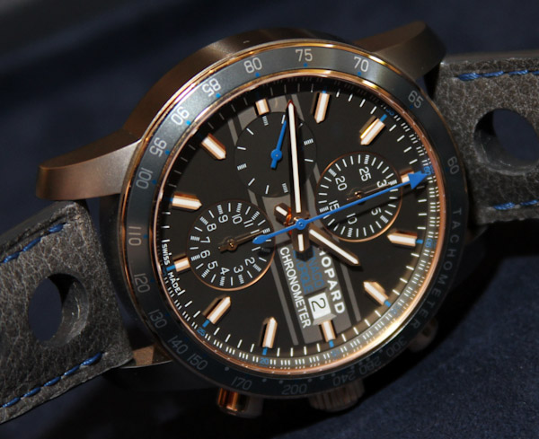
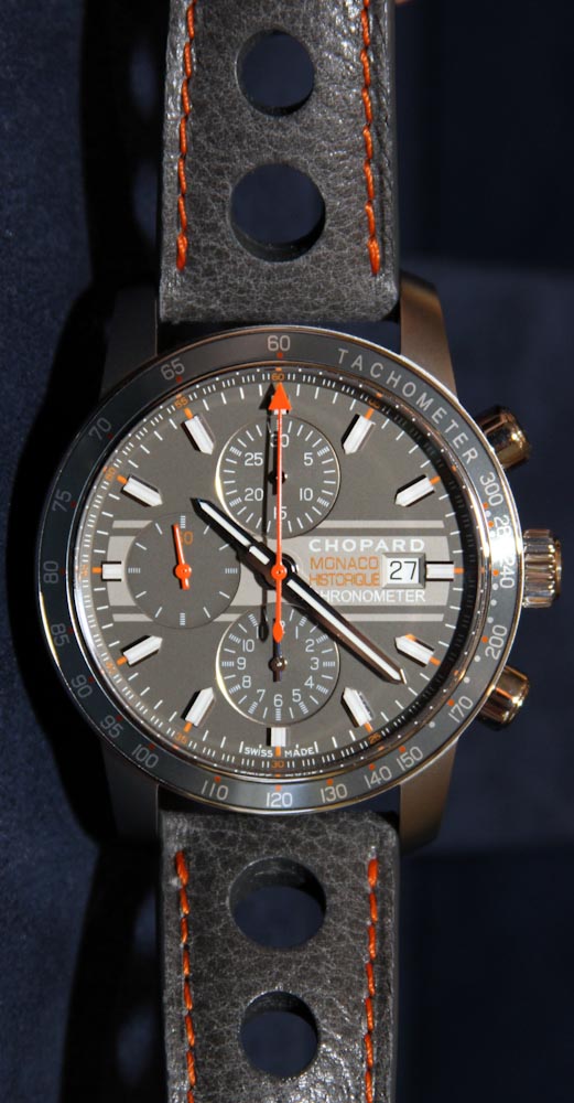
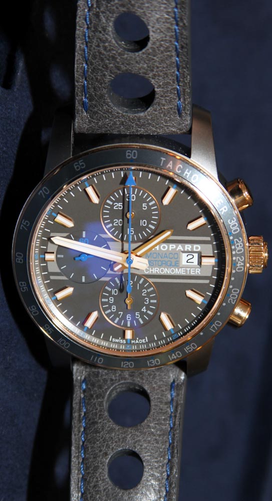
Aside from these new Grand Prix Monaco de Historique watches, for me the famous modern gray watch is the Chanel J12 Chromatic (which I reviewed hands-on here last year). I have to agree that these gray Chopard watches probably go with a lot of outfits. I can’t say that about the Chopard Mille Miglia GTXL Rossa Corsa I reviewed here – which while being cool, does beg for a red heavy day. In line with Chopard mantra, I can’t really use the term gray without also saying anthracite – the tone which Chopard uses to describe the dials. Lighter gray is used for horizontal racing stripes which add a welcome dash to the dial.
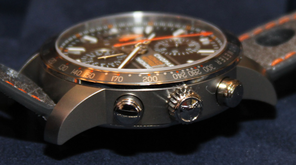
Dial designs (aside from the new colors) are what we have come to expect from the annual Grand Prix de Monaco Historique race watches. Nice applied hour indicator, bold hands, lume, and the right mixture of character and elegance. The 42.4mm wide watch cases are light – being done in titanium. The gray color of the metal is really enhanced due to the matte finishing used on the cases. Yet another gray tone is used for the tachometer bezel insert. In addition to the all-titanium model with its orange accents, there is a titanium and 18k rose gold model with blue accents. Both are nice but I think the gold and titanium model has the edge style-wise. Of course it does! It costs more.
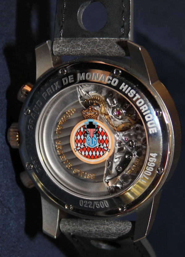
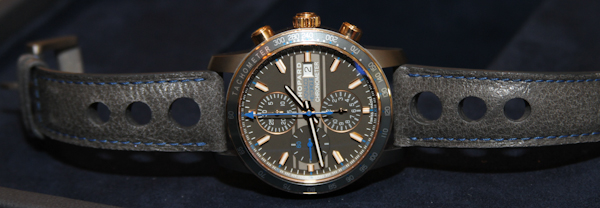
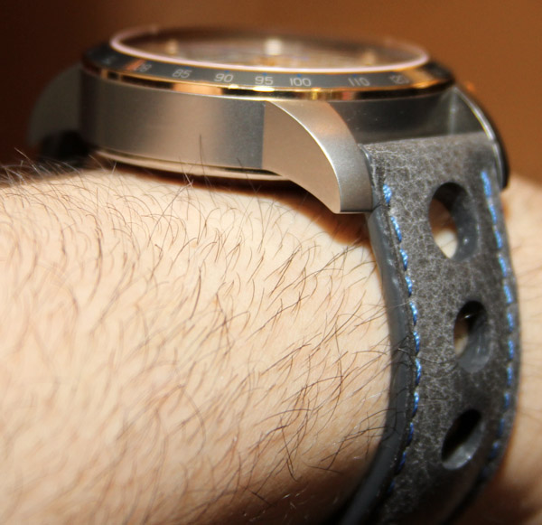
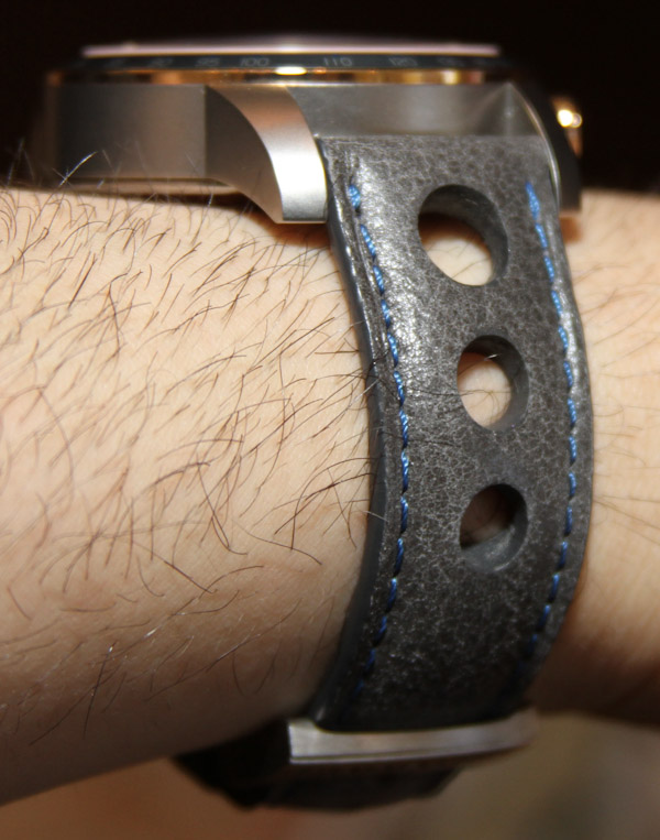
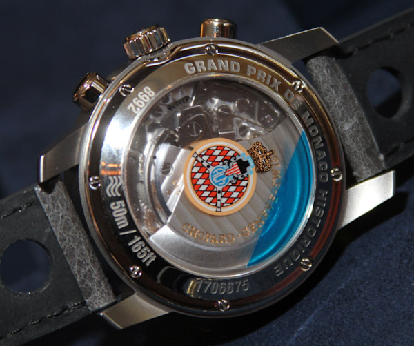
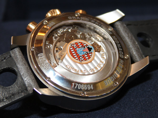
Chopard matches the cases with a great looking gray-colored Barenia leather strap – requisite racing portholes on the straps are included. On the back of the watch over the sapphire exhibition caseback window is the insignia of the Automobile Club de Monaco (aka, guys who probably get a few of these without having to pay for them). While the reference 168992-3032 titanium model isn’t strictly limited – it will only be produced this year. The reference 168992-9001 titanium and gold model is technically limited to only 500 pieces. Great if you love gray, these watches retail for $7,540 in titanium and $11,140 in titanium with 18k rose gold. My favorite Chopard Grand Prix de Monaco Historique still might be my Time Attack MF model.