The Chopard Grand Prix de Monaco Historique Chronograph ref 168570-3001, while inherently masculine, is a very pretty watch. I think it goes without saying that someone who loves watches has a weakness for pretty things. Pretty watches allow people to overcome a lot of otherwise valid complaints about a product, and the opposite is true as well. Producing an attractive watch is more difficult than it might first appear, and even more difficult is translating an attractive design into materials that look great in person. One of the benefits of buying watches from well-established brands is that, in many instances, they have figured this process out, making attractive designs into actually attractive timepieces.
So where does that leave the Chopard Grand Prix de Monaco Historique collection? Does it have things I want to complain about but otherwise forgive because I find it attractive? In a sense, yes, but these are common complaints about luxury watches. Chopard’s “Classic Racing” watches, a term that includes model families such as their Mille Miglia, SuperFast, and Monaco Historique collections, have always represented mostly very simple and high-priced timepieces. Having said that, they are mostly very good looking watches. That places the consumer is an interesting position, but I don’t think it is an unfair one. For eons, we have been asked to pay a premium for well-made eye-candy, and that legacy continues in full force today.
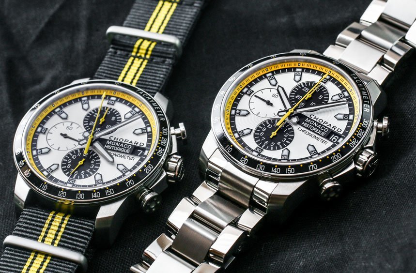
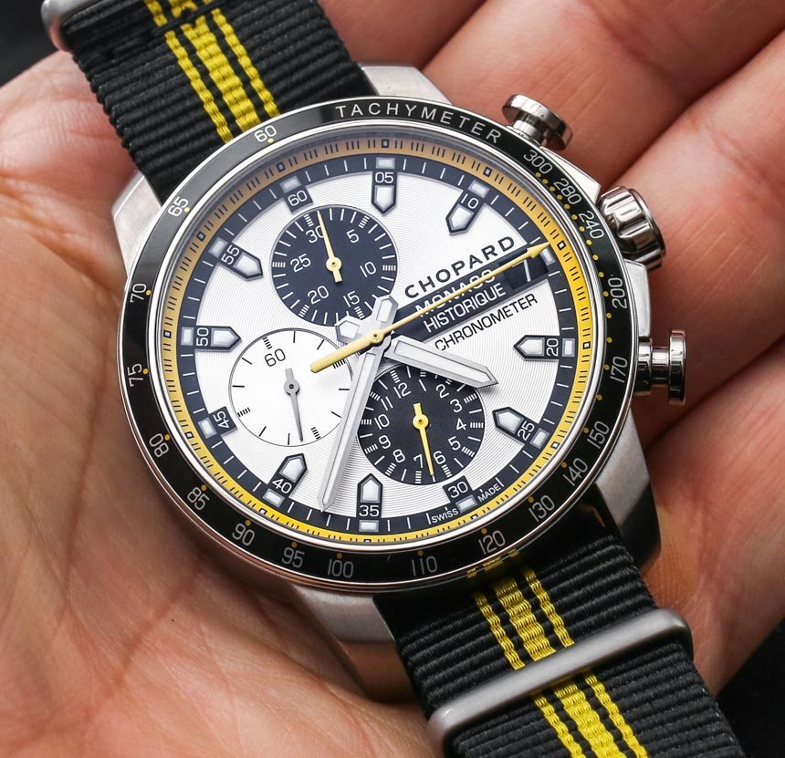
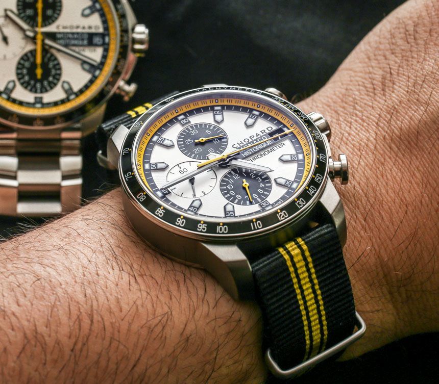
I last left off with the new 2014 Chopard Grand Prix de Monaco Historique collection with a hands-on article here. You can see how the 2014 models feature a Monaco Historique three-hand model (Automatic), power reserve (Power Control), and this Chopard Grand Prix de Monaco Historique Chronograph. Each shares a titanium case construction, as well as the fresh looking black and yellow “bumble bee” color scheme. I knew about the collection a few months before their Baselworld 2014 launch, but it wasn’t until I got some hands-on time with the pieces did they really capture my affection.
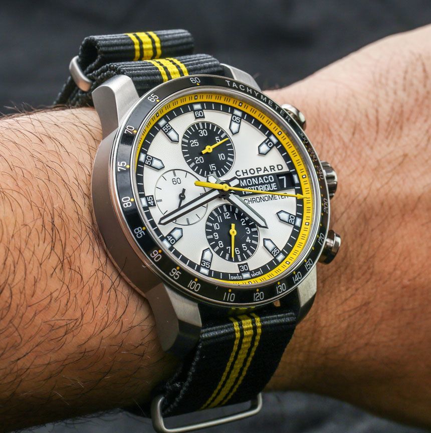
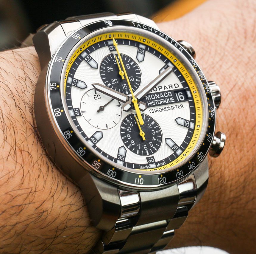
Out of the three models, the Chopard Grand Prix de Monaco Historique Chronograph is the largest, at 44.5mm wide, but it wears remarkably well, given its stubby lugs which prevent it from going off the wrist of most people. Having said that, I want people to be aware that it wears larger on the NATO-style strap. That is because the nature of the strap ads a few millimeters on each side. Most people are used to NATO straps wearing large – which is why they put them on small vintage watches, in order to make them look bigger – but it is a consideration if you have smaller wrists and love the idea of this Chopard Grand Prix de Monaco Historique Chronograph on the cool looking black and yellow NATO strap.
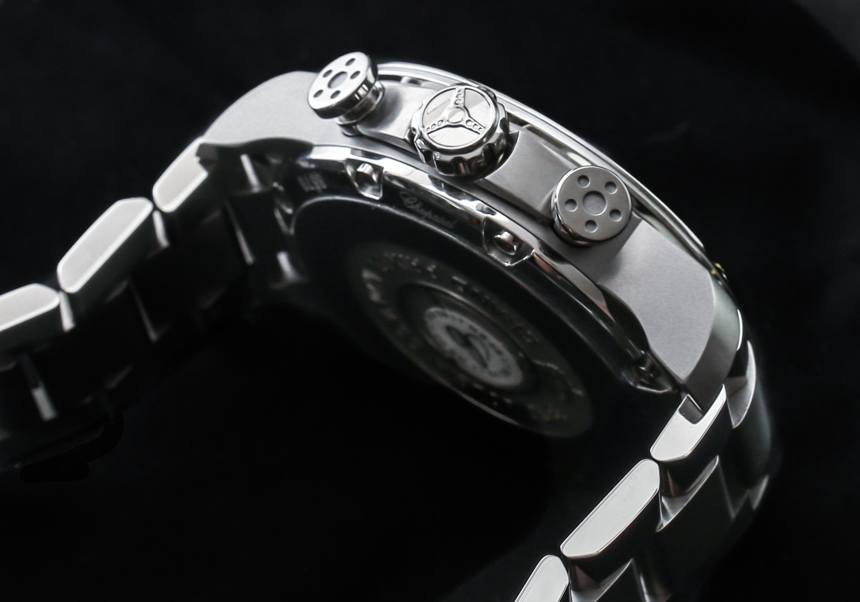
You’d be forgiven for not thinking that the case is produced from titanium. While lighter than steel, the polish looks almost exactly like steel – which is really impressive. Fancy polishing techniques can get a mirror polish out of grade 5 titanium, something that you don’t see on lower grade titanium metals. Chopard really pushed for a classy look with the titanium cases of these Grand Prix de Monaco Historique cases, and I think it is where some of the value comes in.
While attractive looking and not too thick, the black tachymeter scale bezel inserts around the dial are aluminum. This isn’t inherently bad, but I would like to see Chopard getting on the ceramic bezel band wagon sooner than later. Not only are ceramic bezels something I am coming to more and more expect in watches at this price level, but they are much more durable from a scratch-resistance perspective. Perhaps a consolation is the incredible anti-reflective coating that Chopard applies to the domed sapphire crystal over the dial. I am a huge fan of crystals that have so little glare they appear to be not be there at all. The sign of a great sport watch, in my opinion, is one that has a dial you feel you can touch with your finger. Chopard frequently uses very good sapphire crystals, with very good AR coatings, and that is something I will consistently stand behind as an indicator of quality.
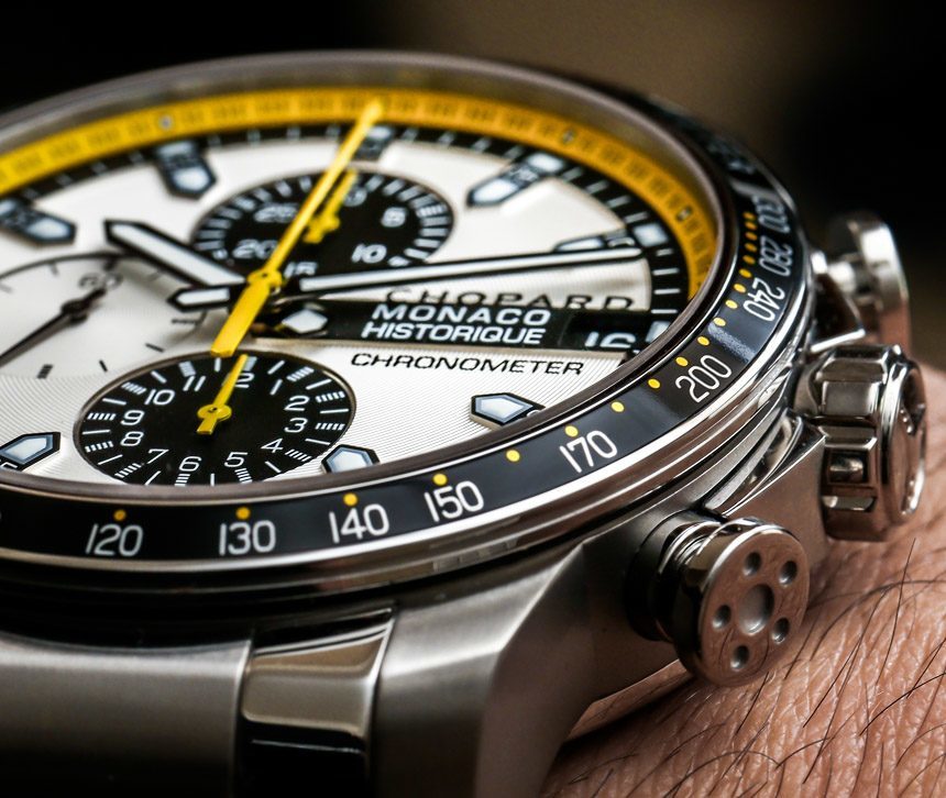
While this case design isn’t new, it goes very nicely with the Chopard Grand Prix de Monaco Historique Chronograph in titanium. There are also some steel parts to the case which I believe are the crown and pushers, and possibly the caseback. The crown has a small steering wheel-style relief, while the chronograph pushers are meant to look like pistons. All of this comes from the racing-inspired design ethos behind most Chopard men’s watches. It might be cliche, but it is something that Chopard does better than so many other watches with “racing-inspired” designs. Chopard’s take on this is to blend a few minor design cues with a bold sense of color you see in the racing world. At the same time, the watch doesn’t scream, “race track!” which means owners don’t need to feel silly wearing their Chopard Grand Prix de Monaco Historique Chronograph outside of car-related events – something which I think is a major consideration when buying a “themed” high-end sports watch. To a degree, you want it to be versatile enough to wear in a lot of situations.
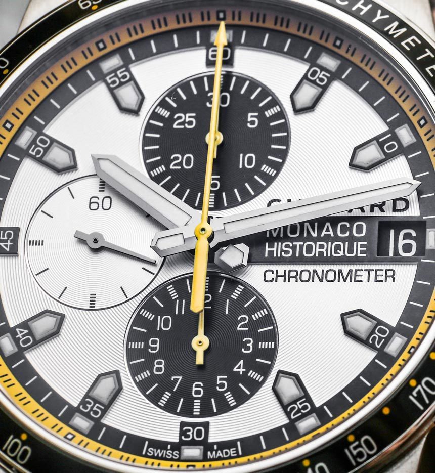
The dial of the Chopard Grand Prix de Monaco Historique Chronograph is truly lovely. At its core, this isn’t a new design, but it does have some novel design features as well as finishing. The subsidiary dials are easy to read and offer a high-contrast between hand and dial color. The raised hour markers are applied with SuperLumiNova lume, and more is in the hands. What I love about the hour markers and hands is how well they contrast with the mostly opaline dial. While polished, they aren’t in natural steel or black, but a sort of dark gray that makes them dark enough to contrast with the dial, yet still have a little polished glimmer. I think Chopard got not only the finishes down well, but also the colors. This type of attention to detail doesn’t happen by accident.
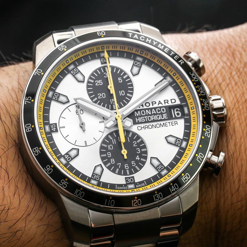
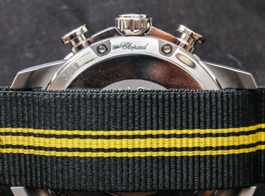
Some actually pointed out something to me what I’ve known for a while, but don’t normally mention. Chopard is a master at branding, and when looking at the logo on the dial, you can tell. Chopard pretty much only uses this logo for their men’s racing watch. Turn the watch over and look at the caseback to find Chopard’s more typical logo in a cursive font. In order to promote the masculine racing theme of the collection, they even have a special logo to use for their own name on these watches.
Personally, I happen to like the black and yellow accents of the dial a lot. Black and yellow together are visually arresting and in this case very attractive. If you don’t like the colors, that is fine, but if you do, then I think you’ll find a lot to love in the 2014 Chopard Monaco Historique watch models. More so, if you like the NATO strap.