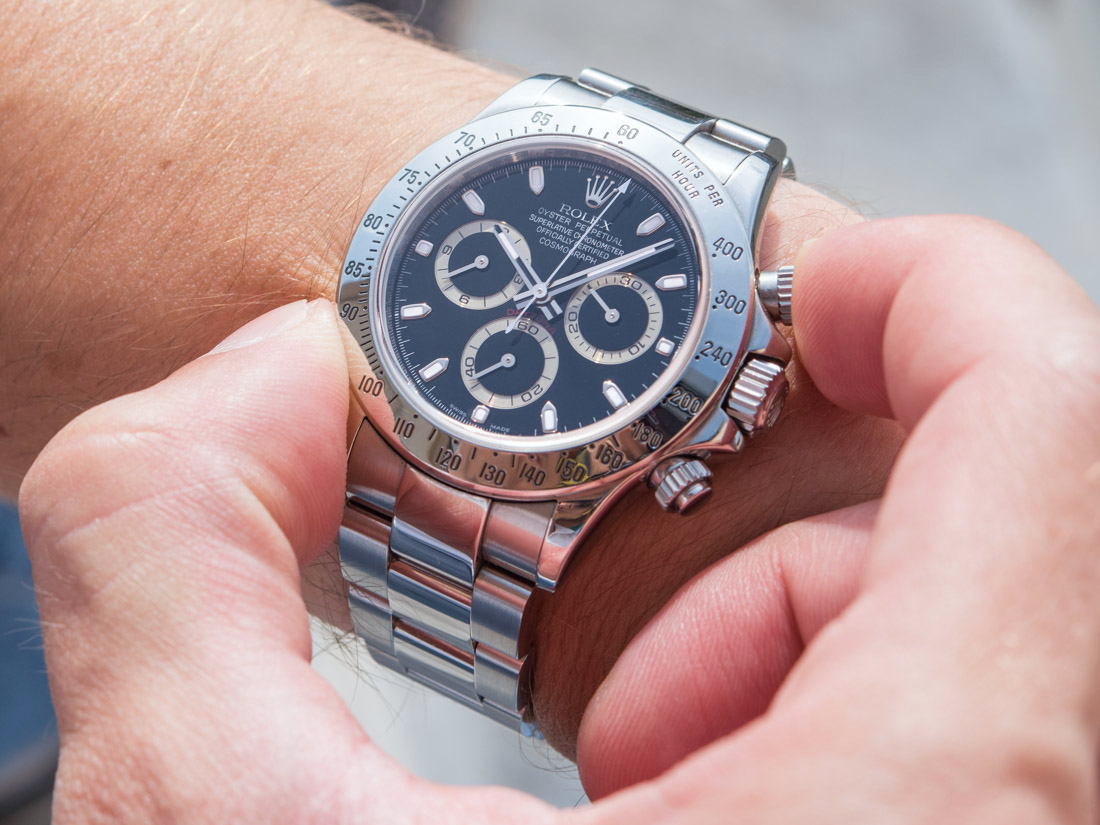
Throughout its long-winged career, the steel Daytona 116520 has existed in two variations, with a black-silver dial as seen here, and with a white-silver dial. That’s it, for 16 years. Try and imagine the 911 Carrera looking exactly the same for a decade, and coming in just two colors. Yes, the (mind you, always hidden) movement has been tweaked more accurately by Rolex a year or so ago… and yet, no matter how remarkable that achievement is, it is admittedly extremely difficult to appreciate on a daily basis, even for the nerdiest of watch enthusiasts.
Even with this aside, let’s say you look at the steel Daytona, one that is so omnipresent in many of the more prosperous parts of the world, and you ask yourself the question: what do I see in it that I myself discovered, that little aesthetic detail or feature that only I and few others can appreciate, that cannot be seen from the other end of the dinner table or is not known by all the nouveau riche, who rock it with a straight face?
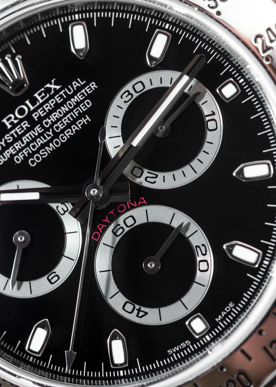
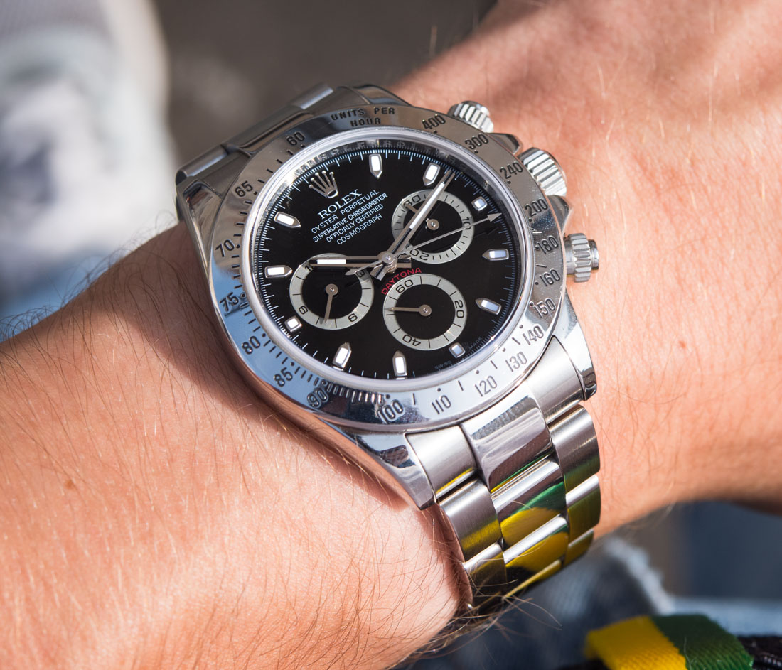
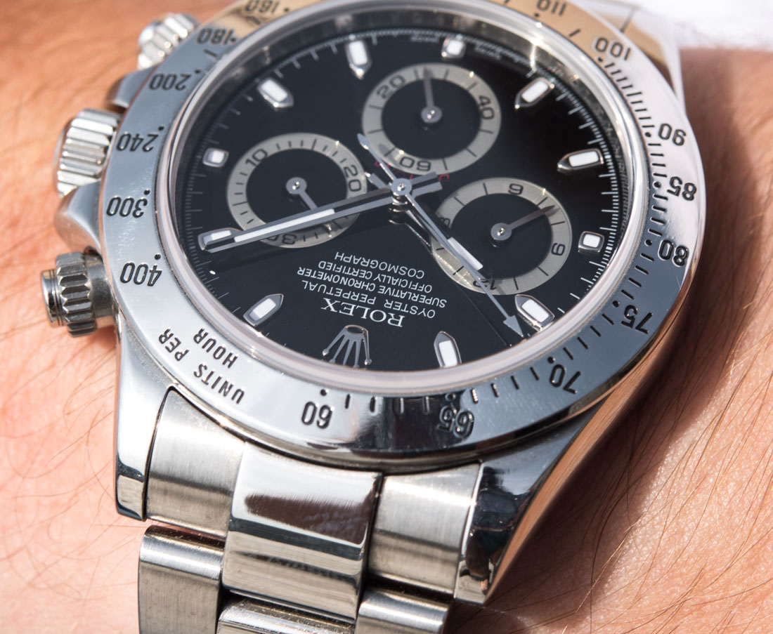
A rare occasion when the red Daytona text really pops – certainly adds a lot of flair and life to the dial.
Admittedly, the Daytona’s history and its highly impactful (and copied) design, or its stellar movement are more than respectable. The question that every prospective Daytona buyer might want to ask (or, some time after purchase will wish to have asked) oneself is whether wearing a design so fantastically ubiquitous in the luxury watch scene can be outweighed by these values.
I mean, sure, there will be those who just like the design and/or the brand and don’t want to think about it in such detail – for them, the Daytona is a luxury fashion icon, almost completely unrivaled. However, those looking for more than a desirable face, might say that we’re in 2017 and not in 2003, and today it is easy to find oneself feeling spoiled by the stronger-than-ever competition that tries very hard indeed to offer more either aesthetically or technically in this $10k+ price range. We must add that Rolex does of course offer proper drool-worthy stuff for watch nerds: the Sky-Dweller – that became much more affordable this year – is both novel and just insanely well engineered, and the Datejust 41 (reviewed) is better than it has ever been… But the steel Daytona, in comparison, is one foot in the past and one hovering over present – and whether you want that for the future is down to you to decide.
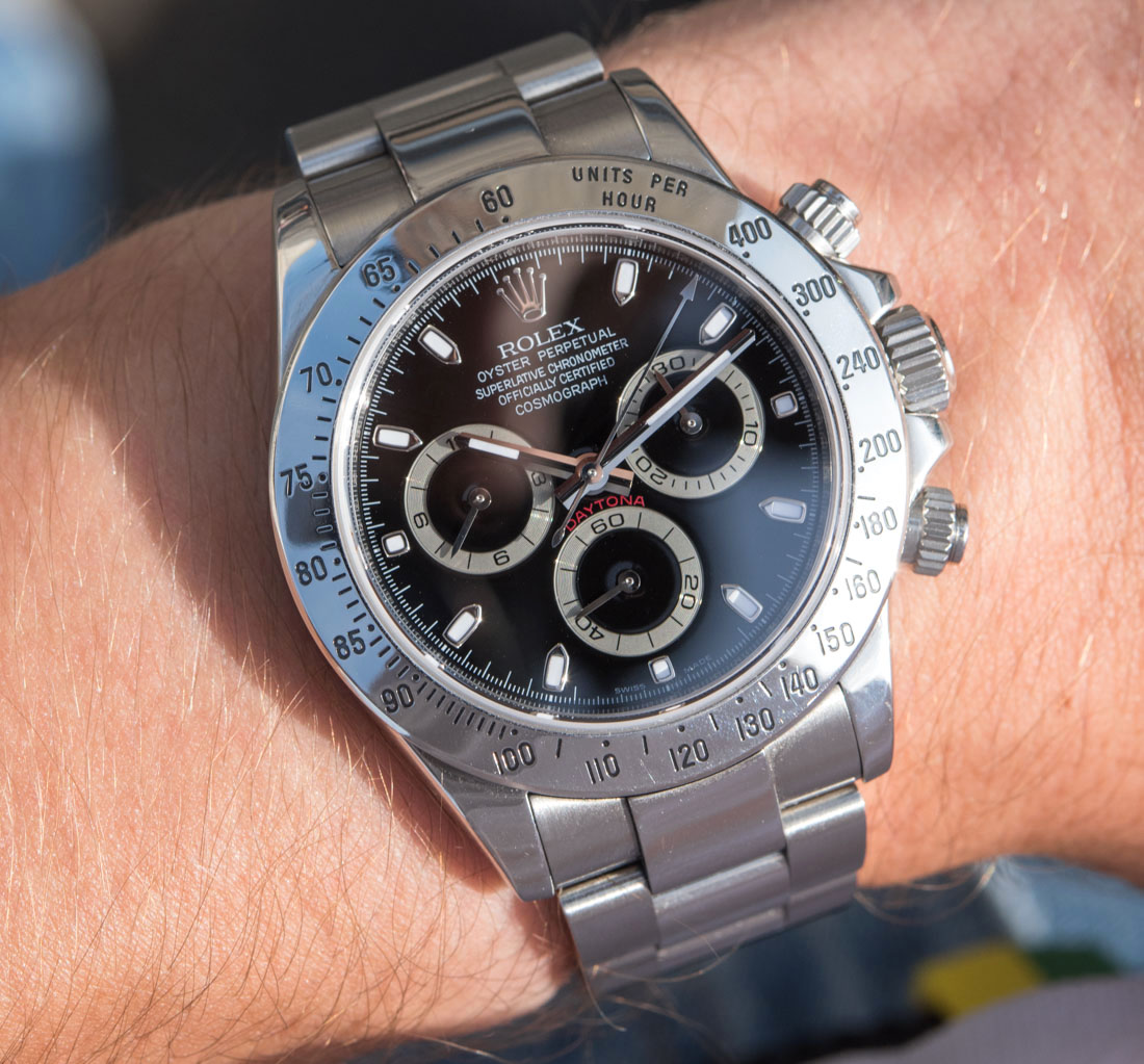
Design Specifics – A Familiar Sight
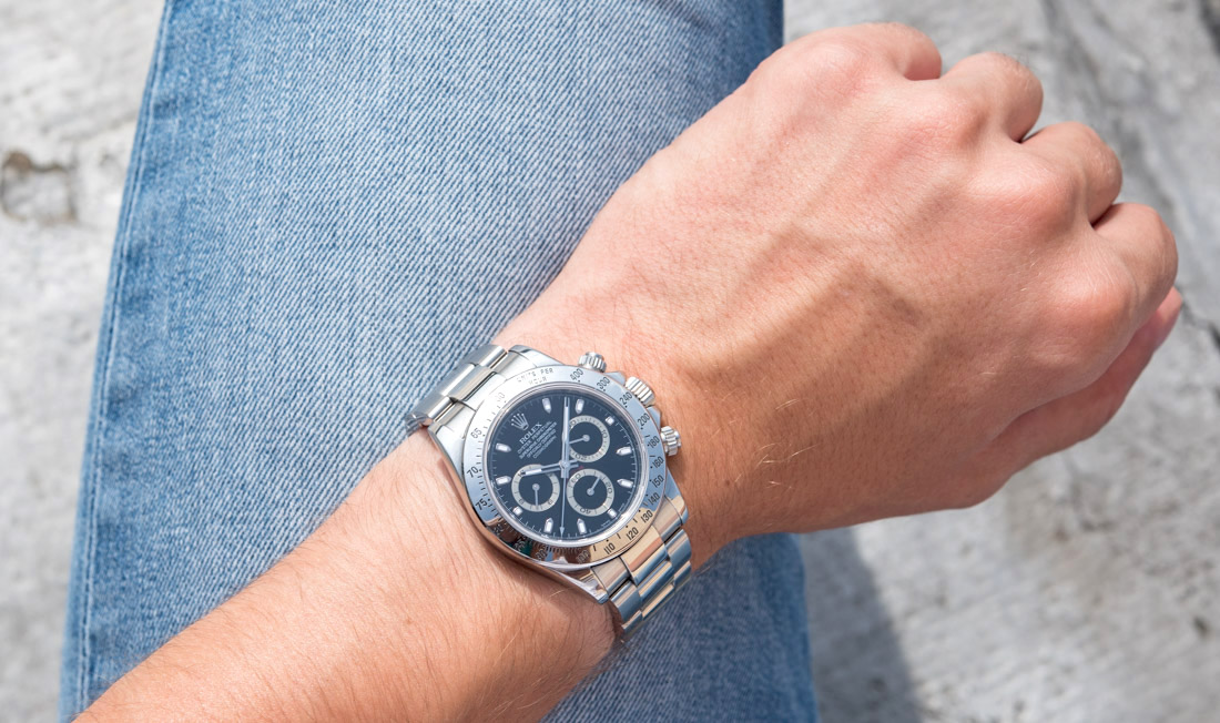
Screw-down pushers, large, guarded crown, sporty-ish tachymeter bezel, a shiny Rolex crown at 12, three unusual sub-dials, a lot of text, and the three-link Oyster bracelet. You need not even consider some of the utter monstrosities other major brands have put their name on in the early 2000s to understand why the Daytona’s restrained design has aged so well.
Almost impossible to notice, but the 3 and 9 o’clock sub-dials are actually set a tiny bit above the 3-9 center line of the dial.
The proportions are almost perfect. The way the width of the dial goes with the size of the bezel, case, and the bracelet’s links is spot on, but the size of the sub-dials and their black inner circles are very much a developed taste over the much more common solid sub-dials. I do wish there was a steel Daytona with solid colored sub-dials and was sort of disappointed by the 2016 revamp in this regard. Note that until 1988 the Daytona had solid sub-dials, so it wouldn’t exactly be sacrilege to bring them back on the steel model – gold variants (hands-on here) do have them and look a lot better, to my eyes, at least.
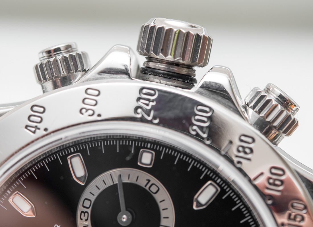
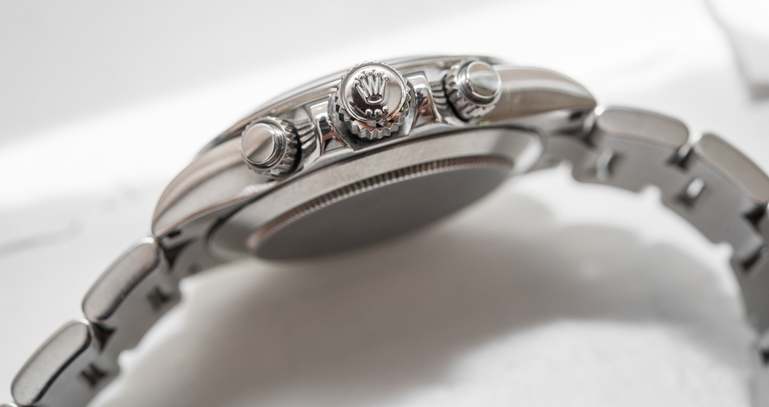
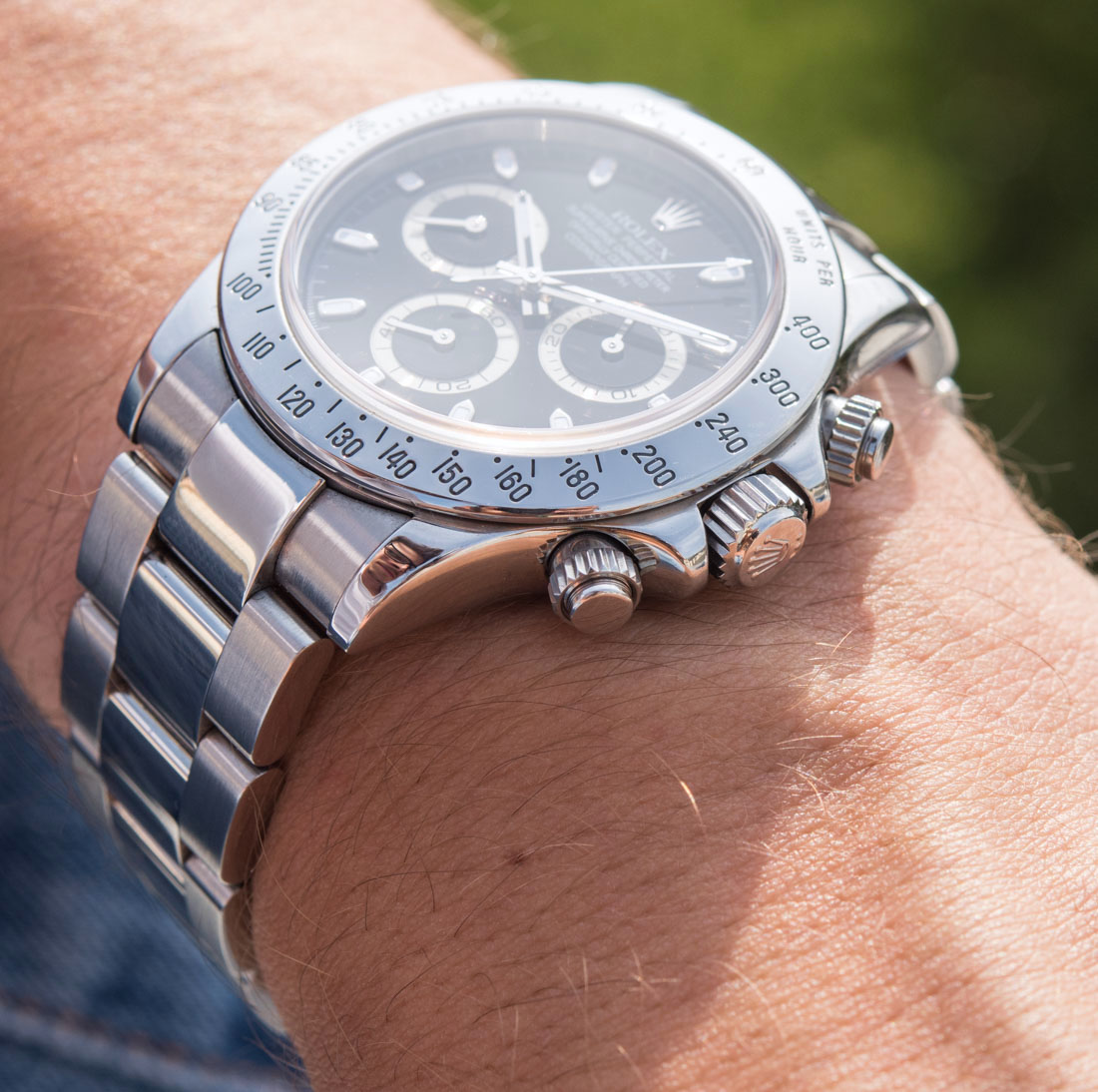
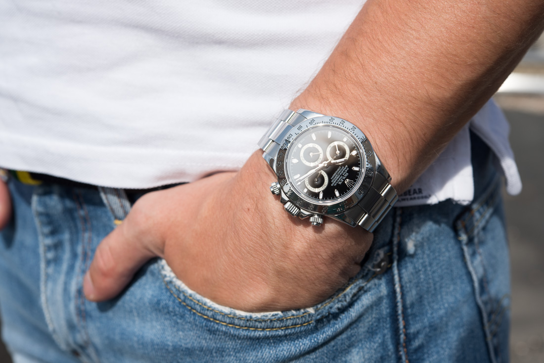
The Triplock screw-down crown is large and hence easy to operate – something that cannot really be said of the pushers. As seen on the picture above, they are difficult to grab and when you start turning, the watch wobbles on the wrist, making this screw-unscrew operation that much more annoying. Larger pushers do look less elegant, but they sure are easier to use. Though their tactile feedback is reassuring, it isn’t anything to write home about.
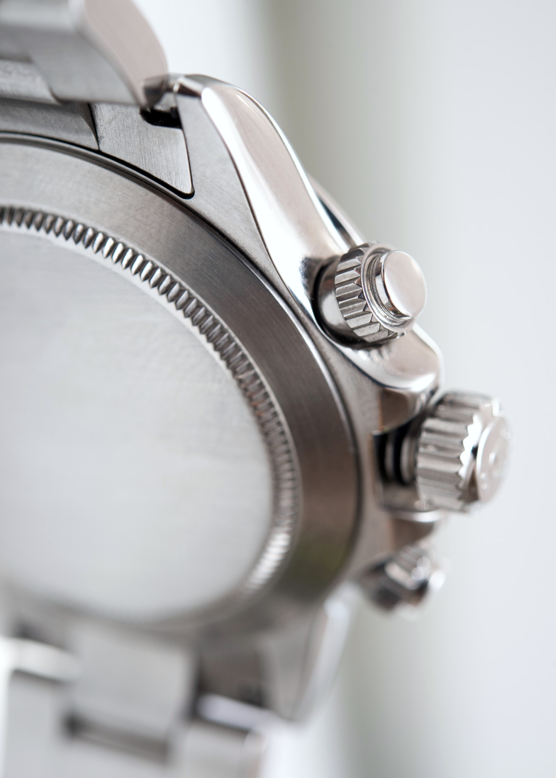
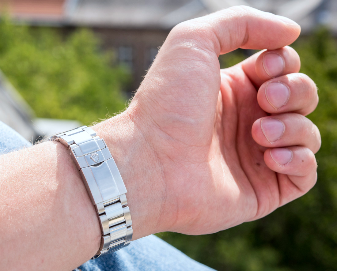
Neat curves, nicely integrated bracelet and difficult to grab, but elegant pushers. That curved, polished lug is a sight to behold.
Interesting to note are the curved lugs of the Rolex Daytona 116520: if you seek the nostalgia provided by the neatly curved lugs of old Rolex cases (as opposed to the bulky shoulders of the “Maxi case” on the new Submariners), the Daytona will likely offer what you’re looking for. The gentle curves in the solid 904L stainless steel feel fantastic to the touch and work nicely with the late ’90s/early ’00s vibe that the subtle lines of the Daytona emit so effortlessly.

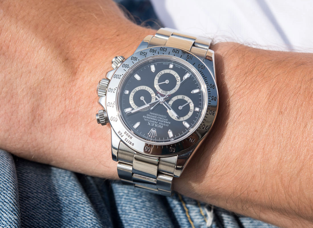
The bezel no doubt was worthy of an update: the metal appears stamped and the surface at times uneven – the way its markings are applied can’t measure up with the eye-watering sharpness achieved through more modern manufacturing techniques. The design is iconic for sure, but there’s a range of lighting situations and reflections when the steel bezel fails to look its best. The ceramic bezel is not only much more modern, but also higher quality in its execution – not to mention its resistance against scratches. The “steel Daytona look” will arguably be complete only with a steel bezel – but be aware that nostalgia, as is so often the case with vintage watches, comes at a price of somewhat inferior quality of execution when compared to the latest and greatest.
Legibility
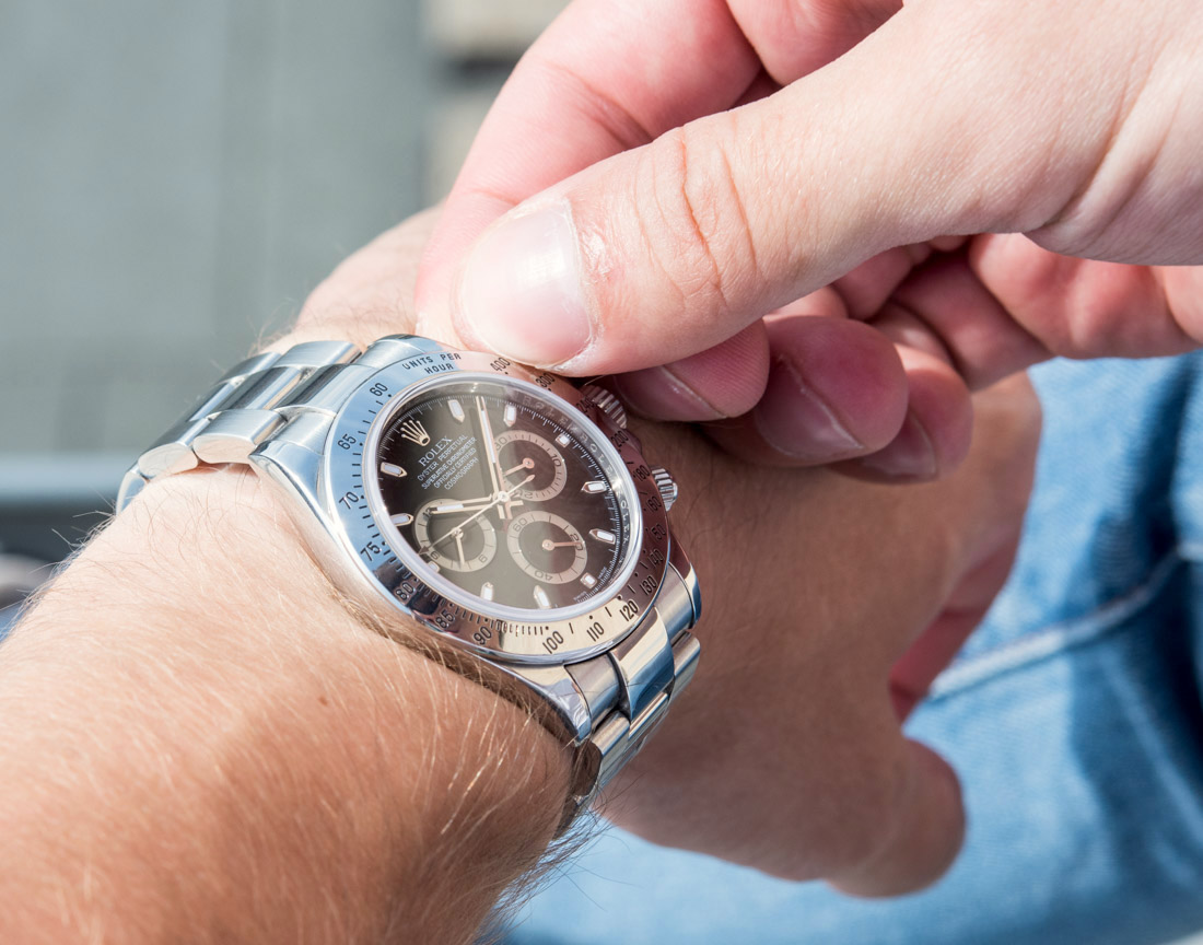
Good, but scarcely great. The front crystal shows smudges and finger prints like few other watches do, something that is further amplified by the black dial. If you’ve ever owned a black car in a rainy place, you’ll know what I mean. That said, the crystal does not excel at killing reflections either – I presume this is appreciated by the average customer who enjoys the sparkly glare of the entire watch when trying it on in the store: the crystal certainly aids rather than hinders reflectivity. If the crystal was curved, I would be more understanding, but I have seen perfectly flat crystals make me forget reflectivity even existed – and, considering the long run, I’d appreciate the Daytona to have excellent AR, rather than a light-show on its crystal.
…More reflections. When viewed at a steep angle they’re gone – but reflections are very much present the majority of times.
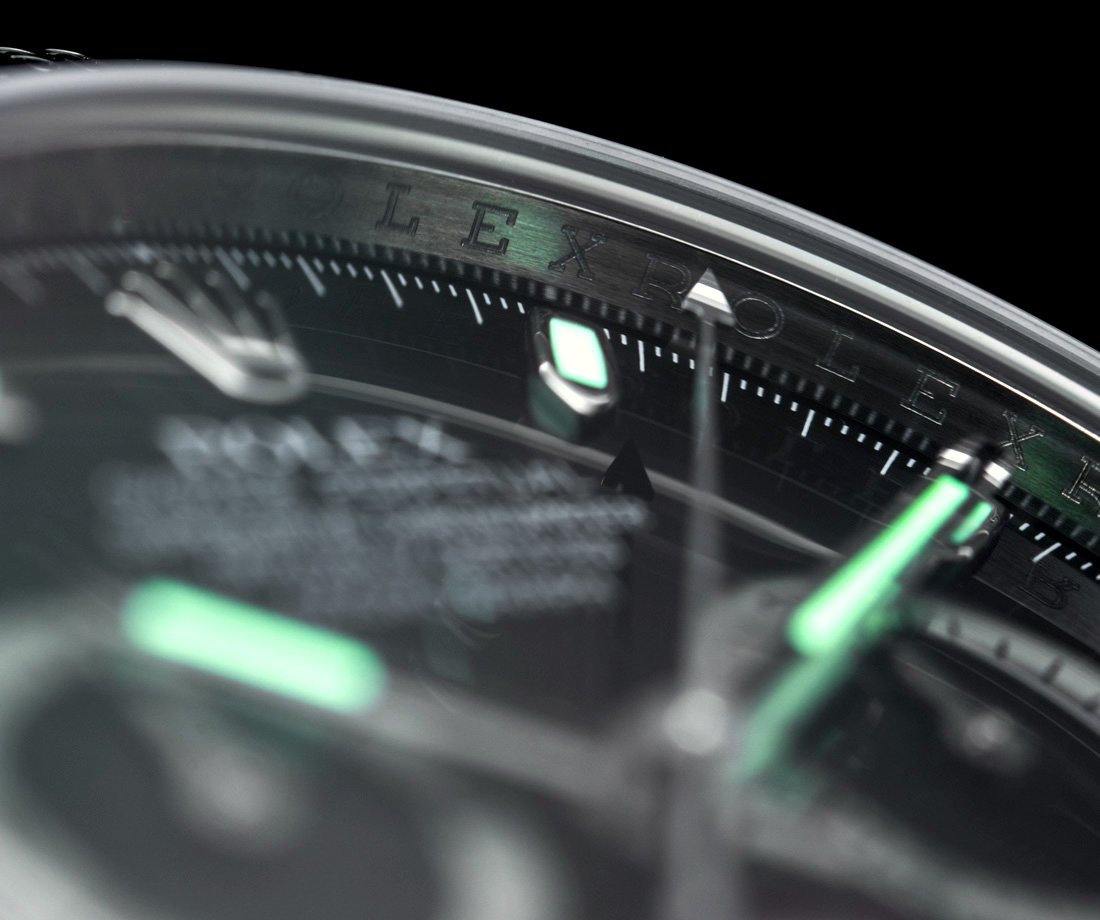
We’ll talk about wearability and legibility in specifics soon, so for now we’ll just say a few words about the dial and its features: there is no date, no GMT, no power reserve, just three hands mounted in the center, and three sub-dials. The crown’s prominent placement at the 12 o’clock position breaks the conservative, highly practical theme – elsewhere around the dial you’ll find lumed indices. There is no lume on the sub-dials or their hands, so the chronograph remains legible only with ample ambient light.


The hands are absolutely perfectly sized, all are amply long and wide, so kudos to Rolex for that. Their color schemes at first sight make sense, but in this extended review it stood out to me how they at times seem to work as a sort of camouflage. They are the same basic colors as the dial and its components, and the main hands’ colors are spread out in a way that when they are over the sub-dials (let’s say when the time is 3:10, etc.) they make it challenging to distinguish them from the background.

Further above: the main hands blend neatly into the sub-dials. Just above: white gold indices and hands, though the latter could use a bit more volume.
White gold is used for the hands and indices on every Rolex (unless gold of another color is used for the case), and while they are shiny alright and are nicely made, at times they appear they could use some additional volume. Manufacturing techniques have advanced over the last 20 years and pieces as tiny as sub-dial hands we see crafted more complexly and with proper volume below this price point. Rolex doesn’t manufacture its own hands and since we have seen Rolex successfully make suppliers push their limits (think of the super complicated Oysterflex rubber strap from recent past), the supplier of the hands should step up their game as well – especially since we are into the five-figure price segment here and simple stamped metal hands don’t really cut it anymore, no matter how nicely made.
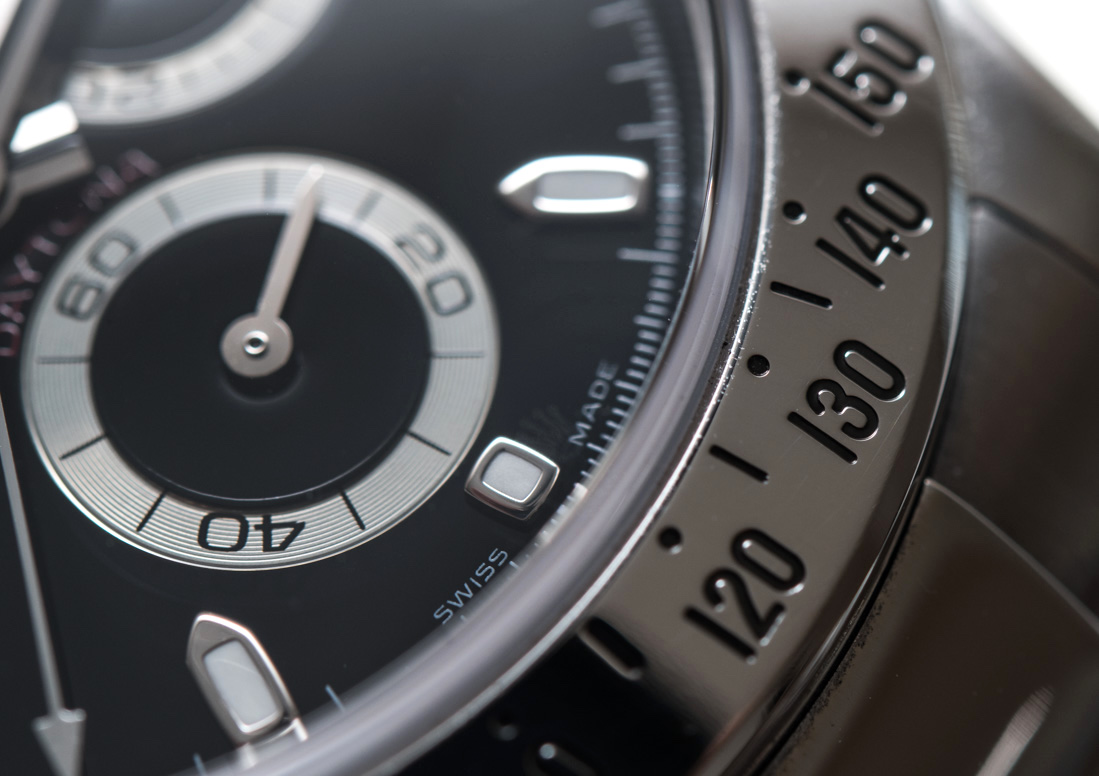
A neat detail that I could really appreciate was how the center of the sub-dials was executed: right around the base of the hands there is an angled part that can be seen with the naked eye when the lighting is right. Here you can really see the thickness of the black paint and the amply applied lacquer over it – in terms of sheen and depth this is as close to an enamel dial as a lacquered dial can get. The red Daytona text adds that extra pop of color this dial so badly needs – too bad that the text is small and dark red, so much so that the majority of the time it cannot be seen either for the smudged crystal, the hands blocking it out, or the lighting not being just right.