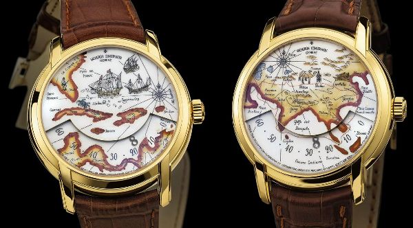
 While I really like the idea, I just don’t think Vacheron Constantin succeeding in getting the point across with these watches. The Metiers d’Art Tribute To Great Explorers 2008 collection is meant to honor Marco Polo and Christopher Columbus with well crafted watches that have old-style maps on them. Solid gold cases frame sophisticated enamel art with gold accents throughout. The enamel style is called “grand feu” and is apparently very tricky to get done right. I have no doubt that the methods used to creates this artistic watches are world-class, and that the fit and finish is top-notch. But that is not what a nice watch is all about in the end.
Vacheron Constantin prides themselves on the special mechanical movement used to power these unorthodox timepieces. It is an in-house automatic movement ref. 1126AT. When the image on a watch face is paramount to telling the time, the method used to tell the time needs to be innovative and not detracting to the art displayed on the dial. Thus, Vacheron Constantin uses a special disk method to display the time on the bottom of the watch. Through a opening between the layers, a number (indicating the hour) pops out and moves across the bottom from 0 – 60. Following the progress of the hour number, you can roughly figure out what time it is. Not with particular precision, but these aren’t exactly instrument watches either. I must admit that while I don’t find the method of displaying the time to be particularly attractive, it is a simple and effective means of getting the job done.
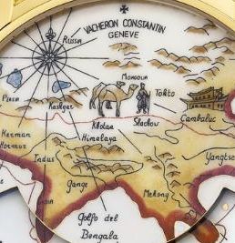
 So you have a nicely made watch with an interesting movement, what exactly is my problem you ask? Well it has to do with the art itself that looks, childish to the say the least. I love the look of old world maps, but these just look really basic, and not a very good match with the special enamel style that is used. There is very limited detail, and I’ve seen many, much better antique map drawings. The writing is not especially elegant, and this is even reflected in the Vacheron Constantin logo that is done in the same style. It is not very crisp or interesting for that matter. I do like how the land masses are outlined with gold, this is nice, but I am not super keen on the browns used, but that could be argued as part of the style. The little illustrations are basic at best, and don’t represent a large degree of style of skill. To be honest, these small painting remind me of the skill you’d see employed when buying trinkets at some bazaar; its not bad, but its not up to par with what these watches will inevitably costs (more than trinket prices).
The images themselves are supposed to represent basic maps of the areas that Marco Polo and Christopher Columbus explored. That is sort of a tribute to the explorers I guess. It doesn’t actually say anything about them, at least not on the face. So basically my opinion is that while these are nice watches, they aren’t nice enough. Vacheron Constantin seems to be a bit hit and miss these days. That is ok, they are trying though. We will see what they spring on us next.
See Vacheron Constantin watches on eBay here.
See Vacheron Constantin watches on Amazon here.
