Zenith has always held a special place for me. From a fairly young age, not long after high school, the brand occupied an elite status in my mind. More specifically, it was and remains in my top two favorite brands of all-time, the other being Grand Seiko. In my mind, they offered two intriguing sides to the same high-frequency coin. Where Grand Seiko possessed a certain austerity to it, a degree of refinement I found in few, if any other places, Zenith was quite the opposite. Zenith might be a Swiss brand, but it always seems to have an American-grade boldness to it, a panache matched by none, at least none with Zenith’s horological pedigree. And thus, my two favorite watch brands were chosen: a restrained and sophisticated dress watch and a wild, avant-garde sports watch. Why can’t one watch just be both?
Zenith, to their credit, almost had an answer to my question already: the criminally overlooked A273, a classic chronograph that had a measure of civility to it. Yet the A273 itself had committed an offense: it was offered during the same basic time frame as the legendary tri-color El Primero. Because of this coexistence, it was doomed to be overshadowed by its more prolific brother, which continues to be available today. Unlike the El Primero, the A273 was powered by a beautiful, yet far less revolutionary, hand wound movement. There it remained, largely unnoticed even among Zenith collectors, awaiting the time it too would receive the El Primero.
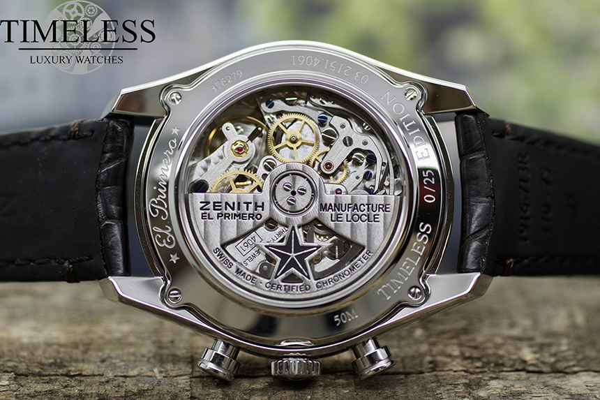
The watch we’re looking at today does have an El Primero, but it’s not the A273. It’s the new Timeless Chronomaster Heritage Chronometer limited edition. It’s closely inspired by that A273, of course, but it is not a reissue or a new version. Instead, it takes a leap forward, and not only in terms of the movement as we’ve made subtle updates throughout the watch. Let’s take a close look at the Timeless Chronomaster Heritage Chronometer and learn more about both its predecessor and the limited edition.
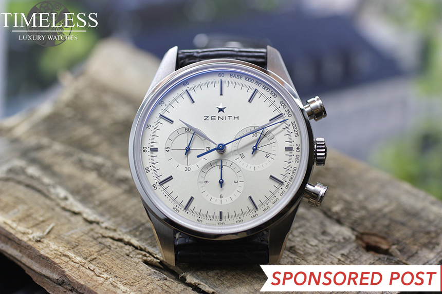
The aesthetic heart of any watch is its dial. Almost everything that defines a model as a unique, distinctive piece can be found there. For this watch we wanted to use a dial that was extremely understated and clean, yet never boring. That meant removing almost everything that was superfluous. I find that the need for simplicity is greatest in chronographs, and other watches with intrinsically busy dials. This watch, therefore, would have no date and it would have no “El Primero” or “36,000 VPH” writing on it. It had to be reduced to the essence of what a chronograph must have while nonetheless balancing some of those traits that defined its ancestor.
While it lacks unnecessary writing or a date complication, the tachymeter remained, as well as the distinctive 3/6/9 lines on the minute sub-dial. Those were, at the end of the day, counterproductive to the task of simplification, but without them, the watch would lose almost any connection to the A273. Pursuing simplicity is, in our view, a good thing, but left unchecked it would inevitably lead to a uselessly blank dial. It must be balanced with other design goals.

The dial itself had to be both understated yet have a charming, dynamic character that keeps it from ever becoming boring. The best way to accomplish that, we’ve found, is via a sunburst finish. A good sunburst finish, like this one, almost disappears in some light, appearing flat and non reflective, yet in other lighting, usually more direct, it comes alive with vibrant, brighter colors. In these photos, with a white light box and perfectly even lighting, the dial comes off almost as silver, but in most situations, it’s a more appreciable champagne, or as some have commented, cream.
The three small lines on the minute sub-dial, pointing to 3, 6 and 9, have undoubtedly piqued your interest. This was a feature found not only on the A273 but on a variety of vintage Zeniths, and while it might look flamboyant, it had an extremely utilitarian nature. I’m told (I wasn’t alive at the time to offer my own testimony) that these marked the intervals at which long-distance phone calls increased in price. Thus, the chronograph complication could help its owner in the rather mundane task of reducing his phone costs.
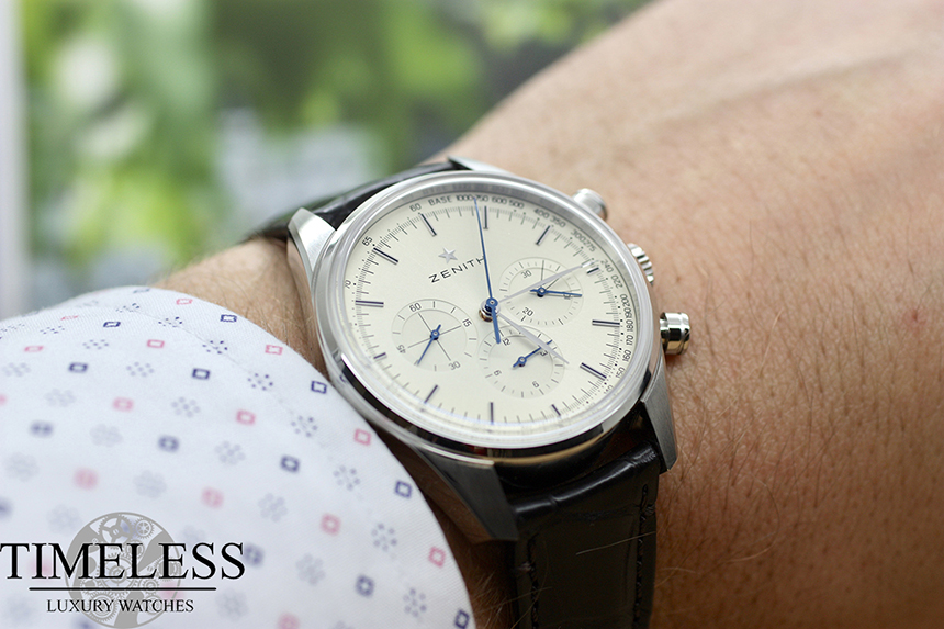
The blued hands and champagne dial complement one another, each making the other more vibrant and visible. Typically, we would use a single color for a complication, like all chronograph hands being blue and all others being silver, but in keeping with the A273, we opted for the three sub-dial hands and the seconds hand to be blued while the hour and minute hands are silver. It’s not the most logical layout, but it has a very pleasing chromatic symmetry to it. Breaking with tradition, however, is the shape of the hands. The original A273 used sportier stick hands for hours and minutes, but we felt that the leaf-shaped hands better suited the dressy character that we were aiming for with the Timeless Chronomaster Heritage Chronometer. Conversely, we added a short counterbalance to the sub-dial hands because, being blue, they matched the similarly-shaped blued seconds hand, contributing a degree of consistency.
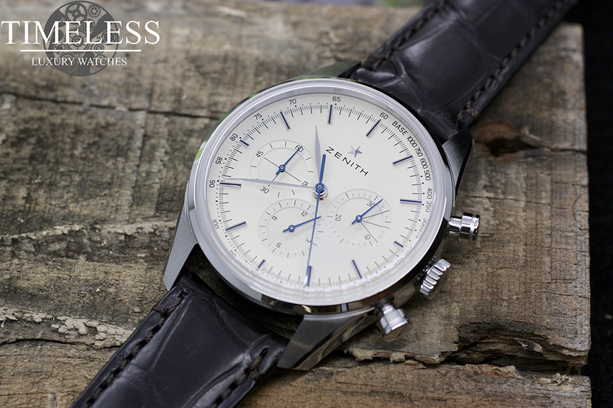
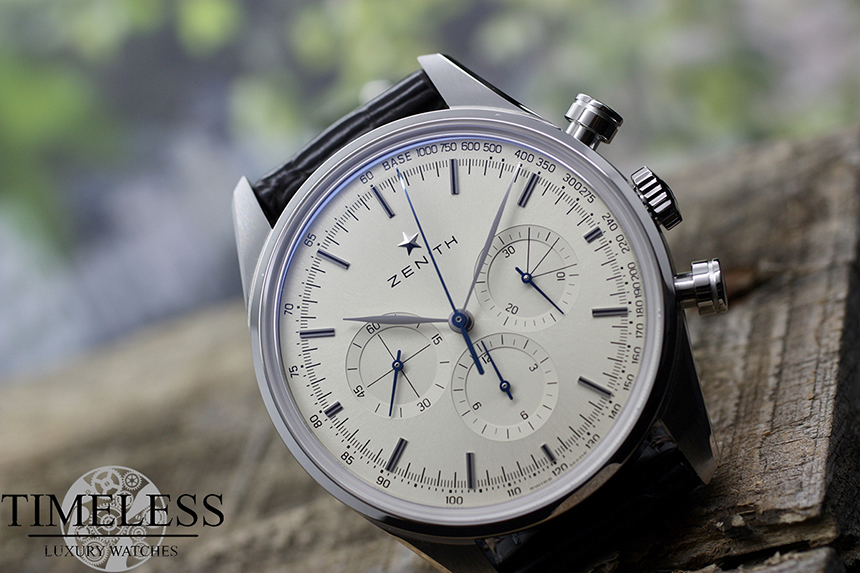
Another important goal for us was to avoid the overlapping dials found in so many modern Zeniths. These are often criticized by collectors, even fellow Zenith fans, although I’ve never personally found it to be troubling. The overlapping sub-dials matched the effortless avant-garde nature of the tri-color El Primero quite well, being almost flippant with its design. That sort of brashness works well on overtly sporty models, should a brand be gutsy enough to actually try it, but for a much dressier, more austere model like the Timeless Chronomaster Heritage it wouldn’t do. Naturally, we wouldn’t dare modify the El Primero within to space the sub-dials out further, so we were necessarily restricted as to where the sub-dials must be located. The solution was self-evident: the sub-dials had to be smaller. Although reduced in size, they’re now as large as they can possibly be without overlapping, and to aid in legibility, there is a subtle ring, a change in texture, around each sub-dial which helps separate it from the surrounding dial without need for an outline or applied marker.
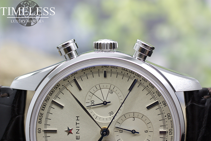
One of the other important changes we made was moving to a new case. We chose the Heritage 146 case due to its size and classic design. As is so often the situation for our limited editions, we opted to use a 38mm size. In general, we use 38mm cases because we find it to be a very versatile size, and in a small run limited edition we want to reach the broadest variety of collectors possible. You’ll also notice in this photo that the crown is quite a bit thinner than the Heritage 146’s crown. The A273’s crown was also fairly thick, but again, we felt that the slightly thinner crown was more consistent with its dressier image. Being an accurate, automatic watch with no need to set the date, the crown won’t be needed particularly often to begin with. You’ll also notice that the pushers have a small groove in them, another subtle difference from the original.