The last really new J12 from Chanel was the Chromatic that aBlogtoWatch debuted to the world here. Back in 2011 when Chanel released the Chromatic it upped the ante for Chanel’s “ownership” of ceramic as a luxury material with a new metallic gray material that mixed ceramic with titanium. Chanel really started its own ceramic revolution with the original J12 watch about a decade ago. In black or white, it was anything but a polarizing design as the J12 is still beloved by many. Having said that – even though I think the J12 is a nice men’s watch – it was women who found it the most interesting.
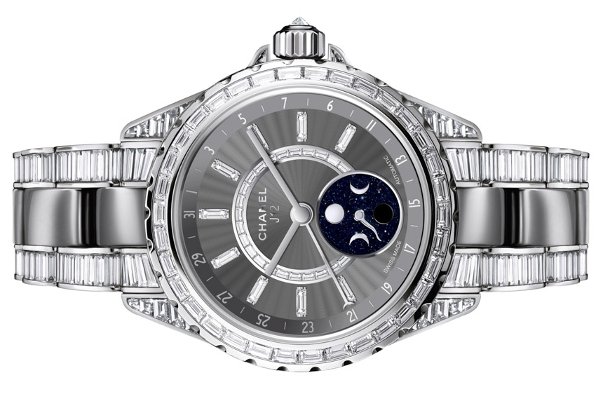
Now, in late 2013 Chanel adds a new character to the J12 collection with the J12 Moonphase. The added moon phase complication is being debuted in a range of models that span from a classic white J12, to a Chromatic model, and even a totally jewel encrusted limited edition model (actually two of them). Though for now, the J12 Moonphase will be available exclusively in the 38mm wide size. Let’s take a look at the new J12 Moonphase which offers a bit more than just a new complication.
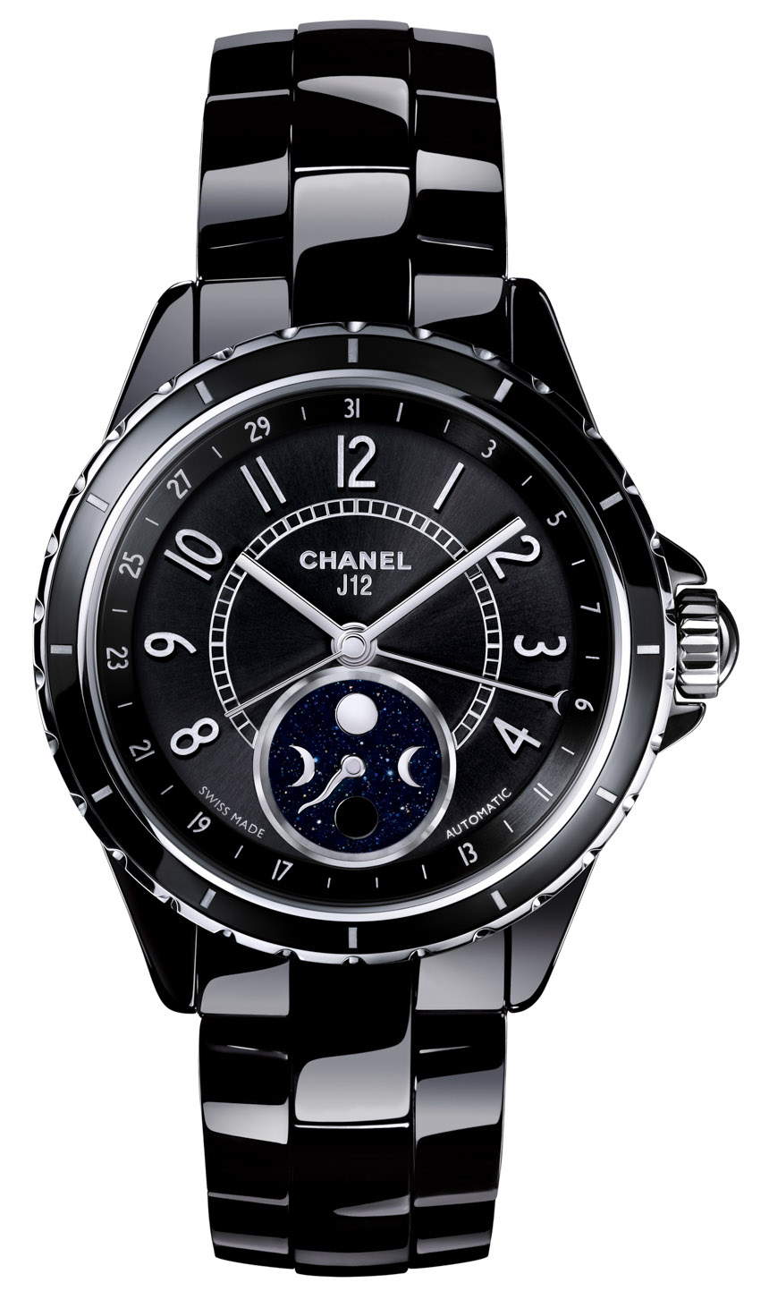
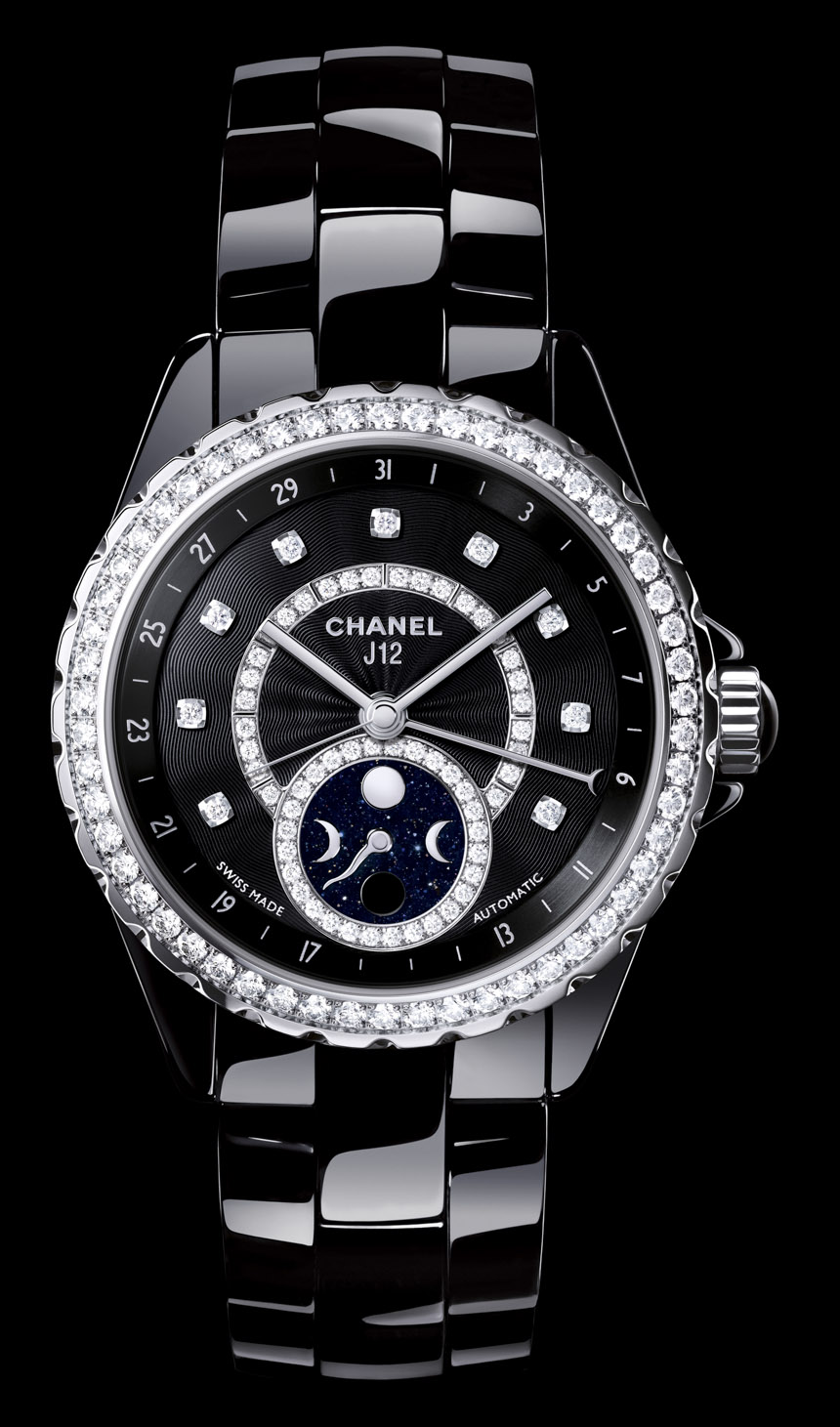
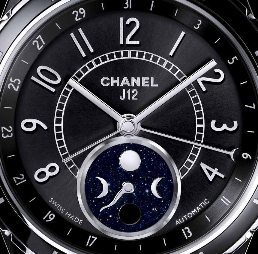
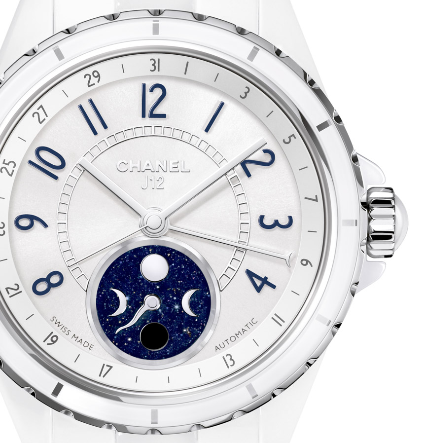
Chanel produced a very lovely video to go with the launch of the J12 Moonphase collection. Unfortunately, it has very little to do with phases of the moon. Chanel is first and foremost a fashion company and they full-well know that moon phase complications are more emotional than practical. I usually don’t like “hand style” versus “disc style” moon phase indicators, but Chanel did a lot here to make their moon phase indicator dial very beautiful, and easy to read. Borrowing from a number of classic timepieces, they use a serpentine-style hand against an aventurine dial. Aventurine is a sparkly blue stone that does a good job of mimicking the night sky. I was happy to see it used here and feel that it was a smart and high-class aesthetic choice for Chanel.
Though this does open up an interesting question. Why produce a new collection of ladies’ watches that focuses on a complication? Over the last few years – especially high-end watch makers – have been pushing the idea that more and more women are interested in horology versus strictly fashion and aesthetics. While there are many very passionate female watch lovers, it hasn’t been my experience that a lot of women are too concerned with complications. So I find it interesting that Chanel sees a lot of potential marketing what is essentially an astronomical complication-focused product.
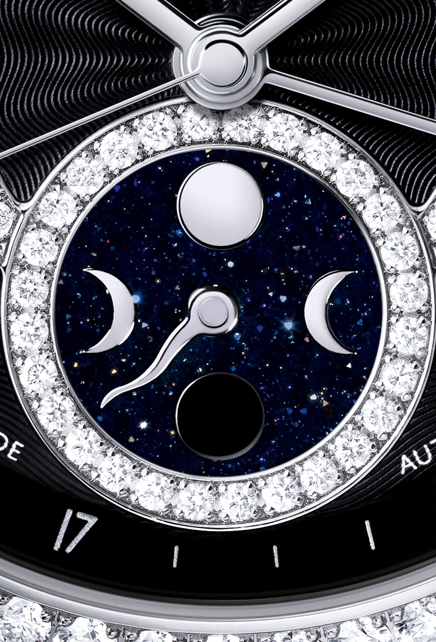
Though if you absolutely had to go with a complication (aside from the time and date) that reside in a high-end fashion-oriented timepieces for mainly women, I think a moon phase indicator is a clever choice. It is an emotional complication helping to understand the phases of the moon – which in turn controls everything from tides to perhaps tempers. What is further interesting is how the inclusion of the moon phase dial altered the iconic look of the J12 dial. This is very much a fresh face if you look at the details.
First of all, on the dial you have a new shorter seconds hand that tracks the inner scale and follows the hour hand rather than the minute hand. This of course is done to keep it separate from the pointer date hand. Chanel uses a hand rather than window to indicate the date, which again is new for the series and borrowed from more traditional watches. Another interesting change is to the bezel. No longer a rotating bezel, the now fixed bezel is thinner with either simple baton markers… or of course diamonds.