
All this about a few millimeters here and there was said because proportions are a pet peeve of mine in any watch, irrespective of the number of digits it has on its price tag. Now, the reason why a lot of expensive watches get away with appalling proportions (and I maintain that the 41mm RO is my favorite least-favorite example) is because they drizzle it with expensively made, shiny decorations, useless features and tiny texts on their dials, keeping many (including me for long) from seeing that the watch actually has the bezel-dial ratio of a watch that has actually melted.
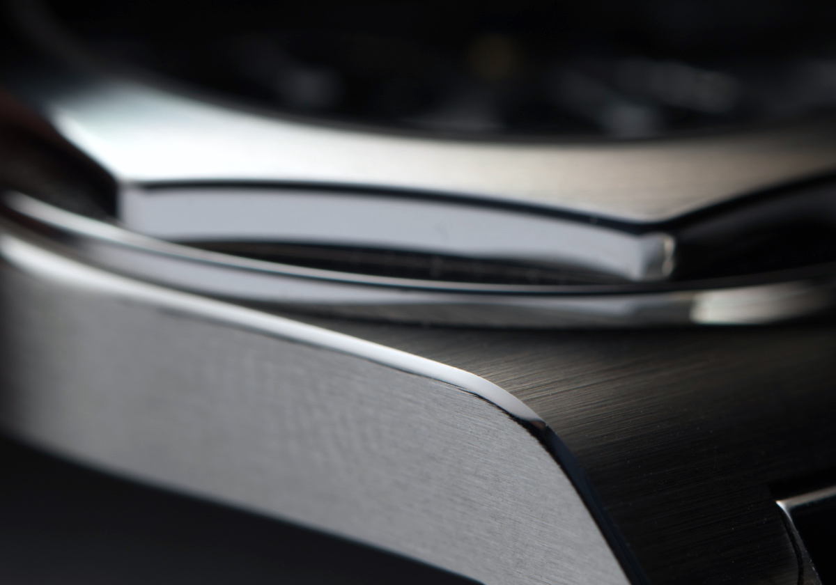
Even the underside of the lugs – which are often sharp on so many five-figure priced watches – have their own bevelled and polished edge. Well done.
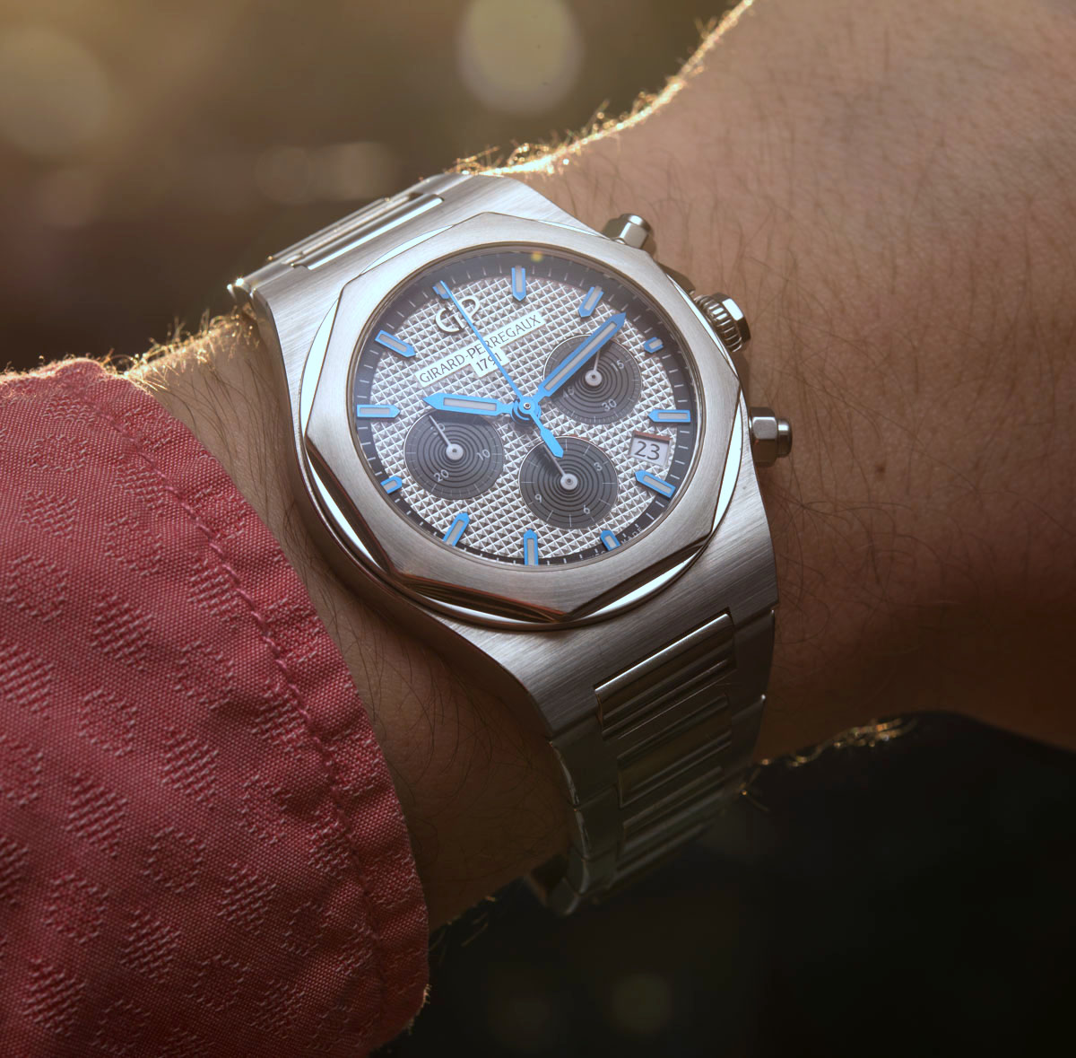
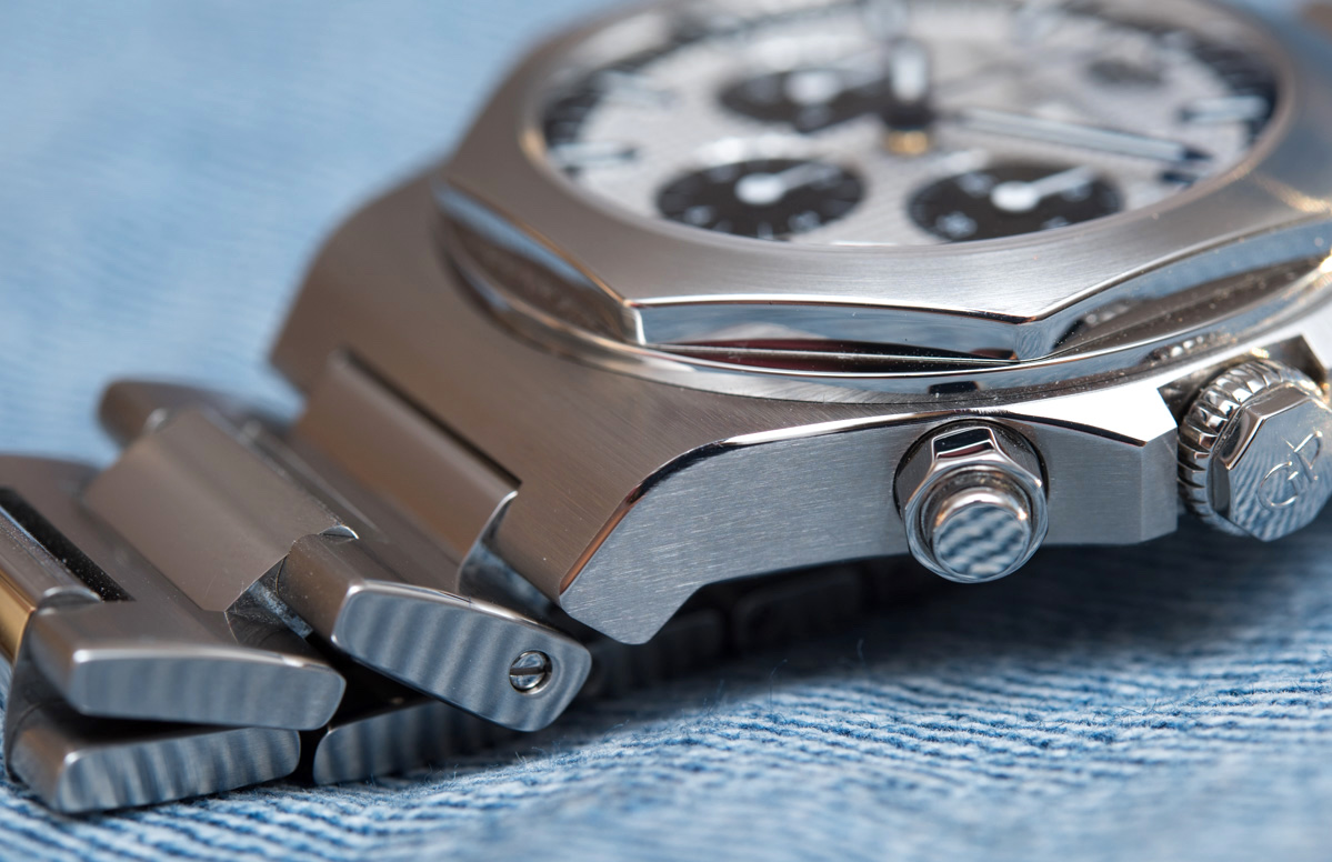
The Laureato Chronograph 38mm gets a lot of things very right indeed as far as its overall quality is concerned – this concerns quality of execution, attention to detail, and choice of material (more on that surprise a bit later on). To my eyes, with the watch in hand at last and not judging it from images, the bezel takes a few steps back and is about as neat in real life as it is in-your-face on images. First, the bezel’s satin-brushed octagonal top is sloping noticeably towards the outer edges, which adds refinement and interest, whatever the viewing angle. Second, the polished round base of the bezel is much, much narrower and less showy than on images – in reality, it serves as a neat veneer to the bezel, as opposed to looking like a poor round bezel with an octagonal one slapped on it.

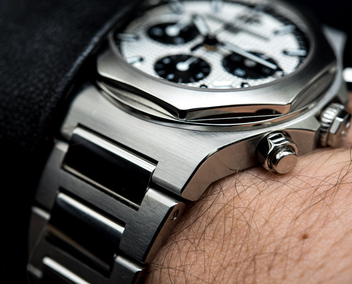
The narrow, 38mm diameter case is very long, as though this little case was trying all it could to stretch towards the edges of the wrist – this undertaking it fails at, but that doesn’t hurt it one bit. The case is remarkably slim for an automatic chronograph with a date – a lot of times the reason why you don’t see narrow chronographs is simply because they look as neat and elegant as a hillbilly’s filet mignon. Technically all chronographs with 7750s (or modified versions thereof) are so thick that they look unrefined and uncomfortable in a narrower case. The Laureato Chronograph 38mm is just 10.90mm-thick, making it one of the slimmest chronographs out there these days – another refreshing and strong point of it.

On a more objective note, a rather pronounced case element is the angled lug structure. The case sort of just goes on and turns downwards into the heavily tapering bracelet – more on that in a bit. The lugs feature the same sort of brushed-satin finish as we saw on the top of the bezel, but for some reason the surface treatment appears more pronounced here. While it looks great, especially with the beautifully done, polished, angled edge on its sides, this also is a scratch magnet that will easily collect scratches as you reach for things while wearing the watch – just reach into your coat or bag’s pocket and it’s just bound to get scratched… And when that happens, it will show up quite noticeably on this relatively large, continuous surface. The upside to all this is that the Laureato Chronograph is in fact a very pretty watch that one, I guess, would want to see neat and pristine for as long as possible.
904L Steel?
Girard-Perregaux certainly doesn’t make a big fuss about the fact that they have joined the extremely small group of brands who use 904L steel in place of the industry standard 316L variant for their cases and bracelets. Rolex is best known for using this high chromium content, hard to machine variant of stainless steel, but GP appears to do so too for all its steel Laureato Chronograph models. The upside to 904L steel is its “exceptional radiance after polishing” and its “superior corrosion resistance.” I must say, one would have to handle a lot of watches before he (or she) could appreciate the difference without having two watches made to the same standard but from the two different metals side by side. I can, maybe you can – but even those who can’t, GP is probably betting on will be able to tell how genuinely high quality the Laureato Chronograph feels once observed in hand. As we will see, GP is going all in here with most all details – so much so that they have understood communicating all these points at once could be overwhelming for some in their audience. The punch line to all this is the fact that the Laureato Chronograph does look and feel properly expensive – which it should, if GP wants to carve a chunky slice out of the luxury chronograph cake currently feasted on by the usual suspects.
Bracelet & Clasp
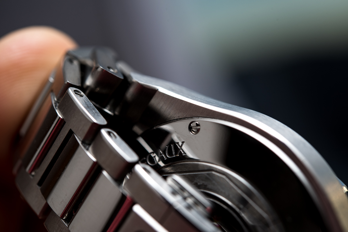
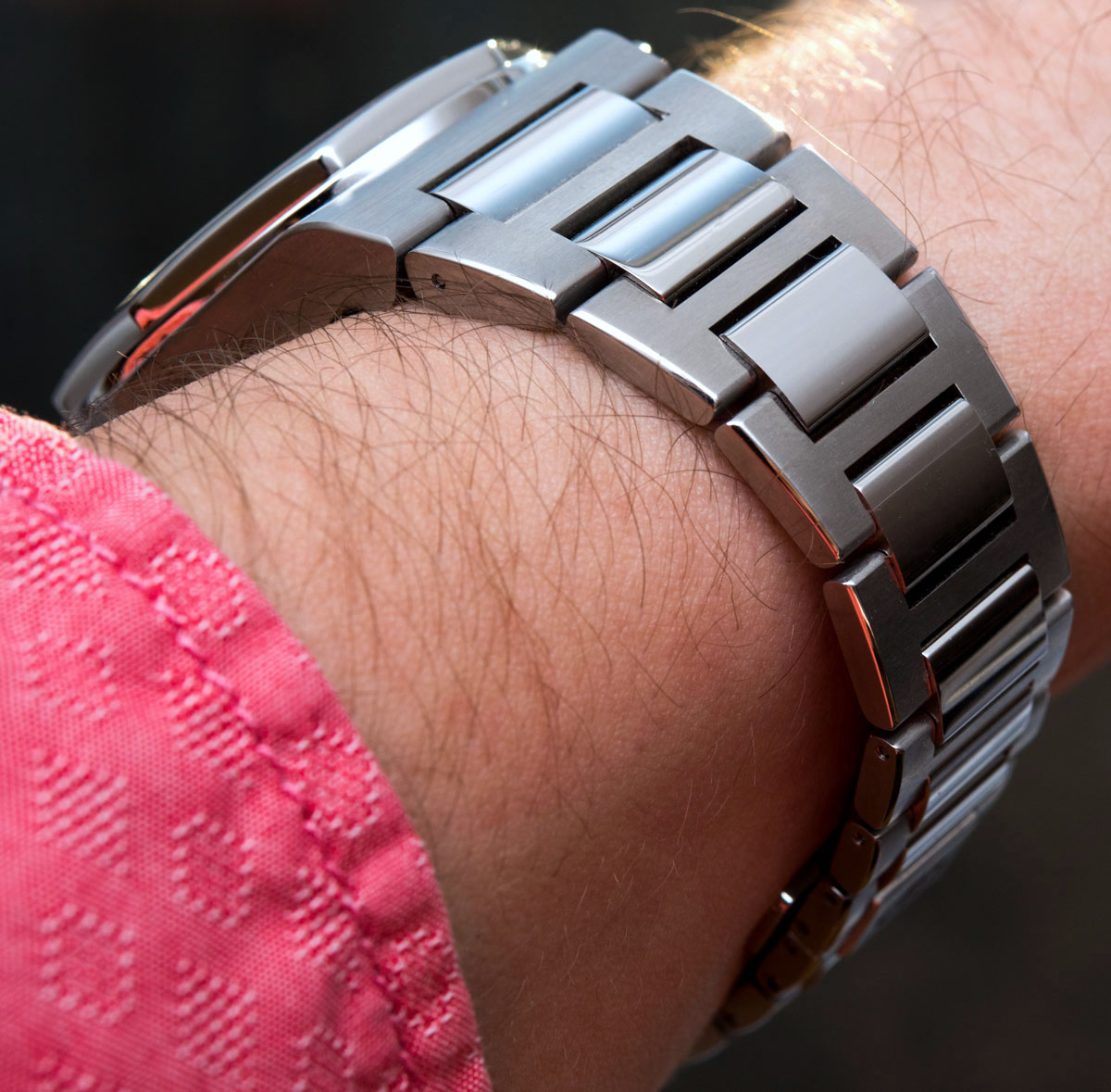
The bracelet has the looks of a three-link design but is actually just a series of two links, with satin finished H-links hugging the brightly polished center links. Looks refreshing, elegant, and expensive at the same time. The outer edges of the H-links are bevelled and polished too, making this a strong contender in the high-end luxury scene, even if it is less expensive by a big, big margin, when compared to the established pieces from AP, VC, and Patek. Another plus is the use of screw pins that make swapping the links easy – once you’ve sourced a decent quality precision screwdriver, that is.


The folding clasp is neatly disguised into the series of polished center links with it reaching beyond the plane of the curved center links by less than a millimeter. Highlighted by its two large pushers, its brushed surface, and the GP logo, the clasp is nevertheless easy to find and use. I do have my usual gripe with it though: there is no integrated extension system, so if your wrist expands, you’re rather stuck – pun intended. So yeah, the double folding clasp is slim and nicely integrated, which is good for wearing comfort, but I can’t stress enough how all luxury watches on bracelets should by all means have a) an extension system of some sort, even a basic 5mm one at least, and b) an easy strap change system.
Dial Quality, Legibility & Features
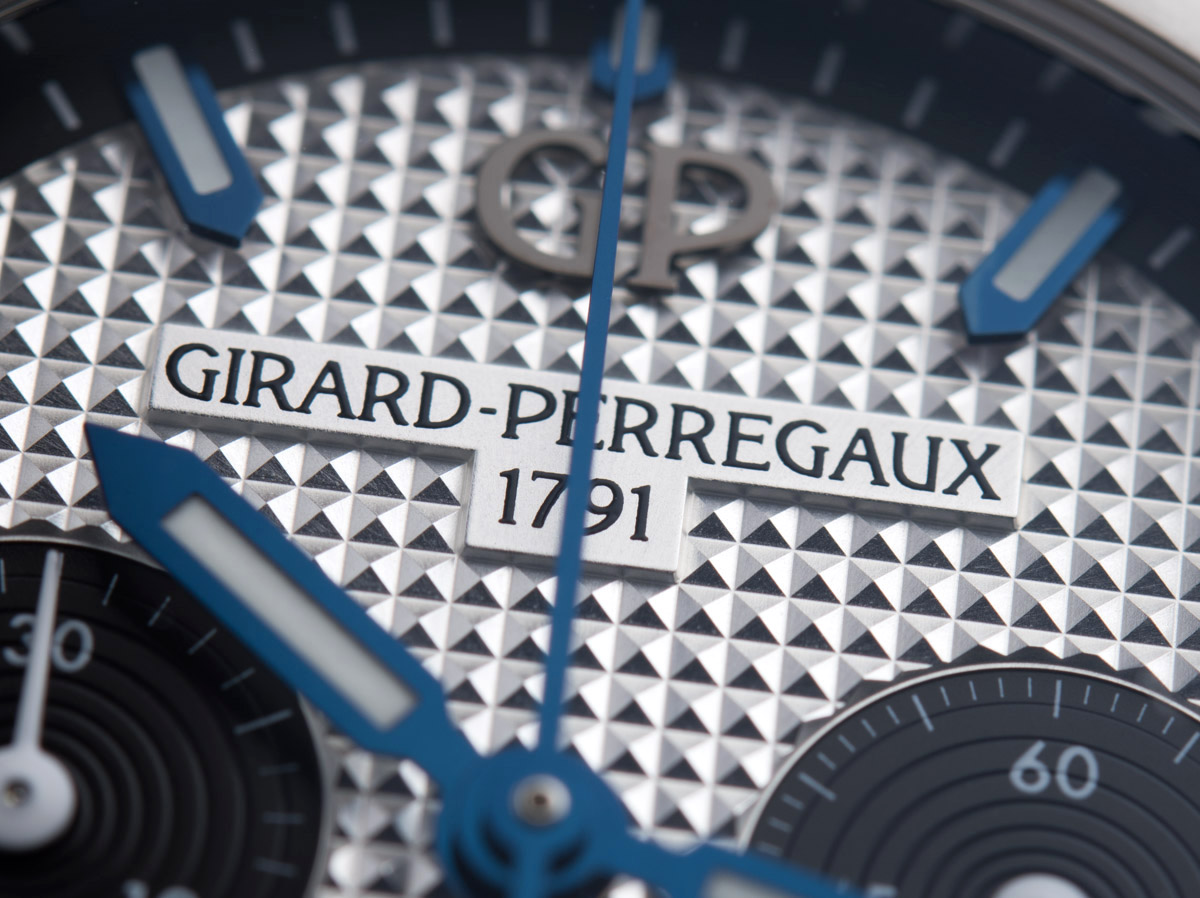
The Girard-Perregaux Laureato Chronograph 38mm model with this panda dial has excellent legibility. The hands are long and contrast beautifully against the silver dial with their thick borders, and although they are the same shape (something I personally rarely like but I do here), they are easy to tell apart at a glance because their respective and comparative lengths are perfect. The black sub-dials have white tracks, indices, and hands, which work not only in favor of legibility, but design as well, as they match the base dial color well. The applied, sword-style indices are absolutely massive, making this Laureato look like a proper watch that was meant to be, you know, read every once in a while. They match the hands not only in their shape but also their surface treatment – what may appear to be pitch black in some situations, turns out to actually be a vibrant, plated blue. Both the hands and indices are beautifully made and are high quality – well done, GP.