In watches, as in fashion, color is a huge topic. Most industries that produce industrial products (which a wristwatch is, more often than not) would probably not make a point of celebrating an existing product produced in a new color. Yet, anyone who follows watch collecting knows that color is not only a reason for many people to celebrate but, in some instances, is also a reason to pay serious price premiums. Color in watches is a huge topic, and for the purposes of this article, I’d like to discuss what colors I believe will dominate men’s watch dials this year and in the years to come.
Color has become an even more popular topic of discussion in the social media era, especially with watches. A major reason for this has to do with the different ways consumers shop for goods. Traditionally, consumers shopped for watches in person in a retail setting. In this context, consumers typically opted for conservative options, including dial colors. This year, many years of watchmaking had most products colored with mostly black or white dials. Even colors such as blue, brown, and gray were uncommon. Watch brands followed the advice given to them by their retailers, who, wanting to move goods quickly, instructed brands to mostly produce easier-to-sell conservative dial colors.
Contrast that era with today, when consumers do not primarily learn about products for the first time in a retail environment, but rather online. Unlike the curated displays of most jewelry store showrooms, the Internet is a jungle of visuals. Just like in the real jungle, only the brightest, boldest, and most interesting patterns get attention. Online, conservative colors are at a disadvantage, while eye-catching colors seem to draw attention. This change in how consumers primarily learn about new watches has had a demonstrated effect on the market’s turn toward color.
What has also changed in the watch industry over the decades is technology and manufacturing practices. Not too long ago, it was not even technologically feasible to produce a lot of otherwise desirable colors for watch cases and dials. Manufacturers were limited by the natural colors of metals and other materials, as well as a relatively limited array of stable colors that could be coated or otherwise applied. In fact, in the more distant past, more dial colors were possible because more watch dials were hand-painted. The move to more mass-produced parts and components had a serious limiting effect on many of the fashion choices a watch designer could implement into new watches. Today, things are much different.
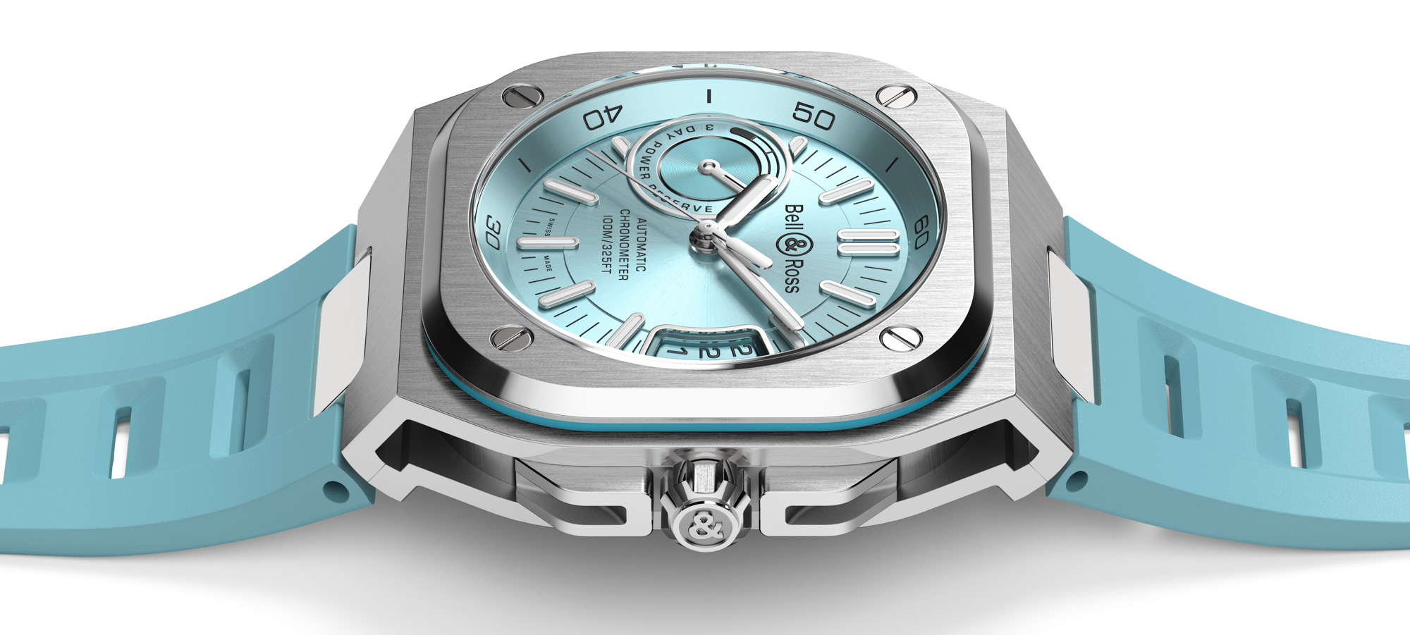
For example, we take for granted the proliferation of blue watch dials, which now come in a dazzling spectrum of shades. Until recently, blue watch dials were uncommon, even though there was clear market demand. The problem was manufacturing consistency. You could order two production runs of blue watch dials, only to have the two batches result in slightly different shades of blue. Problems like this had a serious negative effect on even non-common dial colors like blue to be common in the market. More recently, however, manufacturing techniques have allowed for the stable recreation of many more colors than previously possible. This has helped the explosion of dial (and even case) colors that the market offers today. That said, after much of the experimentation is done, what will some of the dominant dial colors be for men’s watches in the years to come?
One reason for asking this question is to identify which dial colors are simply trendy, and which are here to stay. Collectors typically like to stay away from overly trendy hues, and it can be difficult to determine what will still look fun five years or more from now. Alternatively, if you are a watch manufacturer, you’ll want to know what colors are truly interesting and here to stay, and which are flights of fancy. I will now segment my discussion of watch dial colors into three categories based on how consumers view them. The first category is neutral colors (that go with anything), and the second category is colors that were once considered bold or risque but that are likely to become increasingly common and mainstream. Finally, I will discuss wilder colors that may have once been thought too niche, non-masculine, or weird, but that for the foreseeable future are going to be considered by many more consumers than would have considered them in the past.
The Classic Neutral Colors
In the context of watches, neutral colors are those that can theoretically go with most clothing color options. Neutral colors don’t really contrast with anything, which is why they go with any color you wear. Of course, there are exceptions, and neutral colors don’t always fit, but their popularity with consumers is based on their versatility. The most classic neutral color for watches is black, a hue that the watch industry has a strange relationship with. At times, it treats black as though it represents no color at all (monochromatic watches are a segement unto themselves), and at other times, all-black watches are chosen because of their distinctive look. As Jean-Claude Biver once told me, all-black watches are “visibly invisible.”
The popularity of black is cyclical. There are times when the market wants anything but a boring black watch, and there are other times when the moodiness of an all-black watch is exactly what people are looking for. Suffice it to say that while you aren’t always going to be in the mood for a black-dial watch, you’ll probably end up having a lot of them in your collection.
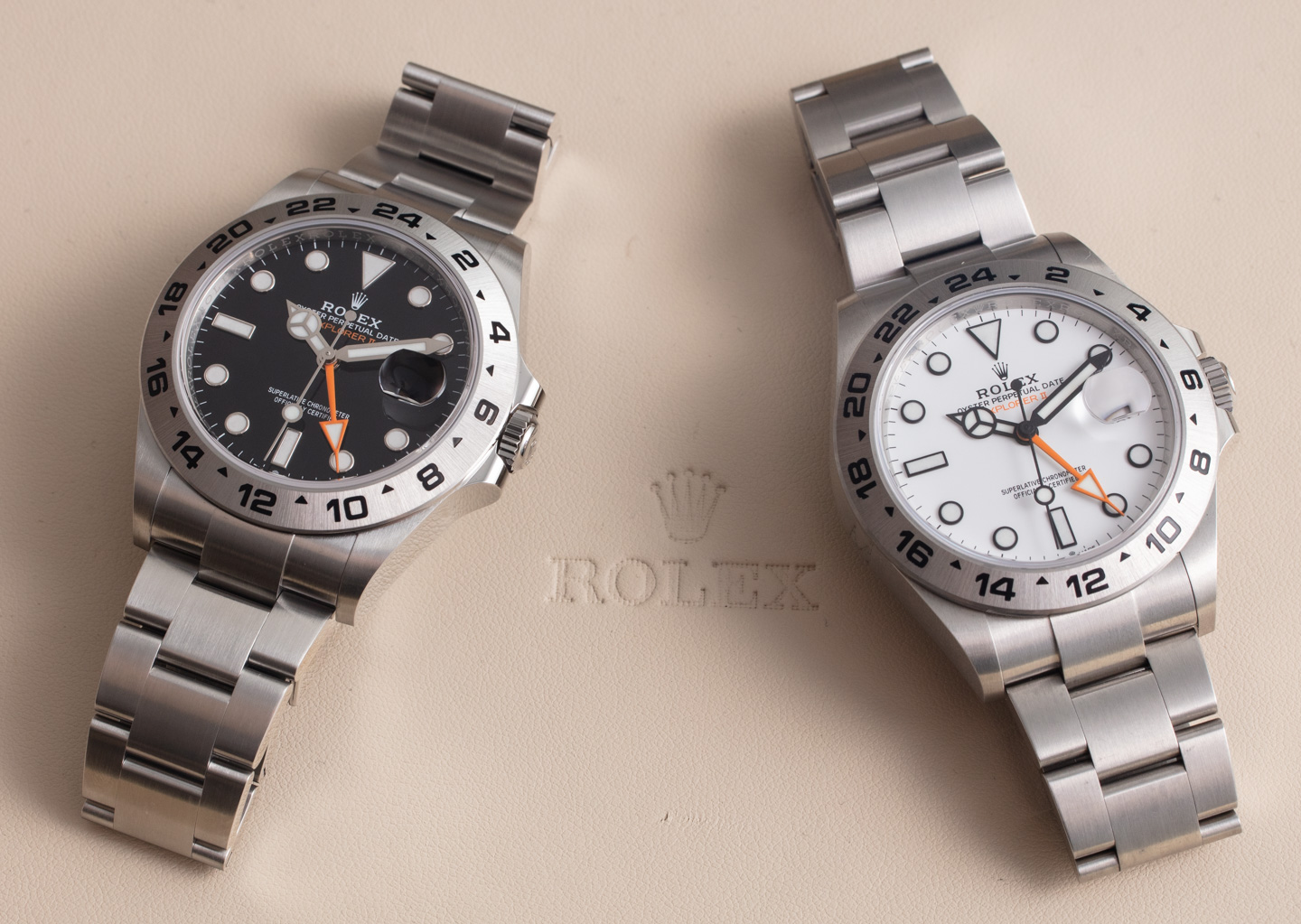
While white is traditionally a neutral color, in watches, it really isn’t. What is closer to being neutral is gray or other off-white colors. Gray especially has become remarkably popular over the last few years, and again, this is primarily due to its status as a neutral color. Gray (including silver) isn’t as dark as black most of the time, and it isn’t as eye-catching as stark white. Gray, in its various forms, will continue to be among the more popular neutral tones of tomorrow.
Formerly Bold Colors Become Conservative
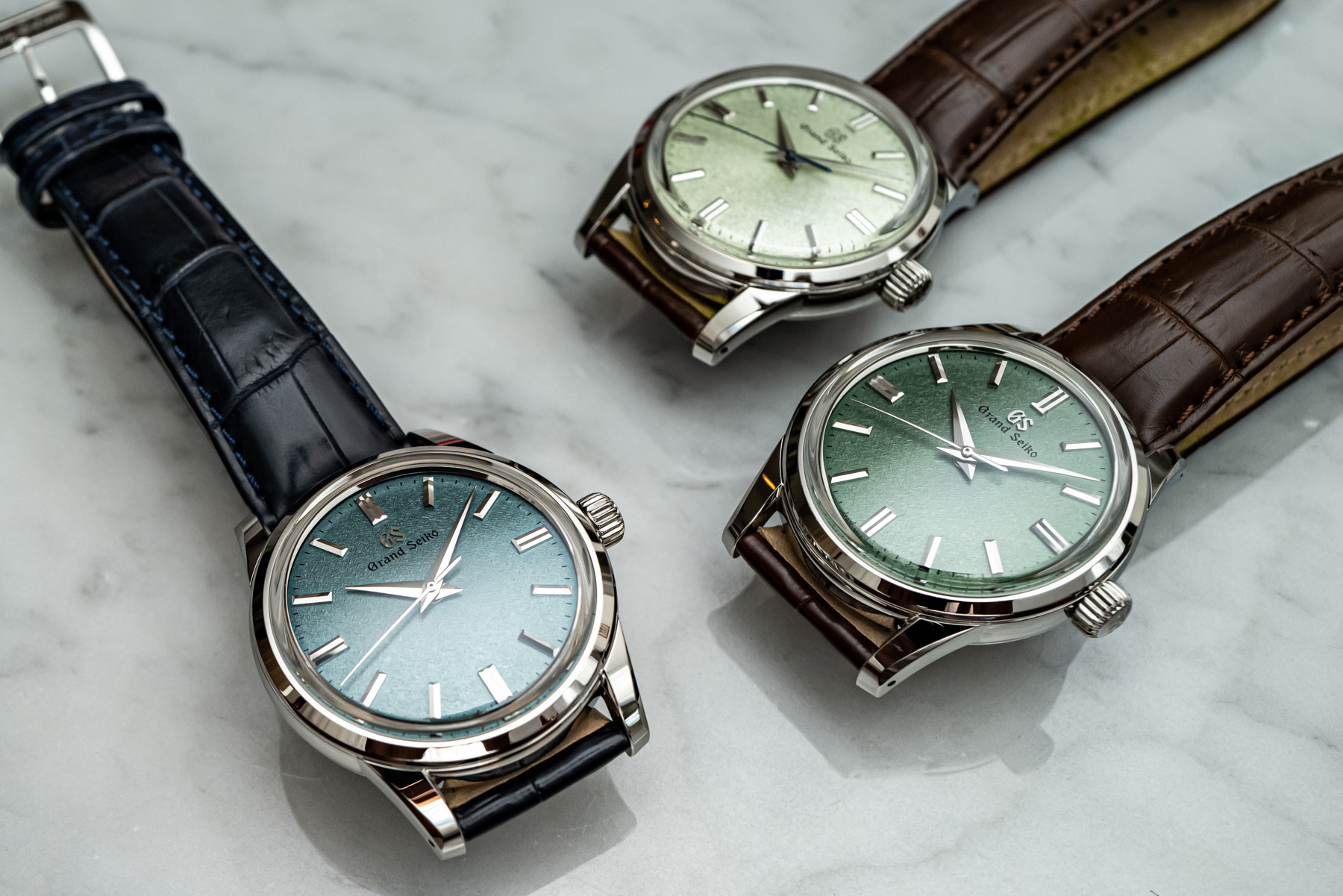
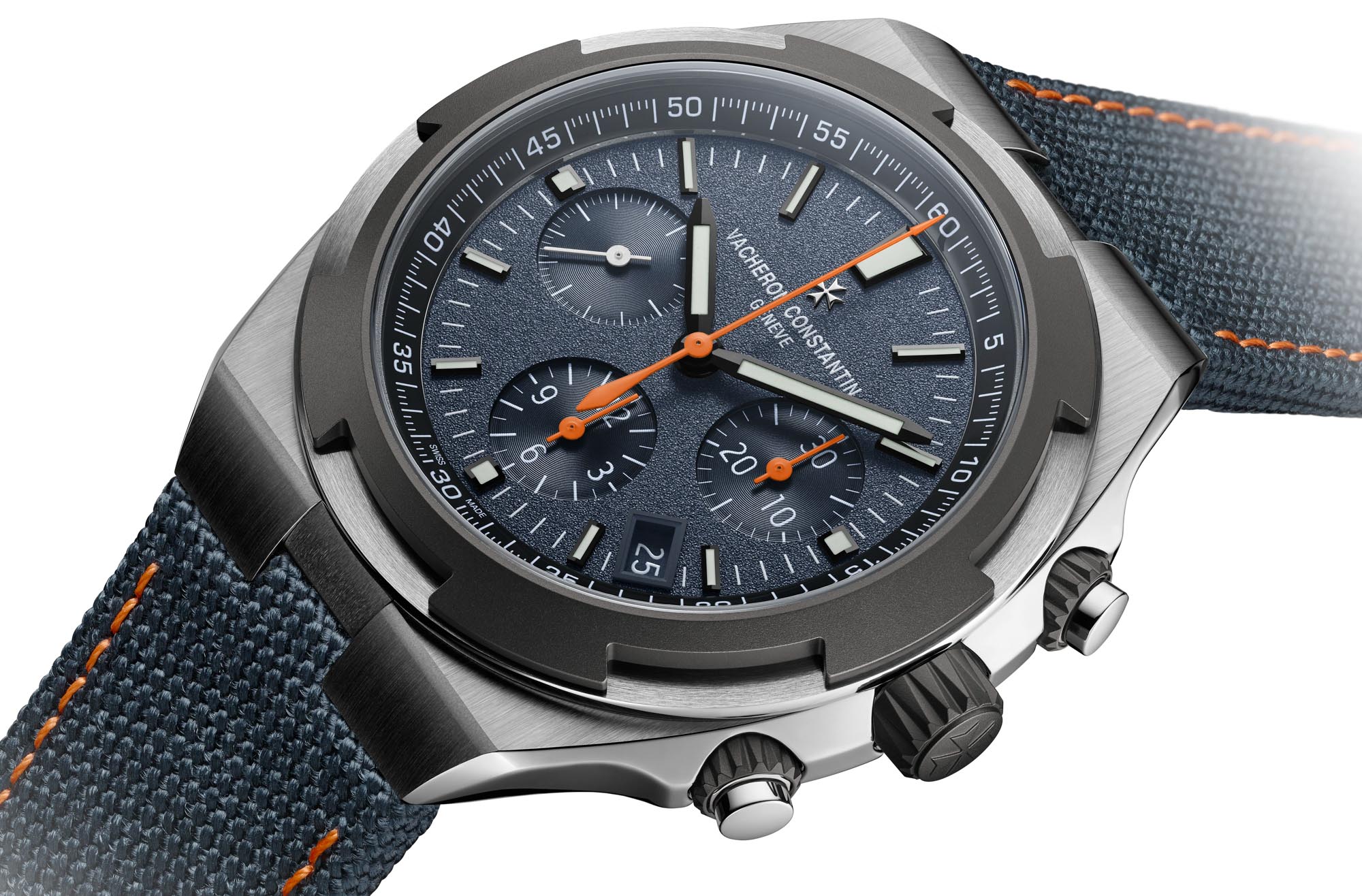
For me, this is the most exciting section because colors that were once very niche are increasingly popular across most major luxury watch brands. Probably the two best examples of formerly bold colors becoming somewhat conservative are blue and green. The watch industry got started with blue a bit earlier, but green is catching up to becoming a favorite choice among consumers who might have previously opted for something neutral, such as a black watch dial. It is true that blue and green dials do not go with everything you wear, but often, the attractiveness of the colors themselves make it such that you can pull off a green watch dial even if you aren’t wearing anything green.
The ability for consumers to fashionably wear a variety of colors as an accessory (as opposed to matching something they are wearing) has made a host of colors feel fresh and popular even though they have been around for a long time. This certainly includes the long list of green and blue shades which have truly dominated watch industry product releases for the last few years. I fully expect this trend to continue, with blue and green watch dial colors being seen as natural, conservative choices for most buyers.
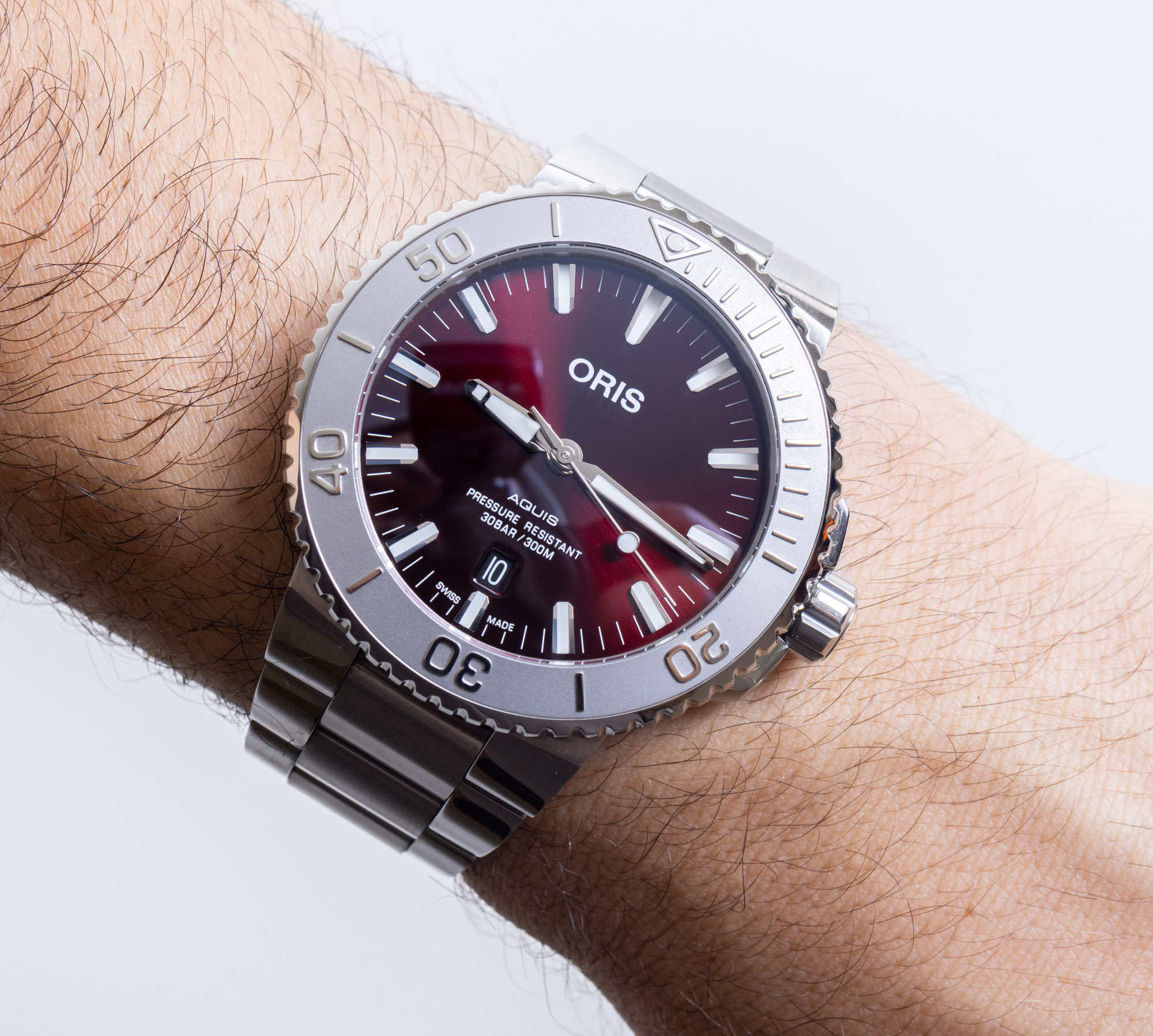
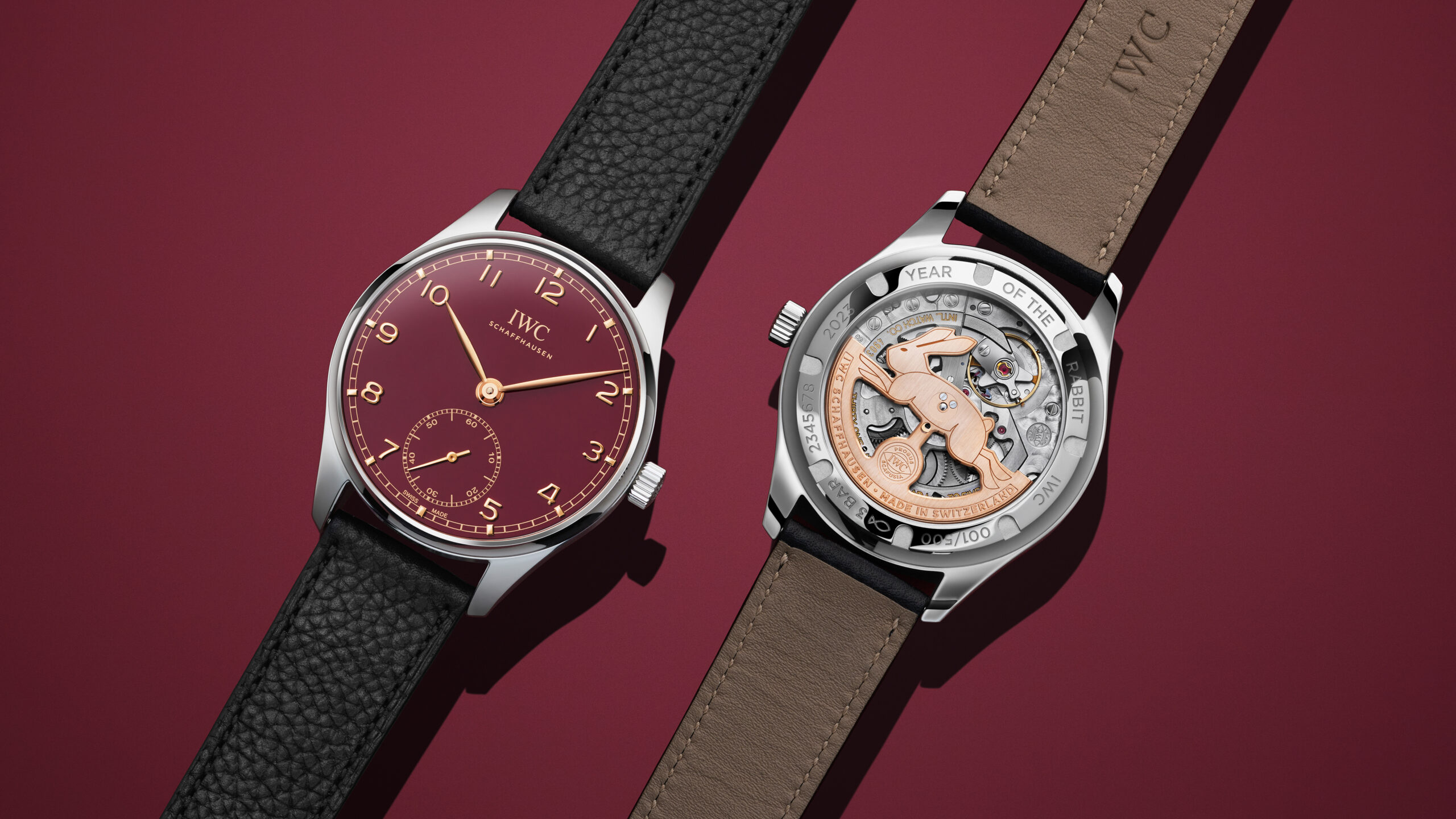
An emerging color that I think needs to be added to this list is red. Bright red can be too sporty or bold for an entire watch dial color, but I’ve seen a lot of success with deeper shades such as maroon and burgundy. While still a bit uncommon, I fully anticipate that more subdued shades of red are going to join blue and green watches as common choices for those wanting a bit of color in their life, but nothing crazy.
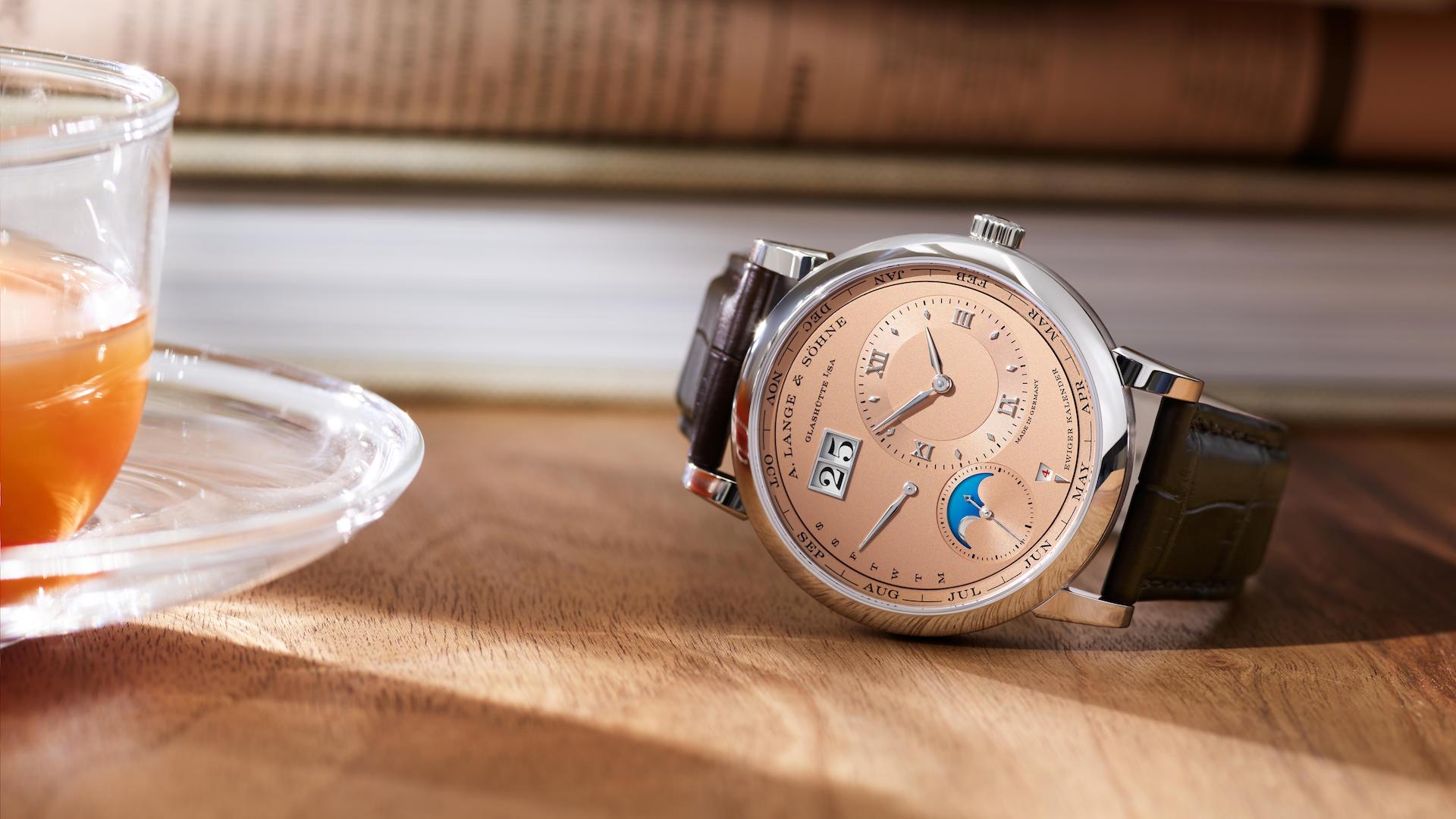
Metal color tones are also going to remain popular. This includes gold, but also a lot of other metal colors including copper, silver, and bronze, as well as the many alloy mixtures thereof. There will be times when brands like to get creative with the names for these colors (such as calling a yellowish/red tone “champagne” or “salmon”), but the large spectrum of metal (including electroplated) colors will remain decidedly conservative (and thus, commercially viable) much of the time.
White also enters this discussion as a formerly neutral color that now has a bit more personality. Indeed, we think of many boring watches with white dials when it comes to this (absence of) color. That said, white watch cases or larger sports watches with white dials are actually quite eye-catching. Around 10 years ago, many men still considered watches with white cases or dials to be feminine. Today, such a reaction might still occur for a hot pink men’s watch, but for the most part, white has become normalized as a relatively conservative watch dial tone.
The Wild Colors To Watch For
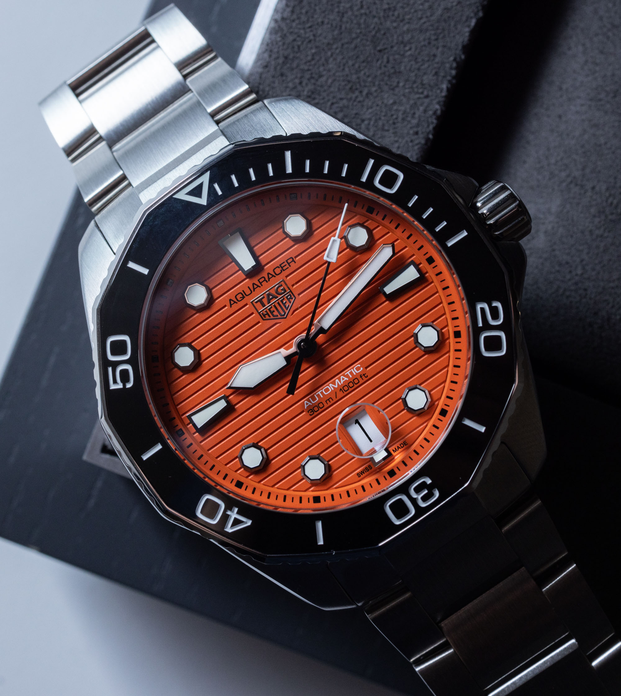
Certain bright colors will probably remain relegated to niche use or appeal. Classic examples are yellow and orange. These colors have undeniable popularity in sports watches, but you rarely see entire watches made in the colors, and entirely yellow or orange watch dials can be difficult to sell. Much of the time, this is because most people do not incorporate a lot of bright yellow or orange into their wardrobe. I don’t see this changing soon, and I think that while brands will continue to try to make bright yellow and orange watches work, they will remain rather limited and artistic by nature.
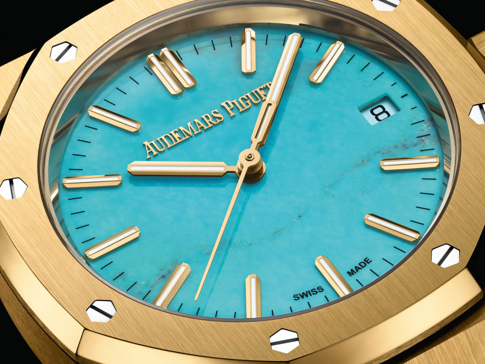
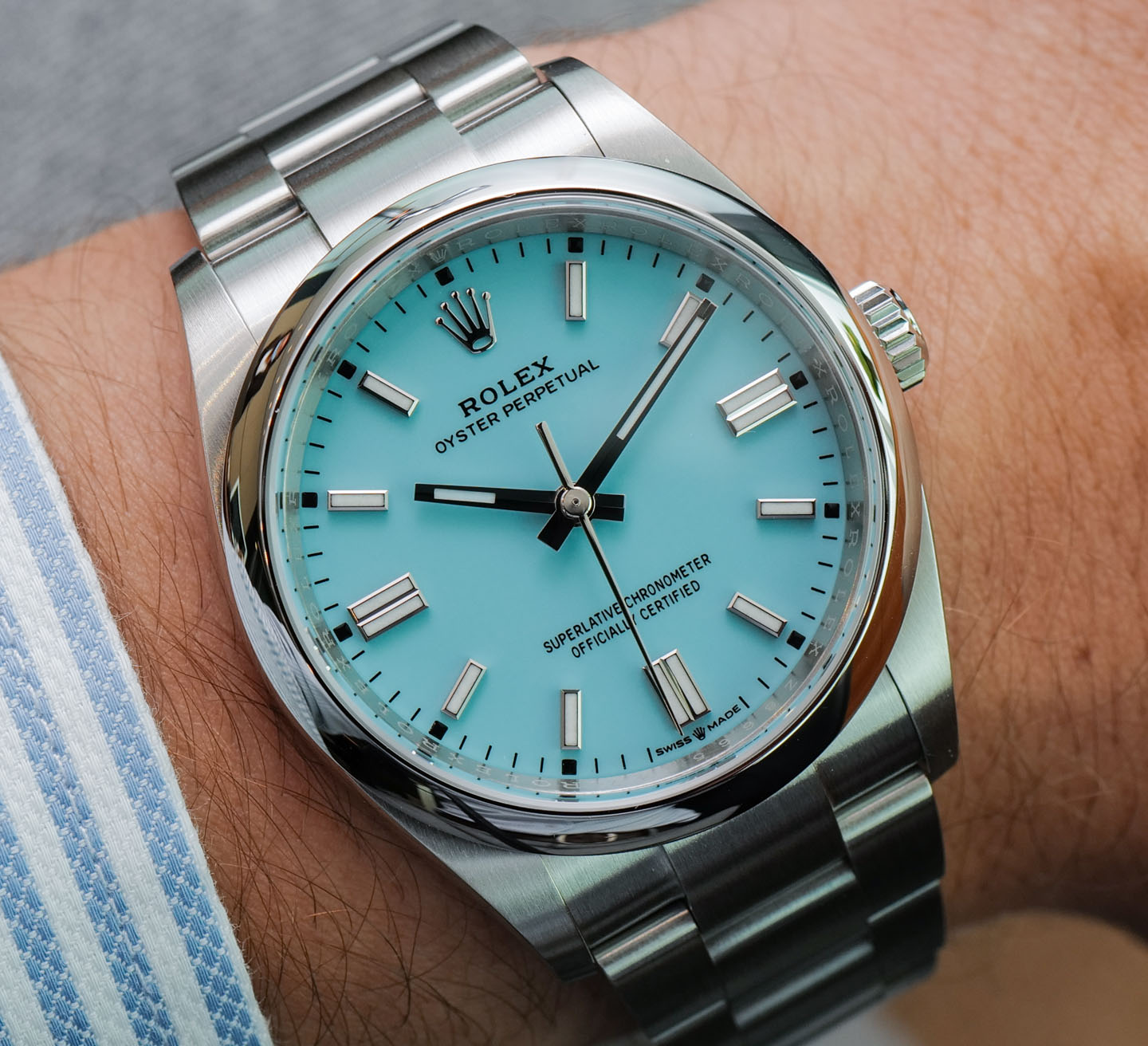
One color I think has a lot of potential with men’s watches is purple. Indeed, there have been some purple men’s watches, but these are rare. Purple has traditionally been associated as a color mostly worn by women, and there aren’t a lot of examples of successful purple men’s watches (though there are some). Just as formerly “feminine” shades of blue have decidedly entered the men’s watch space (think Tiffany blue and various aquamarine/teal colors), I think purple has the same potential. What purple has going for it is that it’s elegant without being too brash. Purple looks great in light or deep tones, and it also is (currently) just different enough to be fashionably interesting. Purple also looks good on very light or very dark skin tones, meaning that an otherwise attractive purple watch dial could be broadly appealing in different parts of the world. Purple isn’t as popular as someone other colors right now, but I envision that we will be seeing more of it soon.
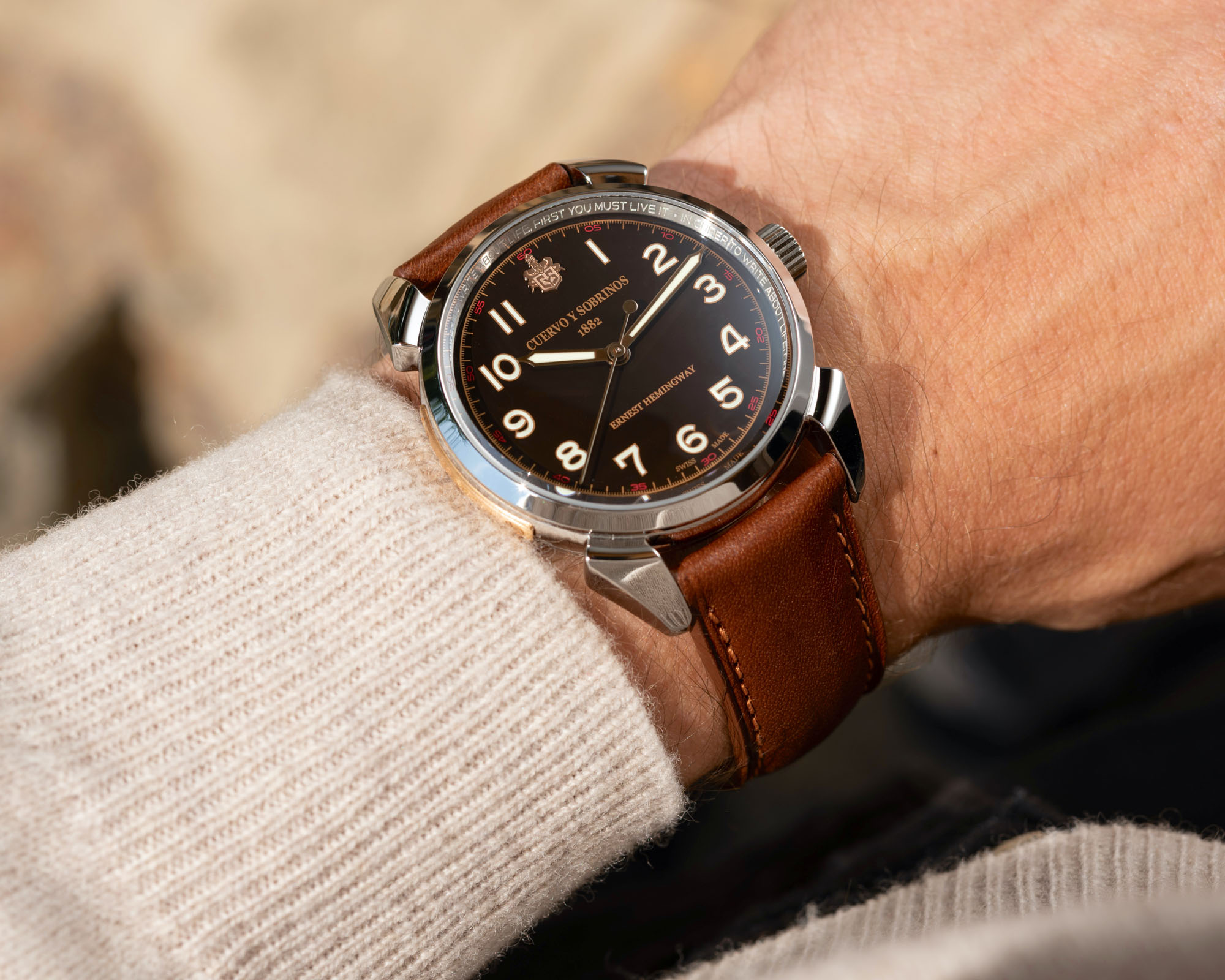
Finally, let’s talk about brown in its many forms. At times, brown is a decidedly neutral watch dial color but, really, only if you wear a lot of brown or earth tone colors to match it. For a long time, brown was an under-represented watch dial color because watch retailers did not like it. Very little else in a jewelry store environment is brown (aside from watch straps), and retailers often felt that consumers simply didn’t respond well to brown watches. I can’t really explain why, but I do know for a fact that brown watch dials were not produced in large volumes for a number of years because of an assumption that consumers did not want them.
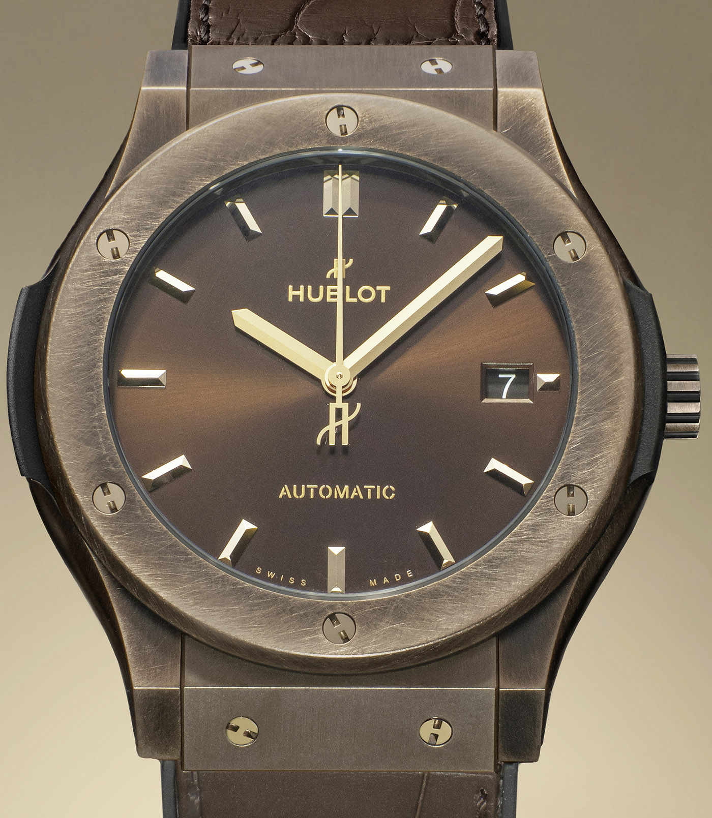
The re-emergence of brown watches came when the watch industry started to venture outside of traditional Western markets. It was a time when brands attempted to appeal to new buyers, who, at times, had different skin tones or fashion preferences. The watch industry started using friendlier sounding names for brown watches including the popular “chocolate” term. Most watches brown watches continue to focus on darker shades of brown that match brown leather fashion accessories and wood decor. For me, the most interesting shades of brown are actually on the lighter end of the spectrum, including tan and sand colors and off-white cream tones. Often, these colors are more visually pleasing than white and can be better used to contrast against a darker color. A good exercise is to compare how your eyes react to first a black-and-white composition and then a similar composition where white is replaced with a light tan, and the black is replaced with a deep brown. I have a feeling most eyes will prefer the latter combo of colors as opposed to the rather unnatural contrast of pure black and white.
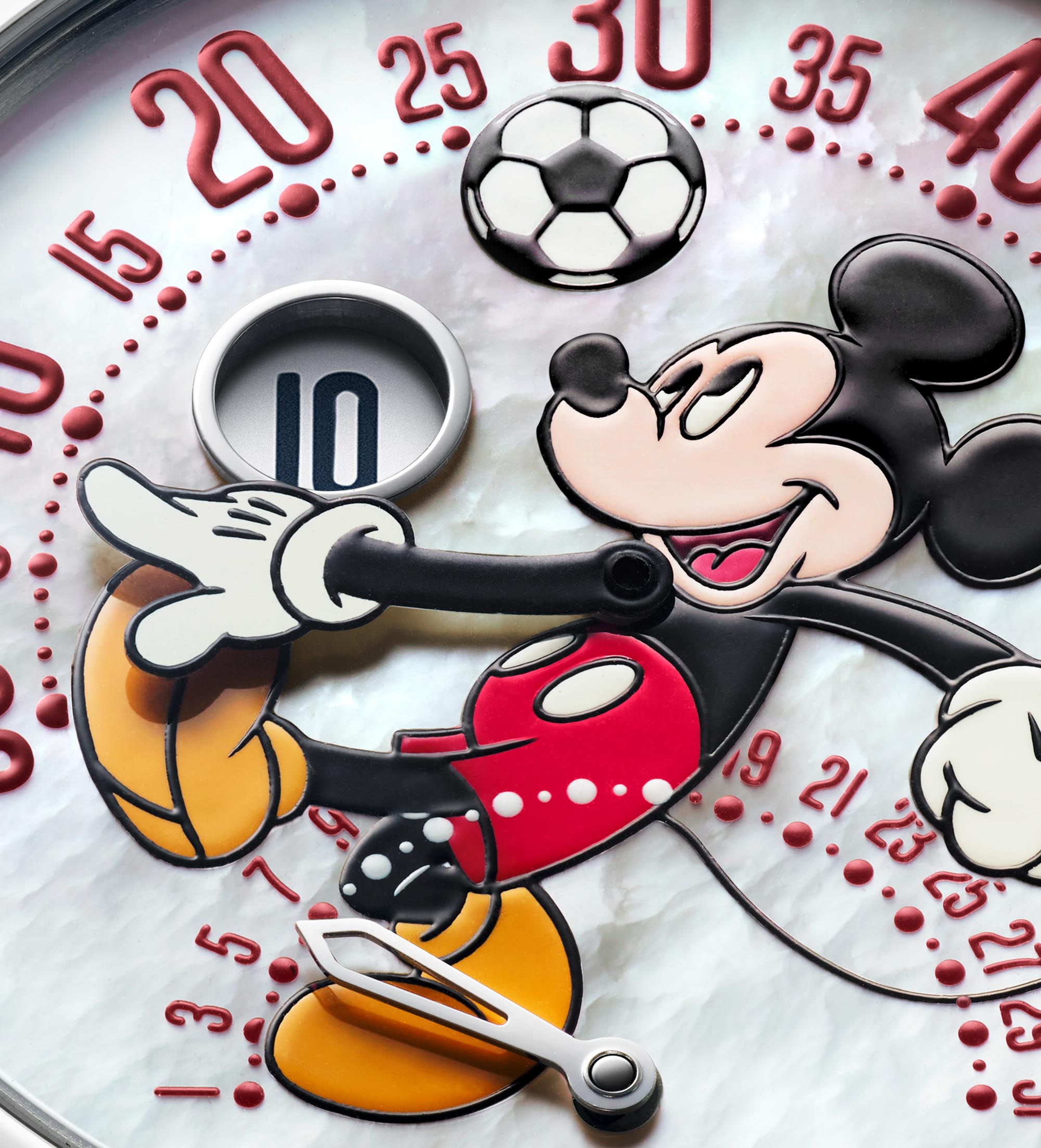
A quick note on color combinations. Much of this discussion has assumed that watches feature one primary color, as opposed to having multiple dominating colors, but no color story is complete without acknowledging mixed color watches or the extreme (and now very popular) rainbow watches. Fashion doesn’t often treat colors as sets or combos. Fashion trends tend to focus on particular color shade blocks, as opposed to color combinations. This is not universally true, but the number of potential options to discuss when you take into account that colors can be mixed together in the same composition makes discussions about which combos are the most popular challenging, to say the least. Suffice it to say that color mixtures are just as viable as solo-color trends, but given that their appeal is also more niche, coming up with attractive combos is an independent creative/artistic decision, as opposed to following trends much of the time.
Enjoying a variety of watch colors is an excellent way to diversify a watch collection. Different colors not only offer fashion versatility and allow you to match a timepiece with your particular skin tone, but colors are also very socially acceptable ways of calling attention to yourself. I find that on days when I want to be “less visible,” I will wear a very neutral or conservative dial color. When I feel like calling attention to myself, a more brightly colored dial seems like a far more polite way to ask for attention than wearing a watch that sparkles with diamonds.
I also see no evidence to suggest that more assertive watch dial colors are a temporary fad. Of course, it is true that in a few years, the trendiness of certain bold colors or looks might fade, to a degree. But shapes and styles are more prone to trend changes than mere colors. The fashion industry might want people to think that colors wax and wane with popularity, but this is an artificial construct generated by elite fashion media and manufacturers in order to help push sales of new clothing each season. Beautiful colors are timeless, and thanks to increasingly sophisticated manufacturing techniques, your timepiece collection can have a little bit of everything.