VERO Watch Company first blipped onto my horological radar with its initial release, the “Open Water.” It was a spartan and understated diver that derived few cues from timepieces that had come before. Since then, I have kept an eye on the brand, popping onto the brand’s Instagram page from time to time to see what it was cooking up in Portland, Oregon. Each perusal brought incremental changes, with new colorways and slight variations. These subtle shifts occurred until a couple of weeks back when the Workhorse chronograph galloped into my feed. I was simultaneously thrown off and also enraptured by the aesthetics of the watch. When presented with the opportunity to check it out firsthand, my answer was a no-brainer.
 There is no getting around it: The Workhorse is a bit of an oddity. It is an amalgamation of design cues that reference a number of different points of inspiration. In some ways, it is sort of like looking at clouds and trying to discern what they most resemble. Everyone sees them a little differently. Some may look at the Workhorse and see an old Jeep, while others (like myself) instantly speculate that famed designer Giorgetto Giugiaro’s works must have been in the forefront of VERO’s mind. It could also be compared to other watches, as well — the Seiko Tuna, the Casio G-Shock, etc. However, despite the comparisons we could draw, this watch is absolutely atypical, especially in the current microbrand space.
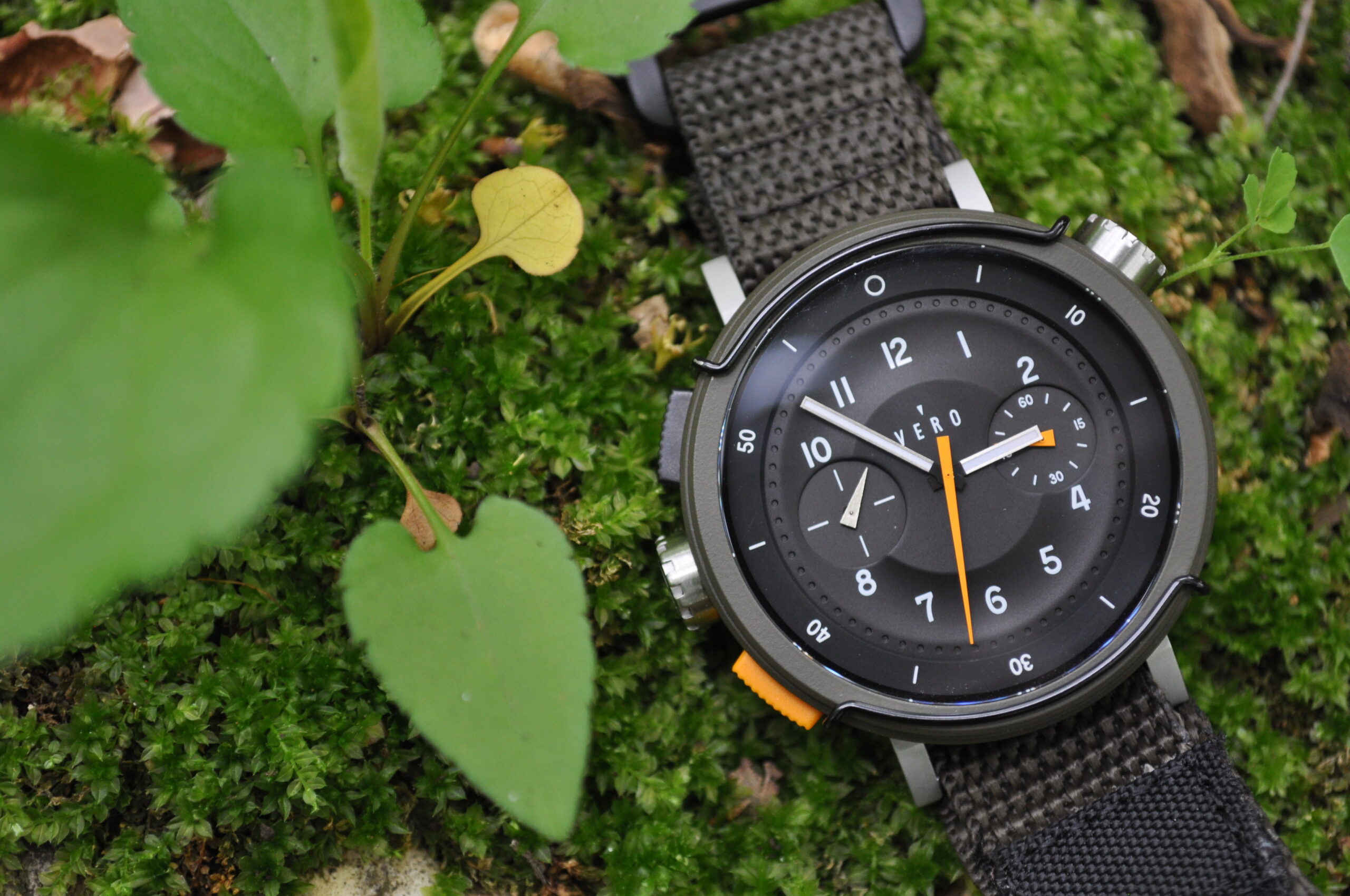
 The Workhorse is available, as of now, in two different colors. There is an OD green and a desert khaki, officially called “Backwoods” and “Canyon,” respectively. I opted for the former, though it was a tough decision and I waffled many times. After opening up the package containing the Workhorse, I was instantly a fan of the plastic pushers, which have been cleverly positioned on the left side of the case destro style. While any form of plastic is probably not the most durable material, I think it works wonderfully with the vibe of the piece. On the wrist, the appearance of the pushers makes the watch feel like it could have been pulled straight from the 1980s. The unique position, for those of us who wear watches on our left wrist, keeps the pushers from becoming obtrusive. If you are ambidextrous (or just prefer to wear watches on the right wrist) the pushers and crown are shallow enough that they are unlikely to pose a threat to comfort either way.
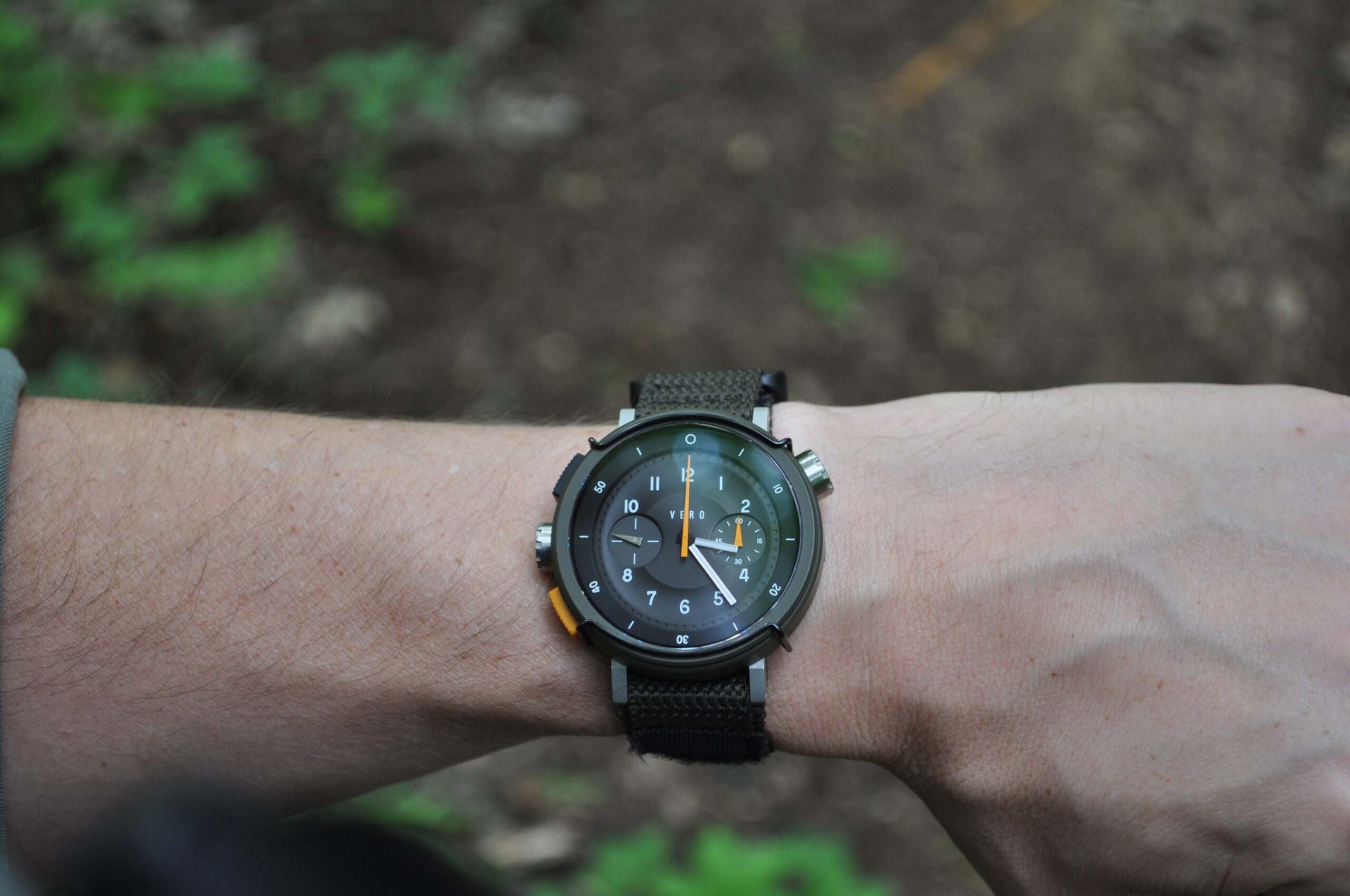
 At 44mm in diameter, sans pushers, this is not a small watch. There is, however, some sorcery applied to the dimensions that make it quite wearable on my 6.5-inch wrist. I think that, although the lug-to-lug measures 50mm, the downward slope of the lugs helps the Workhorse sit well on the wrist. A height of 12.5mm keeps it relatively svelte, though some bulk is added by the Velcro strap. On that note, however, I have played around with a variety of strap options. This watch sings on rubber, and with 120 meters of water resistance, it makes perfect sense.
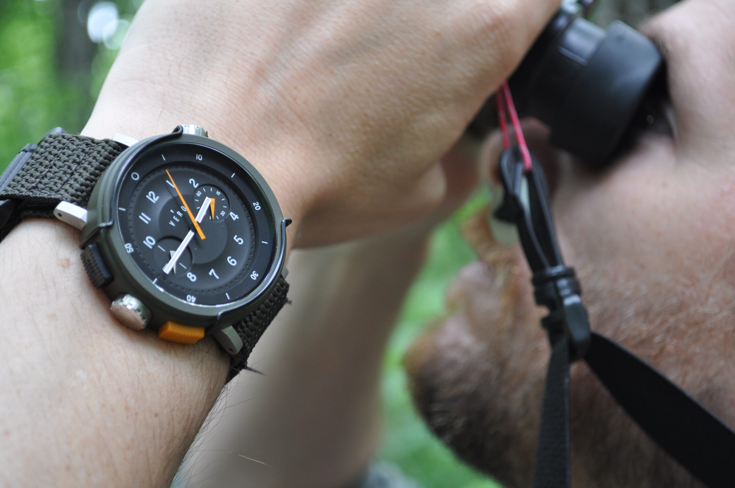
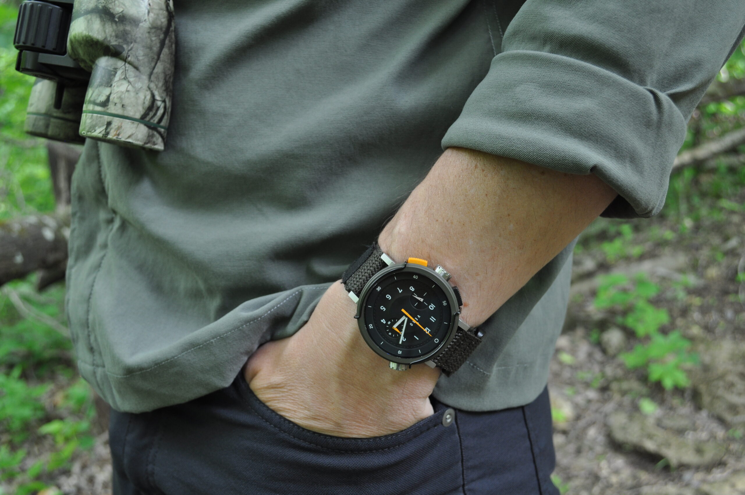 The combination of earth tones and the inclusion of “bull bars” meant to protect the flat sapphire crystal give the Workhorse a decidedly utilitarian appearance. There is a lot of functionality crammed into the piece that makes it ideal for any number of outdoor pursuits. Obviously, there is the chronograph complication, but additionally, VERO made the decision to implement an internal rotating bezel. This is operated by the two o’clock crown. I haven’t found myself using it much. I have a tendency to fidget with bezels, but the fact that this internal function requires the crown to be unscrewed means you have got to be much more deliberate about putting it to use. An external bezel would be an interesting addition to see in the future.
 The use of a somewhat contemporary typeface on the dial contrasts a little with the overall design of the watch, but this was clearly a deliberate decision. There is more color at play with the “Canyon” model, whereas the “Backcountry” has a mostly black dial. The vastness of the dial on the “Canyon” is broken up by splashes of orange. The lack of color on the “Backcountry” makes the dial a bit more nebulous. While the hands are lumed, night viewing is difficult, in my experience. This is probably a result of relatively little lume in general, and thin hands in comparison to the size of the watch.
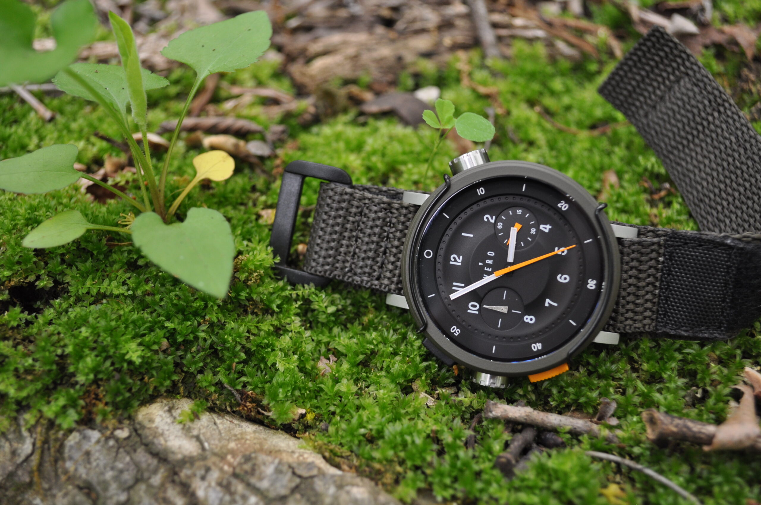 There is a dimensionality to the dial that I quite enjoy. The minute markers, for example, are mere divots in the chapter ring. The bilateral subdials are recessed, and there is a concave contour to the dial that fits in with the quirkiness of the piece.
After spending the past week with this faithful steed, I do not think that there is any portion of the piece that was not carefully considered. Details as seemingly insignificant as the labeling of the pushers come together to make it one cohesive celebration of function-forward design. VERO even includes a 10-year warranty, seemingly daring me to be as rough as I can on the Workhorse. Honestly, I look forward to the challenge, and I appreciate that level of commitment to the product. Though I would be intrigued to see an automatic version in the future, quartz is where it is at for me.
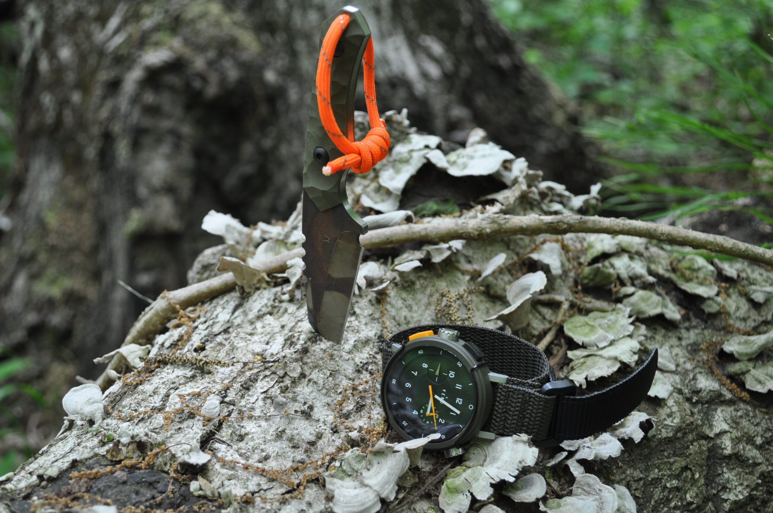
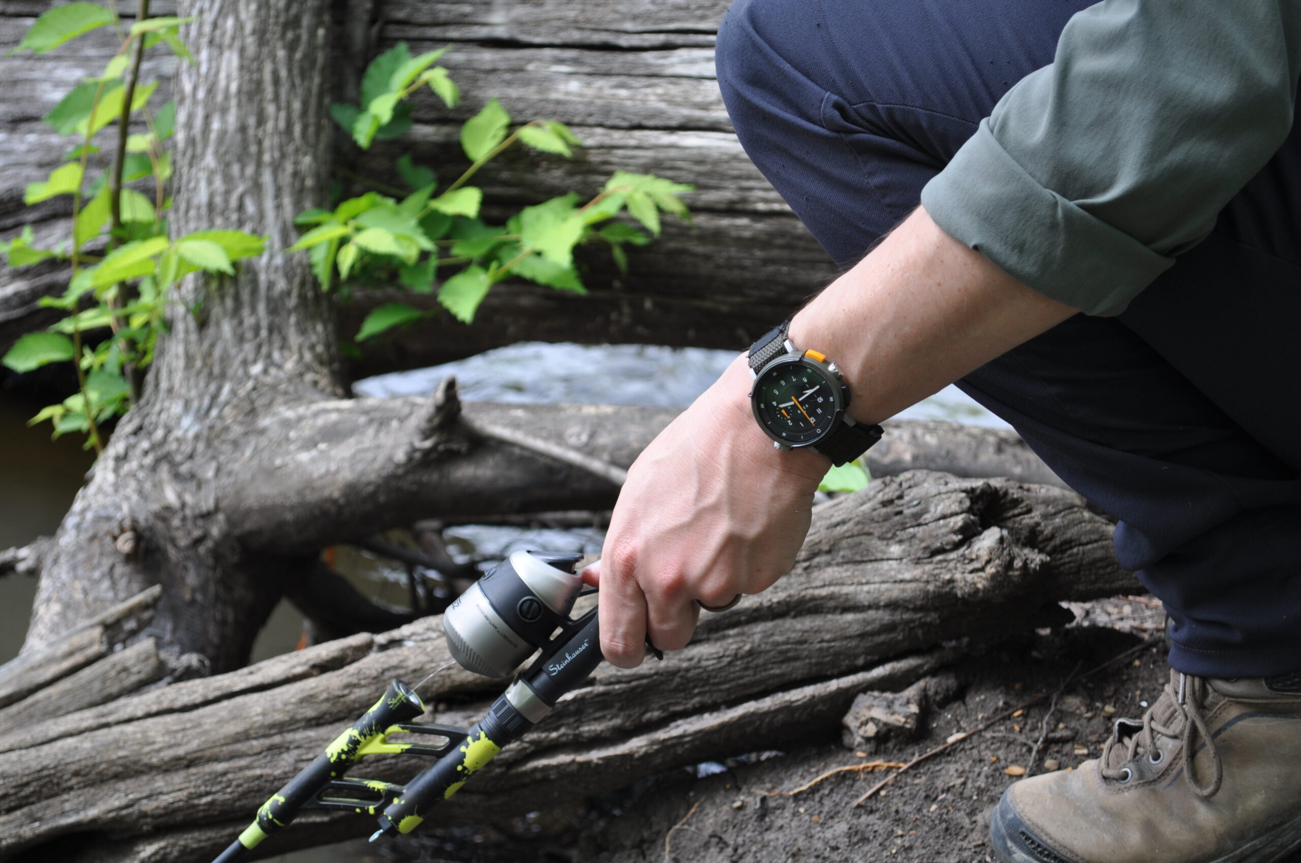 At $425, the Workhorse provides a lot of functionality for the price. Though I prefer to avoid the common horological clichés, I think if you are in the market for a “grab-n-go” watch, this is a serious contender. It just feels like it could be thrown in a backpack for a camping trip without a second thought. Few watches walk the line between “fashion” and “equipment” so expertly. The Workhorse feels like it is made to be put through its paces, and I am excited to see where this model line goes in the future. Clearly, VERO is unafraid to challenge the status quo, and I hope that the brand continues to push the Workhorse to the limits, just as it is intended.