Problem 2: No “Always-On” Option
My other complaint is also related to the watch face discussion, albeit with an explanation that is more understandable in that it relates to battery life. It is that Apple should really try to offer an “always-on state” for the Apple Watch. Other smartwatch makers such as Samsung have been offering this for a while, and I think it is really cool. Though admittedly I see little use of the always-on face for Samsung watches out in public.
I actually blame this not on consumer preference, but because Samsung turns the always-on state of the watch dial “off” as a default setting for their Gear and now Galaxy smartwatches. For me, the interesting thing here is how very few smartwatch wearers actually go into the settings and customize their products. I actually feel that Apple knows this, and is hesitant to offer more customization options at a time when most users aren’t even familiar with how the current customization options work.
An always-on state for the screen would allow the watch to display its dial and thus character for the world to see. For an engineer who values battery life and efficiency, this concept is likely anathema. Even still, ask anyone who is a regular audience member of aBlogtoWatch or the many other people out there who continue to prefer traditional watches to smart watches with an almost militant zeal. These people continue to deny the Apple Watch and other smartwatches their “watch” status for a very peculiar reason. That reason is because unlike their traditional, often analog watches, smartwatch faces offer little to no personality. Just about any type of watch dial has more personality than a blank screen. It’s a statement I am sure most people would agree with.
Solution: Balance Efficiency And Personality
As someone who comes from a long history of wearing watches with personality, I ardently want the Apple Watch to have the same or similar ability to display personality as the traditional watches I still enjoy. I want this not so much for selfish reasons, but because I think it will encourage even more people to wear smartwatches. Apple and its colleague competitors are strictly pushing the utility and functionality of smartwatches as the main reason to buy one.
They say it is a device that will help you be healthy, help you pay for things without your wallet, and help remind you of things. All of that is true, but none of those things are particularly sexy. If your smartwatch can help round-out your outfit just like a traditional watch can, then all of a sudden the smartwatch is both sensible and sexy. Isn’t that what Apple and other smartwatch makers truly want?

So my request to Apple (once again) is to really work on that whole “always-on” state for the screen. I’m willing to sacrifice some battery life for the option of having some interesting and animated display that I can notice is displaying on my Apple Watch, and that I know others can likewise notice as well. I think consumers who can’t readily appreciate the social communication value of this need only wear an attractive traditional watch for a while, and notice how they feel the first time someone notices their wristwatch. It’s a thrilling sensation that becomes rather addicting for some people (as members of the luxury watch community can attest to).
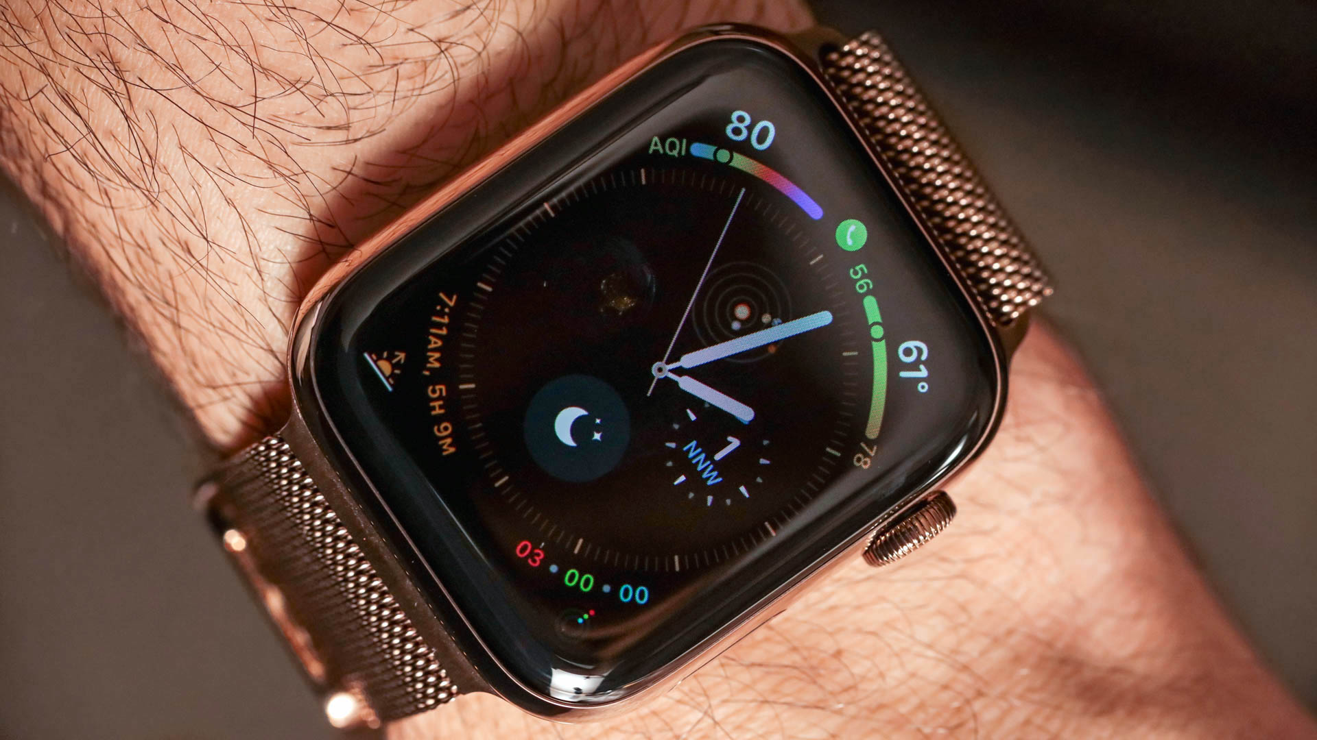
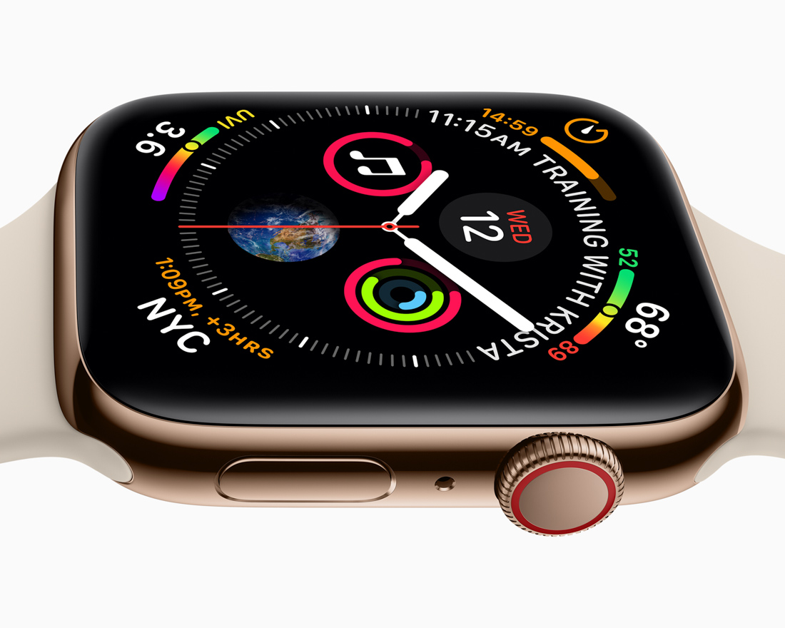
Infograph Dial & Complications
Now that I’ve shared my personal suggestions on how to better refine the Apple Watch, let’s discuss the Infograph dial – which I’m a big fan of. Apple claims that the Infograph face offers up to eight complications on it – and it looks pretty good in the process. Note that Apple isn’t going to win any awards for packing in information on one dial. The traditional watch industry has beaten that number long ago, and if you really want, you can get third-party watch faces for Android Wear that have so much data in them they will very rapidly drain your battery life as the system tries to update them all.
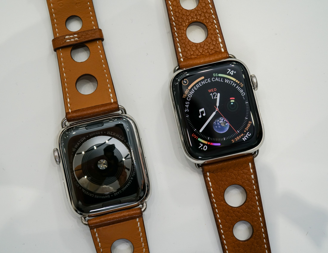
Rectangular Dial With A Round Face
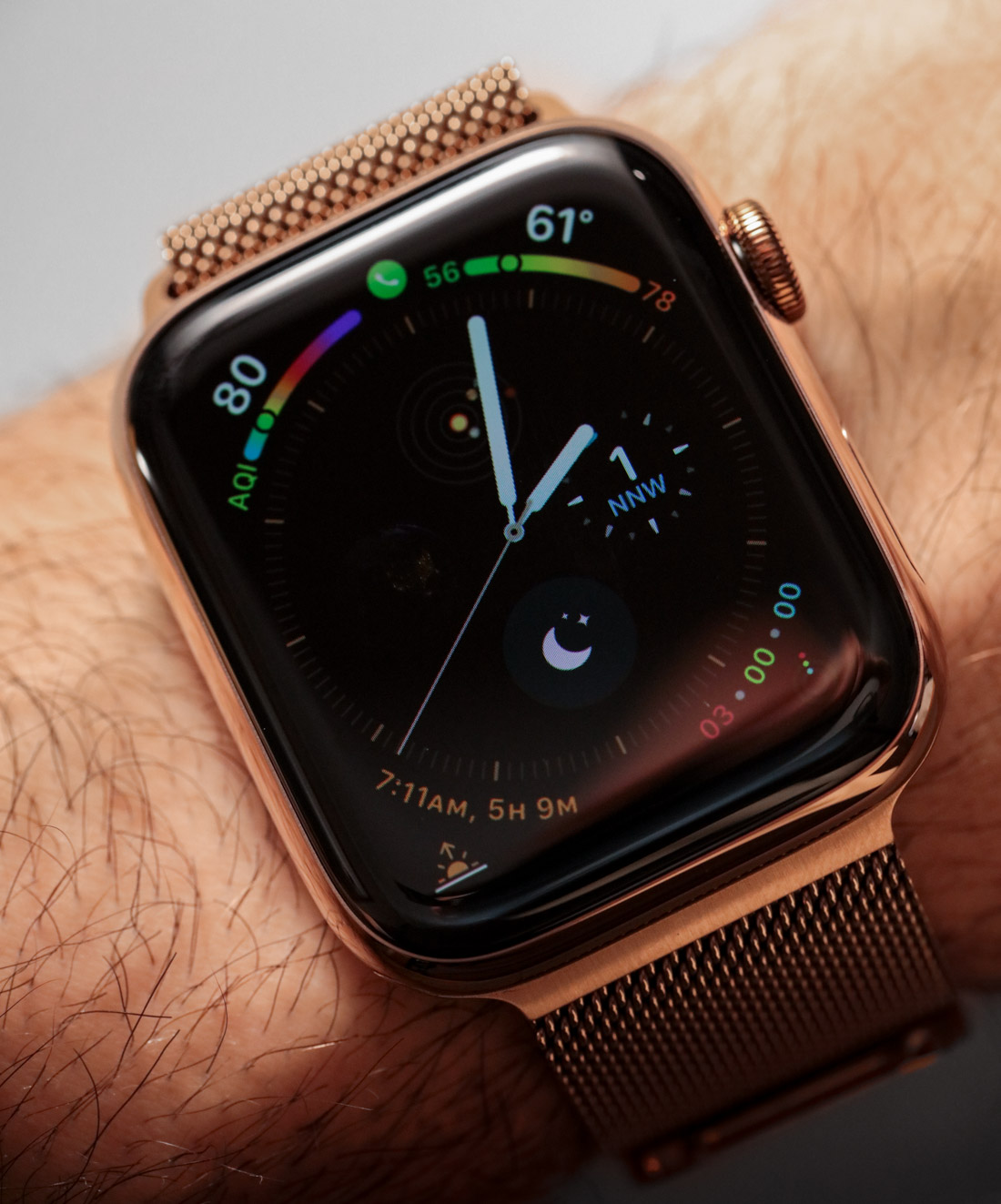
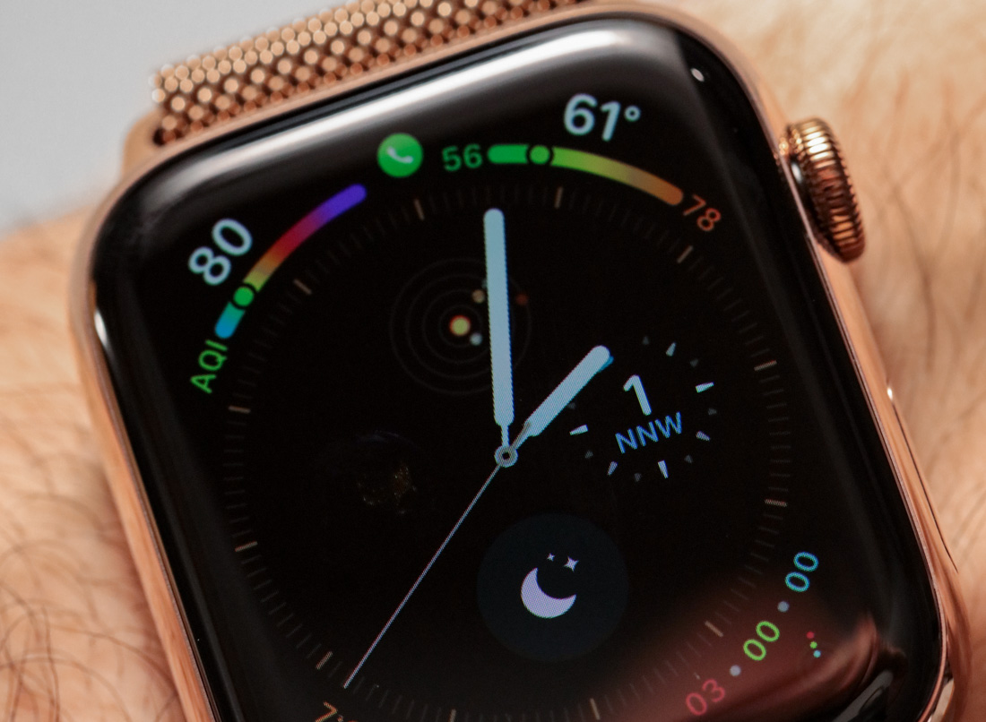
One of the first things I noticed about the Infograph dial is that Apple seems to have tacitly admitted people like round dials – even though their dial is rectangular. Infograph has a round dial for the time with four subdials inside of it as well as four additional “wrapping” complications at each of the four corners of the face. It’s the best way I’ve seen any watchmaker put so many rounded elements into a rectangular space and the result is very attractive. It is also a design that is thoroughly steeped in traditional watch design.
Inspired By Traditional Watches
Unlike the Modular dial and some other faces for the Apple Watch, Infograph and its related dials feel very much like they continue to pay deference to the traditional world of analog timepiece design. That’s not a bad thing since traditional wristwatch makers have a head start on smartwatch makers. The others are wise to pick up where the traditional watch industry left off, as opposed to trying to develop everything from scratch. You can easily notice this fact in smartwatch products – meaning those companies who clearly looked at traditional watches prior to designing their smartwatch, and those who vaguely glanced at a few images of traditional watches on Google before making something overly simplistic in CAD to house their smartwatch electronics module.
What I particularly like about Infograph is that it incorporates new complications that are both useful and positively emotional. This is a very tricky balance and what I mean by that is that if you configure the Infograph dial correctly, you can have a mixture between the information you need to look at, and information you want to look at.
Temperature & Planetarium Complication
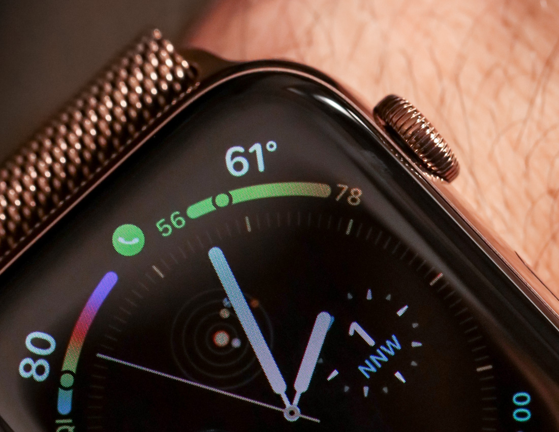
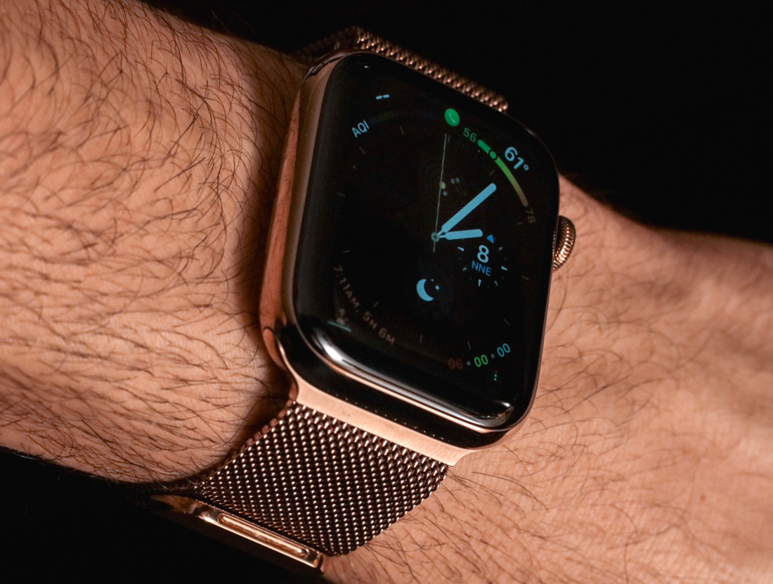
A good example would be something like the current temperature complication and the planetarium complication. While Apple has a few complications related to weather, the one I am talking about wraps around the outside of the main dial and indicates two things. First it indicates the current temperature digitally, and second, it shows a spectrum with the high and low temperature of that day, along with a small dot to indicate where the current temperature lies along that spectrum. The planetarium, on the other hand, shows the relative placement of four of the solar system’s inner-most planets.
The latter complication is something you can find on some very select, very exclusive traditional mechanical watches. Its placement in the Apple Watch is akin to “now you too can enjoy what was once super expensive to wear.” The vast majority of people have no need to know the relative position of these planets – along with some of the other (probably more useful) astronomical complications now available for the Apple Watch.
Despite these complications lacking utility, they are totally cool. The planetarium complication is one example of a “feel good” feature that not only gives the Apple Watch needed character but helps inspire the wearer’s imagination. The day any timepiece becomes “all business” is the day most mainstream consumers forget about it. Apple’s ability to at the same time pay homage to the traditional watch world, but also give its users the ability to have fun in the Infograph watch dial is a big reason for why I love it.
Data Shared Through Good Design
Data is just data unless you know how to present it. In today’s world of infinite data, we are shockingly poor when it comes to insights derived from said data. Graphing data for human consumption is a science and art form I am very interested in – and Apple is probably the leader when it comes to doing this in smartwatch form. The aforementioned temperature complication is a good example. Merely stating the current temperature is one thing, but graphically indicating where the current temperature exists within the day’s high or low gives the wearer additional insight when planning their next few hours and is an excellent example of not only displaying data but properly filtering it for utility and convenience.
Going back to the discussion on data, the internet has tons of it. Theoretically, you can access much of the information you could on your phone, on your watch via the browser. But do you want to? With the Apple Watch Series 4, Apple has finally started to again advance the type of complications that users might be interested in looking at. This is data curation and I think it is one of the values that come with getting a professionally designed smartwatch dial. That means not only selecting the type of data to present to the user, but also doing so in a way that feels satisfying and useful. Apple has of course been doing this since the original Apple Watch, but with the Infograph I see them take an accelerated evolutionary step in the right direction.
Health & Environment Monitoring
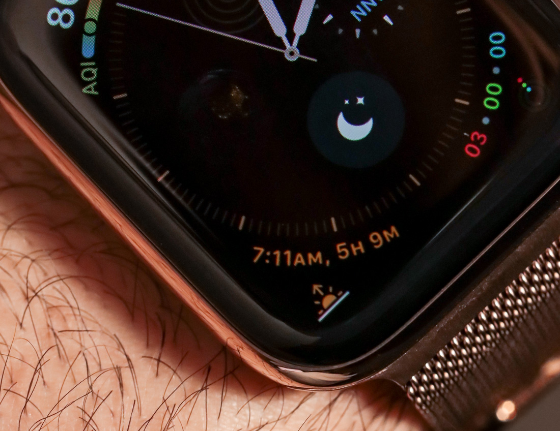
Other new complications available in Infograph mostly relate to environmental awareness – which goes back to Apple’s big push to make the Apple Watch a health device (or rather a general “well-being device”). You can choose to display a complication that shows the air quality index (AQI) as well as the strength of UV rays from the sun that day. You can know the current wind speed and direction, or you can view the current phase of the moon in graphic detail. At their best, traditional tool-style watches assisted their wearers in helping them to safely navigate their surroundings.
As mechanical watch innovation more or less stopped 50 years ago, so did the development of new complications in traditional watches. Smartwatches have either tried to replicate traditional watches or have been stumped by the number of potential types of data they can theoretically display to users.
Apple has been perhaps the most considerate of the modern smartwatch makers because of their ability to curate and artfully arrange a variety of data that is both useful and fun. It isn’t empirical evidence, but I have to say that seeing the UV or air quality index on my wrist has allowed me to think twice about engaging in a particular activity. In places like Beijing where checking AQI is something everyone does on a daily basis, having the information so easily accessible would be a very valuable convenience. When a smartwatch or any other piece of technology allows you to make wiser decisions as an individual – I think that presents a lot of value to the consumer.
Apple Watch Series 4 Closing Thoughts
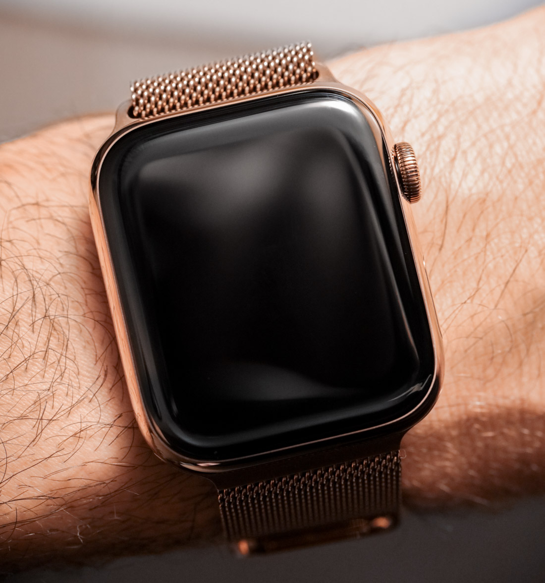
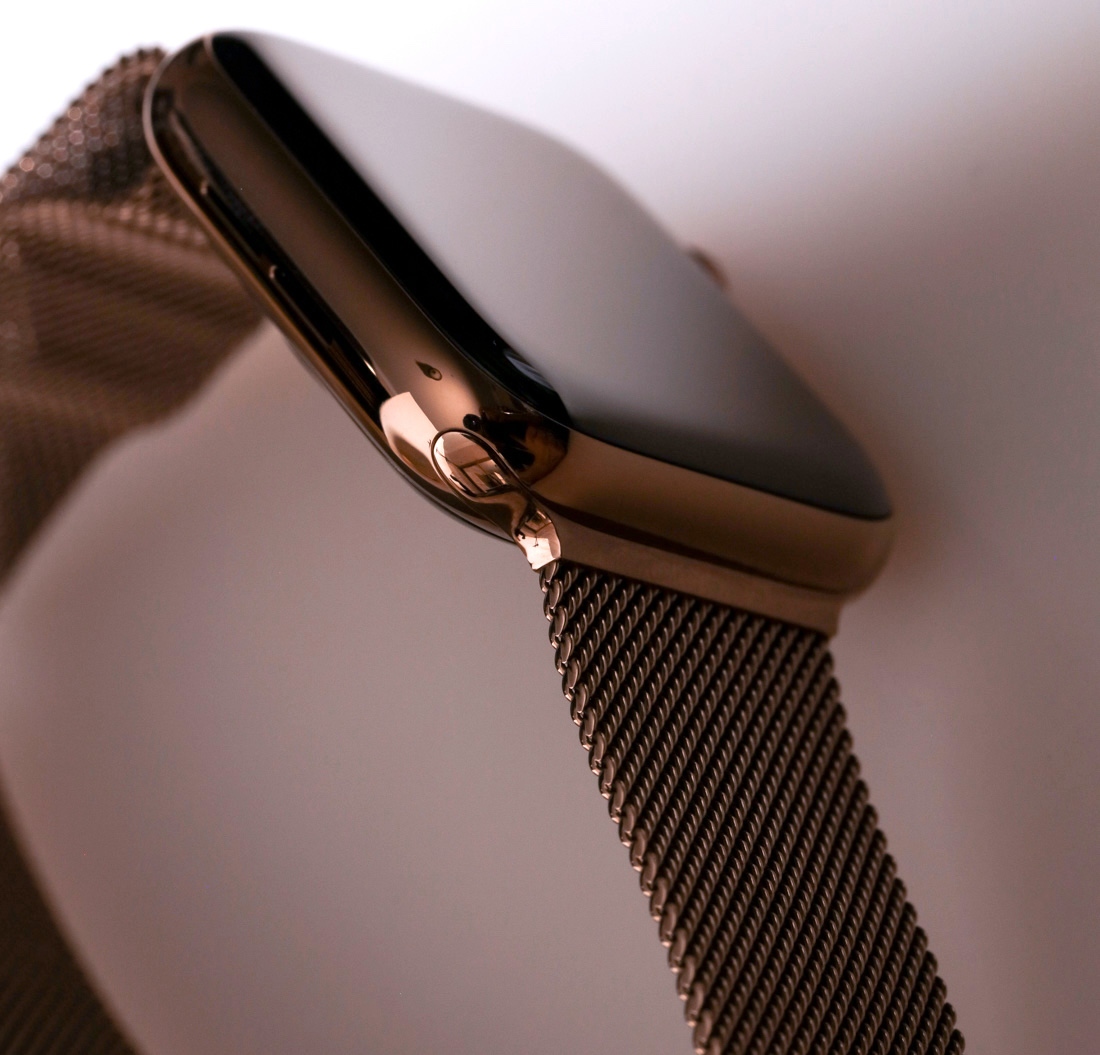
Whereas many other popular smartwatch makers leave most of this up to enterprising and curious consumers, Apple does what it always does best and tries to present a few limited, albeit quality options to the consumer with the complications in the Infograph digital watch faces. If you have a little trust in Apple’s design and engineering team, then I think you’ll be genuinely surprised at how some additional information on your Apple Watch face can make you not only safer and better prepared for the day, but also in a better mood. For this review, I wore the Apple Watch Series 4 in the 44mm long Gold Stainless Steel Case with the Gold Milanese Loop bracelet – which has a price of $849 USD. Learn more or order at Apple here.