
This is the second part of the “Features in Watches Worth Collecting” series where I go through some traits and aspects of watches that make them appealing to modern collectors. Part 1 focused on the materials that go into creating watches and movements, and in part 2 I’ll discuss some design elements that I find important as well as the always-important factor of wearability.
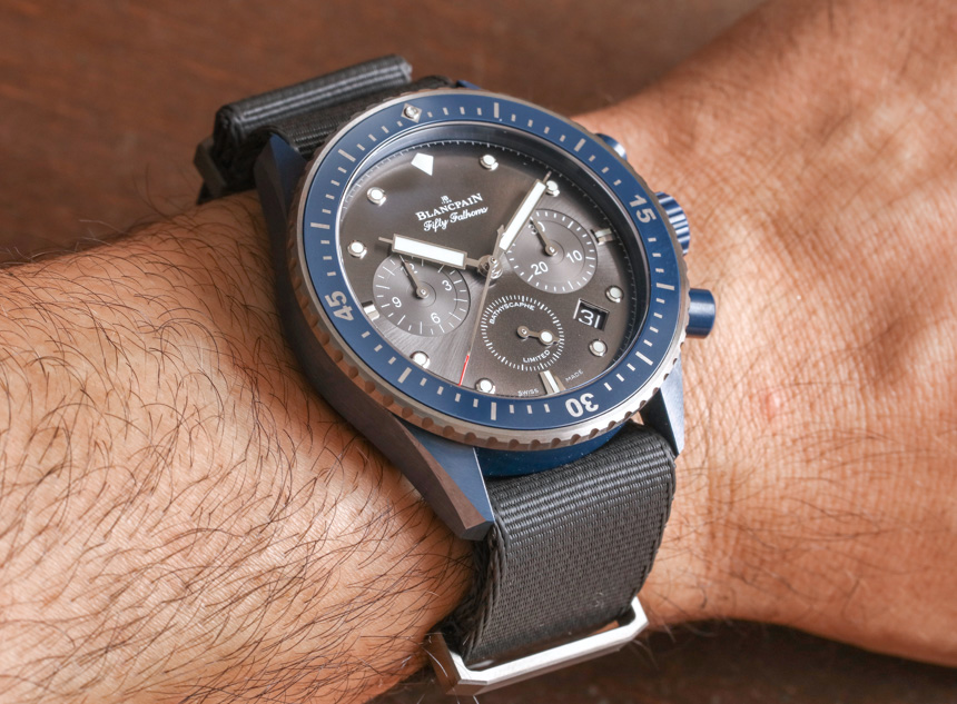
The Most Legible Dials Possible
Over the years I’ve spent more time than I’d like to admit complaining about some legibility problem with a watch. Perhaps the hands are too short, or they blend in to the colors and finishing of the dial too much. Maybe the crystal has too much glare or the dial is unnecessarily cluttered with lines and text. Whatever it may be that I am complaining about, it all relates to my desire to have a watch that can be read as quickly as possible – without obstruction.
If the purpose of a watch is to tell the time, the purpose of the dial is to indicate it. A timepiece must not only excel at being able to track time accurately, but it must be able to effectively display that information to the user. A watch’s dial is a human’s connection to the output from the movement, and the better that connection is, the more desirable the watch is to me. I often measure the quality of that connection in how quickly I can read the information on the dial after looking at it. Far too often, a watch makes my eyes hunt to read the information. Being impatient and wanting information very quickly, watches that waste my time and force me to uncomfortably search the dial for indicators make me irritated. Not the way I want to feel with something I chose to put on my wrist.
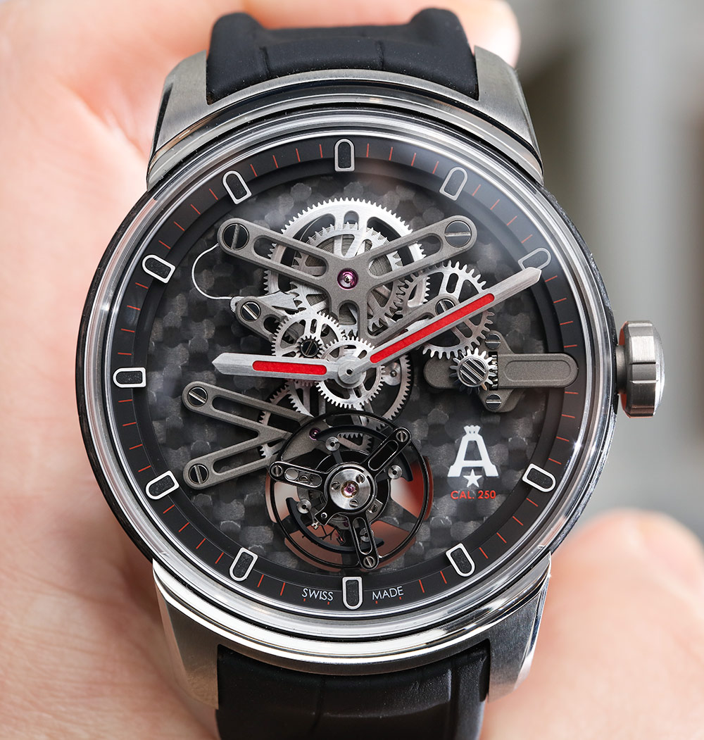
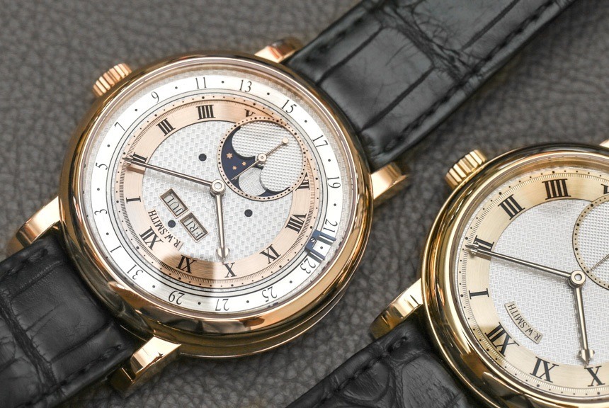
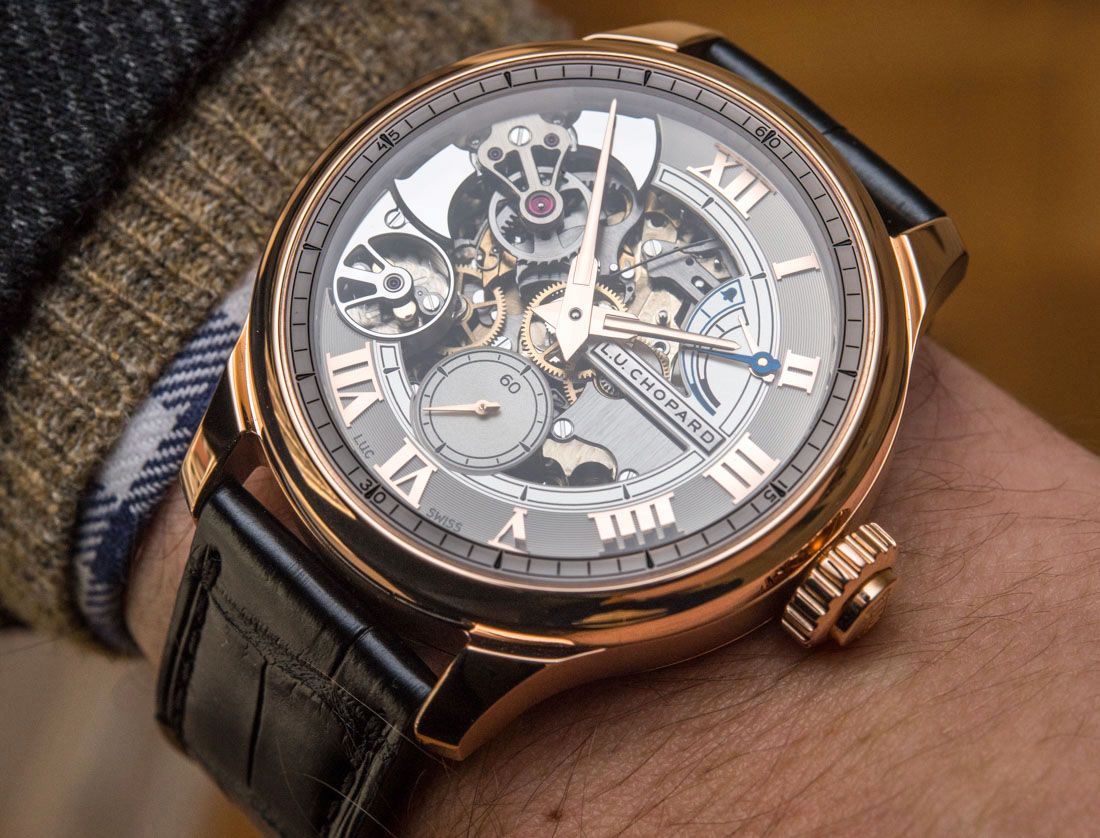
Given these tendencies and preferences, I spend my time searching for watches that are as legible as possible – given the design. I add this qualification because you can always have a super legible dial, but not always a pretty or interesting one. My greatest respect goes to those watches which attempt to include an original or complicated dial design, but that are also legible. Being able to accomplish both of these goals is a challenge that most designs are not able to meet. When it does happen, I find the result that much more enjoyable.
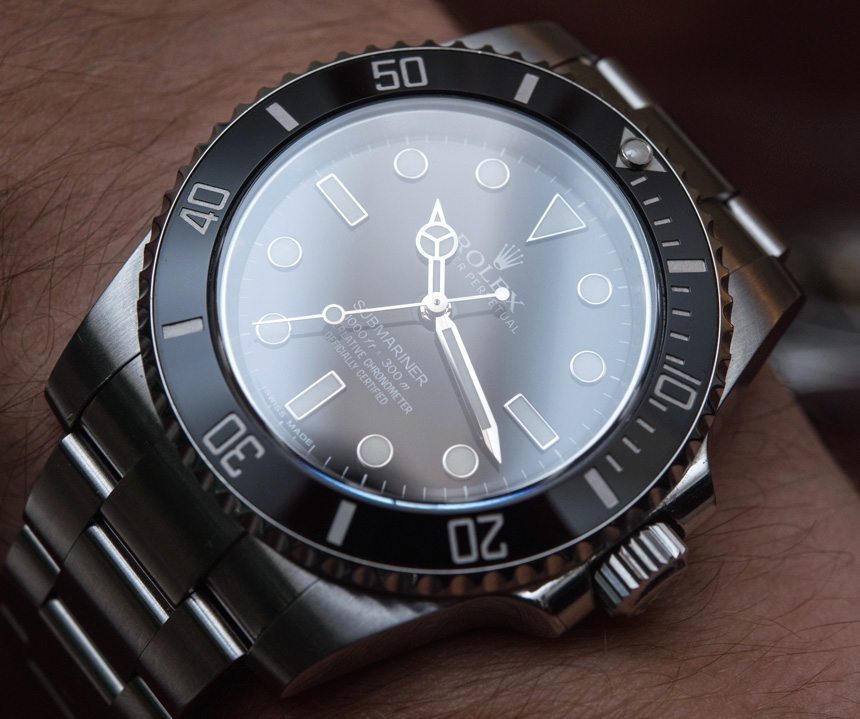
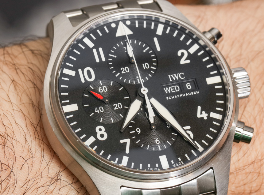
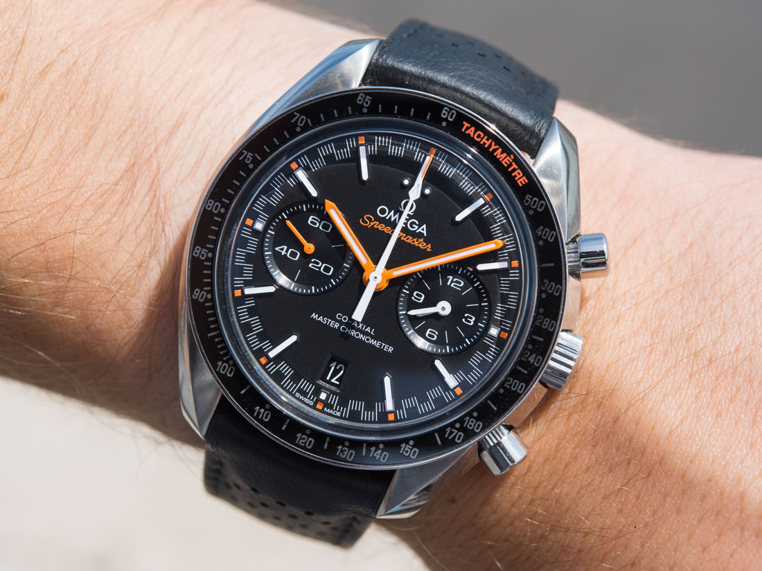
My own experience and research has led me to believe that I’m not alone in having a strong preference for legibility. The world’s most popular timepieces are almost universally very legible, and consumers routinely fail to purchase watches that are difficult to read. Even though watch buyers seem to want easy to read watches, the proliferation of quick-designed fashion (or even high-end) products over the last decade or so has led to a lot of poor legibility watches coming on the market. While it isn’t too difficult to find a legible watch, it is easy to become a dedicated aficionado like myself. Once you fall down this route, the hunt isn’t just for legible watches, but the absolute most legible watches. A few good tips are to avoid watches that have polished elements on the dial, those which stack elements of the same color or finish, and those with very reflective crystals.
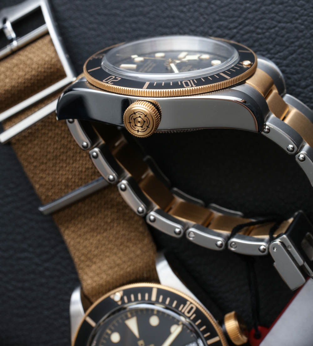
Comfortable Art
“Ouch” is something you should never say while wearing a timepiece. I am embarrassed to say that I’ve worn a few watches that have made me actually utter “ouch” out loud. For the most part, those watches were pulling my arm hair or pinching my skin unexpectedly. This can happen more often than you think. More generally, one needs to watch out for uncomfortable watches because life is too short to not feel happy with what is on your wrist.

I wrote “comfortable art” above because I equally look for function (utility) and form (aesthetics). Ergonomics actually falls somewhere in the middle because design decisions which affect comfort also affect how a watch will look. I’ve worn beautiful watches that are uncomfortable and ugly watches that I barely know are there. Finding a beautiful watch that is comfortable to wear all day is an ongoing goal of mine.
The odd thing is that you can’t always predict what watches will be comfortable or uncomfortable. Part of it depends on your own personal anatomy (the shape and size of your wrist), and the other part has to do with how the watch is designed. Thus, while I can tell you to avoid bracelets which pull arm hair, or cases with sharp lugs (that poke you), it is challenging to make broad suggestions on how to find a comfortable, aesthetically attractive timepiece. This is really where the purely subjective part of choosing a watch comes in. In order to know what looks good on your wrist, and feels good on your wrist, one simply needs to experiment with a lot of watches.
I have no qualms about calling a watch uncomfortable or even painful. Sometimes I like to use the term “WTD,” which stands for “wrist torture device.” That is my exaggerated way of saying that a timepiece simply doesn’t work on at least some wrists from a comfort perspective. I even own some really cool watches that I’d love to wear only if they felt nicer on wrist. It can be a real let down to put on a timepiece you like only to have it not feel right… or simply fatigue you after a few hours or even minutes.
Some quick fixes to easing discomfort could be to change the strap or bracelet. For example, heavier watches are most comfortable when securely strapped to your wrist. Not all bracelets or straps can secure a watch on all wrists, so you might just need to change up a poor-fitting strap. For example, a stiff leather strap will offer a totally different wearing experience than a pliable rubber strap.
Be that guy (or gal) who shamelessly models their watch in a store before buying it. Parade it around like you are evaluating a new pair of shoes. Check yourself out with the watch on your wrist in a mirror. Jostle your arms around as though you are gesticulating in a manner suggestive of communicating in Italy. In short, take the time to make sure a watch looks and feels good such that whatever you wear, you can easily refer to it as “comfortable art.”