Today, we are going to review a watch that I was fairly certain I would not be seeing in person given the limited quantities being produced. That said, it was still intriguing enough of a piece that I did do a preview post about it when the pre-order was announced, and that brings us to today, where I have actually had time with the moVas Bronze Officer on my wrist.
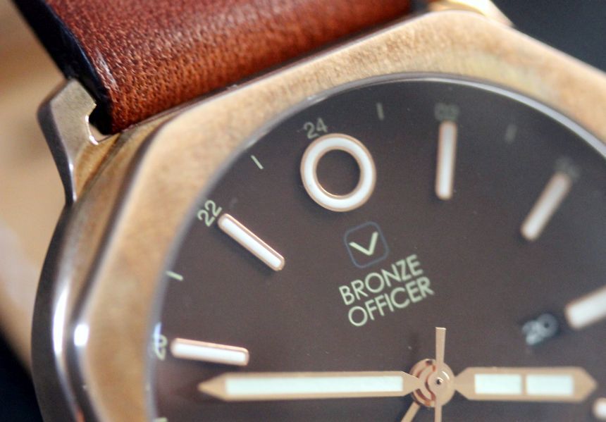
First things first, let’s address the limited quantities of the moVas Bronze Officer. The 50-piece run was planned as the watch to commemorate the 50th anniversary (1965 – 2015) of Singapore. Rather than take something from their existing lineup and just create a new dial to commemorate the event, they instead designed this new watch with details appropriate to the country. They chose bronze to reference the rich history of Singapore and the impact that trade has had. The GMT movement was to highlight those migrants (such as moVas’ Sean Wai) that need to know the time in other time zones. Finally, there is a rather small “Singapore 1965” printed down at the 6 o’clock position to denote the milestone.
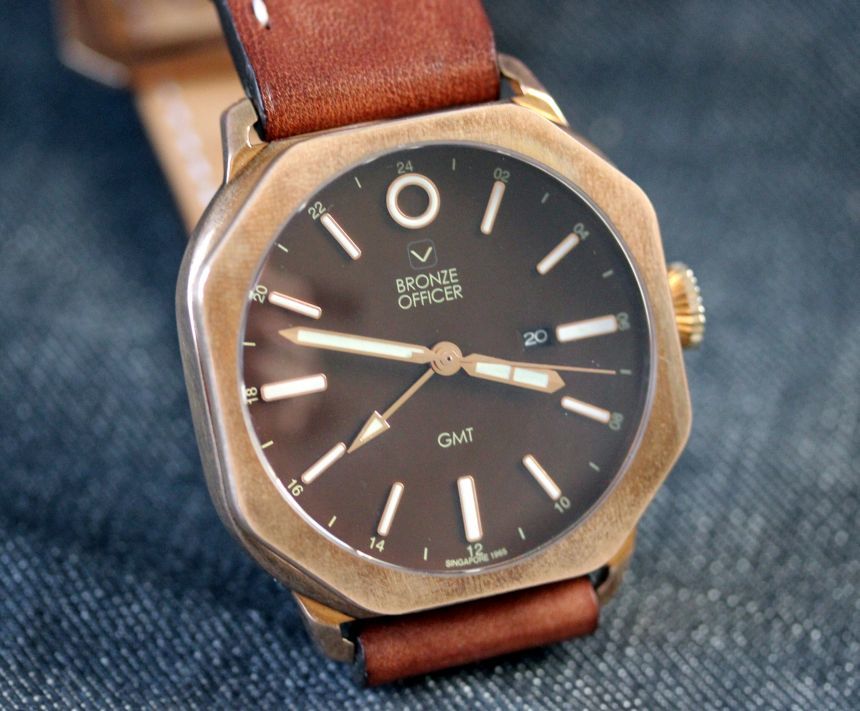
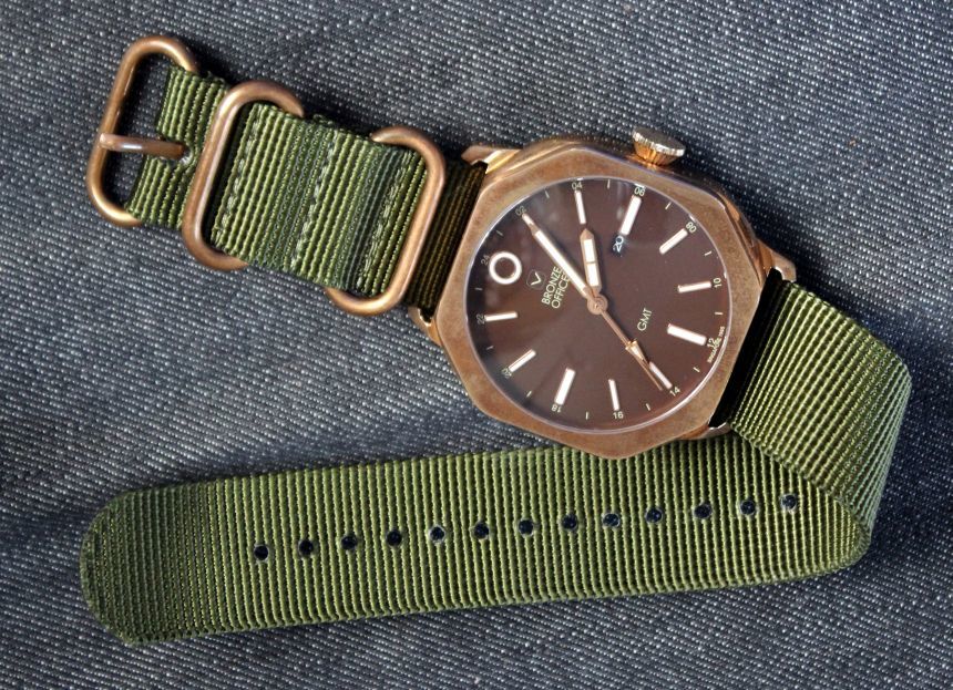
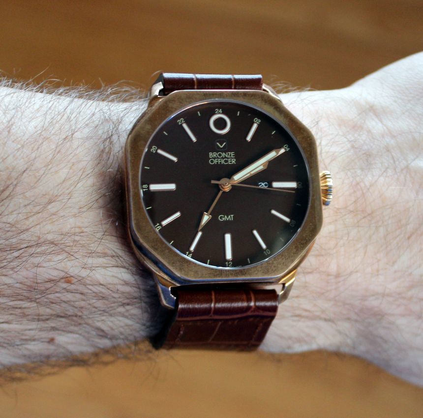
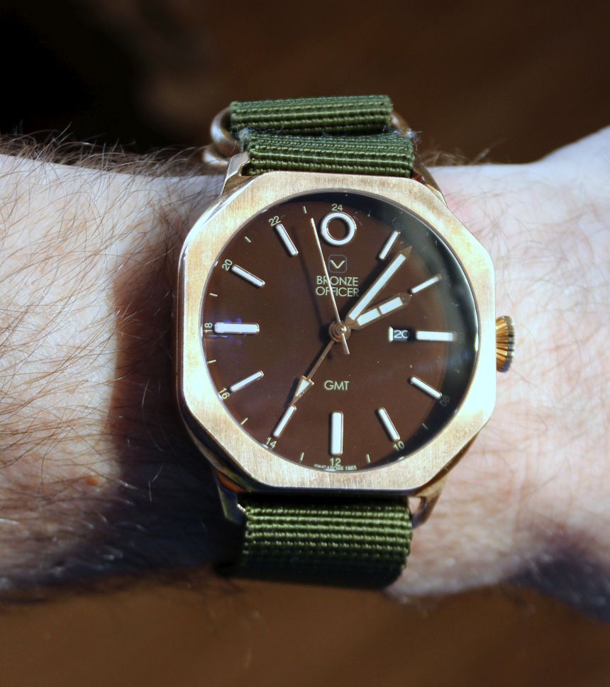
These three touches on the moVas Bronze Officer are subtle, I will give you that, and you might argue that gold is more the 50th-anniversary material. Given the high polish that the rounded portion of the bronze case has (as do the indices and the handset), you still get that feel of gold, while it also gives something a bit different. Speaking of different, the case is another example of this. On top, you have an octagon for a bezel, which has a brushed and somewhat oxidized finish. This is paired to a rather rounded and, again, polished lower portion of the case. I am a big fan of alternating finishes on a case, though this is the first time that I have seen this stark of a 50/50 split, and never with this combination of hard edges and soft curves.
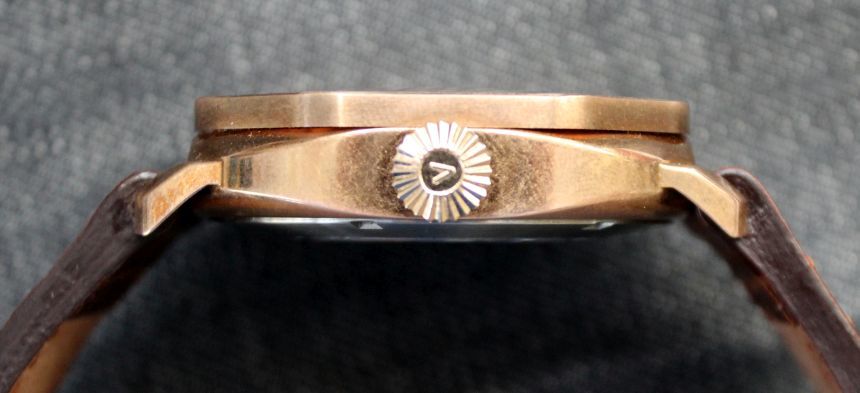
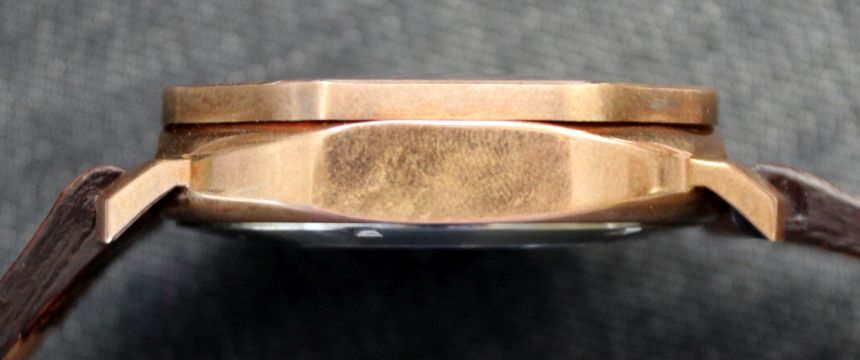

I was initially unsure how this would work when I saw the images, but work it does. In person, you do notice that bezel with its matte finish, and that is not a shape we see very often (aside from stop signs), let alone on our wrists. Viewed from the side, you get a flash of brightness from the polished curves and crown. If that seems a bit incongruous for you, I would say to give it some time. I do not believe that the polished portion is sealed at all, so it begins to develop that patina as well. It is still brighter than the bezel, but it does dull down a bit unless, of course, you keep polishing the oxidization away. Then again, how much oxidation develops depends on how often you wear the watch, and in what sort of conditions.
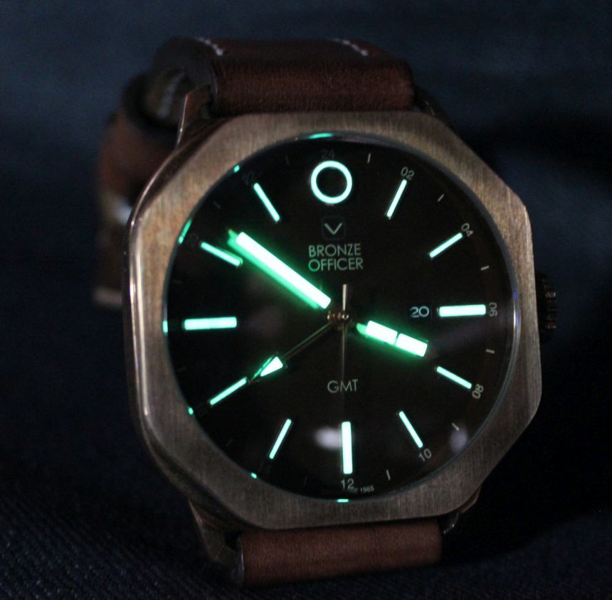
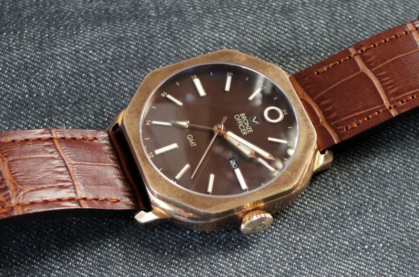
The curves of the case are picked up in the curve of the sapphire crystal set in the bezel – yet another subtle cue that I enjoyed. This tops the 45mm case and keeps the polish on the handset and indices nice and bright. Against the chocolate brown dial of the moVas Bronze Officer, you have a crisp contrast, further enhanced by the lumed indices. It is not the brightest lume I have ever experience, but it is quite workable. On the dial front, I also liked the “O” that takes the place of the 12 o’clock index. Often there is some shape or double-index used here to indicate the position, but I’ve not seen this particular shape. Then again, there seems to be a lot of that going on with this watch.