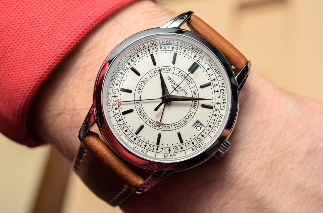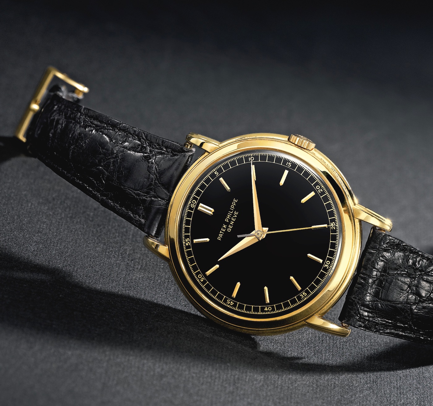
There’s been a lot said about the new Patek Philippe Ref. 5212A Calatrava Weekly Calendar watch, mostly about the new eponymous complication, that it’s a new steel model, and of course, that handwritten font used on the dial. At this point, I’ve spent years in watch media and handled or spent time with about every watch there is, and so I feel no guilt about any of my strongly held views. Least of all would be my absolute adoration of Patek Philippe, so naturally, I was eagerly anticipating getting to spend some time with the 5212A on the wrist at Baselworld 2019. Now that we are a few weeks out from the show, I wanted to revisit what my initial impressions were and if this watch still makes me as happy as it did after I first held it.
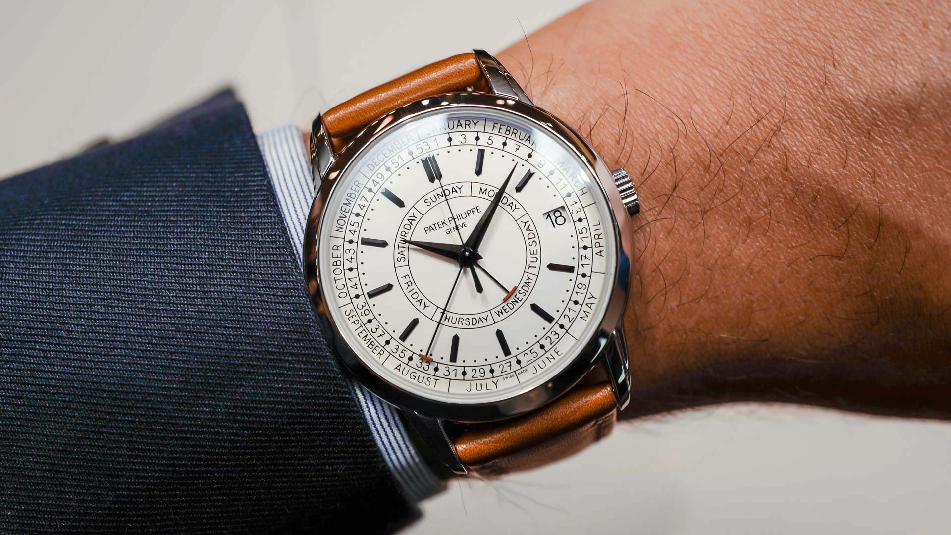
In short, my regard for the Patek Philippe 5212A Calatrava Weekly Calendar has only grown. I find that it encapsulates why I admire the brand so much. It’s a celebration of human idiosyncrasies in a time when nearly all the text we process or read is a machine- or computer-generated font. It’s also a celebration of the humanity of the people who actually design and create these wristwatches, undermining the assumption that uniformity is a necessary requirement of perfection in typeface.
The Patek Philippe Calatrava has long been seen as the quintessential dress watch, and the brand’s creative risk-taking here is one that will result in a piece that collectors will clamor over for years to come.
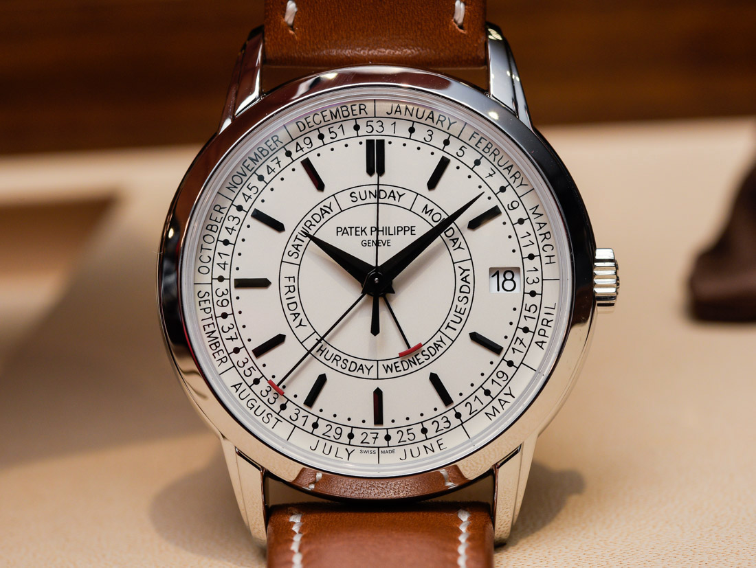
In this article, I’m going to discuss why I’m such an advocate for this Patek Philippe Calatrava by first exploring its design, obviously with a focus on the typography but also the rest of the dial and the watch that PP says inspired the 5212A. I’ll also briefly share my personal thoughts on how this watch design had me reminiscing about Lu Heng Wu, a small family-owned company that meticulously creates handmade compasses and tools used in feng shui consultation. After that, I’ll talk about the new 26-330 movement that introduces the weekly calendar complication, which is the first of its kind. I’ll get into the technical stuff, as well as the idea of a weekly calendar, in general. Finally, I will touch on the case and finishing, which discreetly show off some of what Patek Philippe does best, especially when looking at the five-central hands, the two-tiered lugs, and the bezel.
Typography Celebrates Idiosyncrasy
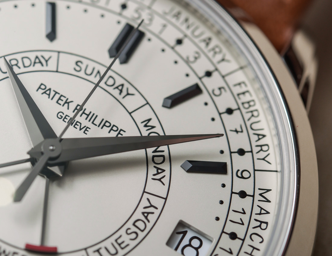
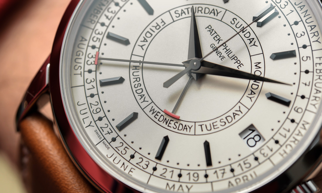
“Romantically Analog” is the most accurate way I can convey my real love of how the 5212A dial directly borrows the handwriting of one of Patek Philippe’s designers who worked on this watch. The image is nearly as sentimental as Patek’s “Generations” ad campaign: A designer seeing the same handwriting they used in countless sketches from when the watch was being conceived is then ultimately used in the final product. I’m generally pretty detached and unsentimental about decisions made by any company or brand, regardless of how I feel about them, but there’s something about this backstory that I just appreciate so much.
There’s an intentionality in not using any abbreviations for the names of months or days of the week, meaning there is no symmetry in text size or spacing. At the highest levels of an already notoriously aesthetically critical industry like this, where everything has to look absolutely perfect, the honesty of human typography is powerfully refreshing to me.
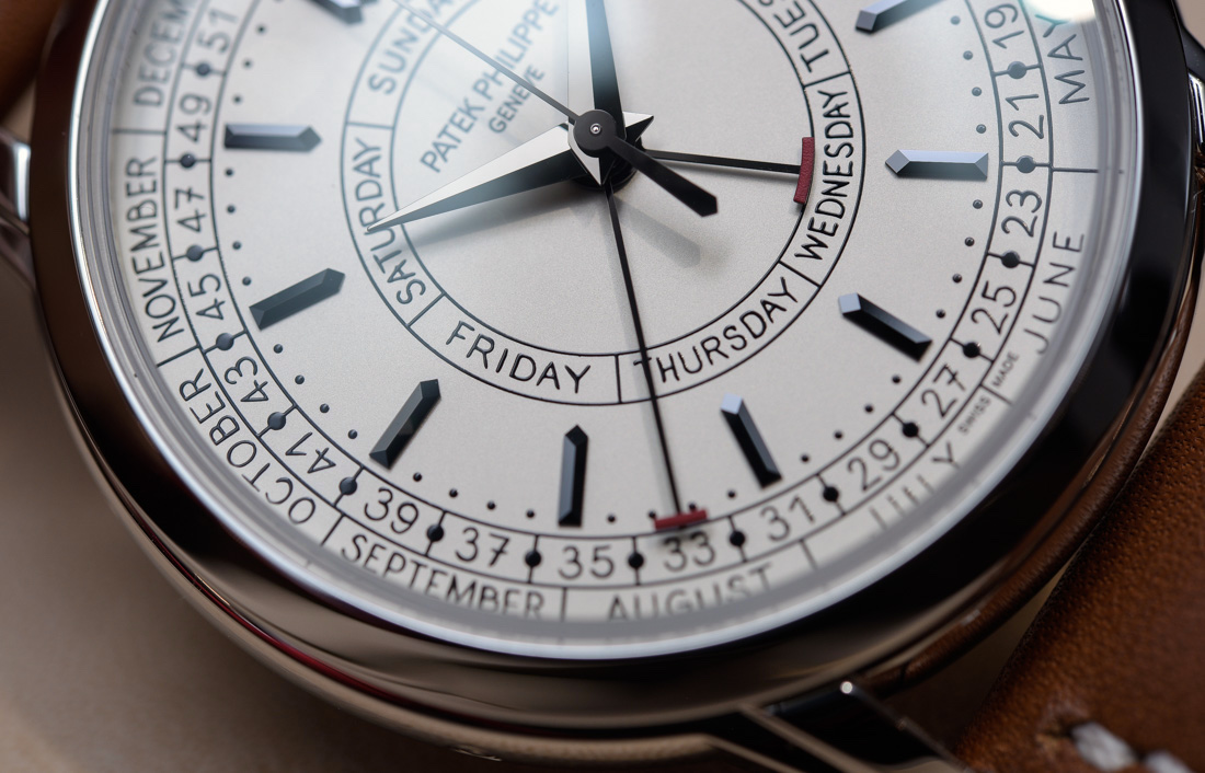
Take a look a look at the last three letters on “October,” “November,” and “December” on the dial that read “BER.” They’re so different from each other, because… well, that’s just how people write. We can’t write in perfect uniformity, no matter how well trained the hand. Text in perpetual uniformity is a font, whereas handwriting incites its own unique sense of wonder. It’s a potent conveyance of the concept that art can’t be separated from the artist. In this case, it’s the designer and the watch that are inextricably linked together. It’s a note written from the designer of the watch, not just for you, but for future generations.
I never thought about it until considering this watch — how refreshing it is to read anything that’s not a font, even one as nice as Patek’s standard font. I also never knew this tidbit, but the standard Patek Philippe font goes by the curious name of “Monotype Grotesque Regular.”

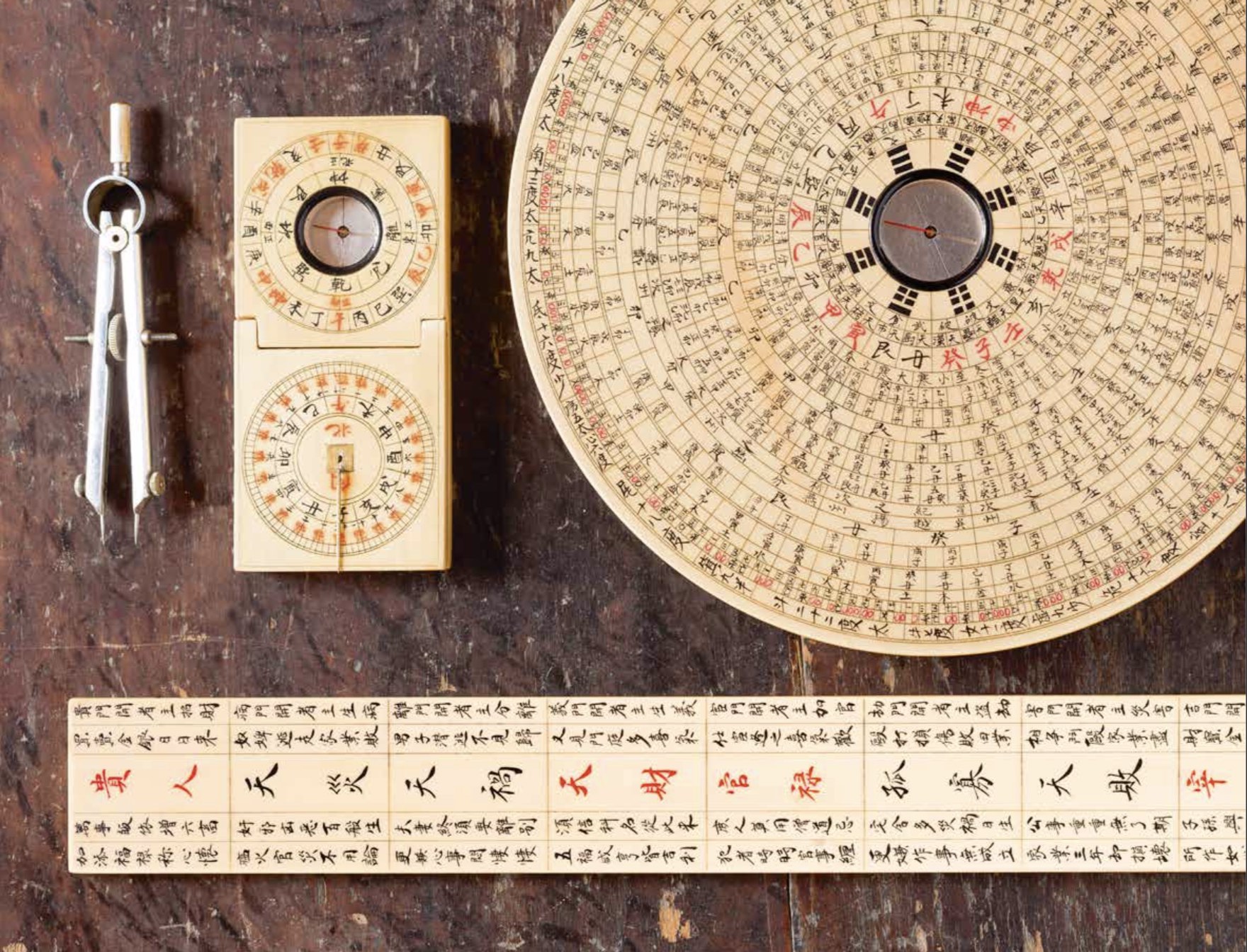
When flipping through an older issue of Patek Philippe’s magazine from a few years back, I can recall a feature I had forgotten about until the Patek Philippe 5212A Calatrava Weekly Calendar was released. The article was about Lu Heng Wu, a Chinese company whose philosophy parallels the path of Patek Philippe. It’s a small, family-run brand that produces handmade compasses, sundials, and rulers for feng shui consultation based out of Anhui, China. The Wu family is currently led by Mr. Wu Zhaoguang, who took over the business after his father’s passing in 2014.
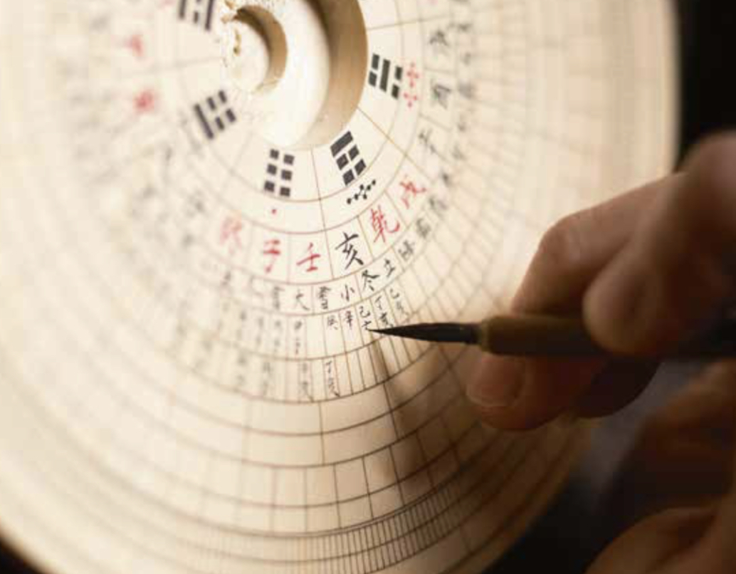
A south-facing feng shui compass called a “luo pan” is made from a handmade wooden disk consisting of concentric circles emanating out from a central bowl. It takes about three months to produce one of these disks that range from five to fifteen inches across. Each generation of the Wu family has refined the process of building these instruments, with Zhaoguang contributing a development in the last step that involves the needle setting. This development improved the suspension of the needle, improving accuracy and eliminating the need for a totally level surface. It’s a refinement of a refinement that is stark in the way it mirrors how the Stern family has guided the brand through the years.

The connection I made between the Patek Philippe 5212A Calatrava Weekly Calendar and these feng shui instruments was really not a very sophisticated or even tangible one, but it’s an image that immediately snapped to the forefront of my mind. There’s an image of one of these luo pan disks being made, with one of the concentric circle items being written in by hand. The immense pride of craft and investment in the elaborate and increasingly rare human talent required to produce a Lu Heng Wu compass (or a Patek Philippe Calatrava) has to be something shared by the owners of these companies.
It’s an homage to these designers and artisans who dedicate their lives to such a niche craft in a hyper-modernized world to acknowledge that their handwriting is as perfect as, or even preferable to, the uniform execution of a font or typography.

Am I reading too much into this? Maybe, but I have a feeling there is a subconscious intentionality in finding newer and bolder ways of communicating to the world how important the people who create these watches really are. In a time when finding young people willing to dedicate their lives to watchmaking is challenging, this appreciation for their contribution and recognition of their importance resonates powerfully.
A Weekly Calendar
More than a couple of people I’ve spoken to have found themselves puzzled about the weekly calendar complication. The calendar week isn’t commonly used anywhere outside Germany and some parts of Northern Europe, from what I understand. (Any Germans or Northern Europeans reading, please weigh in.) But it’s very common in Germany to reference the KW (Kalendarwoche or “calendar week” in German).
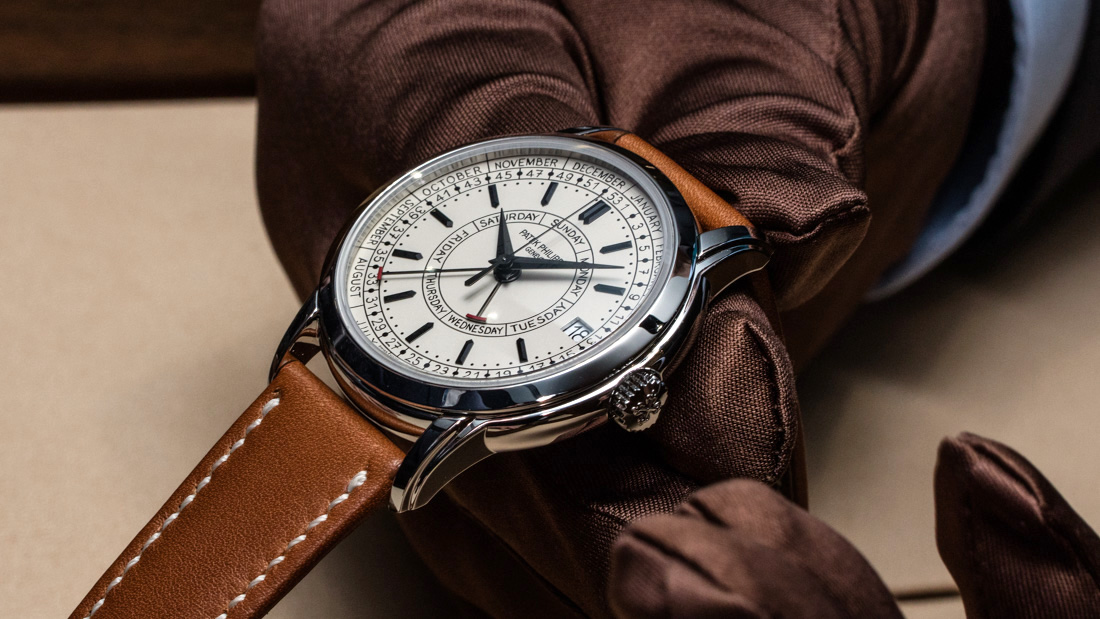
So, say it’s April 8th and I want to remember that I need to get an important birthday gift by August 31st. Assuming I know offhand that it’s currently Week 15 and this birthday is on Week 35, I have 20 weeks to go. This is probably a more frivolous use of the weekly calendar (and perhaps betrays distractions on the back of my mind…) but maybe a better example would be an editor informing a writer that a draft of an article is due on Week 40. So, it’s not a specific date that’s set in stone but it’s also an easier way to remember that work week, which is from September 30-October 6th. No months or dates, just Week 40.

We don’t really use this system in the U.S., but maybe we should. By simply writing this article, I’ve rethought how much time is in a year by simply considering the digestible, seven-day chunks that make it up. Months are an abstraction of time, where holidays tend to immediately become the focal point, at least the way I see things. There is something about the weekly calendar that’s easier easier to track and manage.
The Ref. 2512/a
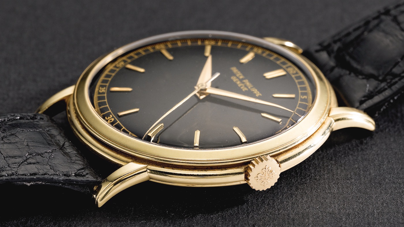
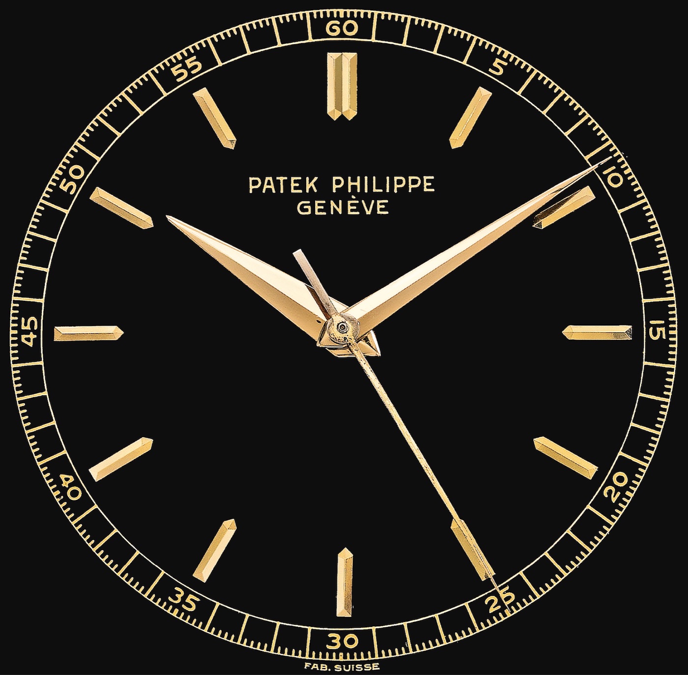
The inspiration point for the Patek Philippe 5212A Calatrava Weekly Calendar is said to be the ref. 2512/a, a one-of-a-kind watch that was produced in 1955. Some initial mixing up of the two reference numbers isn’t a sign of dyscalculia, as Patek intentionally rearranged the digits of the ref. 2512 to create the ref. 5212A. This was an uncommonly large 46mm wide Patek Philippe Calatrava three-hand gold watch that first sold on April 28, 1956. It remained in that owner’s hands for 32 years until it sold at auction in 1988 and then, 24 years later in 2012 it was sold at another Sotheby’s auction for just a little shy of one million dollars.
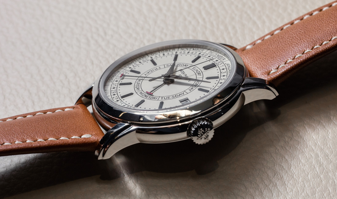
The point of inspiration is subtle since the differences in size, material, and level of complication are substantial. However, the 5212A has two-tiered lugs and a two-tiered case, which is absolutely reminiscent of the 2512. I wish it were possible to have held the 2512 as I spent time with the new 5212A, but the comparison will have to hinge on the photographic record.
On the dial, you can easily draw a line between the baton-shaped hour indices, elongated triangular Dauphine hour, and minute hands on both watches. Finally, that beautiful box crystal is so reminiscent of that classic vintage Patek Philippe Calatrava look that’s achieved with the visual cues from the case design.
A watch Patek Philippe doesn’t note as inspiration, however, is the Multi-Scale Chronograph ref. 5975. While functionally dissimilar, seeing visual echoes in the similar lugs and that dial layout wouldn’t have you labeled as crazy.
New Caliber 26-330 Base Movement
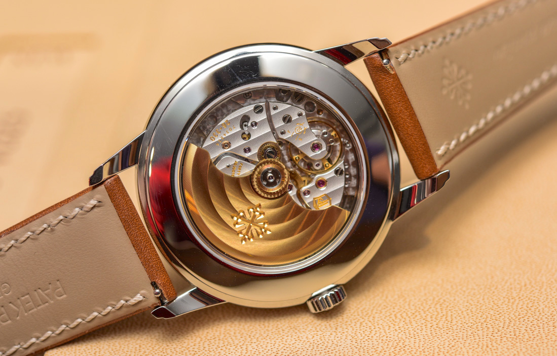
The new caliber 26-330 movement is really an updated and modified version of the caliber 324, which Patek Philippe currently has 10 versions of outfitted on its production watches, as of now. This ranges from the classic three-hand plus date 324 S C found on the Patek Philippe Calatrava, Aquanaut, and the women’s Nautilus. I say “women’s” because, while it hasn’t been publicized much, something I picked up on was that the 40mm steel Nautilus 5711 has swapped out the 324 S C for the 26-330 S C.
A big addition is that there is now a stop-seconds function that was sorely missing. Beyond that, the winding rotor is now secured with a nut, where the 324 used a screw. Secondly, the 26-330 loses the friction spring that prevented “chatter” from the seconds-hand on the 324.
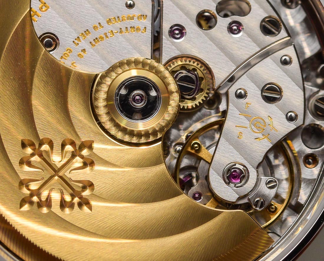
The 26-330 instead uses an anti-backlash third wheel that has split teeth, which just means there are two flanks per “tooth,” one to drive the pinion and one to stabilize from shock, while a spring that is built in prevents that “chatter.” The anti-backlash wheel is done in gold-plated nickel phosphorous that’s created through a LIGA process (using photolithography, electrocasing, and molding to create very high-aspect ratio parts). The end result of this modification is overall energy savings, as well as balance inertia improvement, to the same levels as on the caliber 215.
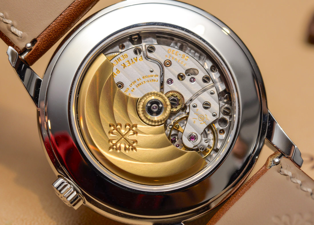
The caliber 26-330 has several improvements over the 324 when it comes to the self-winding mechanism which can now be uncoupled. It introduces a reduction wheel with an integrated clutch (that PP has filed a patent for) and replaces the outgoing click spring on the winding wheel with a helical spring that doesn’t need click adjustments, improving overall reliability. The outgoing clutch rocker is replaced with a spring by a clutch wheel, which shares the same clicking functionality with the reduction wheel.

