The watch industry is a big space. That space is often filled with “in the moment” trends that many brands tend to follow because it’s what’s hot right now. This can get monotonous for contributors to the community and we often find ourselves drawn to something different – something challenging – as a form of mental reset from all the momentary hype around a particular topic.

This year has hands down been the year of the GMT – specifically those of the Pepsi variety. And while I’m definitely a fan, the topic has gotten deserved, but exhausting coverage from small and big players alike. Since the GMT is probably my favorite complication, I stumbled upon a tattoo-clad, motorcycle marketed, little gem that caught my eye, provided a serious challenge to my typical sense of style, and stretched my tastes and appreciation – that watch was the Franck DuBarry Revolution Fileteado GMT – featuring an engraved case, an interesting stamped silver dial, and a GMT function.

Perhaps it was all the art classes (yeah yeah, I know) I took in college and the many cultural artistic expressions that were so interesting to me, but I can’t say for sure what drew me to the eccentric brand, or the Fileteado GMT. I can say that both are a wild departure from what I would normally be drawn to. The brand itself comes from the mind of Franck DuBarry, former CEO of TechnoMarine, a brand I was quite fond of early on in my watch enthusiasm. Franck DuBarry’s eponymous brand launched in 2016 and draws influence from art and history to create some pretty unique designs – the most interesting to me, being the Fileteado art style used in the Revolution GMT collection.
Fileteado is an artistic style well known in Bueno’s Aires, Argentina, a place where Franck spent many years during his travels while developing a sharp focus in bringing the designs to his watches. Fileteado is typically identified by broad strokes filled with colorful ornaments and phrases that can be brooding, funny, political, or insightful depending on the artist. Many examples can be a combination of a large palette of these themes. The Revolution Fileteado GMT pulls from those influences through and through – and the result is a brash, bold, and what many would call “offensive” watch that caused me to go through many different opinions the longer I wore it.
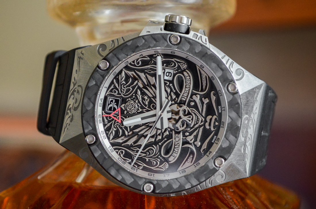
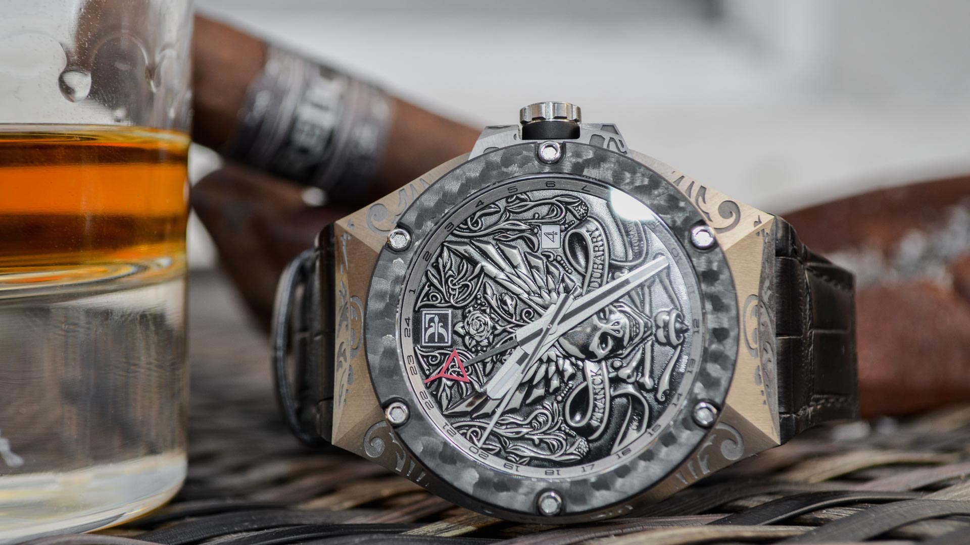
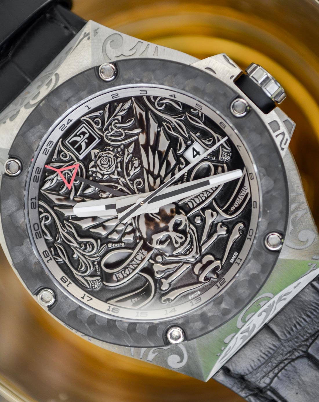
Revolution Fileteado GMT Case
Considering its 43mm size, the case is remarkably light. The lack of weight eventually grew on me, as it’s part of the identity of the watch and a major theme I feel is important to the overall case design. Just about everything from the case material, the bezel material, the buffer material (more on that in a second), and the strap material is designed to minimize the weight.
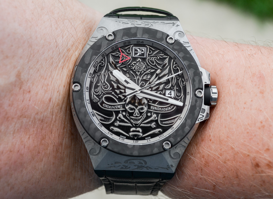
Let’s start with why this watch is so light. The case is made of brushed grade 5 titanium that’s been heavily engraved. And if that wasn’t enough, the watch features a lightweight “forged” carbon-fiber bezel that’s very difficult to capture well in photography but is very fitting for the watch. Adding to the industrial look is something the brand calls a “Soft Touch” buffer between the bezel and the case, and the crown and the case. This “Soft Touch” buffer is Neoralithe – a relatively new resin-like material that’s lightweight, and shock-absorbent and honestly just really cool looking. It reminds me of Singularity Black paint, and gives the appearance that the watch itself is dropped into the case, and not an extension of it – further adding to the almost ad-hoc industrial design of the watch.
Which brings me to what I consider the second major piece of the watch’s identity – the case engravings. I’ve handled enough to find that there’s rarely a mediocre engraved case – they’re either well done, or they are not. I’ve seen my share of the latter, but the Fileteado GMT has some seriously high-quality engraving, though I do have my qualms with it – mostly due to how the engravings interact with the case shape.
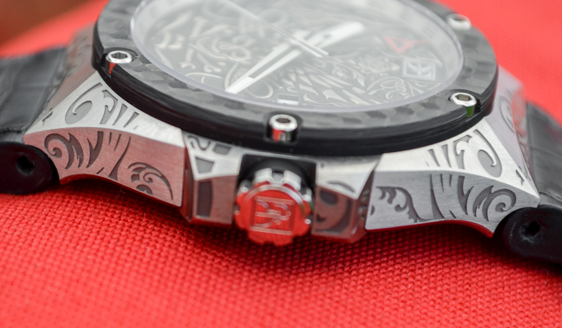
While the face itself is round, the case and lugs feature very industrial, flat, and contrasting edges and the engravings tend to “stop” at each edge. This leaves an awkward line through the engravings where they approach an edge. For instance, the flat lugs feature an edge that is aesthetically pleasing, and something I found unique (really reminded me of the Linde Werdelin cases), but the arch goes straight through the engravings – leaving this awkward gap in the design.
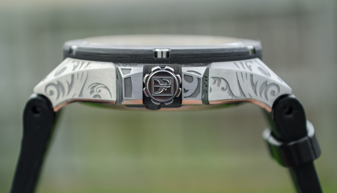
I imagine this is due to the difficulty in keeping the engravings from appearing shifted on the edges, something that many other brands offering engraved cases either build into the design itself or design around. Unfortunately, the Fileteado GMT did neither, and for me, the gaps were glaringly obvious even if they were designed to draw attention to the case shape, and impair what would otherwise be a more a visually enticing engraving.

Revolution Fileteado GMT Dial
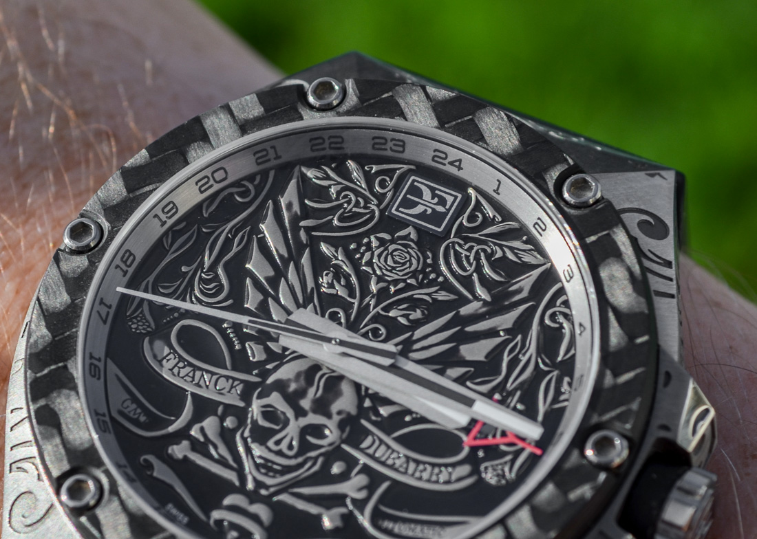
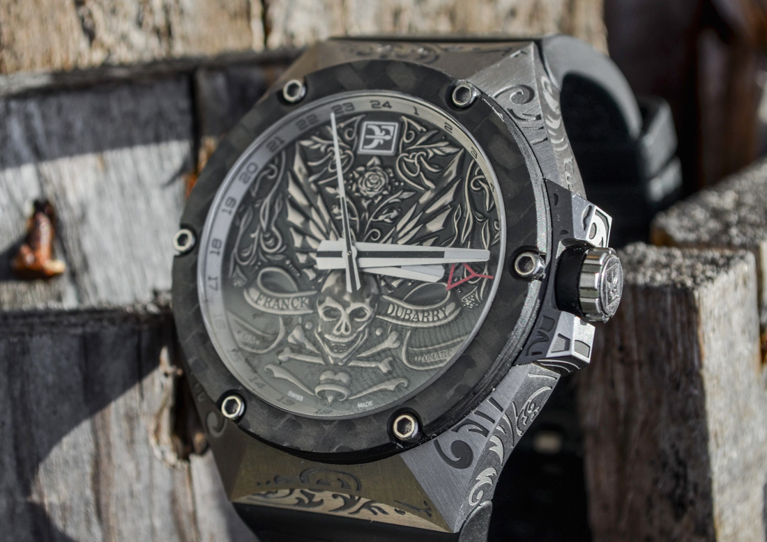
The third part of the watch’s identity and the focal point of the Fileteado GMT is most definitely the dial. Everything on the watch is designed to draw focus to the motif. It’s what first drew me to the watch, and the aspect I find most interesting. The dial is stamped silver (think of a coin) that is then heat treated to create a burned effect that looks and feels very organic – unlike many watches that use the same technique and fall victim to looking over manufactured. I couldn’t help but be reminded of an old Dia de Muertos coin fastened to the dial.
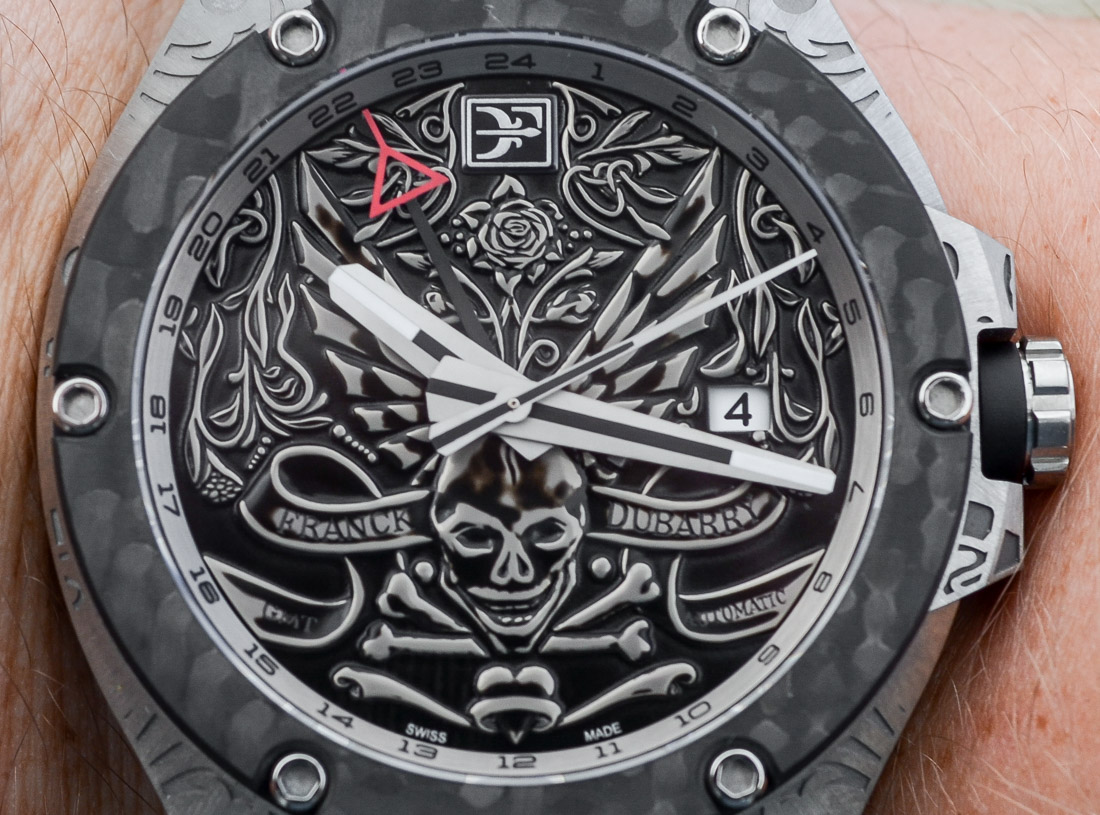
The design itself channels a bit more of the brooding side of Fileteado art with its dark, menacing, and almost intimidating design. A skull and crossbones image is featured above 6 o’clock with extended wings behind it, and a rose right under the cool Franck DuBarry logo 12 o’clock index. Filling the rest of the space is an intricate ribbon featuring “Franck DuBarry” and “GMT Automatic.” Since a staple of Fileteado art is creating the illusion of depth by using various degrees of shadowy negative space, the top half of the dial features a climbing vine and flower motif reminiscent of many prominent Fileteado artwork of the ’70s. Surprisingly to me, the 3 o’ clock date window does a great job of blending into the dial, and not distracting from the overarching theme. Overall, the actual design and implementation behind the stamped dial are superb.