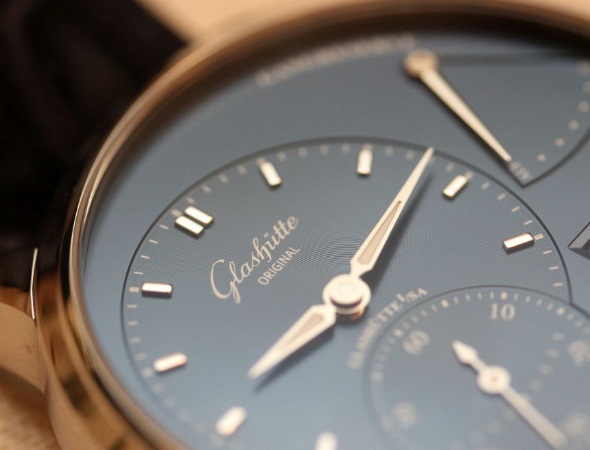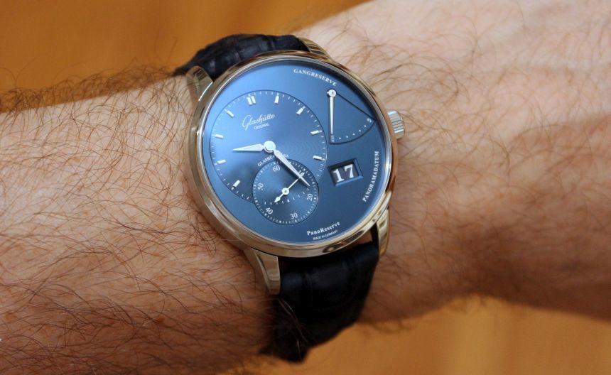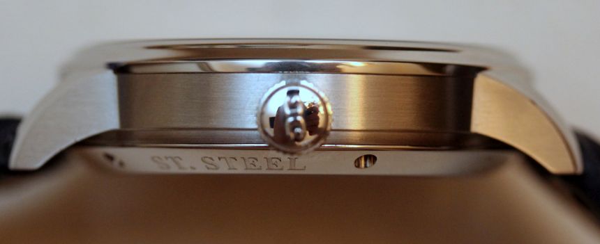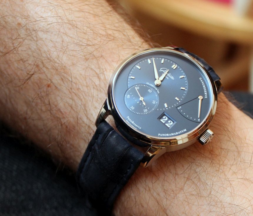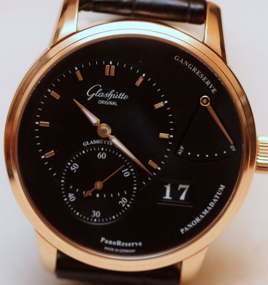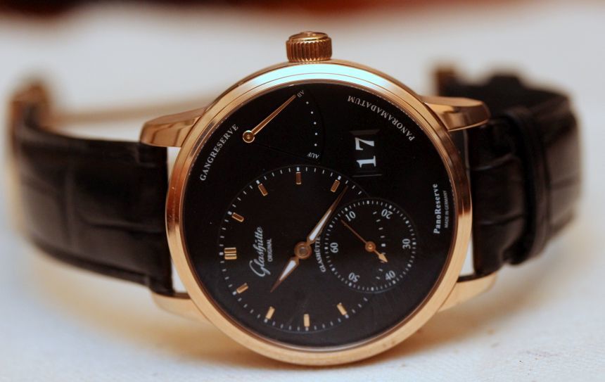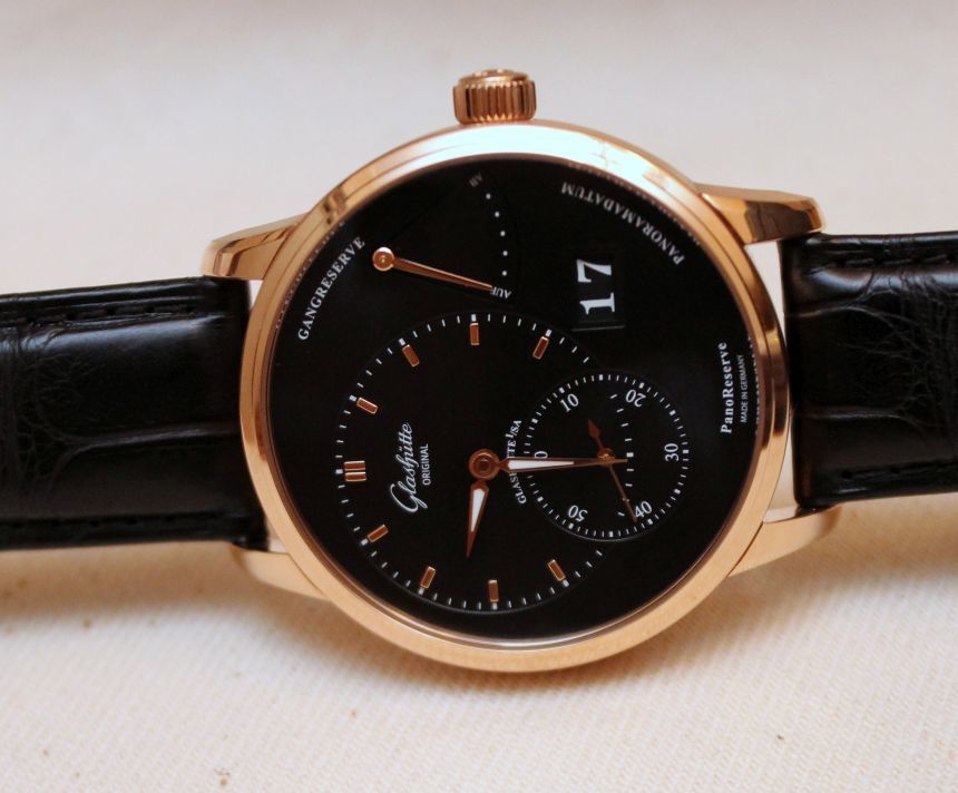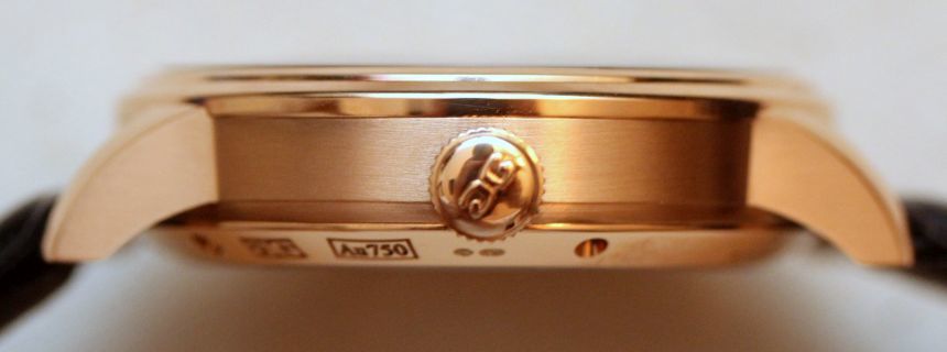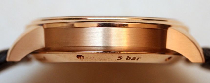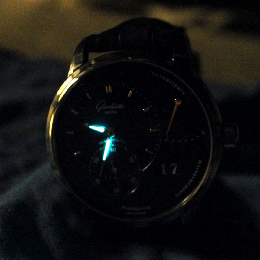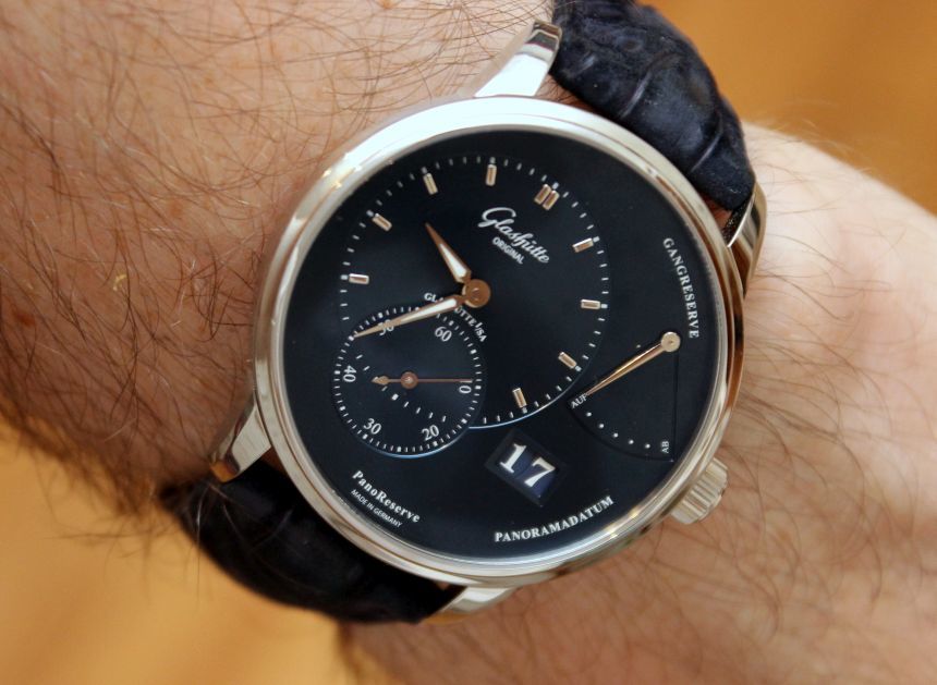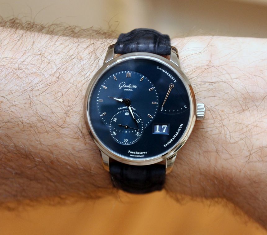
Back in February, we first brought you word of the new Pano models from Glashütte Original. As David noted in that article, he anticipated the blue-dialed versions to have the greatest impact, given the rarity of these blue dials appearing in steel cases. Recently, I had the opportunity to spend time with both versions of the Glashütte Original Panoreserve, and can tell you that, while they are both beautiful watches, the galvanic blue really does steal the show.
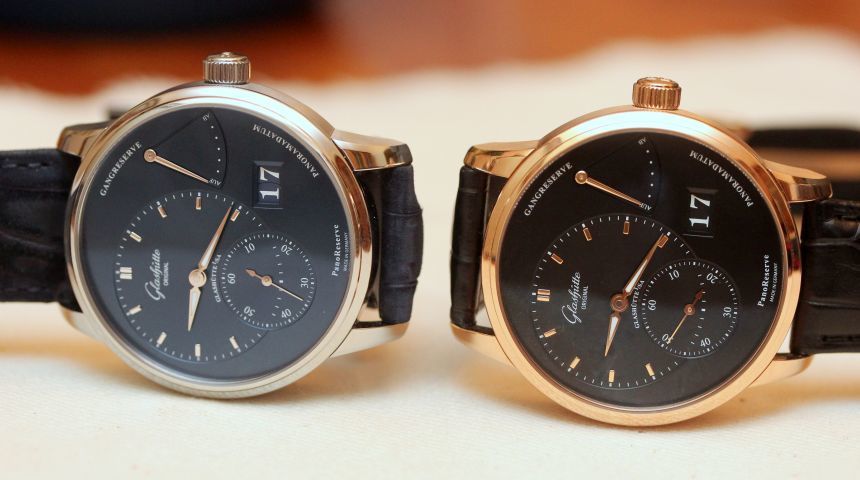
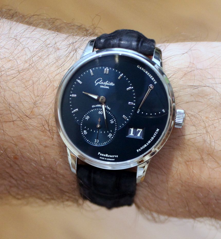
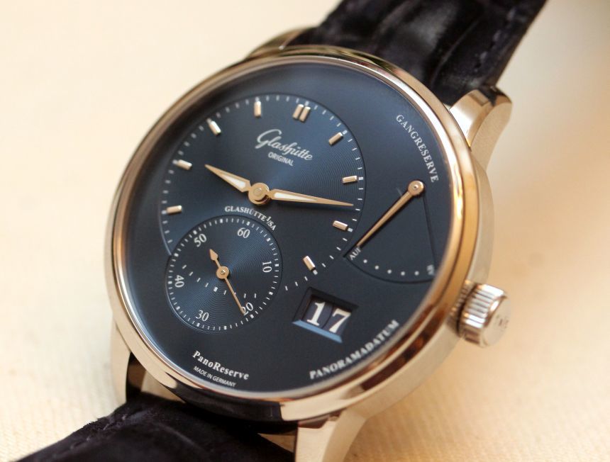
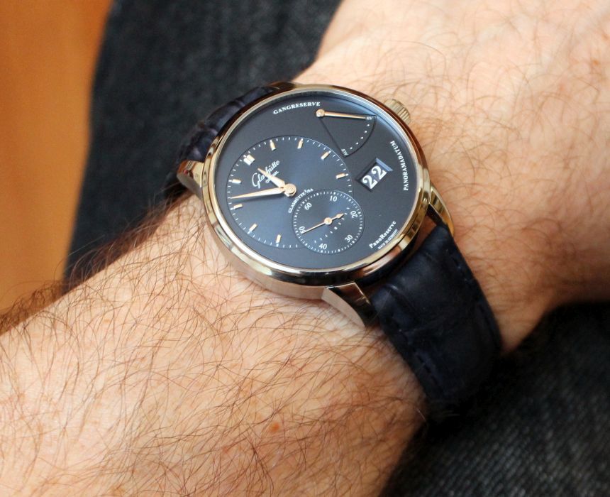
That said, it is not like either version of the Glashütte Original Panoreserve is a slouch. They each pack a lot into their 40mm cases, both in terms of functionality and styling. Let’s touch on that style for a bit. In the Pano line, Glashütte Original has established a look that means we can expect an off-center dial as we have here, which means a smaller look at the main time display. Interestingly enough, this really did not present any issue for reading the time. The hands stood out crisply against the dial (be it black or blue), assisted by the luminous paint inset on those hands. Conversely, for the sub-seconds dial being as large as it is (in relation to the main time) it was not a distraction on the watch. Sure, it was there so you could see the seconds going and ensure the watch was running without holding it to your ear, but it did not dominate the dial. Instead, it did its job quietly and efficiently.
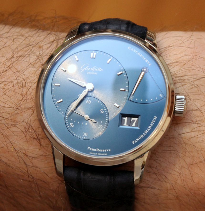
Next to that sub-seconds dial is where the Pano part of the Glashütte Original Panoreserve comes into play – the date display. I have had time with this date display on other Glashütte Original models, and it has quickly become one of my favorite implementations of a large date display. The numbers are bold and crisp, and the gap between the two digits is all but negligible. Yes, it is there as a fine line, and you can see it up close. When you are wearing the watch and actually using it? You do not even notice it, the date presents as a single block.
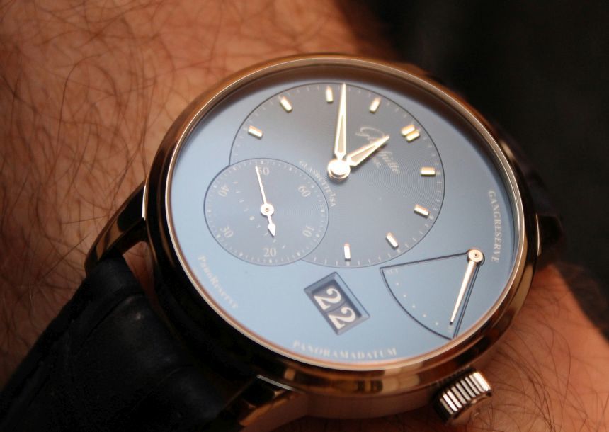
That leaves us with one other aspect of the dial on the Glashütte Original Panoreserve to talk about – the power reserve. Again, given the relative size, you might be tempted to think that it would dominate things a bit, but I did not find that to be the case as I wore the watch. As with the sub-seconds dial, it simply did its job, letting you know how much of the 42-hour power reserve remained in the 65-01 calibre movement.
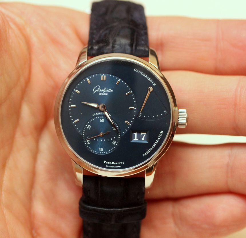
Taking a step back and viewing the dial as a whole, it really surprised me that I liked the Glashütte Original Panoreserve as much as I did. I tend to favor symmetry a great deal in a watch, and this one is anything but. But while things are off-kilter a bit, it is not done in a chaotic manner that we may sometimes see from a brand trying a form that is non-traditional. No, here, things are cleanly and logically laid out (credit the German roots of the brand for that), and I think that is what ultimately made the dial work well for me.
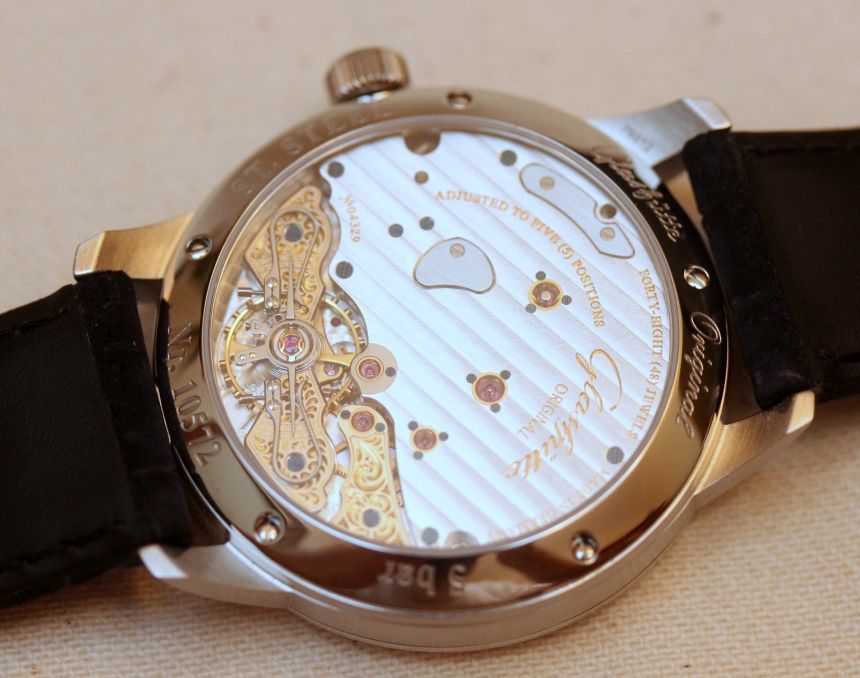
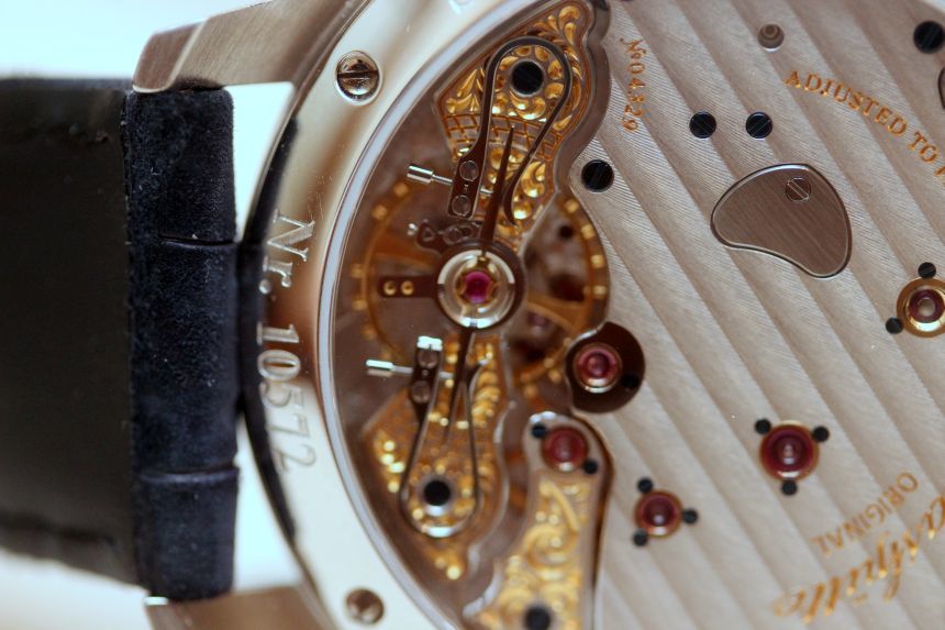
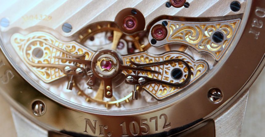
Of course, a watch is not only a dial. Flip the watch over, and you are greeted with a very open view of the aforementioned 65-01 movement. While the large (and nicely finished) 3/4 plate does dominate what you see, the lower portion does give you a sort of cherry on top, so to speak. While there is certainly a utilitarianism to most of the movement, when it comes to the exposed balance wheel and adjusters, some artistry is allowed to shine out. In some ways, this is an appropriate place to focus the extra finishing, as it is the most kinetic part of the movement. Sure, we may “ooh” and “ahh” over a full hand-engraved and exposed movement, but we rarely see the whole thing. Here, we end up with a very solid implementation with some extra visual kick on it for when we flip the watch over.
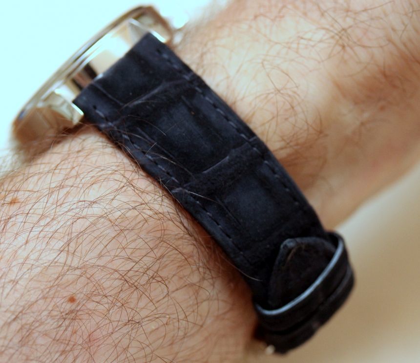
Rounding out the full package is one of the more interesting straps I have had the pleasure of experiencing. While the red gold version of the Glashütte Original Panoreserve features a regular alligator strap, the galvanic blue dial is paired to a nubuck Alligator strap, also in blue. I seem to have been drawn to some of the more exotic leather straps of late, and I have been intrigued by these softer treatments, be they suede or nubuck. Here, it made for a rather delightful feel, and given its dark matte finish, it, well, just looked different than any strap I have had on the wrist, short of some tweed ones I played with last year. While I do not generally call out stock straps for their desirability, this one definitely makes the cut. As with other Glashütte Original models I have reviewed, the strap is installed the reverse of how you would expect. With the deployant clasp, it’s not as much of a concern, as you just need to adjust your muscle memory to release it in the opposite direction.
While I spent time with both variants of the Glashütte Original Panoreserve, the galvanic blue dial with the blue nubuck strap was by far my personal favorite. Aside from blue being my favorite color, it really is a well-done combination of muted blues that works well together, something we do not see all that frequently, especially in a steel case. On the other hand, if you want something that really gives the feel of a luxury dress watch (in the classic sense), then the red gold with it’s black dial is a great way to go. For me, though, it’s blue through and through, as I found it worked well at the office, on the weekend, or paired up with a suit. This latest iteration of the Pano lineup gives a lot of great functionality in a cleanly-executed asymmetrical package. You can pick up the red gold Glashütte Original Panoreserve for a price of $23,900, or the steel case with the blue dial and strap for $11,500 (bring along another $1,300 if you want a stainless steel bracelet). glashuette-original.com
Necessary Data
>Brand: Glashütte Original
>Model: Panoreserve
>Price: $11,500 – $23,900
>Would reviewer personally wear it: The blue one, without hesitation.
>Friend we’d recommend it to first: Someone like myself, in terms of preferences and mindset. Like order and logic, but want something a bit different from the norm? This is a solid option.
>Worst characteristic of watch: That one has not called my watch box it’s permanent home.
>Best characteristic of watch: Functionality aside, it is how the use of blue was executed in the watch and offset against the steel and white gold elements.

