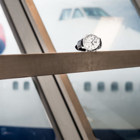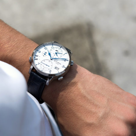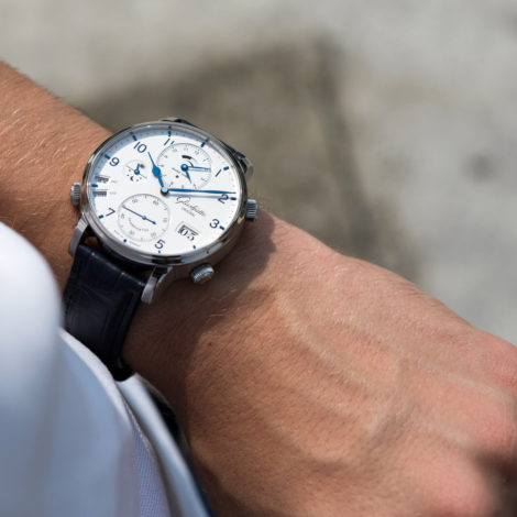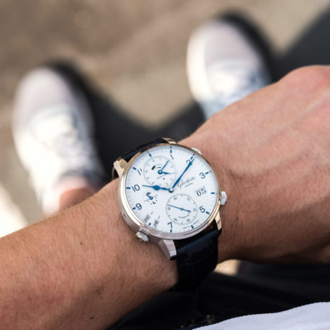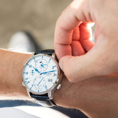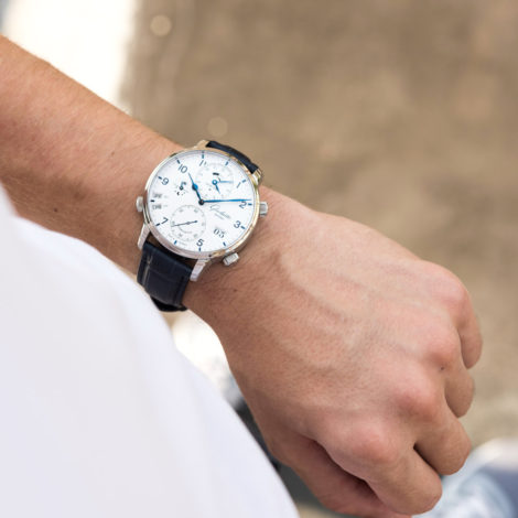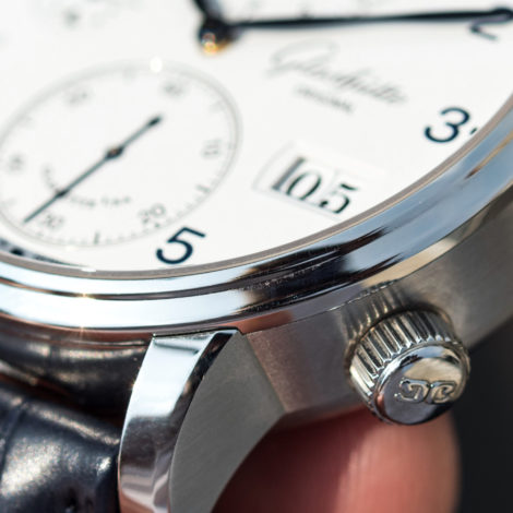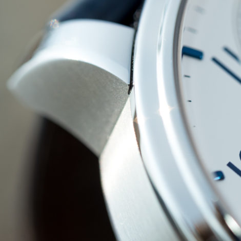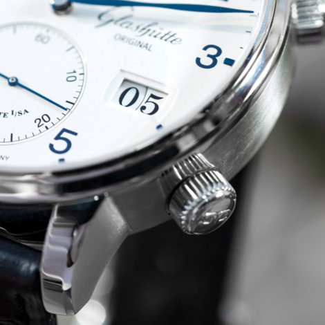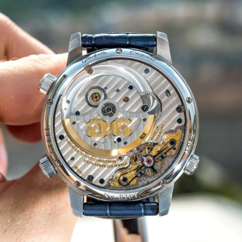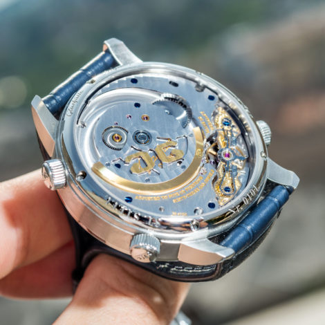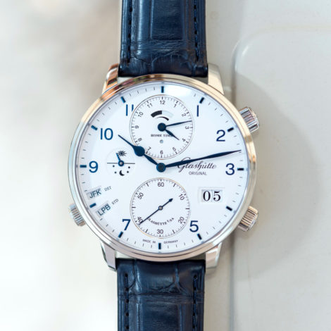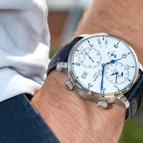
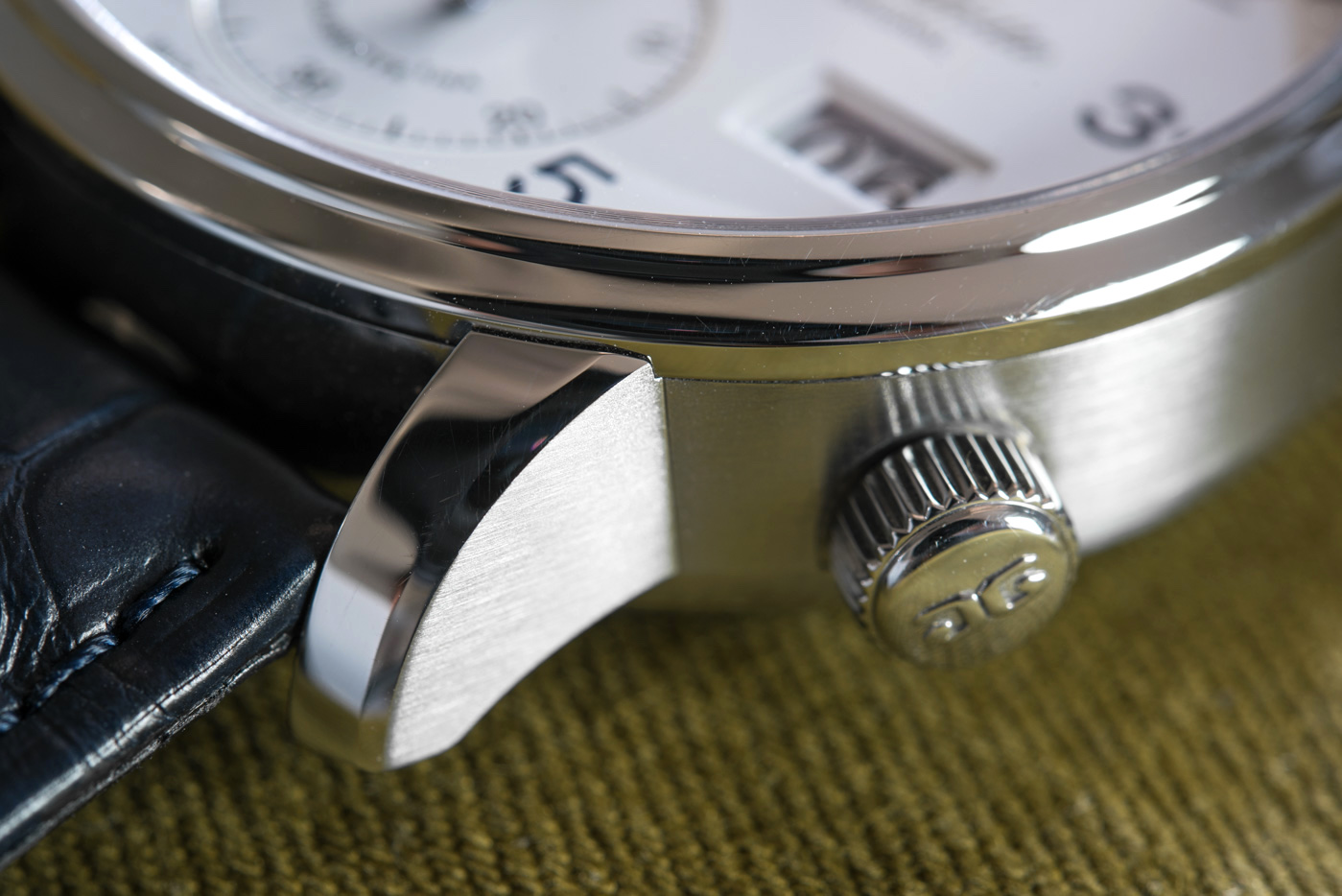
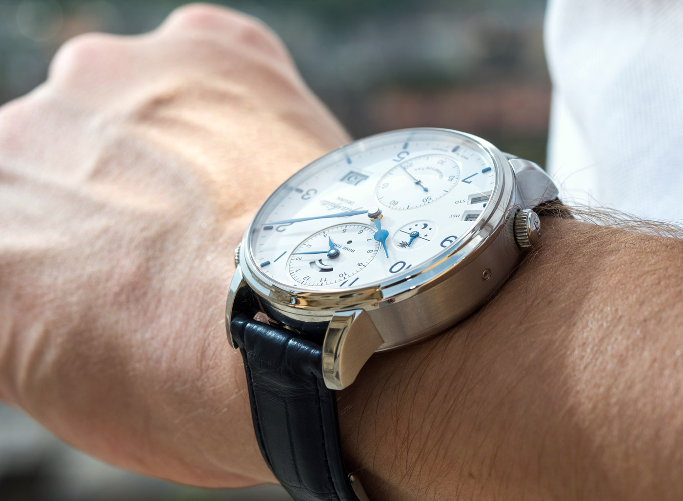
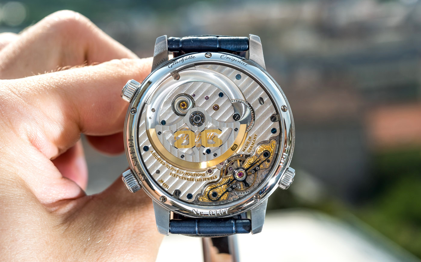
To stop paraphrasing and give you some specifics, I’ll praise the build quality and robust feel of this 44mm steel case we are looking at with this Senator Cosmopolite. It looks and feels rock solid, but not to the detriment of refinement. My second favorite detail is in the quality of the surface treatments on the case side – a brushed surface with the sort of subtlety and refinement few can or care to achieve these days (it’s either too harshly applied or is a mish-mash of weakly defined “finishing” a lot of the time) – as well as on the highly polished bezel and lugs. The top of the lugs I especially like, with that most subtle beveled edge that comes off at a barely noticeable angle, flows all the way down to the tip of the lug and has a very deep, refined, powerful sheen to it all along. The polished surfaces have appreciable depth to them, but that is only possible if you use superb base materials and go the extra mile to treat them without cutting corners. By contrast, I am not a fan of the crowns and their not very nicely defined flutes.

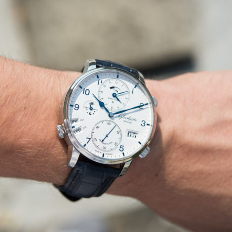
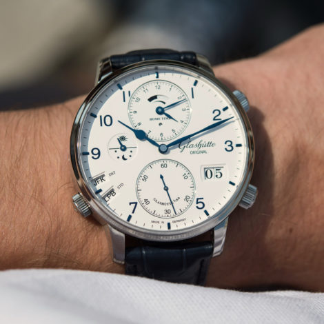
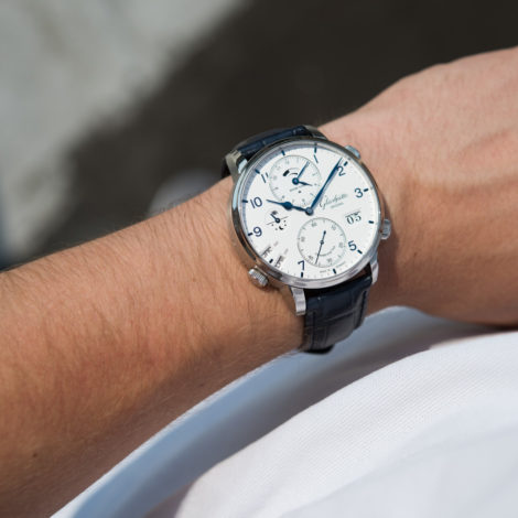
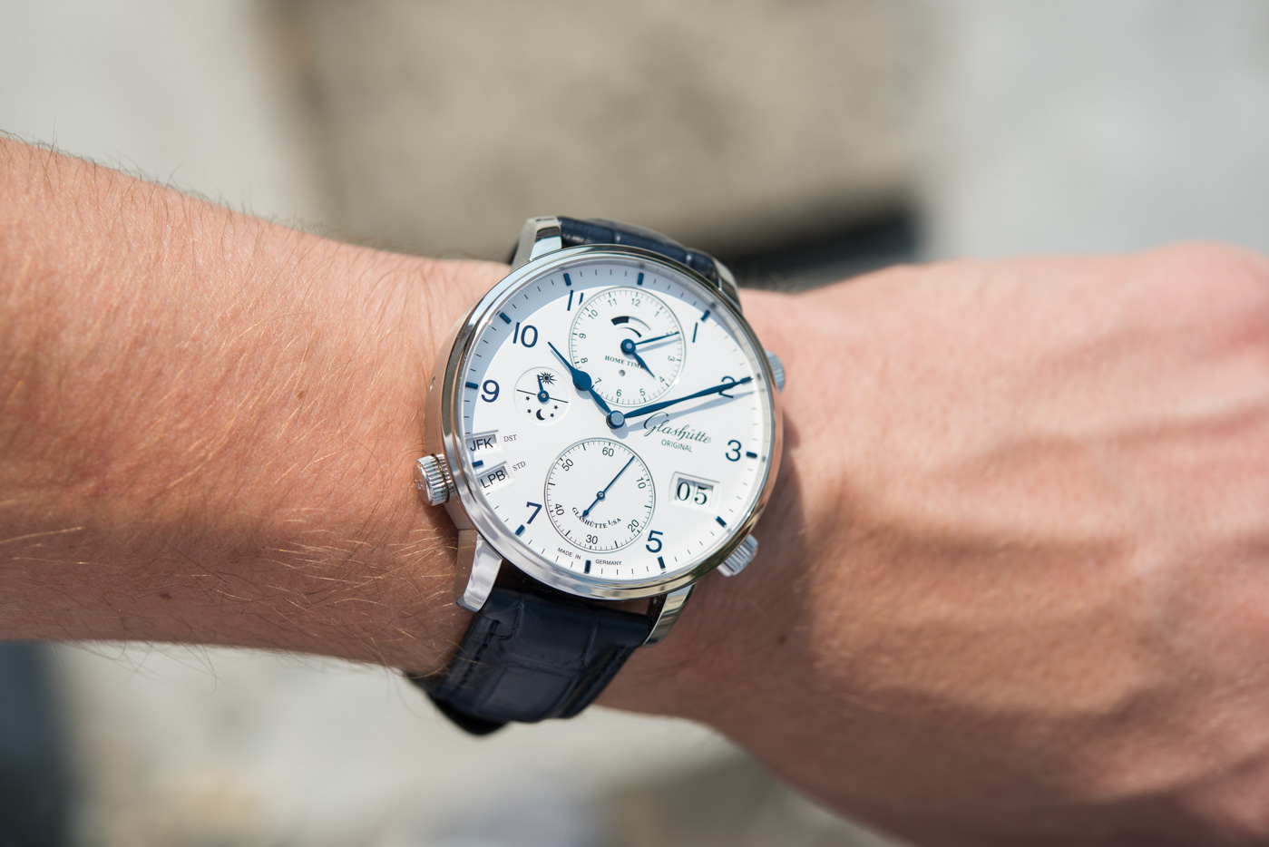
The dial sure isn’t shabby either, but follows with the same approach I described above: details are small in size and in quantity too. There is no guillochage or any other distinct surface treatment inside or out of the sub-dials. The entire dial sports a very mildly textured surface, resembling some special type of fiber-based paper or papyrus. As I say, it is indeed very subtle and the difference it makes for the human eye is more in the way it eliminates nasty, blinding reflections (as seen on lacquered dials), than in it being appreciable in its very texture by the naked eye.

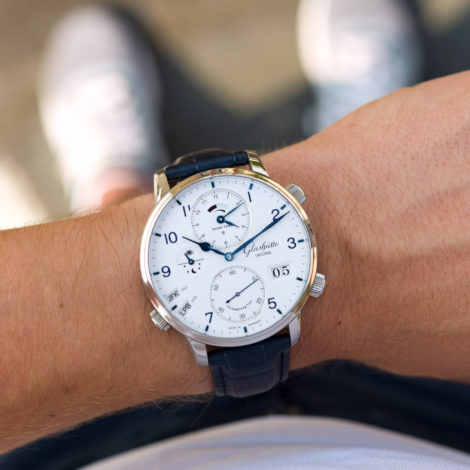
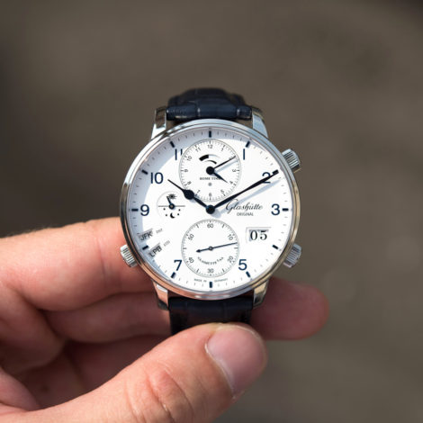
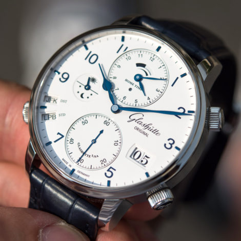
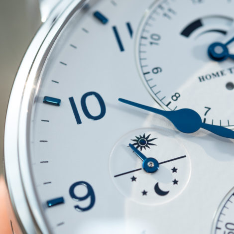
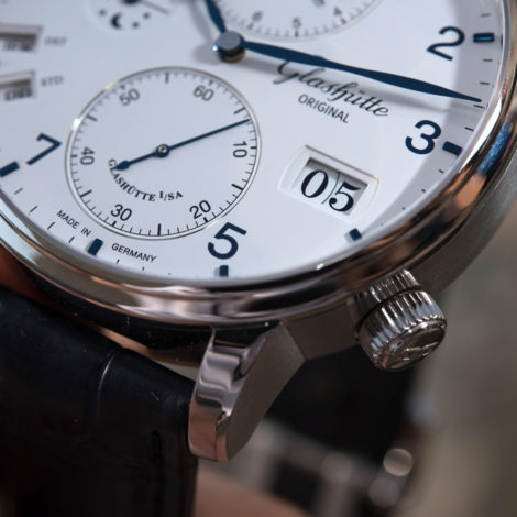
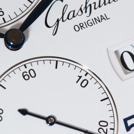
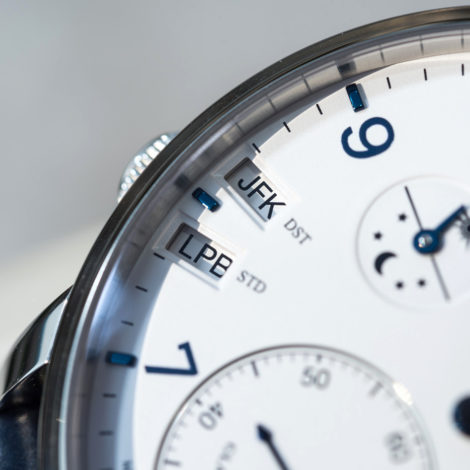
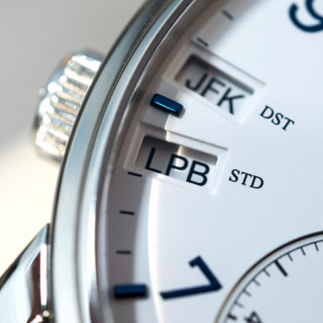
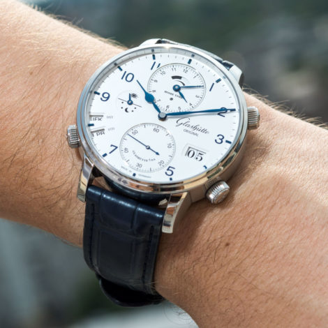
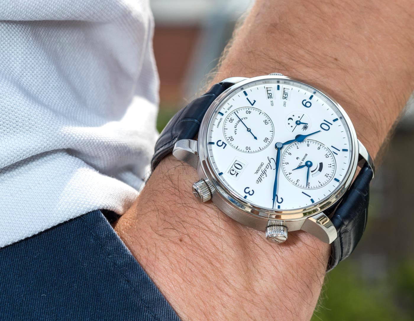
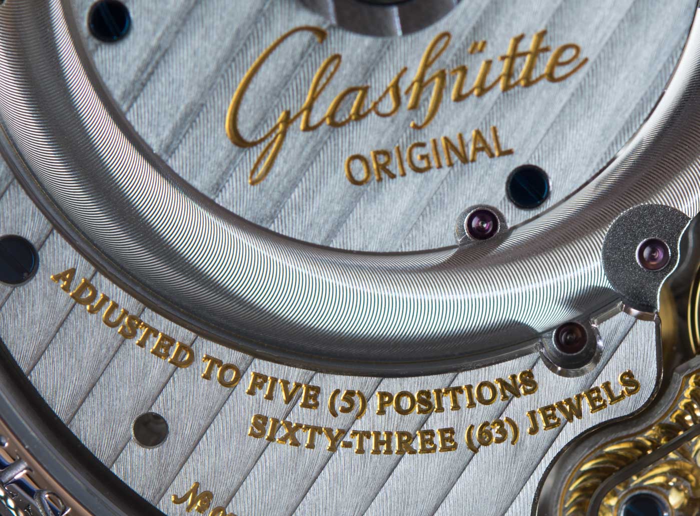
There is plenty of play with spaces and planes though: basically every indication or print, with the exception of the exceptionally flat Glashütte Original logo is either stepped down below, or is raised from the plane of the dial itself. The three large apertures, the two IATA code windows and the PanoramaDatum window all have stepped frames and it is only the much smaller power reserve and home time AM/PM indicators that have direct-cut edges.
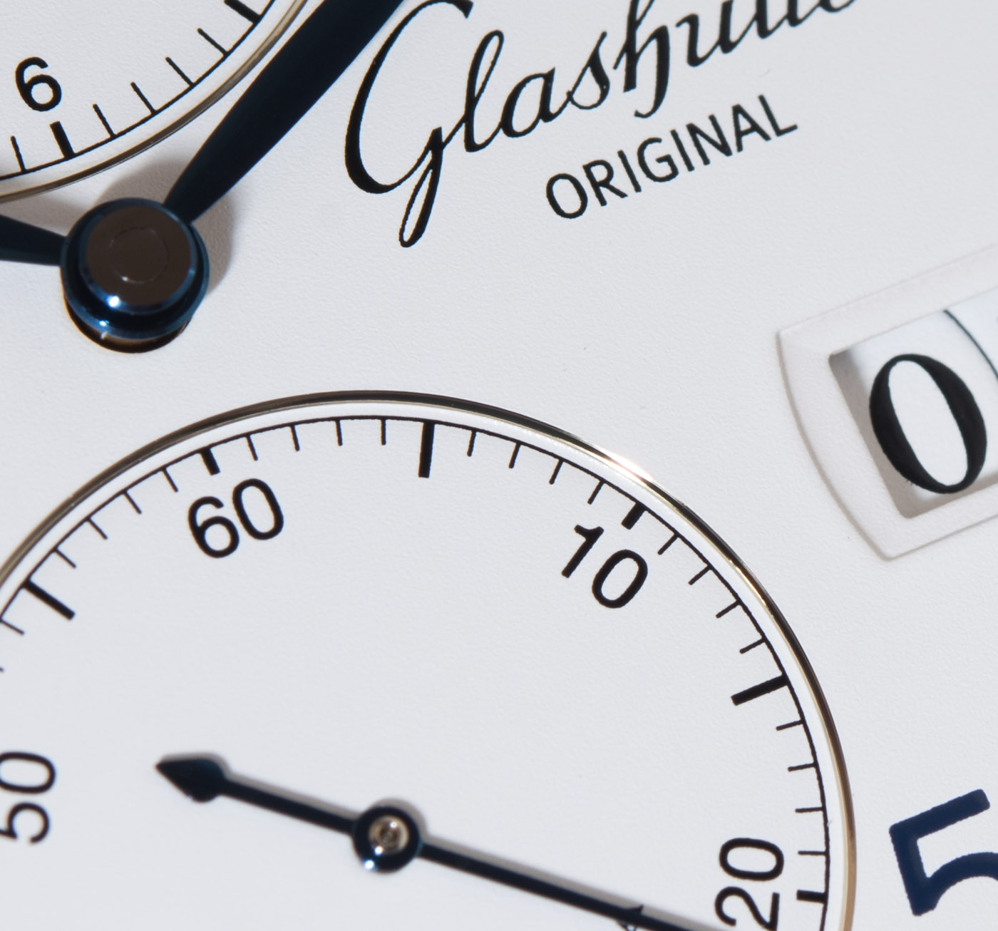
An exceptionally neat detail is the narrow ribbon of gold surrounding the 12 and 6 o’clock sub-dials, indicating home time and the running seconds, respectively. When the watch is on the wrist, these veneers are more often than not hardly noticeable. They might make for a neat, passing reflection as the watch moves and the sun hits this strip of gold momentarily. Under close scrutiny with the naked eye – or a macro lens – these do however stand out. They introduce a small step down from the plane of the dial and are yet so neatly installed, I actually am not even sure how these are applied onto the dial. It’s way less than a millimeter in thickness, so this may just be some film applied to the edge of the dial there; or it may be an actual ring that’s installed by hand. I don’t know and don’t even want to spoil this little detail by asking.

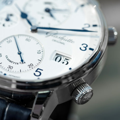
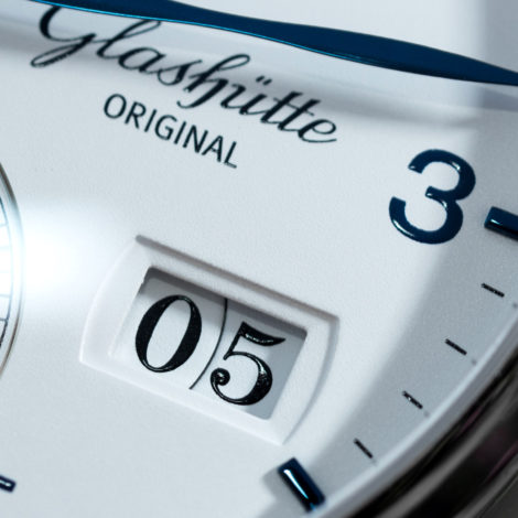
When you do see a dial that’s done right, even if it’s as simplistic in design as the one on the Senator Cosmopolite, you’ll have no doubt about its origins. The way the paint is applied is, I’ll dare say it, old-school. The thick paint and the way it gathers in the lower and upper ends of the “0” in the “05” indication of the date above… Or how the minute markers between the applied 5-minute markers on the periphery create tiny, borderline microscopic, and yet consistently thick batons… The crisp edges and the three-dimensionality on the prints of the larger numerals and texts…

…It’s the sort of thing that implies some (or most certainly more than one) dial makers or print experts have gone beyond the stage where others have settled. They sought a way that went beyond the “Is the desired text present? Yes? Oh, job done then.” and rather wanted to create something with their own style, a most subtle hint at their quest for quality. It’s maybe because I spent a few hours too much editing the images for this review, but I just can’t seem to get over the quality of the print on that PanoramaDatum.
You see? When I referred to a Germanic approach to fine detailing in an otherwise plain and functional design, this is exactly what I meant – the thin ribbon around the sub-dials and the way the ink is applied three-dimensionally on the date disc and elsewhere.
Is Glashütte Original asking a bit too much of its prospective buyers? A little bit, yes, I think they are. The Swiss are excellent at dressing up a watch face with superfluous and absolutely needless exercises in excess: 5 or more different types of guilloche patterns, 7 lines of superlatives spelled out in fonts of varying types and colors, hands in 18ct gold, front crystals, indices, lugs of the weirdest shapes and so on. Glashütte Original, although not without its own exceptions, is absent of such practices – or rather more restrained at least, I should say. But when you have to dig down to a level of <1mm thick gold veneers and <0.5mm thick deviations in ink deposits, that means that although immense work and expertise has gone into a watch face, it is rather more difficult to blow the mind of the one-time Duty Free shop customer, who wants to reward himself for his endless struggles on Business Class and in Senator Lounges. The words “Instant gratification” and “Glashütte Original” have never been together in the same sentence before – until now! Whether that’s a good or a bad thing is down to everyone’s dynamism and development as a watch enthusiast.
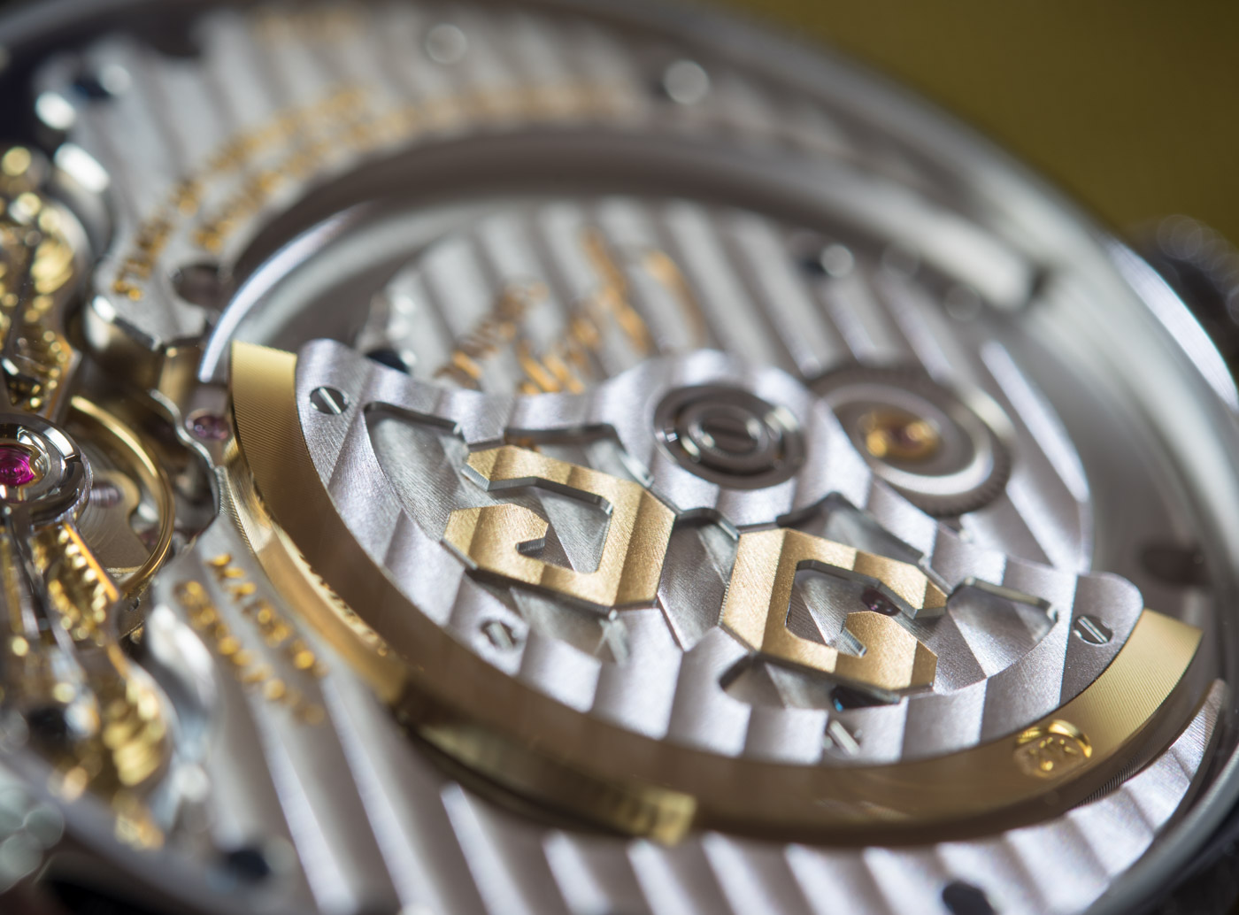
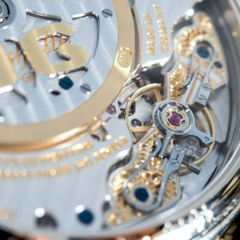
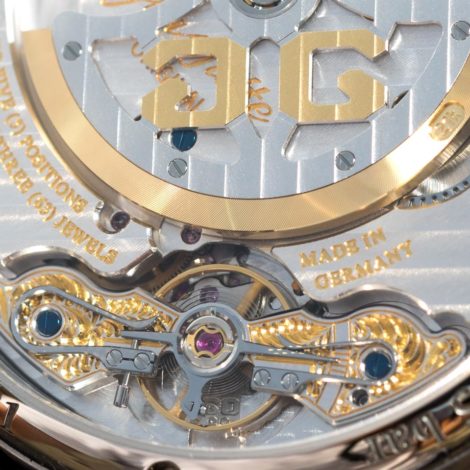
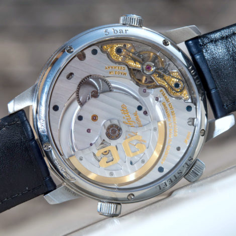
Things take a very different direction on the caseback side. Everything is just as lavishly decorated, but with a lot more obvious muscle flexing going on. It’s as though all the calculated restraint was offset by the caseback side. Lots of gold, hand engraved this and that, iridescent “stripe finish,” bevelled edges, and a whole lot more. Even the inertia weight on the edge of the micro-rotor is stamped with the official “21k” marking for gold – because that’s what it is, of course.
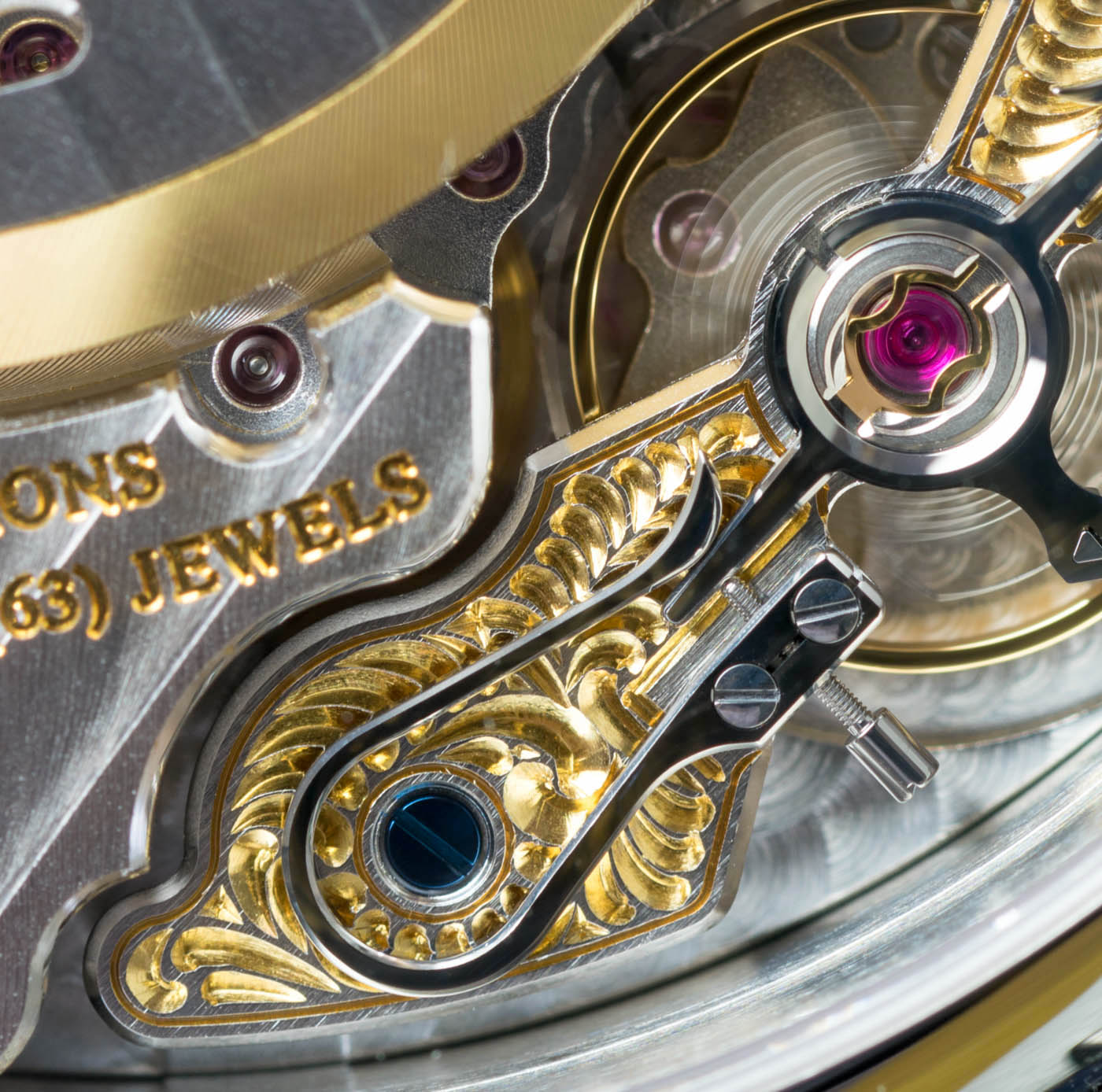
In the Glashütte Original manufacture I had the, ehm, pleasure of trying mirror black polishing on one of these swan neck regulators – there are two of these on more special Glashütte Original watches, one on each end of the bridge that secures the balance. On the picture above it looks dirty and it took a while for me to figure out why: the black mirror polishing on the top of this steel part reflects how its surrounding reflected on the inside of the sapphire caseback – you follow? It’s a picture taken with a powerful flash and a similar effect is created by watches (namely Rolex) with a non-AR-coated sapphire crystal and a black lacquer dial. The hands and other stuff have 2-3 reflections as their reflections bounced back and forth between the glossy inside of the non-anti-reflection-coated crystal and the glossy dial. The edges are bevelled and polished too, just for good measure.
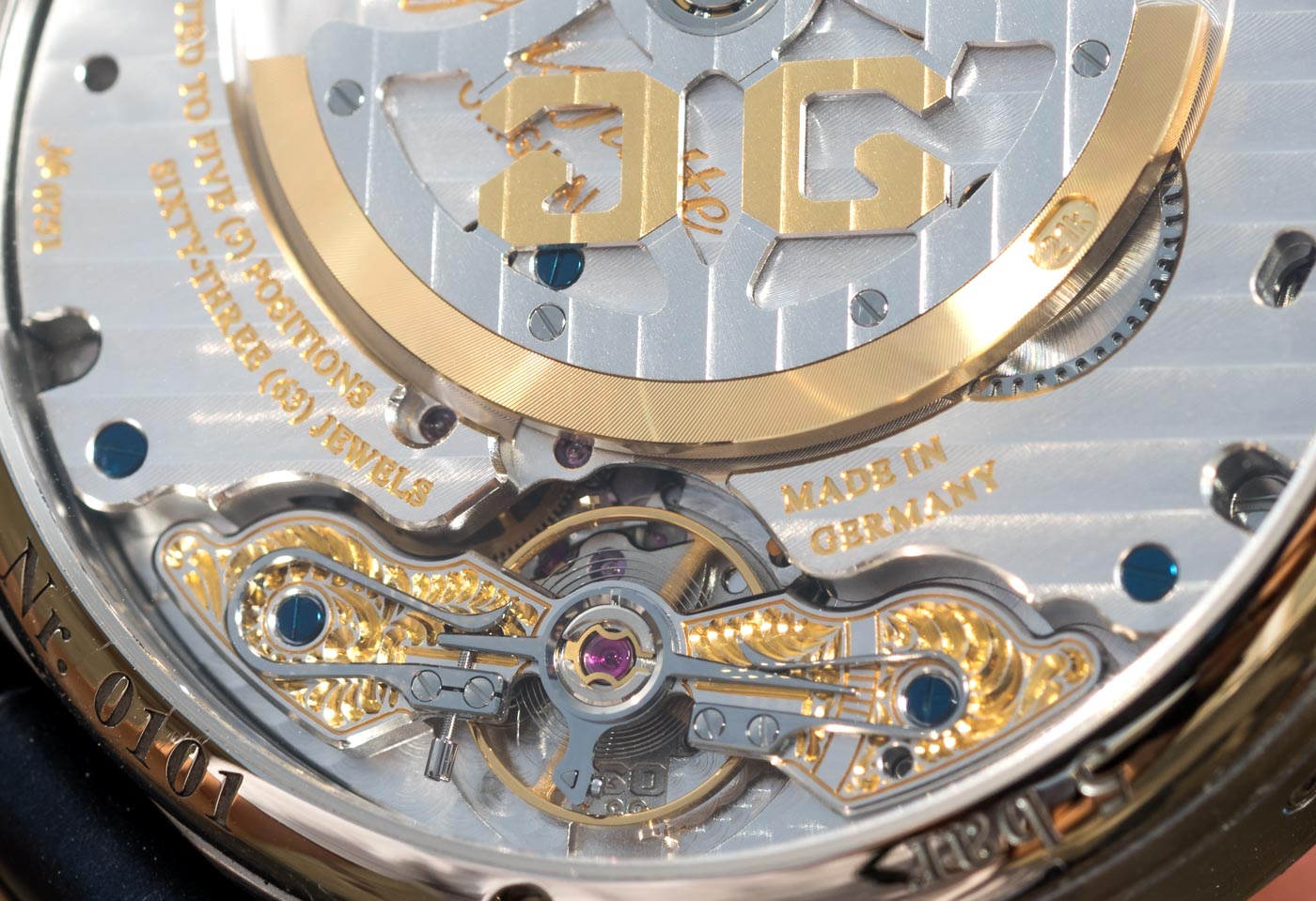
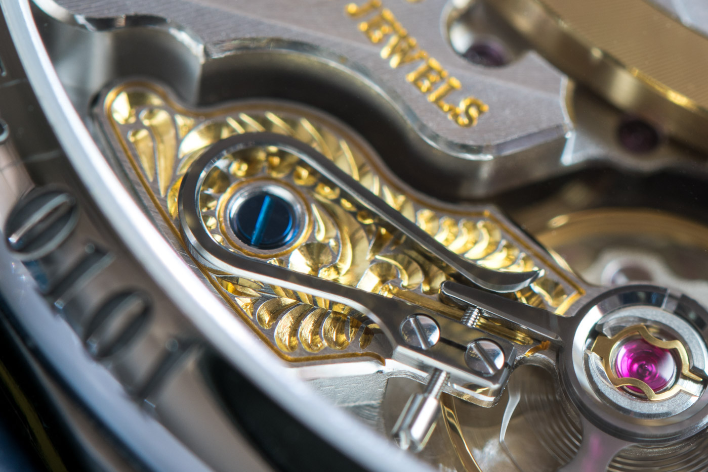
This balance bridge is, by the way, hand engraved by one of the few hand engravers who work at the Glashütte Original manufacture. They told me that between themselves they can tell which balance bridge was done by whom, as they all have different styles. Where luxury watches of this caliber these days are still assembled by hand – and that’s a lot of very hard and very impressive work – I think this sort of added custom, one by one work adds tremendous value and specialty to any timepiece. It’s large, it’s easy to see and appreciate, and it looks like a million bucks. This hand engraving is one very powerful and meaningful element of high-end Glashütte Original watches. Well done, you.

Things change quickly depending on the type of light and the proximity of the scrutiny that’s performed on the movement. The striped finish is indeed very subtle – not by any stretch of the imagination on par with infinitely refined haute horlogerie executions that some independents can achieve (for many times this price, mind you). The texts are crisp and sharp and beautifully done, not to mention such details like the screws that are heat blued, one by one – I’ve tried this one too, and the only thing more difficult than handling and blueing these screws was not burning my hand with the metal bar used for this purpose that was hot as hell.
The main point here is in linking back to the issue of “in-flight entertainment.” When I took this watch off in the gazillionth hour of my travels, it had managed to wow me – and wow me again and again over the course of the month or so that I’ve had it around. From the layout of the visible jewels, the shape of the large three-quarters plate, and how it still manages to hint at the many things it holds secure, the hand-engraved, “looks like a million bucks” balance bridge, the four moment of inertia adjustment screws, the inexplicable treatment on the bit that secures the jewel of the fourth wheel (to the far right, in center height, on the image above), the subtle curves of the plates and bridge, the different fonts and their gold fillings… There’s so much to look at and appreciate. And, unlike so many calendar and/or timezone watches out there, this one offers plenty to look at – it’s not a dead or boring looking movement, but the very contrary.
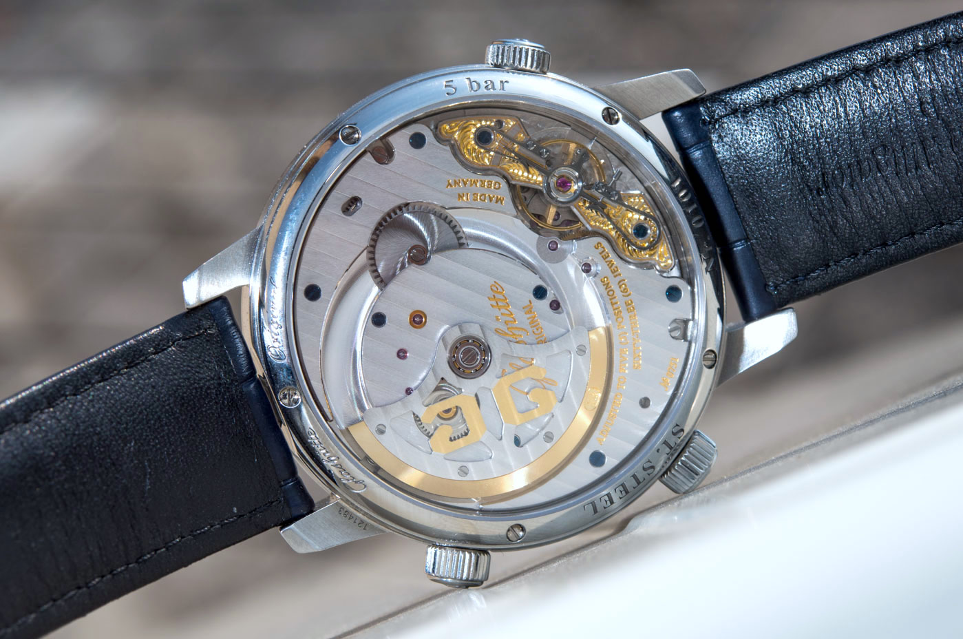
It shifts its highlights as the light varies, its layout and execution is special enough to render it exciting and curious even after thousands of watch movements that I have seen. And the contrast between the lavish movement and the stern dial is all the more entertaining – but only if you can put yourself in place of the designers and engineers. I wonder, did this come as totally normal and natural to the various teams at Glashütte Original, or did they have heated debates about keeping the front so restrained and the back so busy, at least relatively speaking? It’s not about ever learning all the answers to all the questions – though that’s fun too – but having something literally on hand that one can look at and brainstorm about wildly different, albeit no less subtle approaches to product design.
After all is said and done, the Glashütte Original Senator Cosmopolite is a niche product that few will appreciate and yet fewer will actually purchase. But the fact that GO could fill it literally to the brim with its own character and engineering solutions sends a meaningful message. Whether you look at it as an impressive halo-exercise or as a genuinely useful, versatile travel companion is down to you entirely, so here’s what I think the Glashütte Original Senator Cosmopolite is.
It is a very, very hard, self-assigned horological homework done to a tee and bathed in as much jewelry and fancy detailing as the great sensibility and calculated approach required to perform said homework would allow. It’s a highly functional, yet intimidatingly complicated watch, designed for the sort of man who not only understands the difference between 24 and 35 time zones, but revels in, and lives by that difference. Sounds obnoxious? Then it’s clearly not for you. Sounds familiar? Then this is the tool you’ll wish you’ve always had. Like most tools, however, it’ll be cherished by the pro it was designed for – and will likely leave most others totally indifferent.
Price for the Glashütte Original Senator Cosmopolite in steel is €21,000. glashuette-original.com
Necessary Data
>Brand: Glashütte Original
>Model: Senator Cosmopolite 1-89-02-03-02-01
>Price: €21,000
>Size: 44.00mm wide, 14.00mm thick.
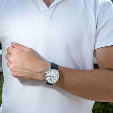
>When reviewer would personally wear it: When traveling, duh! And if a watch fairs well for travel, then daily wear will be a walk in the park for it.
>Friend we’d recommend it to first: Business man who travels a lot. And/or loves German engineering and “prosumer” products.
>Best characteristic of watch: Does what it set out to do and does it better than basically any other watch out there. Unique design and engineering. Exceptionally well made, down to the smallest detail.
>Worst characteristic of watch: I’d say size, but it actually was comfortable to wear. GO’s stiff straps need to be replaced for good, though. Hefty price that is to be settled for this level of refinement and tech.