We all have brands that hold a special place in our hearts, even if they aren’t well recognized, or wildly popular. In fact, I’ve met many enthusiasts who prefer the value of a brand that doesn’t produce something that everyone has. This is especially true in the sub-$5,000 category for collectors or aficionados who have followed the industry for a while that may be bored or un-enthused by what’s constantly being prominently displayed by every influencer or run-of-the-mill rich guy on their Instagram feed. For me, that brand has been Maurice Lacroix. At Baselworld 2018, they unveiled a re-vamped line of their Aikon Collection (aBlogtoWatch Hands-On article here) – now featuring mechanical movements. This month I had a chance to give the Maurice Lacroix Aikon Chronograph Automatic a shot, and I was notdisappointed.
For the sake of transparency, I am a little biased toward the Aikon Collection. A number of years ago, I went on a steel sports watch bender, and spent a ton of time researching and comparing different watches that were within my budget. I couldn’t afford the usual Royal Oak, Nautilus, or Overseas echelon, but wanted something that felt similar – to me at least – both visually, and in fit and finish. Enter the Maurice Lacroix Aikon Gents. It fit the bill perfectly, and I pulled the trigger. It quickly became my most worn watch and ended up being my daily beater.

At the time of purchase, the watches only came with quartz movements. So, the switch to automatic movements was a large part of the draw to the new collection. I would argue that it was long overdue but understand that Maurice Lacroix was trying to fill an affordable gap in their collections – and in that regard, I feel they succeeded. Many forum-dwellers felt it cheapened the brand, but I feel it provided an attainable model to show off Maurice Lacroix’s penchant for detailed finishing and quality design execution without the extra cost of what was inside it.
Case
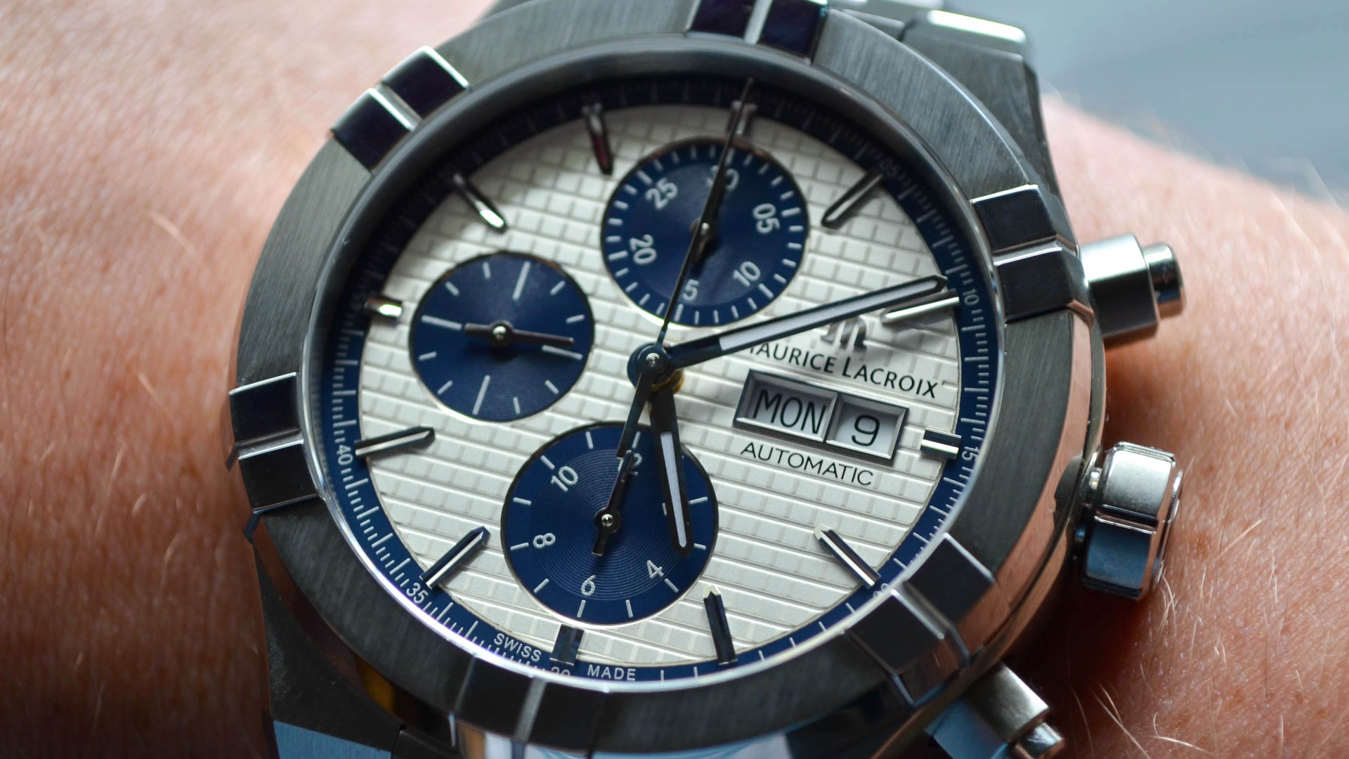
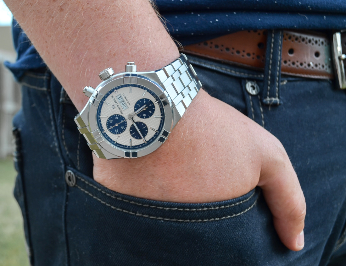
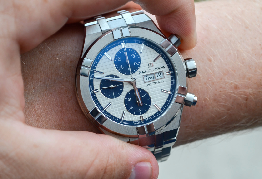
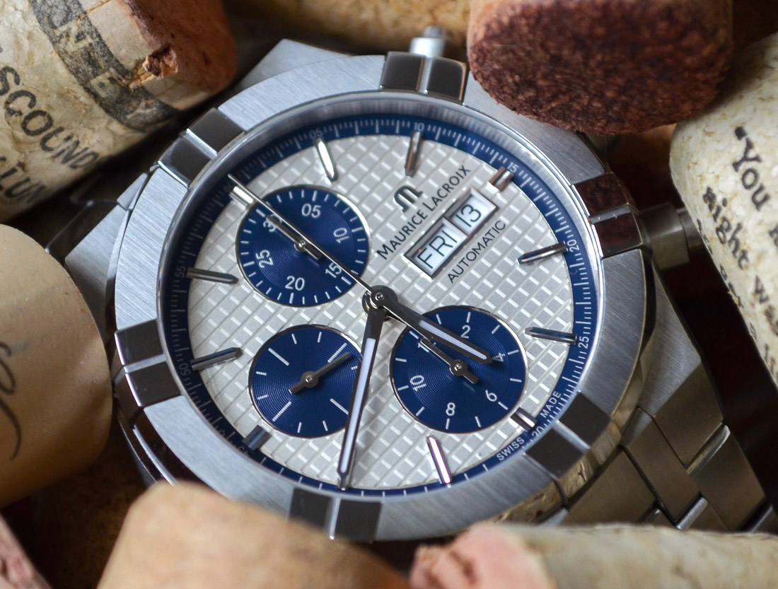
Let’s get started with the case. Not going to sugar coat it, this is a big boy compared to previous models – but not as big as it could have been. Measuring in at 44mm wide and 15mm thick, the stainless steel case definitely has some wrist presence, and doesn’t exactly slide under a cuff – though that’s par for the course with most 7750-based watches. We will talk about the depth of the dial in a minute, but the height of the flat sapphire crystal and raised bezel “claws” made the watch tall and certainly noticeable. One thing I appreciated most about this versus its previous iterations, is that the 6-clawed bezel isn’t nearly as protruding or rounded. The sharp almost-flush nature meant they weren’t getting caught on threads or edges (especially denim pockets) and presented a bit more of a modern-sporty look that really manifests itself through the entire watch.
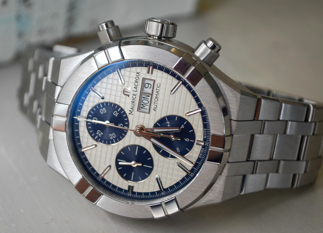
The oversized screw down pushers make the watch wear a little bigger. Though, to be completely honest, I thought the pushers would bother me a lot more than they did. I got used to them being there and didn’t feel like they were uncomfortable or in the way. Unscrewing wasn’t as much of an issue as screwing the pushers back down. It may have been a fluke, or that I wear watches on my right hand, but they never seemed to catch right, and I could never tell if they were fully screwed down without taking the watch off to confirm. I don’t know how many people will actually use the chronograph, but I felt it was worth mentioning – especially if you’re a member of the left-handed crowd.

The sharp tapered angles of the case and integrated lugs provided a comfortable fit and offset the weight a little, and I wasn’t struggling to keep it on top of my wrist. The watch was heavy, and I certainly can’t say “I forgot it was there” as I was very conscious of the nearest door-frame, and was intentional about where my wrist was when moving around. The brushed texture of the case made it a bit of a scratch magnet, and a desk-dweller like myself ended up finding a few scratches that I wasn’t previously aware of. But overall, the case was a superb example of “well done” and fit better than I would have expected from a watch that I would typically consider too big and too heavy for my taste.
Dial
Moving on to the dial and my second favorite part of the watch (hold on, we’ll get to my first), Maurice Lacroix knows how to do a well finished, highly legible, and truly beautiful dial, which was what I initially fell in love with on my first pass at the brand. I mentioned the tall bezel and sapphire crystal before, and I truly feel this is what gives the dial a depth and overall quality that feels way above its price point. Because of the height, there is little to no glare looking at the dial, and the crystal sits high enough that the inside wall of the watch draws the eyes to each texture, but low enough that it feels compact and well-spaced. So many brands creating large 7750-based chronographs tend to create what I consider “wasted space” between the crystal and the dial that gives the watch a cheaper look and doesn’t provide good contrast to the dial. Think of Breitling during its 46mm-50mm phases and the large gap between the bottom of the crystal and the top of the dial. So, I commend Maurice Lacroix for avoiding that here.
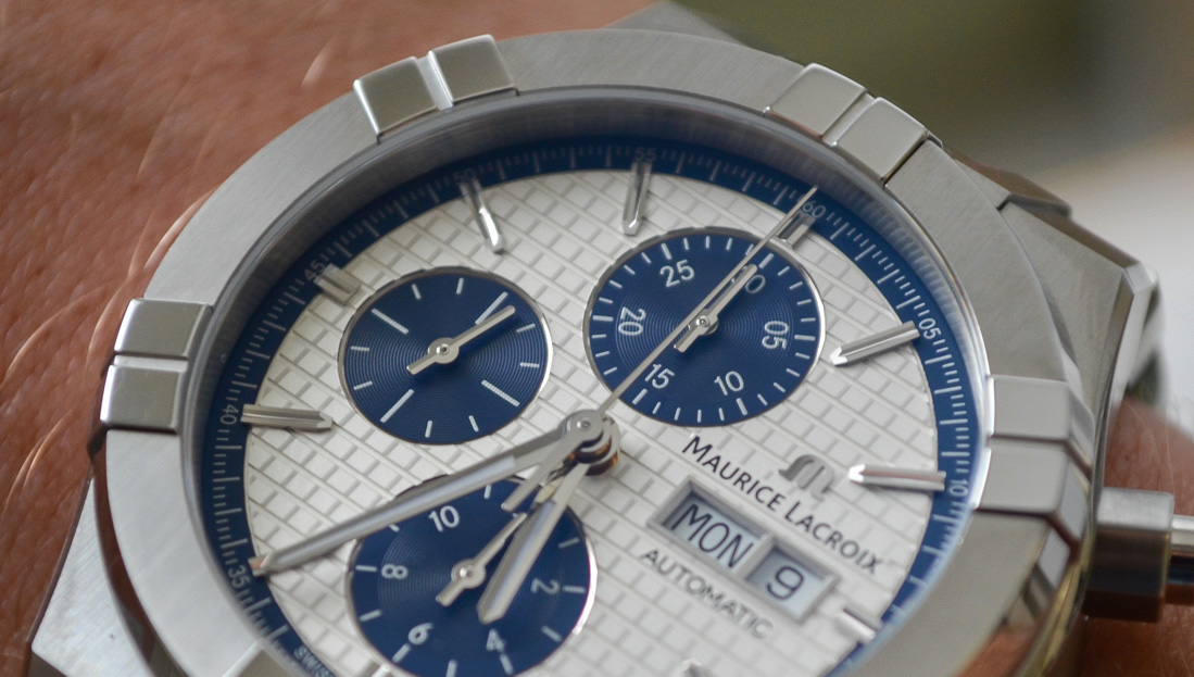
The dial itself has an etched square pattern with an outer blue chapter ring for the chronograph – a welcome step away from the sunburst pattern of its predecessor. The contrasting colors of the steel inner wall, then blue chapter ring, then white dial, then blue sub-registers make everything “pop” and in some lights, make the white dial plate almost pearl-esque or silver. The 6, 9, and 12 chronograph registers feature an alternating “snailed” or circular finish, with polished counter indices that break up the potentially cluttered square and circular patterns looking awkwardly Warhol-ian if they were to meet directly.

I’ve seen a lot of disdain toward the Day-Date window being, quote, “unnecessary,” though I find it fitting for the layout. Sandwiched between the Maurice Lacroix logo and text, and “automatic” underneath it, the branding “burger” (try unseeing that now) looks nice without being intrusive. The polished edges of the window tie nicely together with the polished bar indices and clean, lume-filled polished hands. The polishing felt especially shiny against the square patterned dial, so I tried seeing how visible it was in low-light, without lume, and it was superbly legible with the light catching the edges consistently. In fact, I used a slew of different color lights to see if it would still reflect well against the thin hands and indices, and just about everything but a black light was easy enough to read – despite not having the lume-filled hour markers that the previous generation featured.
Movement
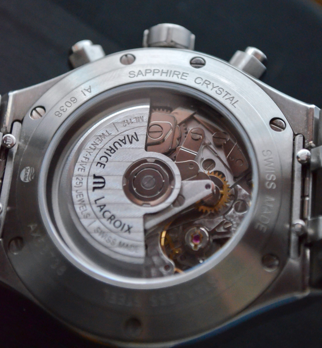
Inside the Aikon Chronograph Automatic is the ML112 – either an ETA or Valjoux 7750 based movement – though, comparing it against another Valjoux-based Chronograph I have, it looks like a better decorated 7750. I’ll avoid using the most common industry word(s) associated with this movement, but long story short, it’s tried, true, tested to death, and capable. Also, I don’t necessarily think buyers scooping this up are looking for something new and cutting edge, plus the added affordability of servicing the movement won’t bother anyone looking for a utilitarian Chronograph that keeps good time.