
Today’s watch industry is arguably more advanced and refined in terms of design and production than it has ever been. Given that aesthetics are such an important part of choosing which watch to wear, one would think that common design challenges would have been addressed long ago. Unfortunately, that isn’t always the case, so let’s look at the often problematic issue of displaying the date on a watch dial.
How is it possible that we see as many unattractive as attractive date windows on today’s watches? The date display is among the most common, and of course valid, sources of criticism among our readers that seems to come up in the comments of almost every article here on aBlogtoWatch. The size, the position, and even the color of the date wheel in relation to that of the dial can drive people nuts – and we often can’t help but sympathize! Too many great designs have fallen short of “perfection” or even been ruined by a misplaced, badly sized, or seemingly carelessly colored date display. Today, we focus on this single small aspect of watch design that can actually make all the difference.
Why Indicating the Date Presents a Design Problem
“Just delete it.” That, at least, is the conclusion of many watch enthusiasts and watch writers who advocate that many dial designs would be improved with no date display at all. What helps this opinion despite the commercial importance of date windows on watch dials is that most people no longer rely on watches as their calendars (phones work pretty well for that). The prevalence of this “no-date” sentiment (and it is very prevalent) should tell you that it is indeed a pressing issue. No date display at all makes sense as one option in the matter of solving how a date window can detract from an otherwise attractive watch dial. However, in a world of impractical and superfluous watch complications, do we really want less of one that is actually useful and convenient? A white date display on a dark dial is a deal-breaker for many people, with the answer being a black date wheel. I would argue, however, that the answer is in viewing the date display as a more central and harmonious part of the design to begin with, rather than just finding a better way to hide it.

In 1945, none other than the Rolex Datejust (above) introduced the first wristwatch with an automatically changing date function, and it was displayed in a little aperture at 3 o’clock. Today, some seventy years later, such date windows are ubiquitous, largely unchanged, and there is no sign of them going away any time soon. The watch industry still feels that the general consumer (not necessarily enthusiasts) often demands this complication – and, apparently, retailer testimony and sales data is proof. After the hours and minutes, I would agree that the date is probably the most useful watch complication there is, in many ways more so than even a seconds hand. But the watch community has every right to demand a higher level of design refinement.
And demand we do, but sometimes it seems like no one is listening. Why do we continue to see so many date wheels that clash – in the eyes of many, at least – with their dial colors? I don’t have the answer for why. As many have wondered in vain, can getting a black date wheel with white numbers really be that expensive or difficult? Some entry-level watch companies (Swiss, Japanese, and even some others) are able to produce reasonably priced watches with matching date wheels. So it can’t be that hard – although, beyond black and white, it might start getting more complicated to match the date wheel with other dial colors.
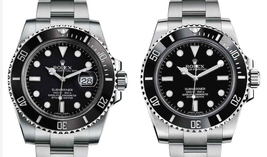
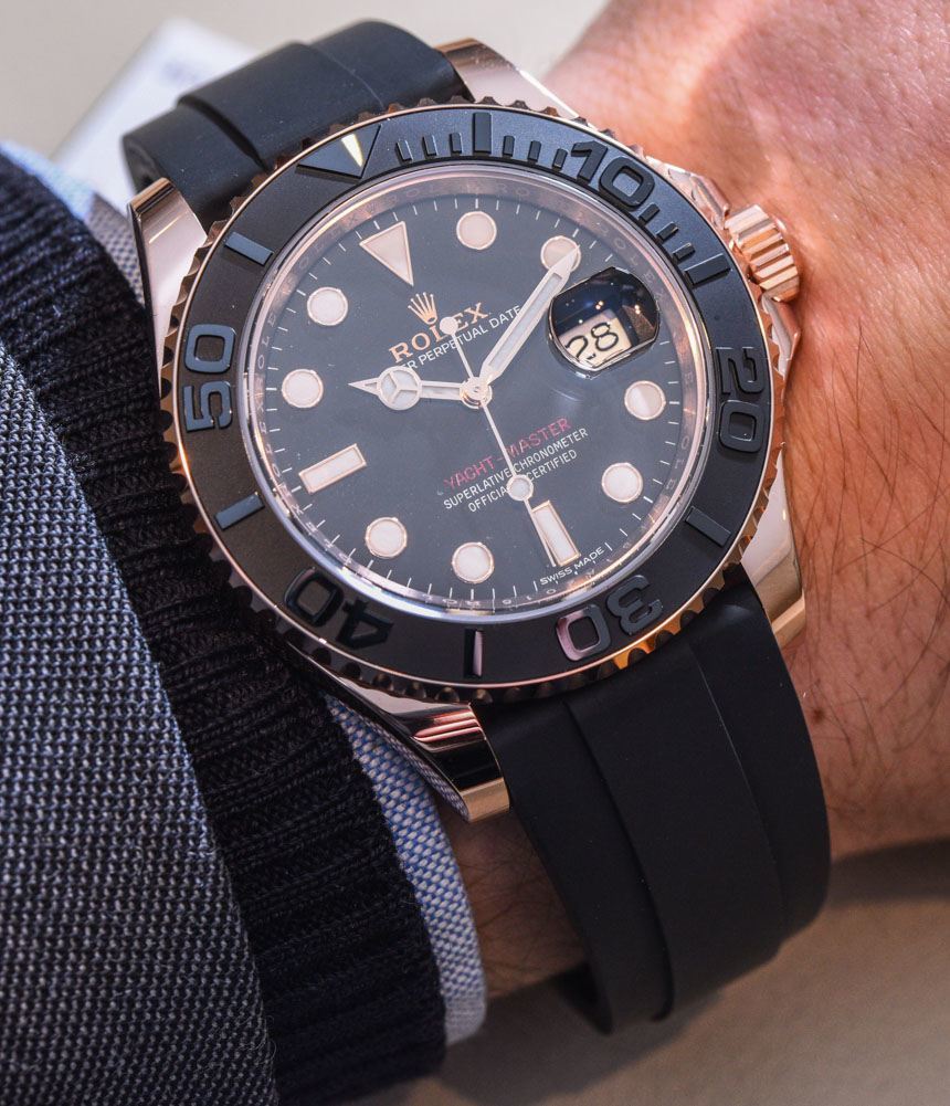
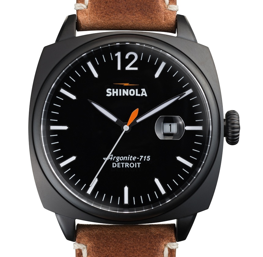
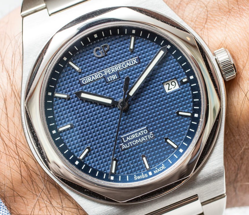
Perhaps it is reasonable for the watch industry and watch designers to feel that “if it ain’t broke, don’t fix it.” Watches at more or less all levels continue to incorporate “contrasting” date displays. The Rolex Submariner, for example, is arguably the most successful and iconic watch design of all time, and offers a white date wheel for a black dial – though, notably, the Rolex Submariner debuted with the no-date version (see our review here) only. However, the white date on the Submariner works, one could argue, because of the overall black and white design, with the white indices and hands on a black dial – if there were no other white elements on the dial, for instance, the white date window would be just as distracting as it is on any other watch.
It also has to be said that, in the past, when watches were common tools that many people relied on in their daily lives, a little white date window on a black dial was a solution that conveyed useful information legibly. But we have evolved, watches are now largely luxury items, and there is every reason to strive for utility and harmonious design. With that in mind, let’s see what options watchmakers have when it comes to fitting date indications to mechanical timepieces.
Swiss Sellita SW300 movement
Types of Date Displays
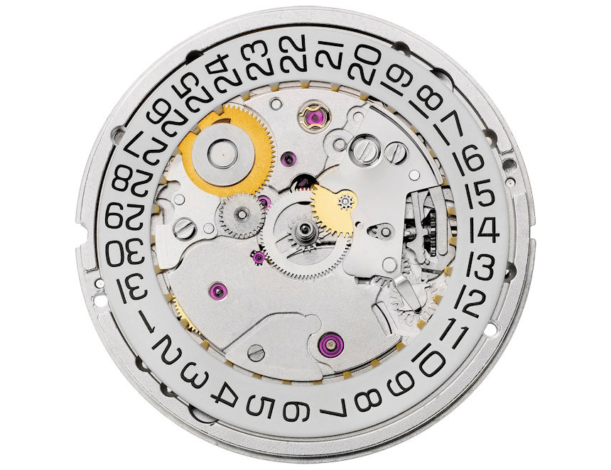
It may be obvious, but one reason that we see the same thing over and over is that the highly common ETA movements (and their Sellita and other 3rd-party copies) which in total are installed into hundreds of thousands of watches every year, proscribe certain layouts and inherently have certain features and limitations – as well as flexibility.
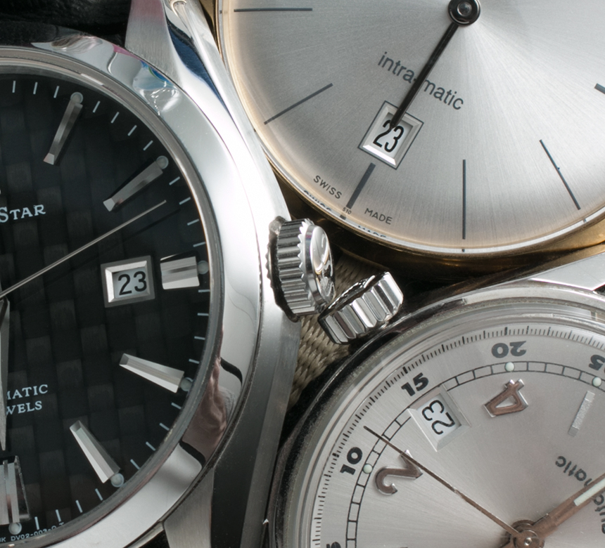
Still, the standard date display leaves us with an aperture at either 3, 4:30 or 6 o’clock on the dial. The technical difference between the date at these different locations is pretty much in the print’s orientation on the wheel – and sometimes it seems as though that decision is where the design creativity stops. Further, in order to fit all 31 numbers onto the date wheel, the numbers themselves often have to be pretty small, depending on the dial size and other considerations, of course. And because most ETA calibers (and, in fact, the majority of watch movements) were designed ages ago when the average men’s wristwatch measured in at some 6-10 millimeters smaller in diameter than today, many watchmakers who produce 42-44mm-wide or larger watches now are forced to fit these relatively small-diameter movements under considerably wider dials. This, in turn, leaves us with date windows positioned oddly close to the center of the dial, cutting indices in half, or just simply appearing to be more of an afterthought than anything else.
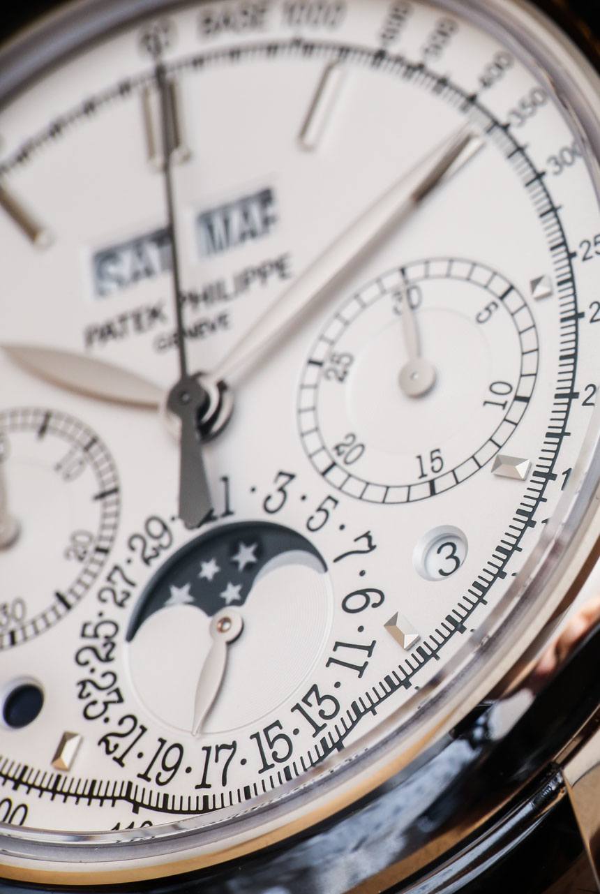
Another issue with traditional date mechanisms is the fact that many of them are rather slow to “update,” meaning that they take their sweet time, sometimes requiring +/- 2 hours before and after midnight to advance to the correct setting. Another infuriating issue is when the date does not display in the dead center of its aperture. The way the two Arabic numerals of the date are displayed and advanced brings us to the second tier of date functions – that of the more creative, more complicated, and, generally speaking, more widely appreciated ones.
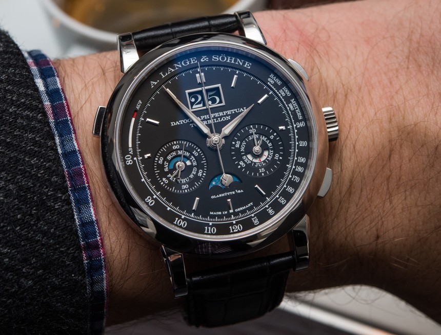
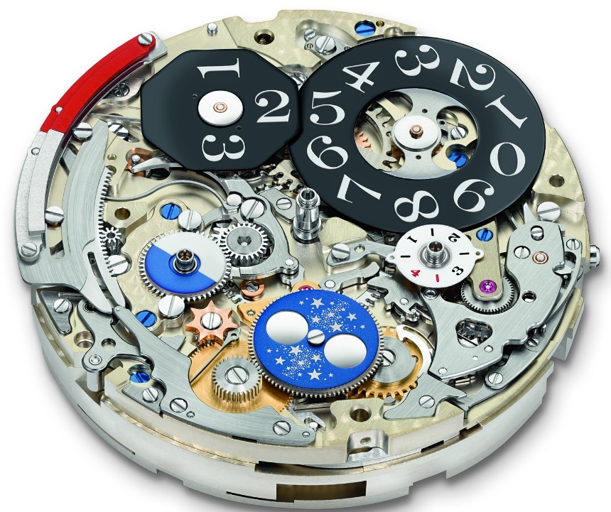
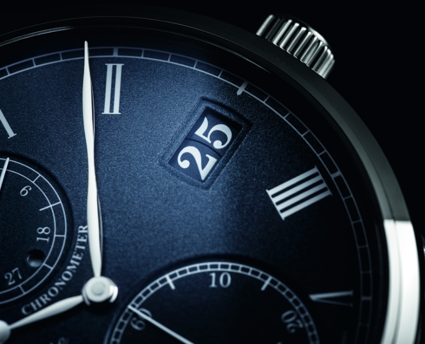
The “Outsize Date” complication revealed on the dial side of the A. Lange & Söhne Datograph Perpetual Tourbillon’s caliber
This watch enthusiast, personally, loves the “big date” (aka: grande date, oversize date, outsize date, panoramadatum, etc.) complication as one alternative that uses the date as a confident and prominent design feature. Two German manufacturers have ascended as the key experts of this indication. With its Lange 1, A. Lange & Söhne debuted the first “Outsize Date” complication on a wristwatch in 1994. Also, Lange’s Datograph watches use it brilliantly alongside chronograph and more complex date complications, while their Saxonia shows it in a more simple and classic context.
Glashütte Original’s PanoramaDate is different to Lange’s solution in that “GO” has found a way to design this large date indication so that the two discs are on the same plane – while in Lange’s mechanism, one disc is visible over the other. A minor difference, but one that is definitely notable in the pursuit of the most refined date indications.
It arguably happens more often with digital date displays than with other versions that an “instantaneous jump” feature is added: what this means is that the watch “charges up” the date indication, gathering energy as midnight nears, and advances or rather, jumps the two discs simultaneously at midnight. This is yet another way to refine date indications – and again, one that we would love to see much more often.
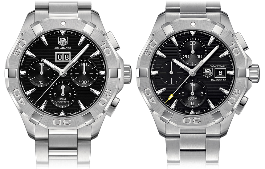
TAG Heuer Aquaracer 300m Calibre 45 Automatic Chronograph with “big date” alongside ETA 7750-based Calibre 16.
Other brands have their own takes on it too, and while it does add complexity to the movement, I would certainly like to see more “digital dates” at more accessible prices. Give the watch designers that option with more widely available and affordable big-date movements, and let’s see what we get. What are your suggestions and preferences for a more elegant date display? Let us know in the comments!
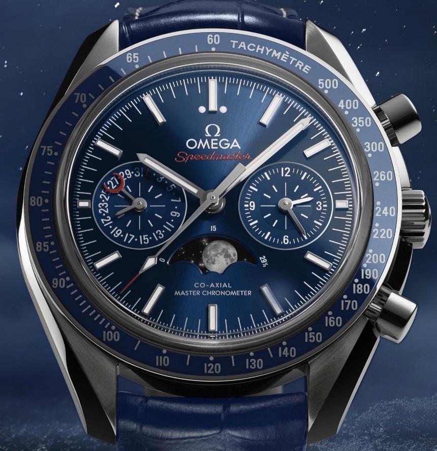
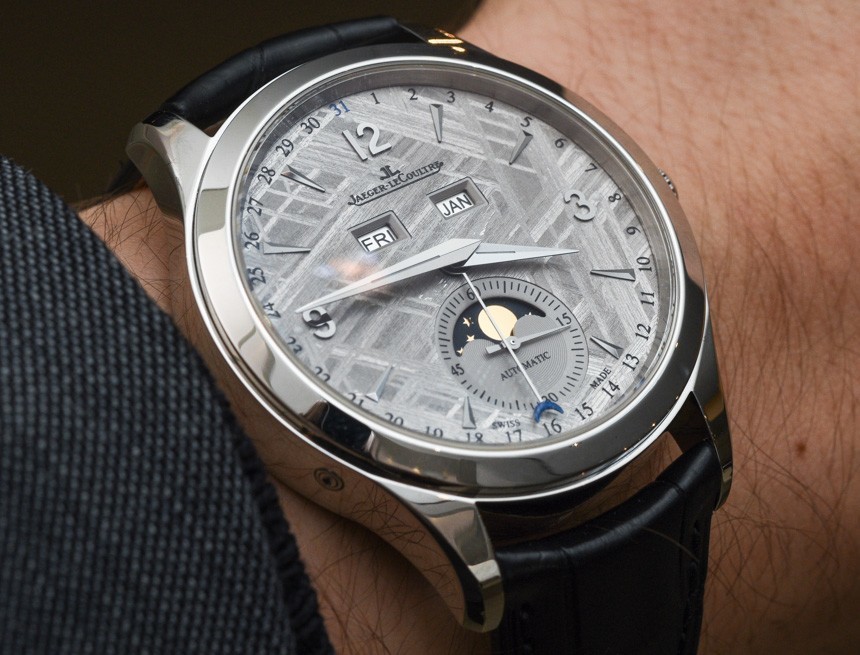
Another great but unfortunately less common alternative is using a hand to indicate the date rather than discs under an aperture. Some eye-catching examples include the new-for-2016 blue Omega Speedmaster Moonphase Chronograph Master Chronometer (debuted here) with a date sub-dial, or this Jaeger-LeCoultre Master Calendar Meteorite (hands-on here) that uses a centrally mounted hand and a date track along the periphery of the dial. Well executed, a “pointer-date” can be a legible and elegant solution to incorporating a date display without disrupting the dial’s visual balance.
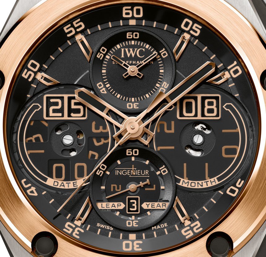
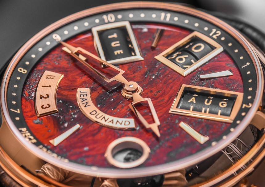
Then, as is always the case in watchmaking, you have what could only be referred to as “overkill.” IWC added two digital indications to their IWC Ingenieur Perpetual Calendar, for instance, while the Christophe Claret-developed Jean Dunand Shabaka used tiny rollers, set laterally into the plane of the dial to display the day, date, and month, respectively. Nothing wrong with a creative approach!
Good Versus Bad Executions
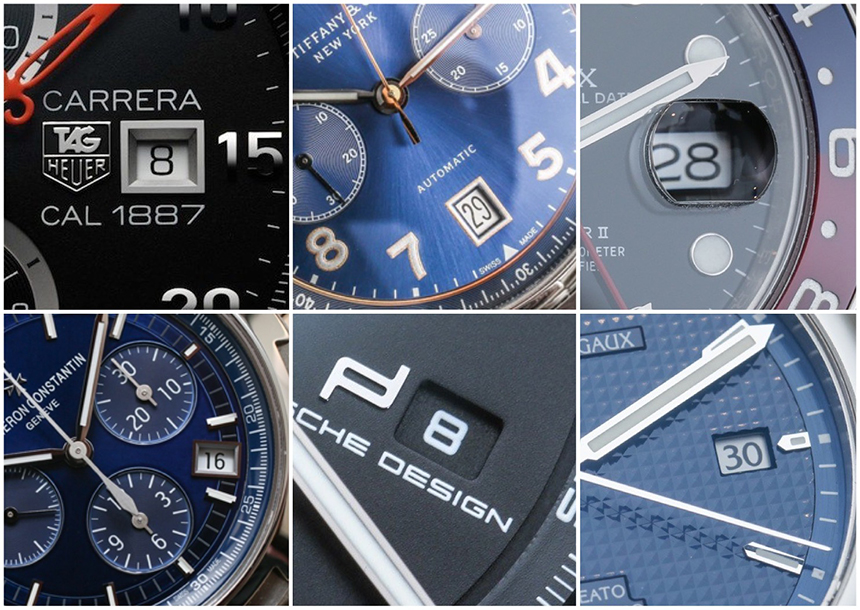
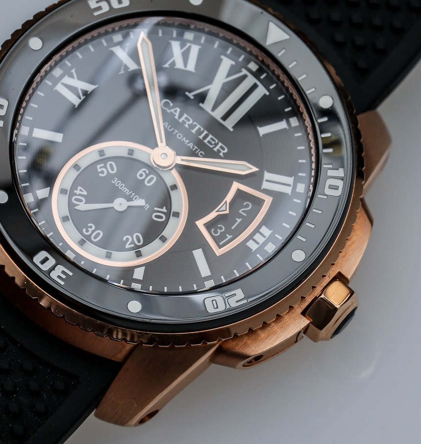
While there are a number of ways watchmakers have come up with to display the date, alternatives to the standard date window at 3 o’clock or 6 o’clock often result in an even more niche, quirky, or avant-garde feel. Expanded date windows that show the dates on either side of the current one, analog “pointer-dates,” and the magnifying “cyclops” on the crystal above, for example, can be even more controversial.
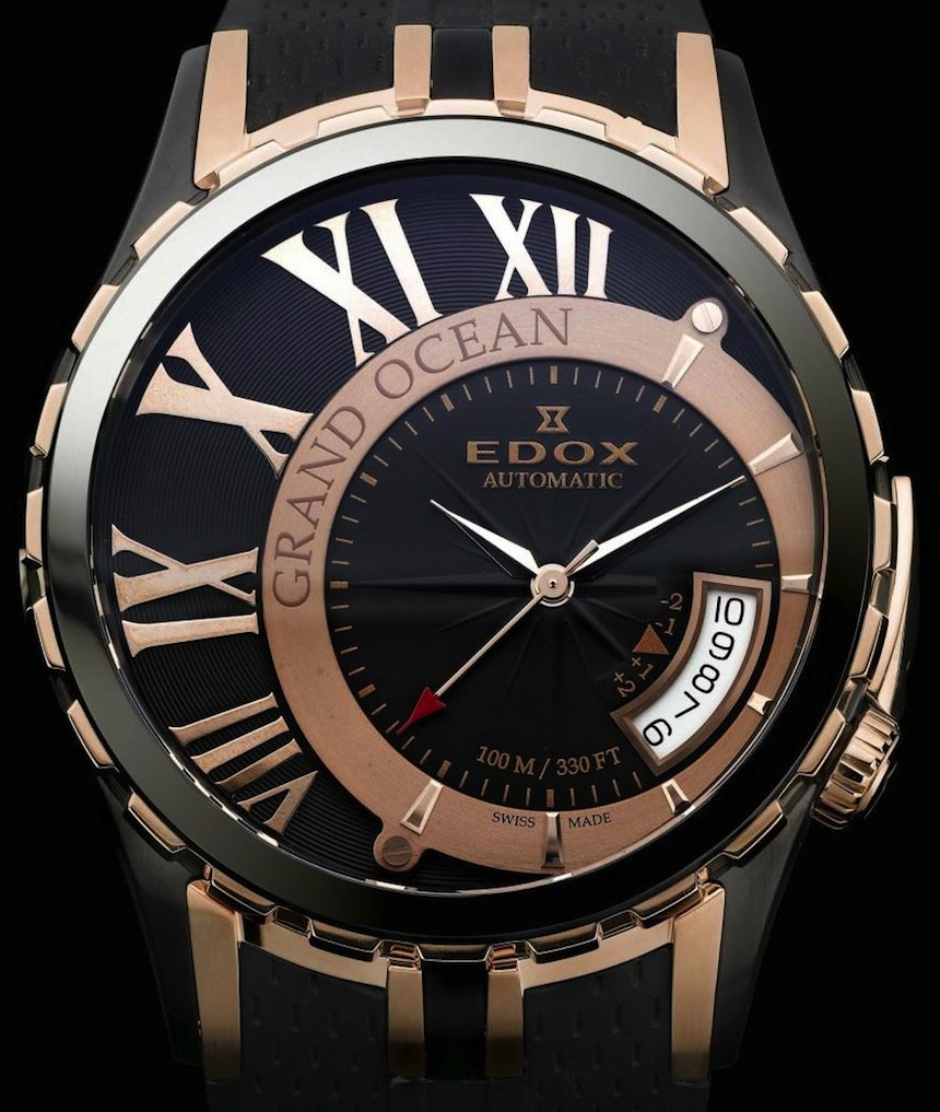
This Edox Grand Ocean Decentrique that you see above is maybe one of the worst offenders when it comes to extended date apertures. Not only is the date disc colored an utterly disruptive white, and the dial gives you an unnecessarily extended view of it, but it also gives you some help with your arithmetic in case you have trouble counting. It may have appeared a novel idea on a computer render, but it is difficult to imagine that many people would want to see this every time they glanced at their watch.
So while we like options and variety, displaying the date elegantly is clearly a tricky task, and it makes sense that you would have to be very careful when dealing with what is essentially a cutout – or a considerable amount of added print – in an otherwise attractive and thoughtfully designed dial. Simply matching the date disc’s color to the dial, to other dial design elements – as in case of the Submariner, for example – and/or offering a model version that does away the date indication altogether are probably the easiest ways of pleasing a much larger number of potential customers.
With all that noted, maybe a watch with a black dial and the date displayed on a white disc at 4:30 is no problem for you at all. The aesthetic issues of the date window are a totally subjective matter (this writer is personally not all that perturbed, actually) and can often only be judged case by case. However, once a design element of a watch has been pointed out to you as even slightly “off,” it can become hard to ignore, to “unsee.” I believe that we enthusiasts are right to scrutinize watches the way we do because, after all, they are products that essentially ask to become part of your person. Although the common date window is not “bad” per se, we want to strive for better, with more creative, deliberate, and elegant approaches to this design element so that it will find a welcoming audience. The date display should be anything but an afterthought.
For consumers choosing a new watch, be aware of this design element as an indicator of the care and refinement that went into a watch’s design and consider how you will feel about seeing it on your wrist every day. To our readers: know that we hear and echo your opinions, and that the watch industry is listening. Do you use the date display on your watch? Do you miss it on a watch that doesn’t have it? At what price point would you not accept a date wheel that fails to match the dial color? How can watch companies win your money while still offering the date? Please share your thoughts and suggestions below.