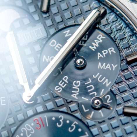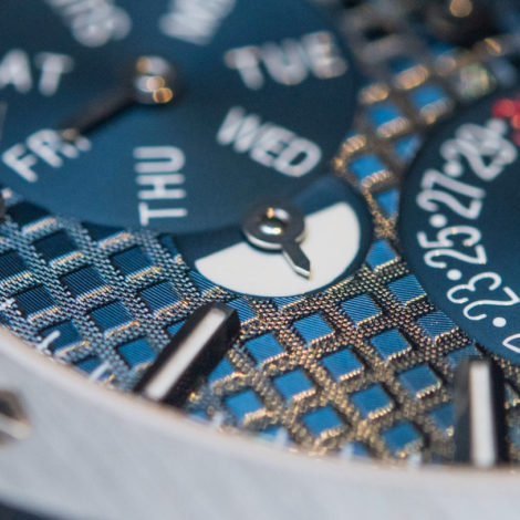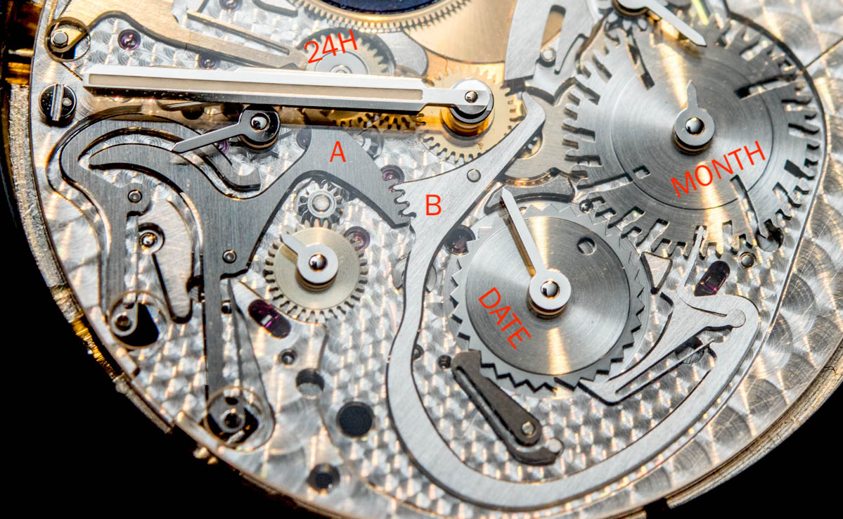
The way it works is that the hour wheel is connected to a 24-hour wheel (marked top center on the image above). This has a pin (currently hidden by the minute hand… Thanks, minute hand!) that pushes on the lever marked A. This lever acts on lever B, which in turn pushes the 31-tooth date wheel by one increment. One of the patented elements is how this date wheel has one weird tooth (you’ll see it just a bit to the left from where the lever is). This deeper tooth “tells” the mechanism that it’s the end of the month which, through some clever geometrics, helps move the month disc by one increment.
See that weird wheel with the four long cut-outs? That’s the 4-year wheel where the depth of each tooth stands for the length of the month. The shallowest are 31-day months, those with a deeper groove are 30, while the deepest ones are the 28-day long Februaries of each year… Except for the leap year. The leap year (the one notch just above the “M” of the month text) has a little notch to mark the 29-day February. The 3 other deep notches are for 28-day Februaries. Now, this weird wheel determines how much its lever will push on the date disc at the end of the month. Come a shorter month, geometrics will vary in a way that the lever will push more on the date wheel, hence skipping 31 (or the required number of days in February). Now, this is all quite inspired and clever, which is why it would have been cool to see it at least partially displayed on the dial side of the finished watch.


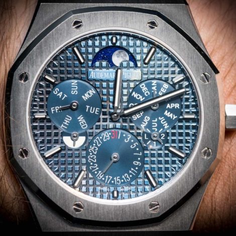
All this is impressive, and that is even more true when you consider how, legend has it, Giulio Papi and APR&P started from the dial layout itself. It is one very symmetrical layout, though it admittedly doesn’t look like it – neither in pictures, nor when the watch is in or on hand.
Usually I’m the one who has an issue with hands that are short or illegible, but here, weirdly, it is almost as though the hands and the “grande tapisserie” pattern of the dial overpowered the already busy indications of the perpetual calendar. There is a lot going on, which for one is impressive in the sense that such a thin watch can keep track of all this accurately until 2100 (2100, 2200 and 2300 will not be leap years), but in a way it perhaps also is a bit too much for its own good.

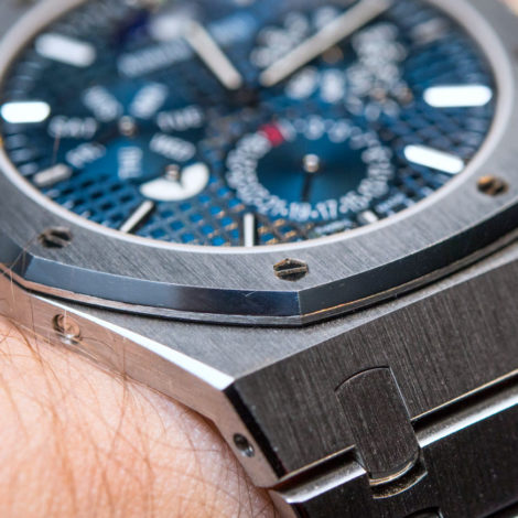
On the wrist, the Royal Oak RD#2 feels thin (surprise, surprise) and yet very heavy. With an all-platinum exterior, the heft is immense and also rather stable, as it is distributed so evenly and close to the wrist. The watch is barely at all thicker than the bracelet, supposedly making for a more comfortable long-term wearing experience. With the heft comes a natural association of durability – as Boris the Blade put it so eloquently, though not in the context of perpetual calendars, “Heavy is good, heavy is reliable. If it doesn’t work, you can always hit him with it.”
As I said above, perpetual calendars are pretty much the most static complication out there – while, say, a minute repeater or a chronograph won’t do anything automatically, they arguably make for a lot greater visual and tactile appeal when operated. A perpetual calendar is basically interesting 5 times a year – 5 moments at midnight when it jumps from 28/29 or 30 to the first. For the other 360 days of the year you are left with knowing that it will be interesting those five times. This remains unchanged in the RD#2, especially with its solid dial. Also remain the corrector pushers set into the side of the case. For a record-thin watch like this, I understand these correctors could not have been engineered into the crown system but, frankly, I’d welcome a new perpetual from the brand where these are good and the watch has more than 20 meters of water resistance, than a few more millimeters scraped off the overall thickness. I understand neither these pushers, nor water resistance were the focus of this RD#2 project – but in main collection watches sorting these two out I think would be more impressive and practical for the end consumer.
Is the Audemars Piguet Royal Oak RD#2 Perpetual Calendar Ultra-Thin a masterful exercise in the perpetual calendar complication? You bet it is. It is novel both in a few ways in how it works as well as how it was designed – outside in, not inside out. However, I don’t think it addresses some of the criticisms usually associated with perpetual calendars (not to mention the premium they demand over simple dates or even annual calendars). It looks impressively complicated from the front and stunningly thin from the side, but it also has a bit of an early 2000s retro look from when watches started getting larger but the movements did not. The squashed indications in the center along with the (I think) bloated proportions of the 41mm Royal Oak make me think in a 39mm case – which I asked and was told that this 32mm-wide movement would fit in – this RD#2 would have been a more elegant execution.

All this said, during the presentation AP’s watchmakers appeared to have been genuinely excited about the prospect of this new-found approach of merging different functions into fewer components that are then distributed on the same plane. The word “chronograph” was said a few times in relation to what may be coming based on this novel approach. Though whether or not we’ll get to see that is a good question, and so is another whether a Royal Oak Perpetual Calendar as thin as this RD#2 will make it to the boutiques anytime soon.
As such, the Audemars Piguet Royal Oak RD#2 Perpetual Calendar Ultra-Thin is a concept watch and hence doesn’t come with a price tag attached. audemarspiguet.com