As I mentioned in my recent review of the Breitling Transocean 38 watch, Breitling was not really a brand that I found myself drawn to, as they felt overly-complicated for my own daily use and preferences. The Breitling Transocean collection, however, shows a slice of their lineup that takes things in a different (and dare I say, cleaner) direction. It is in this collection that we find an homage to the first chronograph with an independent pushpiece, in the form of the Breitling Transocean Chronograph 1915.
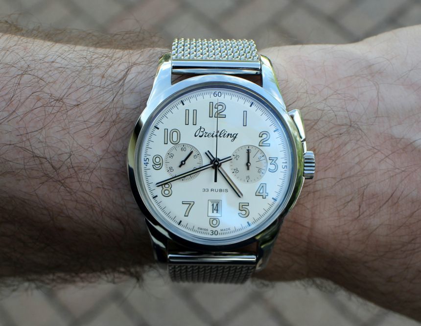
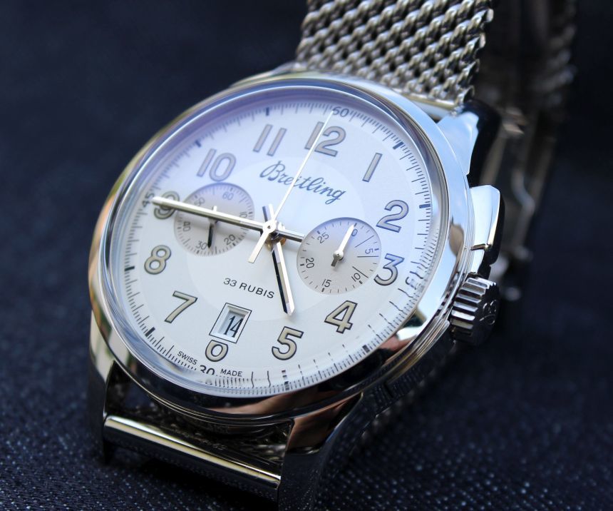
I have to say, I was surprised by how much I liked this watch. I mean, yes, there was a lot to like with it’s relatively clean dial, and plenty of vintage cues, including a domed (and raised) sapphire crystal which gives the sense of the high-rise acrylic crystals of the past. It is also a chronograph, however, which is a complication that I, frankly, have not found a lot of utility for in my life. As such, the design seemed to not sit well with me. While the Breitling Transocean Chronograph 1915 is not making me rethink that stance, it is one that I was happy to spend time with.
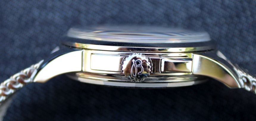
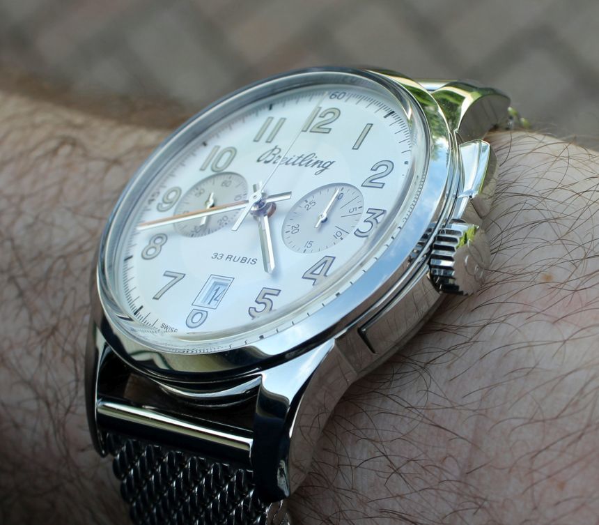
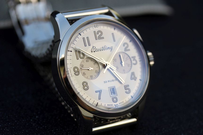
First and foremost, I think it is due to the monopusher design, which is right up at the 2 o’clock position. So, not only have we dropped one of the pushers that would normally flank the crown, we also have a different shape, curving gracefully up from the side of the case. Actually, if you look below the crown, you can see the horn shape actually starts there, with the line continuing through the crown. Yes, it is a little odd to see something jutting out from the case like the pusher does, but I appreciate the design they created here. Also of note? The pusher is nicely rounded off, so I did not experience any issues with it getting caught on a shirt cuff, or even feeling like it dug into my wrist.
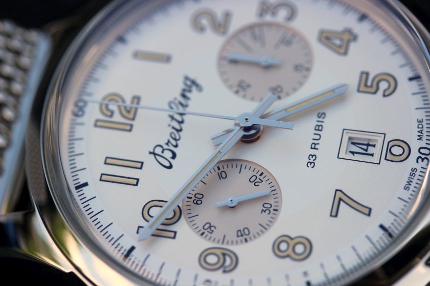
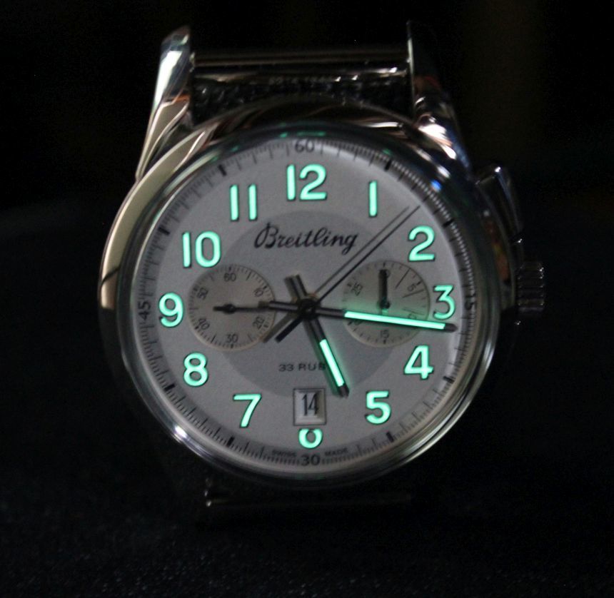
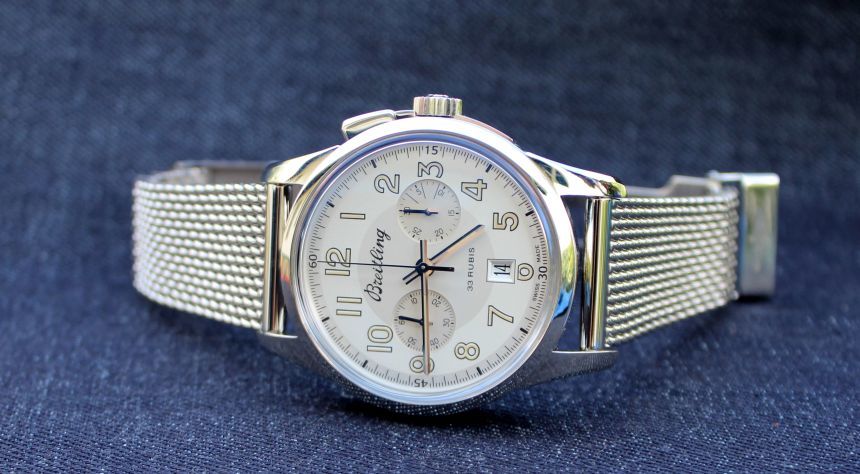
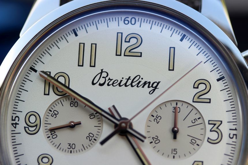
Secondly, the almost monotone vintage-inspired dial helps the sub-registers blend in quite nicely. Overall, I would call the tone a champagne color (not overly yellowed, thankfully) with a lume hue on the numerals and in the hands that gives that aged feel. I will not pretend that the subdials disappear, which they don’t. You have them set slightly lower than the main surface of the dial, so there is a crisp delineation around the subseconds (at 9 o’clock) and chrono minutes (at 3 o’clock), along with them having a slightly darker shade. It still worked to make it so it was not screaming that it’s a chronograph at you, and that is something I liked.
On the dial, the one miss I felt was included (surprising, given how well thought-out the other elements were) is the date display, and this, I felt, had two things working against it. First, we have it cutting off the 6, while no other numeral has that offense committed. Not that more of that would make it better, but it just really stands out. Second, we have it in a very rectangular form, when the rest of the dial and its elements are rounded and/or circular. It just makes those straight edges and right angles stand out. While a circular cut out would be the simple fix for this, I am not sure how it would look on the dial, so perhaps deleting the date (as much as it pains me to say, as it is a useful complication) would be the better route to go.
It was funny to me that the date window caught me out as it did. I have reviewed other watches with numerals cut off, and of course, read reviews of watches with that styling, as well as comments about those watches. While it has been a polarizing design direction (at least it seems that way to me), it was something here that, on the Breitling Transocean Chronograph 1915, finally got stuck in my teeth. Perhaps that was its destiny, given that the Transocean lineup finally has me warming up to Breitling. That, or I finally just reached the tipping point on this, and that particular switch has flipped for me to set another preference that has formed from the watches crossing my desk.
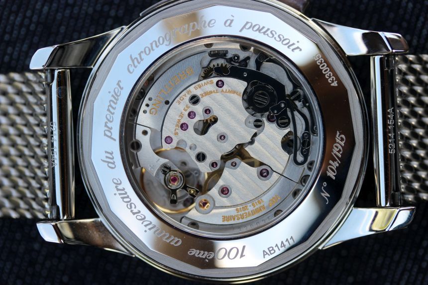
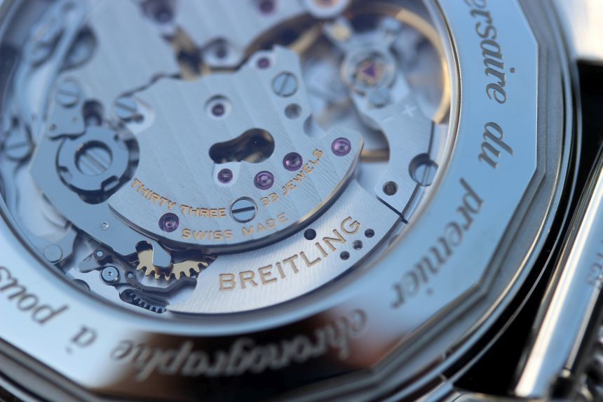
I think I have pretty well-covered the dial side of the watch, so let’s flip it over. Here, we see through a fairly large sapphire crystal the new Breitling B14 manually-wound double column-wheel movement. This is not, perhaps, the most stunning movement that I have ever seen, but it is well-finished (to my untrained eye), and it is interesting to watch those column wheels in action when you kick the chronograph off. Realistically, when you are looking at a movement like this, unless you are really into the intricacies, you are looking for the kinetic bits – the balance wheel and then pieces related to the chronograph. So, in that regard, it’s well done. I am also of a mind to equate it to what we are seeing on the dial – understated, and supremely functional.
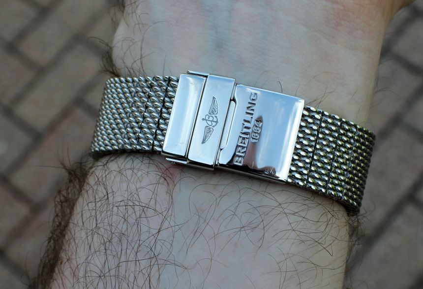
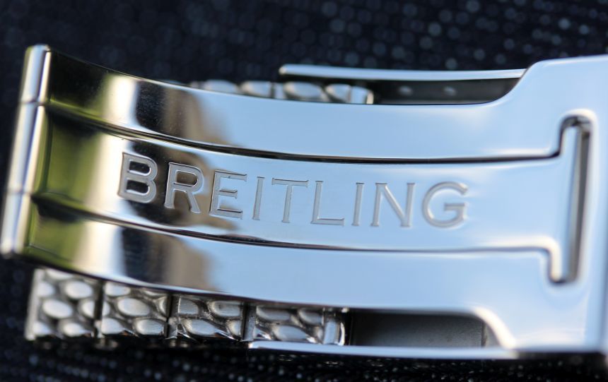
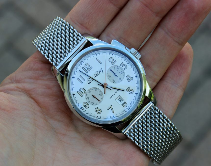
For our review, we were sent the Breitling Transocean Chronograph 1915 on the Ocean Classic Mesh strap, which I also spent time with in the Transocean 38 review. I do like mesh straps, especially for summer, as it mixes things up a bit from the standard steel bracelet. I am also a fan of how Breitling sets the bracelet up for adjustment, with actual links down by the deployant clasp that can be removed to get things sized. Sizing on this one was a bit trickier for me, for some reason, perhaps due to the 43mm case. I could not find quite the perfect fit by utilizing the links and the spring bar in the clasp (which makes an adjustment similar to what removing the link would), so I had to settle for it being just a tad tighter than I might prefer. This held it in place on the wrist just fine, but I would occasionally feel the deployant digging into my wrist. Of course, your mileage will likely vary on this, as everyone’s wrists are different, and I had the same style of bracelet fit just fine on the Transocean 38.
At the end of the day, the Breitling Transocean Chronograph 1915 was a chronograph I was glad to have cross my desk. The overall style did resonate with me, and it marked off the right checkboxes for me when it comes to a vintage-inspired piece. For those looking to get their own, the Breitling Transocean Chronograph 1915 is available in a limited edition of 1,915 pieces (see what they did there?) at a price of $9,090 on leather or $9,275 on the steel mesh bracelet. As I mentioned here, when I first saw images of the Breitling Transocean Chronograph 1915, this is certainly a classy look – and way – to get a historically-inspired chronograph on your wrist. breitling.com