Before we were to flip the watch over and shock our senses yet more with the caseback view of the movement, just one quick note on the case itself. The Ferdinand Berthoud FB 1R.6-1 comes in a stainless steel case, octagonal-shaped to pay tribute to the marine clocks made by Ferdinand Berthoud in the mid-to-late 1700s. If the case looks funky, that is for a reason: the molecular structure of this particular piece of steel was reinforced by a thermo-chemical process involving the diffusion of vapor-phase carbon, thereby “guaranteeing an exceptional surface hardness of 1,200 Vickers,” that is a few times harder than regular steel.

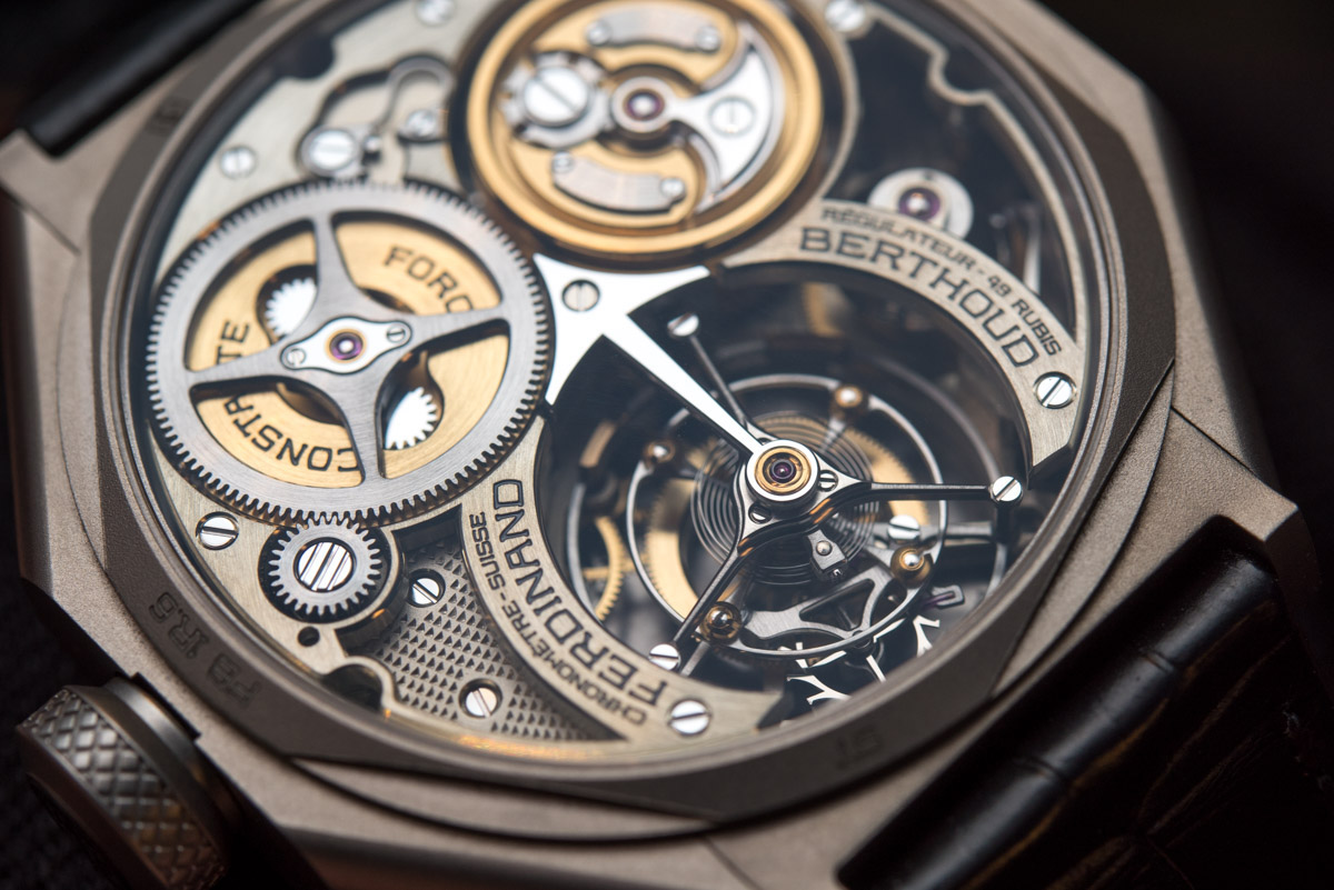
On the flip side, the FB-T.FC.R caliber tries very hard to come up with a name that is as painful to type in, as the movement itself was to assemble. It came very close – you just try typing that in. The caseback view is like no other too: the tourbillon is absolutely massive in its size but filigree in its design. The sublimely narrow spokes leave extremely small room for error for the craftsman who’s hand-finishing the beveled edges, as well as help keep the overall weight of such a large construction to a minimum. What’s more is that the entire upper cage appears to be cut from a single piece of titanium – mess up one spoke and the other two you can only use as labor-intensive toothpicks.

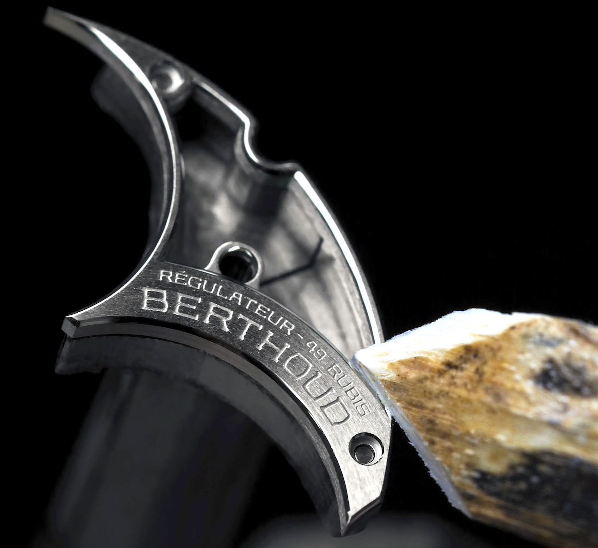
The bridge securing the tourbillon from above is so beautiful that I for long considered it to be a non-functional element, just something that they put in there because they had space for it… But no, it of course first and foremost is a bridge, that also happens to be an arrow – most likely crafted from steel and not from brass. Its edges are beveled and polished (and, if you care to look, you’ll see that the bevel of the head of the arrow beautifully continues on the yellow-ish plates at either side), while its top surface is black mirror polished. I have had the (mis-)fortune of having a go at mirror polishing on a piece about 1/4 the surface area of this and I must say, it’s extremely hard work. The problem is that the entire surface has to be absolutely flawless, no ifs or buts, because the slightest scratch or unevenness would quickly steal the show… and so when you try to correct one scratch, even with the greatest care it’s still super easy to cause another minute scratch… and so the little game begins.

The team at Ferdinand Berthoud (including Guy Bove, who even designed the type-face you see on this watch and who has since left to Breitling…) has gone way beyond the commonly seen idea of “let’s throw beveled edges and Geneva stripes on it!” and enhanced their play with colors and surfaces with yet more creativity. Just look at that weird etched decoration that is made visible by the skeletonized (and beveled and polished…) opening! This area shouldn’t even be there, and yet they opened the plate up just to reveal this unique decoration and the two hand-polished screw heads.

I remember someone flipped out when I said I missed properly beveled and polished spokes on the pedestrian-looking wheels in this $400,000 Jaeger-LeCoultre. Well, first of all, if you look a few shots above on the picture that showed the opening in the minute sub-dial, you’ll see the properly polished (albeit for the naked eye genuinely invisibly narrow) spokes; whereas on the image directly above you’ll see what can be done on a wheel that’s thick and wide enough that its spokes can at least somewhat be admired with the naked eye. Thick, angled, polished edges as well as inside corners (that’s where the spokes meet the round, outer part of the wheel) are seen, further enhanced by a mirror polished chaton with mirror polished screws, a mirror-polished intermediary wheel underneath, and a very subtle concentric brushed surface treatment, as well as some accurately applied and black painted, proprietary typography. The whole thing just bathes in light – it’s a truly glorious coming together of creativity, attention, and perfectionism. This one single shot above is some of the big brands having their asses handed to them right now.

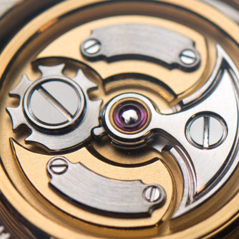
Speaking of big brands who couldn’t hold a candle here: see that little ratchet on top of the barrel? That’s the actual component that inspired Vacheron Constantin to have the Maltese cross as its logo – and while they don’t put it on their watches anymore, it’s casually hanging out here, in what appears to be an exquisite arrangement of exceedingly rare watch movement components. I just thought of this but I’ll go out on a limb and say that those two plates above and below are perfect to carry one’s engraved initials. While at it, just look at the number of beveled edges and the complexity of their shape: even that Maltese-cross-like piece has its very edge beveled, but so is the battle axe shape of the piece right to it, and even that tiny little notch that sticks out to the left. Then look at how the gold of the barrel is reflected by the edge at the very left of the image. This is easily, and I mean easily beyond anything I’ve seen from Vacheron in ages (and I’ve seen their top-tier stuff), but I’d go so far as to say this is even beyond Lange at this point. Interestingly, you can get a Lange with fusée and chain for about the same money as this Ferdinand Berthoud. I know which one I’d buy with my imaginary quarter million dollar watch budget – but if you’d spend yours on the Lange, we could still be friends. See how easy it is to get along?


If you thought the 9.89mm thick, 1700s-inspired, 6-pillar-constructed (i.e. hollow), 1,158-part movement would be where the Ferdinand Berthoud FB 1R.6-1 ran out of puff, think again! The all-machined, non-stamped titanium double-folding clasp features polished and, what the heck, even perlage’ed surfaces as well as a tiny micro-adjust with the F<->B logo applied in polished relief. This isn’t your off-the-shelf clasp you can order from anyone – even top-tier suppliers would leave your email inquiry elegantly unanswered, had you had the bare cheek to reach out to them with such a complex request. Although this may totally be a supplied part (in which case someone must’ve made the company managers drink a few too many glasses of merlot to help them sign up for this), I can also totally imagine Karl-Friedrich Scheufele casually strolling into the manufacture, picking an engineer like a 15th century warlord picks one of his best fighters for a special mission, and giving him the direct order of producing 20 pieces of super complicated titanium clasps. “Don’t you dare come back to me unless it has some weird refined stuff on it I have never seen before!”

The double rolled-edge, hand-sewn, “artisanal” leather strap is made from a single piece of alligator because I guess it’s harder to do it that way than any other. It both feels remarkably rugged and sublimely supple all at the same time – again, someone was pushed to go beyond what is used on other watches. It’s funny, because the same way a $10,000 watch will usually have a nicer leather strap than a $500 watch, the same works with 6-figure priced watches too. I looked at some €480,000 Lange images and I’m sorry, but this strap eats that one alive. Maybe it actually did just that.

What better way to finish than with a shot showing all the mirror polished metal pieces of the dial reflecting something blue from behind me at the time of taking this picture. My soul is simply not yet prepared to take this watch out into the real world, where there is warm sunshine, leaves dancing on the branches above head, clouds casting soft-light all over… And yeah, this is what people with a lot of money and equally as much sense are always looking for in an ultra-luxury watch. They still sometimes settle for less – a blow softened by a big name and a lot of condescending marketing – but it is this obscene level of attention to detail and quality of execution that the old money knows they should be getting from watch brands that advertise to be as old as their families.
With all this in mind, I think this brand shouldn’t have been called Ferdinand Berthoud. Instead, it should have been named after the man who took his love for all that’s great in fine watches and poured it into a single off-limits exercise. I do not at all know him, but my impression of him is that of a very humble man, which is why I think this watch says FERDINAND BERTHOUD on the dial – and not Scheufele. Some 240 years from today (and 480 years after Berthoud’s heyday) I think it should have been the modern entrepreneur’s name that was remembered when one of these watches showed up – and I say that even if this watch, in some ways, took inspiration from a clockmaker of the late 18th century. This exercise is so unique and showcases such immense effort, that I am baffled why it carries a long-dead man’s name. Sorry, Mr. Berthoud.
Price for one of the 20 Ferdinand Berthoud FB 1R.6-1 watches is $241,500. ferdinandberthoud.ch


