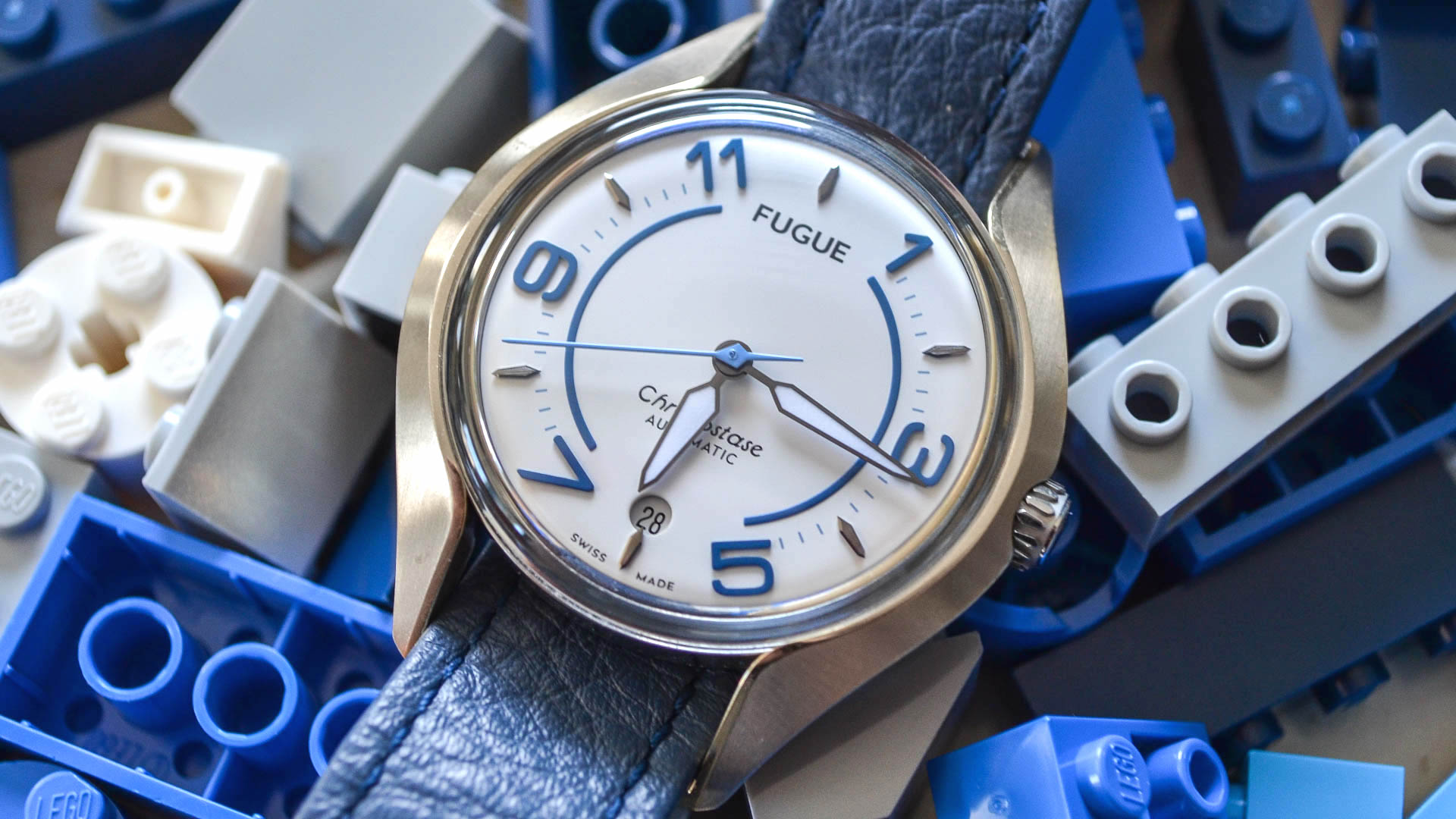
In a world where watches are equal parts technical and emotional purchases, I often find it hard to settle on watches to add to my collection that aren’t exactly grails – meaning watches that stick with me after I initially find them cool or unique. Maybe it’s the nature of the beast, and the sheer amount of watches I get to see and evaluate as a blogger in the industry. But, I often see watches that I find technically interesting that rarely circle back to the point where I consider actually owning them. That wasn’t the case with the FUGUE Chronostase Automatic, a watch I was both immediately intrigued by, excited about, and unable to shake.

Let’s start with what the watch is, and why it was so appealing to me. French microbrand FUGUE’s (pronounced “Fyg” and meaning “Escape” in French) main gig with its freshman release is that it’s literally modular. Straps, cases, and even the watch itself can be easily interchanged and swapped out at the drop of a hat via a cool and unique “drop-in” style design – meaning there are ball bearings at 3 and 9 o’clock that slide and lock the watch into the case. I can’t quite put my finger on it, but perhaps it appealed to my inner-child that remembered playing with LEGOs and K’NEX all day long that made this an exciting prospect. I found the concept to be endlessly entertaining; like LEGOs for adults with a bit of an expendable income, a penchant for watches, and a little nostalgia.

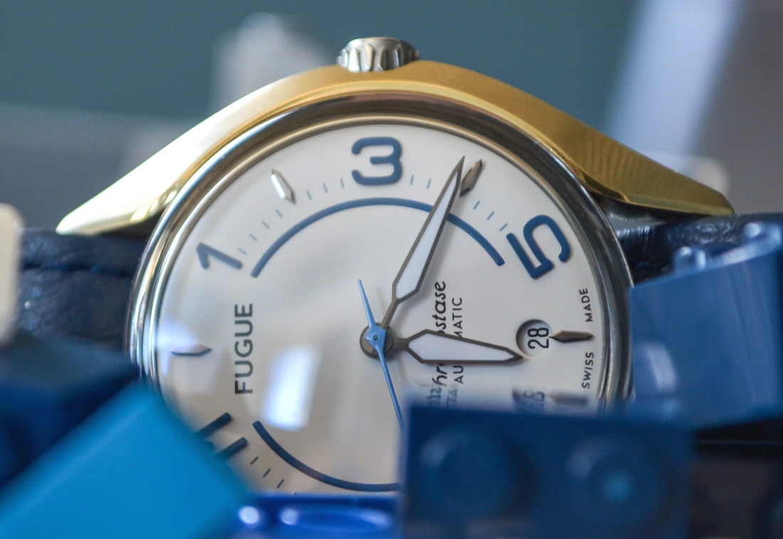
So what do you get with the FUGUE Chronostase? FUGUE offers a decent value proposition considering what the watch includes. When you buy a watch from them, you get to choose a dial and case combination and also add a second case and strap to it. So, you’re effectively getting two looks that utilize the same watch body. I went with the Ocean White model because I felt it would easily show the different combinations, but there is some pretty neat utilization of dial colors, including a brushed steel version with yellow accents that I went back and forth on for awhile. They all come with an interchangeable steel case and your choice of a NATO-style leather strap. From there you can select a second case in either gold or black PVD, and an extra Perlon strap in an array of colors. I chose a blue Perlon strap and a gold case.
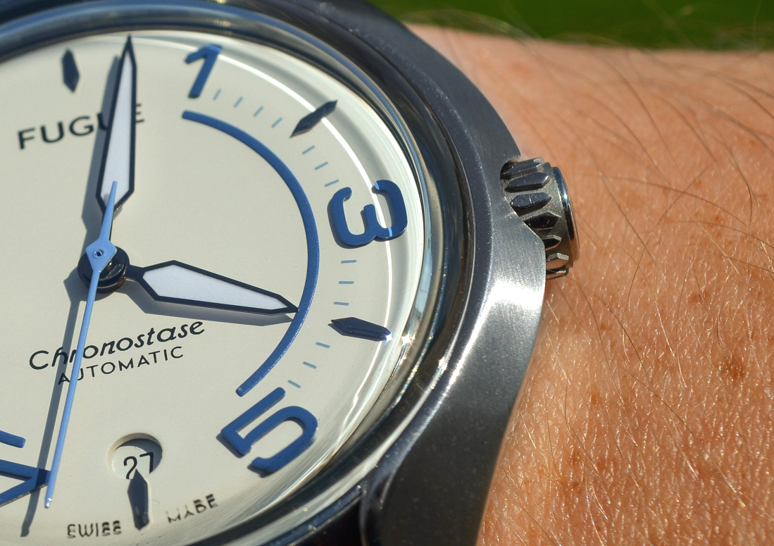
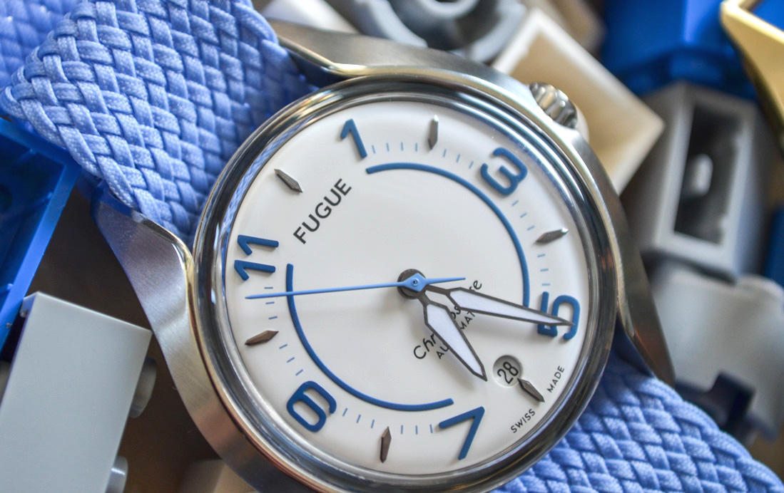
The brushed 316L stainless steel case has well-polished edges (that ended up being scratch magnets) and measures in at 40mm wide; but it feels much smaller than that. In fact, when I read the size, I actually went and measured it to make sure that it was accurate, and it was. I think this is largely due to the relatively small size of the watch itself, the flare of the NATO-style straps, and the wider nature of the case attachment. However, it’s important to note that the lugs are a bit extended and I can’t help but be reminded of watches from ’60s with curved lugs that tended to be longer in nature. Mind you, this is a modern look that channels some of the shape and wearability of a vintage watch, but less of a direct nod to any watch off the top of my head. All that being said, this watch has a very retro feel in almost every combination I used.
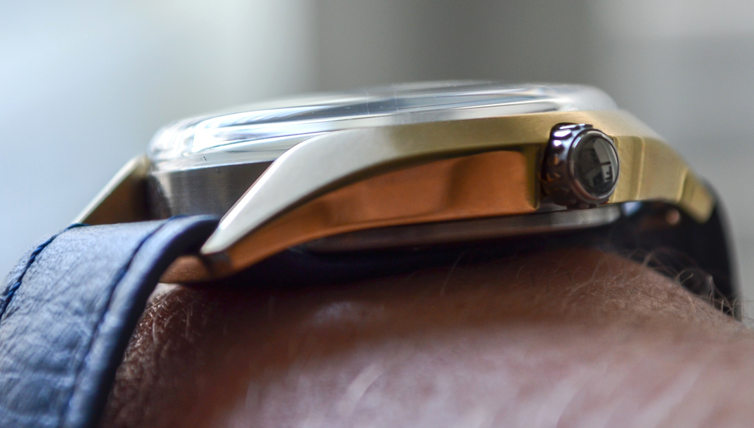
It’s less boxy than ’60s watches tended to be, but still would be remarkably thin if it wasn’t for the highly raised domed sapphire crystal – due to the fact that the actual watch module itself is bezel-less, and wouldn’t really allow for the ability to change things up if it wasn’t. My only issue with the height of the dome, is that the case sits recessed from the curve, and that doesn’t provide any protection for the corner edge of the crystal, and I can totally see this getting shattered against a door frame if the wearer isn’t careful. Luckily I haven’t had any issues with that, but I’m always conscious of where my wrist is when I’m wearing this watch.
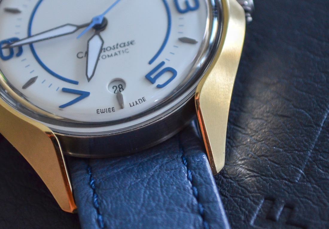
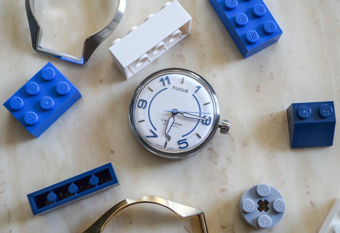
The dial looks very modern, but still gives a nod to watches of the past. The applied Arabic numerals are broken up by applied indicators that give the dial a less cluttered space. The numerals are in a 1, 3, 5, 7, 9, 11 layout, and I found this visually appealing over some of the more traditional approaches to the “bi-index” design (think Montblanc TimeWalker). My only gripe is that with all the applied aspects of the dial, the logo is embossed, and perhaps there was a missed opportunity for a stand-out 12 o’clock indicator – though I suppose it’s largely a matter of taste, and many may prefer the minimal, contemporary vibes of a uniform dial. I can’t help but give props to the brand for including a circular, matching date window above 6 o’clock without cutting off the marker; something that happens far too often, and always bothers me when plenty of space is available on the dial.

