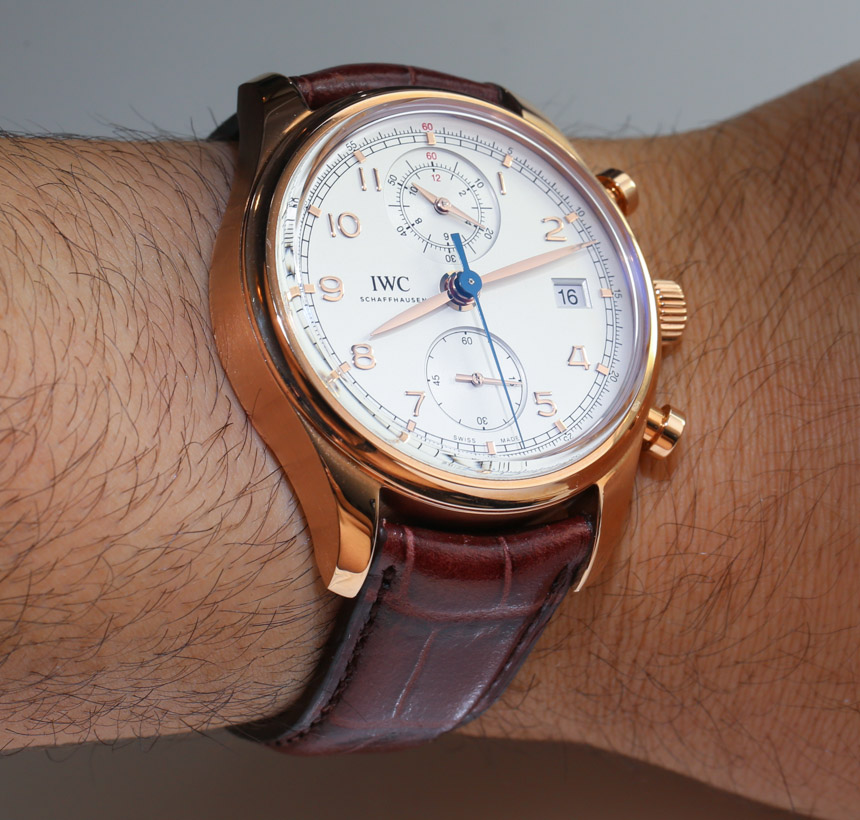
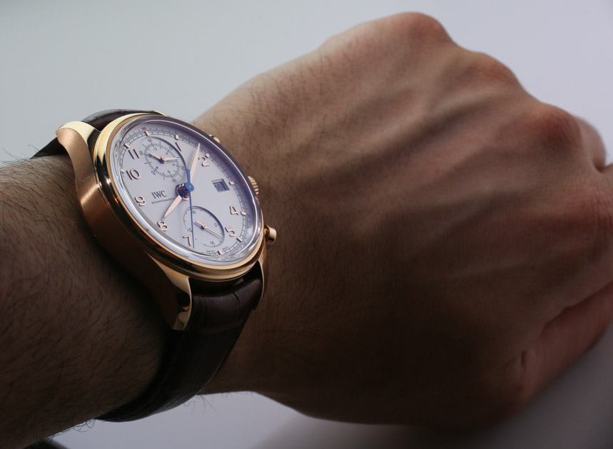
As a “Classic,” the watch fulfills its namesake in being traditional, but not exactly a dress watch. The style sits somewhere between traditional sport watch and suit watch, but there is a nice style diversity to make the IWC Portuguese Chronograph Classic look good with a suit or “nice” casual clothes. We like the case proportions and size that allows it to wear nicely but not appear too small. It would probably appear too large given the theme of the watch save for the inclusion of the chronograph that allows the package to make perfect sense.
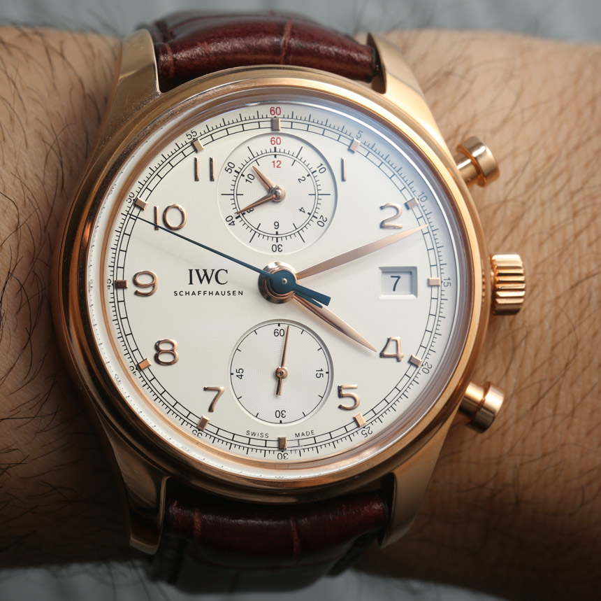
We have to commend IWC on once again giving the dial very nice proportions. The hands are all the right length and legibility is very high. The dial includes applied gold hour markers and a blued-steel chronograph seconds hand. Tiny hints of red add just a touch of classic sportiness. One thing we feel is missing on the dial is luminant. It is true that the standard IWC Portuguese Chronograph doesn’t have lume either, but we feel that the inclusion of lume in some manner would have helped increase the “daily wear” versatility of the watch a lot. If you do however want some lume on a IWC Portuguese Chronograph then I recommend you look at the IWC Portuguese Yacht Club Chronograph. It has virtually the same movement, but a larger 45mm wide case (that is available in titanium).
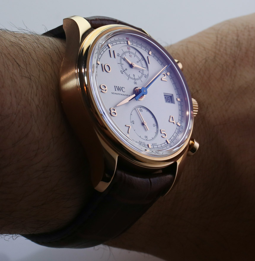
In this 18k red gold case, IWC offers the IWC Portuguese Chronograph Classic with either this “silver-plated” dial or a slate-colored dial. We prefer the lighter tone given that it feels more “classic.” The watch is available with the same two dial colors in a steel case as well. The dial details are well done, but we’ve come to expect that from IWC. Note the slightly recessed sub dials and beveled edge around the date window. These little elements are extremely important because these days it isn’t enough to have a nice dial, but you have to have a multi-level dial. Even with applied hour markers, the dial would be too flat, so brands need to look for clever ways of adding depth to a dial, but not disturbing legibility or calling too much attention to the various layers on a dial.
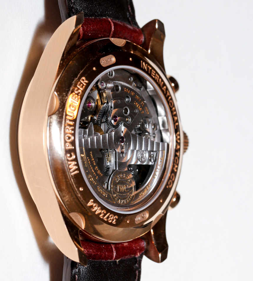
Over the case is a sapphire crystal meant to look like vintage acrylic crystals. This means that the top is mostly flat, but the edges are softly curved down. It does help make the watch look a bit more “classic,” but still extremely modern when it comes to materials. While we like vintage watches, it is difficult to recommend vintage watches in a lot of instances because many of them simply were not made as well as watches today, this is especially the case when it comes to cases, crystals, and dials. Then again, new watches are often much more expensive.