Swiss Rado is working to offer more for fans of modern mechanical watches who may tend to see the brand as characterized by a lot of quartz and an aesthetic that looks modernist from a 1980s perspective. Part of the challenge in appealing to more male watch lovers is putting all the strong visual DNA the brand has cultivated into something more contemporary-looking. The Rado Ceramica Automatic represents all these things and more about the brand, including Rado’s early role in using ceramic as a watch material, of course. What the Rado Ceramica comes down to for me, however, is a refreshingly “different” wearing experience compared to most watches, and I mean that in a very good way.
The Ceramica collection has been around since 1990, but it fits right in with the brand’s aesthetic, particularly with similarly non-round collections like the Integral that came before it and shortly later, the Sintra. I believe the Ceramica was meant to embody the brand’s values of minimalist, modernist styling and use of ceramic. As is pretty well-known, Rado pioneered ceramic watches with the “first scratch-resistant watch” in 1962, the Diastar, made of tungsten carbide. Nowadays, ceramic watches and ceramic watch parts (especially bezels) are everywhere—not least from Rado’s Swatch Group siblings, which makes one wonder about how much Rado’s own expertise has helped brands from Omega to Blancpain steal the ceramic spotlight.
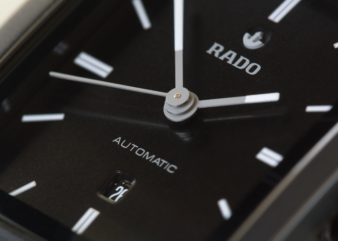
Rado introduced the redesigned Ceramica in 2016 and then announced the Automatic models in 2017. The automatic versions are thicker to accommodate mechanical movements and have different dial designs than the quartz. The new models sure look like an improvement on the outgoing collection and indeed more modern in design. More importantly, the Rado Ceramica Automatic gets some key features right in its design and execution.

The Rado Ceramica is certainly quirky and “different” from a traditional watch design standpoint, and of course it will be polarizing. Most people will have made up their minds about whether or not it’s a watch for them. So rather than trying to make everyone happy, Rado’s goal should be to satisfy those who are naturally attracted to this type of (or this particular) design. With all of Rado’s quartz watches with glossy ceramic, the brand’s perception as making women’s watches is another hurdle for a men’s watch like the Ceramica Automatic. There are Ceramica models clearly aimed at women, but at least these couple of Automatic versions are definitely conceived with male consumers in mind (even if some might deridingly call them “unisex”).
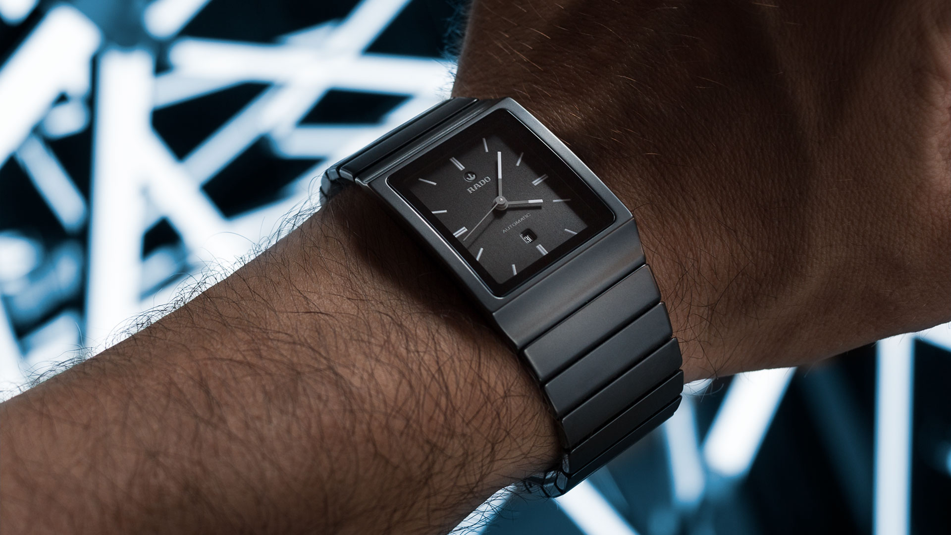
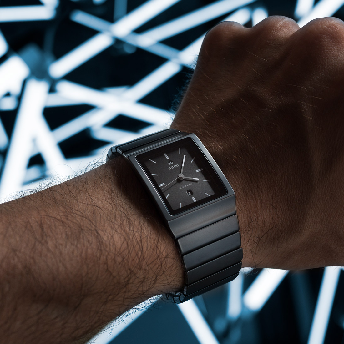
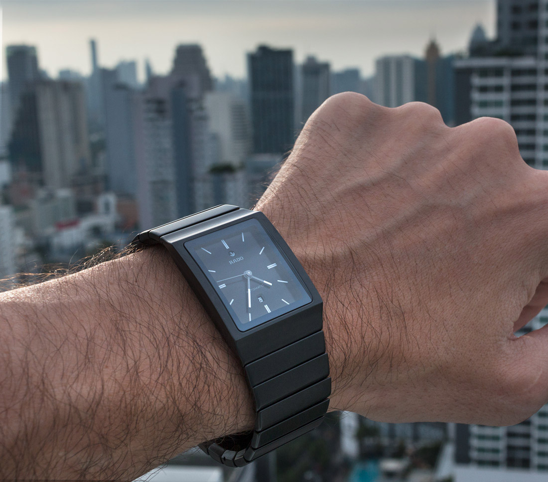
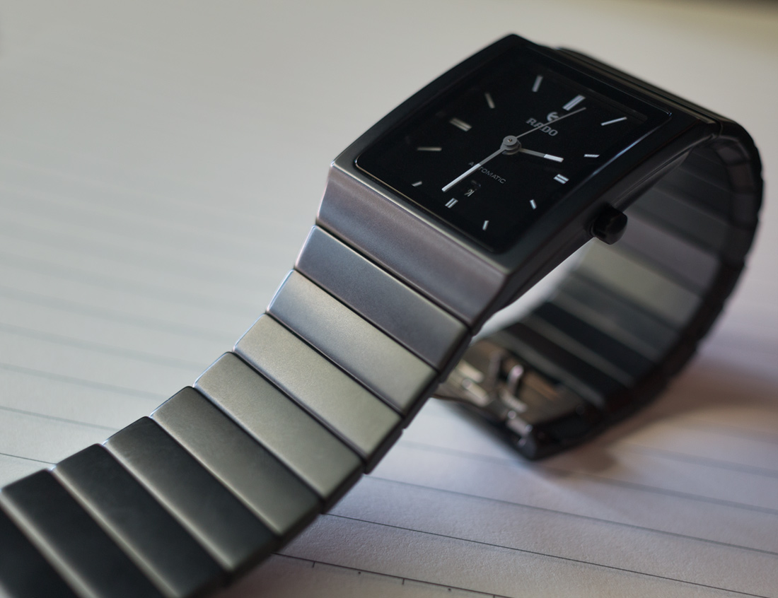
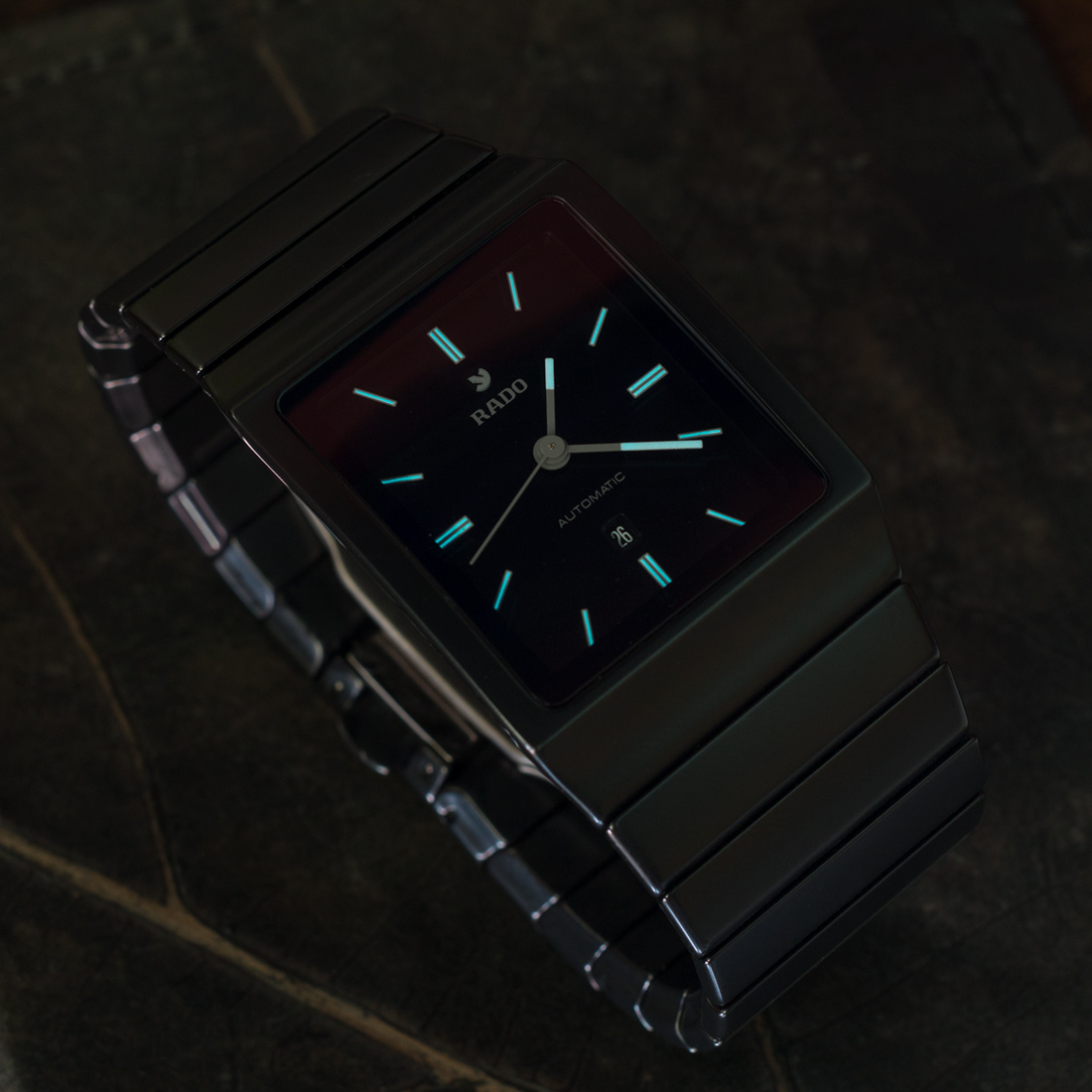
Aside from the automatic movement inside, which is something male watch lovers disproportionately tend to value, Rado did a couple of things to imbue some masculinity in a watch shape not typically associated with modern men’s watches. The first is the ceramic’s matte finish, and this is really successful, in my opinion. A number of times, I have seen pictures of Rado watches that looked cool but then just turned out to be far too glossy in person for my taste. While the deep black color is almost austere, the matte ceramic has a very soft texture to both the skin and the eye, and it is easy to visually appreciate the almost organic contours of the case and bracelet.
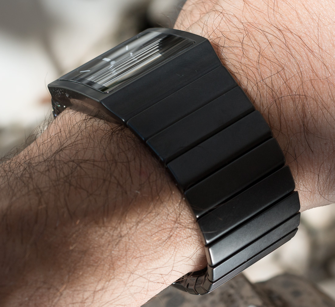
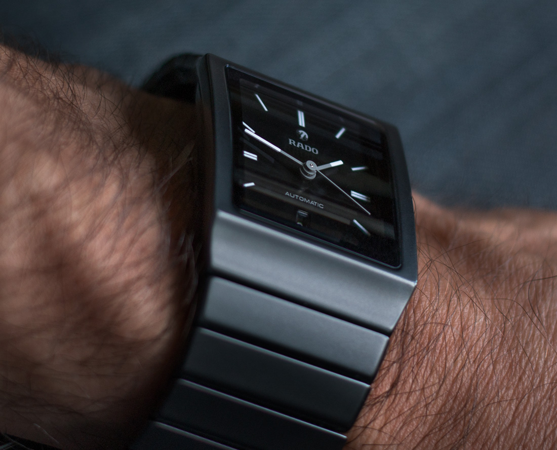
Another important part of the Rado Ceramica was sizing it for men. That means a case that measures 30mm wide by 41.7mm tall, with a thickness of 12.3mm—that’s not that big, but it is bigger than the women’s versions and reasonably well proportioned for many male wrists. I said it’s a quirky watch, and this 30mm width is where Quirk #1 comes in. A major design feature that defines the Ceramica collection is a near uniform width from the watch head where the bracelet hardly tapers at all. In this case, the watch’s bracelet is a burly 25mm all the way to the underside of the wrist, sometimes making the watch head itself appear too small. This is all subjective, and I get that this is part of the Ceramica DNA and gives the watch a certain distinctiveness, but I feel that a bit thinner might have been more elegant.
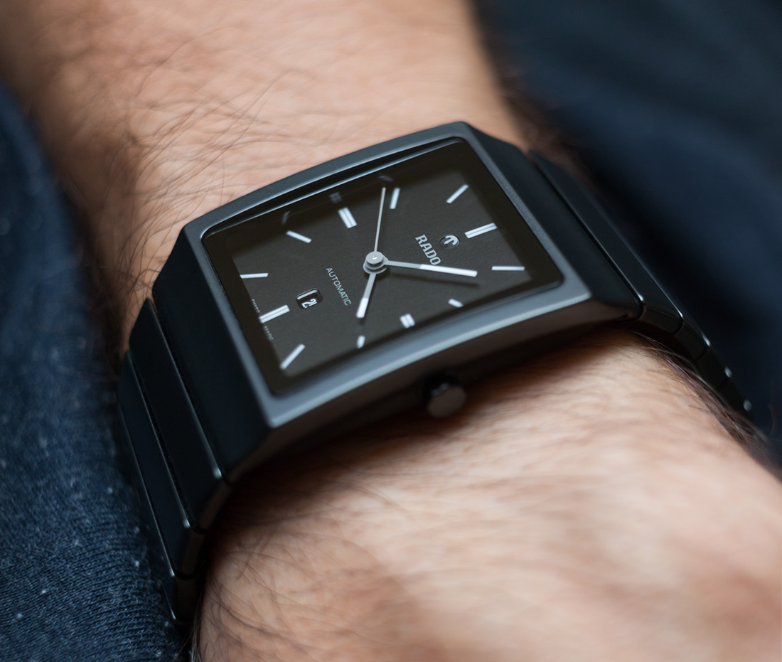
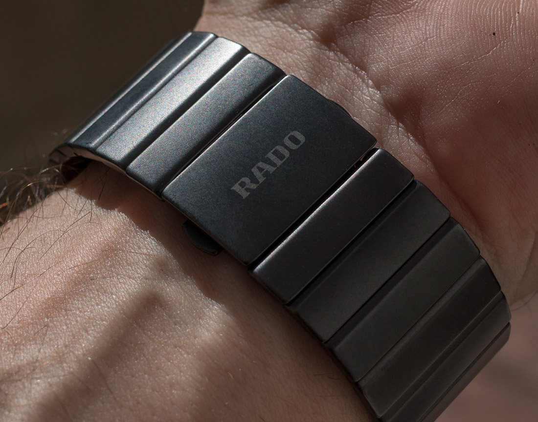
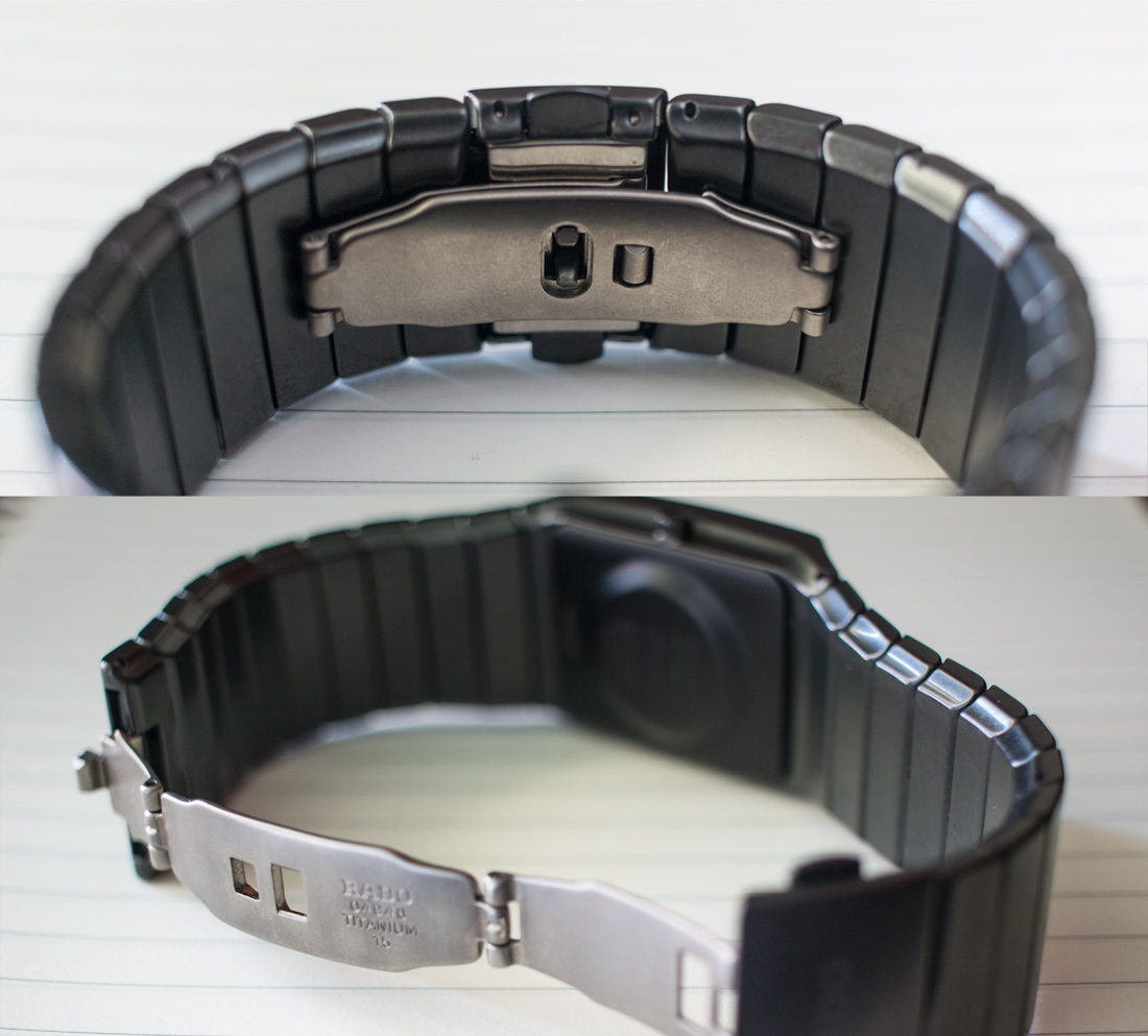
Sticking with the bracelet, Quirk #2 has to do with the clasp. It is made of titanium and functionally is of the butterfly variety, but with one short piece and one longer. The issue here is that it causes a bit of a gap sometimes—at least on my bony and angular wrist (seriously, if your wrist is rounder than mine, it might not be a problem at all). If Rado is going for one adjective with the Ceramica, I think it’s “sleek.” So getting the bracelet to hug and flow with the wearer should be an important consideration, and I wonder if this could have been addressed with cutaways on the inside of the bracelet links for the clasp to fit into—just a thought. Both the clasp and the wide bracelet are things that kind of irked me at first but that have come to not bother me anymore—this is part of the value of a long-term review.