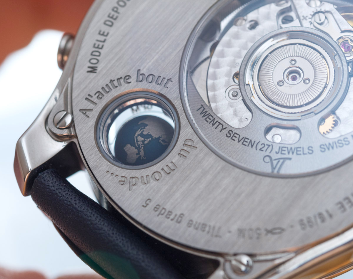
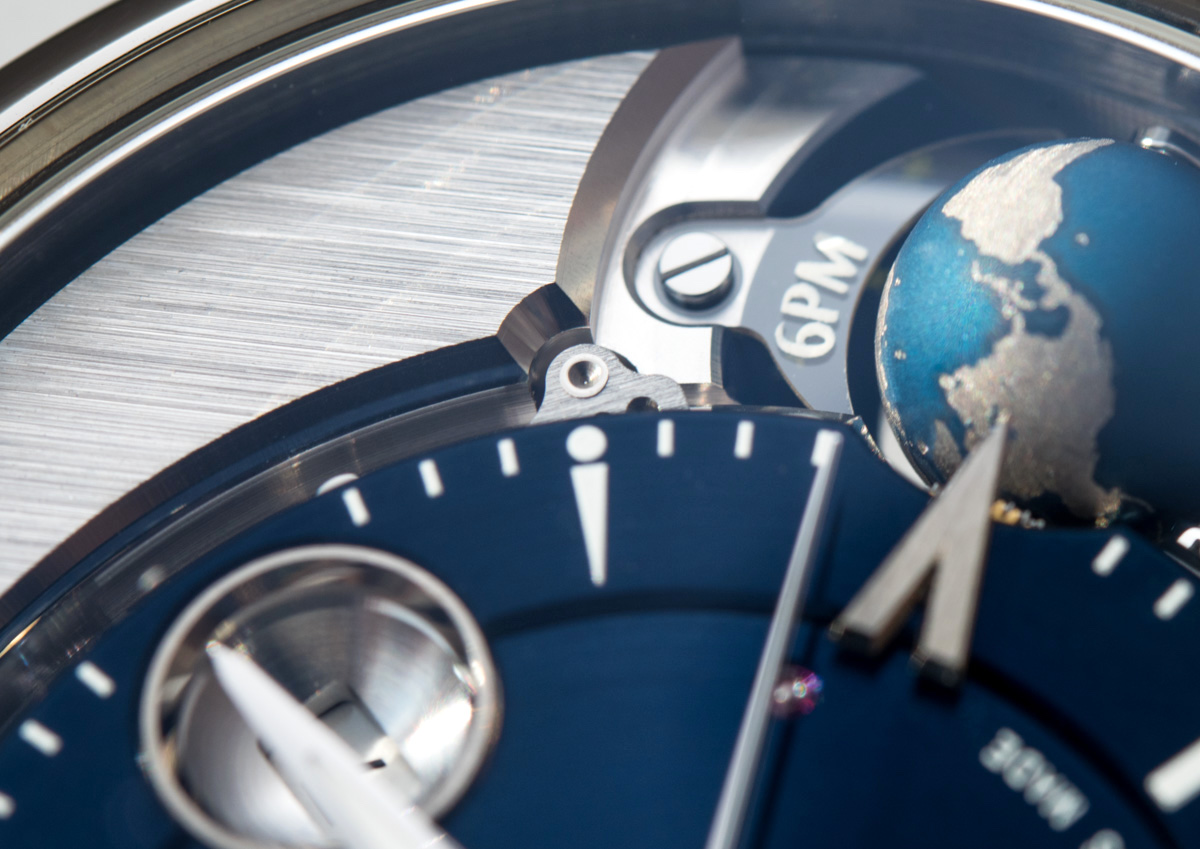
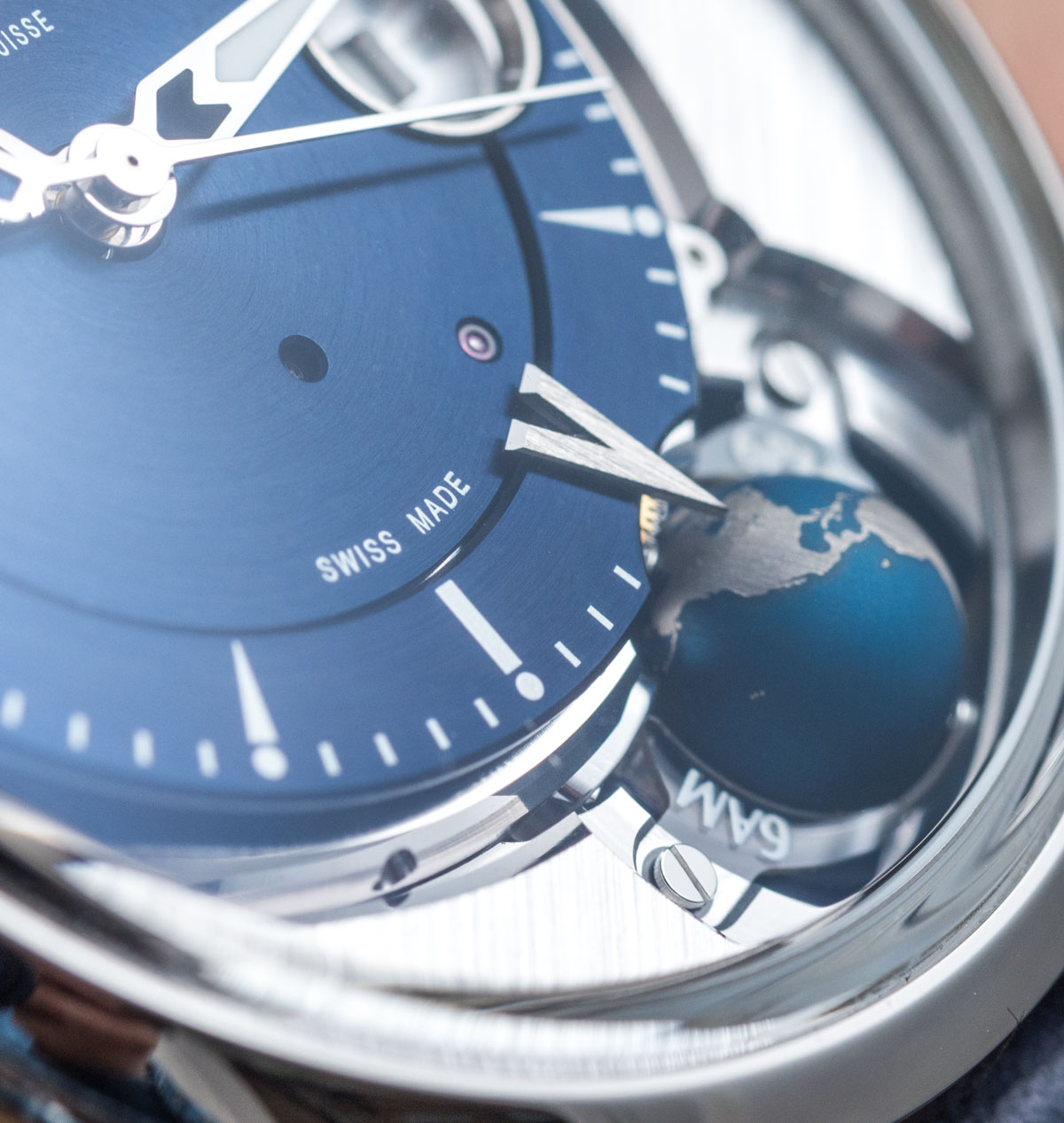
The 7.50mm diameter globe is crafted from titanium, just like it is on outrageously priced alternatives, in an effort to keep its weight at a minimum, hence reducing the strain on what actually is a sturdy and torquey caliber. All larger and smaller bodies of water are represented in a deep, consistent, albeit non-cheesy blue, whereas land is indicated by the exposed titanium that, for some reason, has extremely fine vertical lining on its surface – so fine that one would be hard pressed to see them with the naked eye, but they do show up on macro photography. Perhaps it is where we should note that the watch is named after Tycho Brahe (14 December 1546-24 October 1601), who was a Danish nobleman, astronomer, and writer known for his accurate and comprehensive astronomical and planetary observations, well known in his lifetime as an astronomer, astrologer, and alchemist. He was described as “the first competent mind in modern astronomy to feel ardently the passion for exact empirical facts.” Tome 2 in the watch’s name stands for second edition.
The Movement & Module
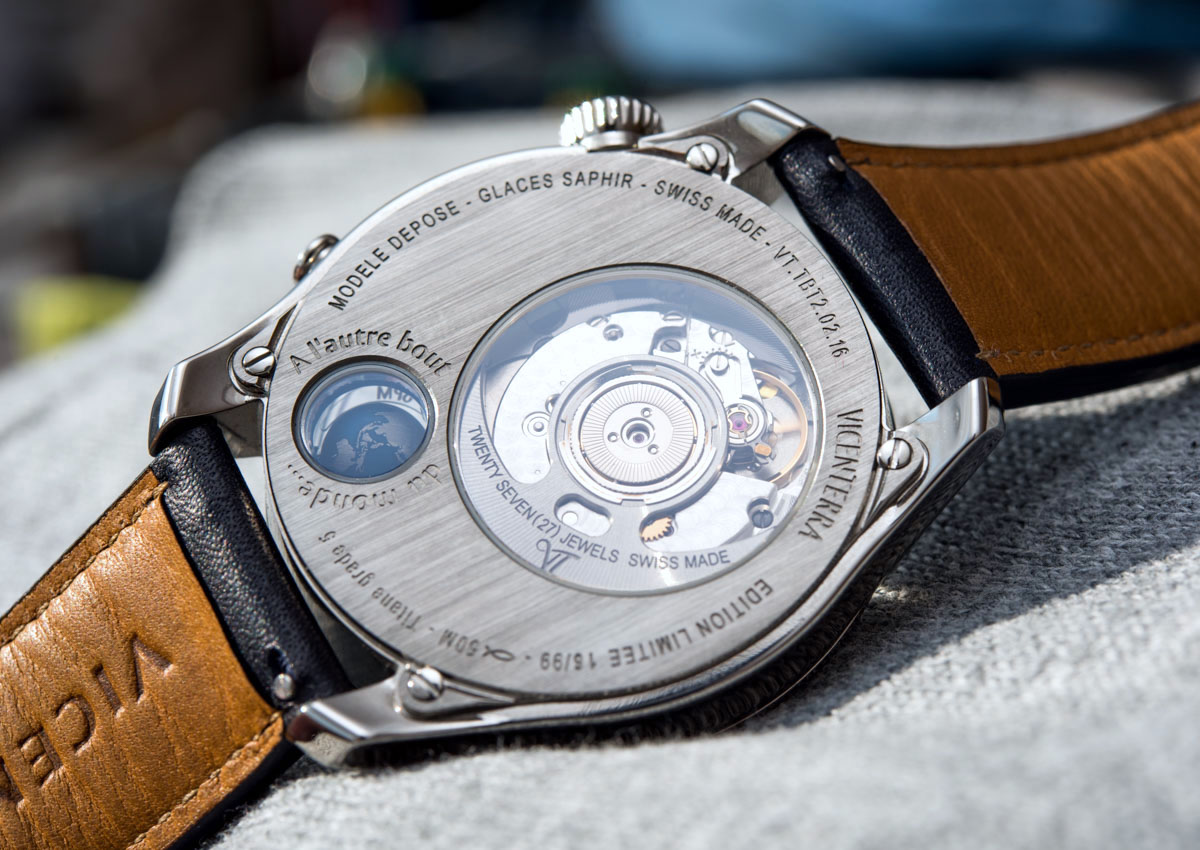
Just a quick note on the movement and module basics before we move on. The ETA 2892 automatic movement runs at the usual 4Hz frequency – it’s good to see that its frequency did not need to be lowered because of the modifications – has 21 jewels, displays hours, minutes, seconds, date, and (vaguely) a second time zone with the globe, and runs for 42 hours. It comes with a customized oscillating weight that is, along with the back of the movement, put on display via AR-coated sapphire crystals. The perlage on the automatic winding plate, along with the custom rotor make for enough eye candy on the back for this sort of money – anything less wouldn’t be acceptable. The movement is mated to an exclusive extra module developed by Vicenterra. This module has six jewels and is designed to link the globe to the movement as well as allow for the adjustment of the globe via the pusher at 4 o’clock.
Dial & Legibility
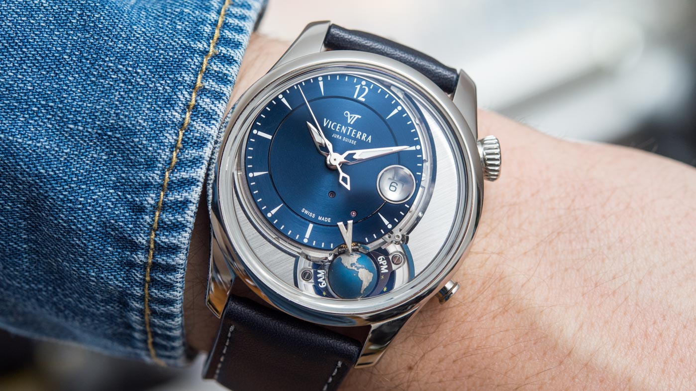
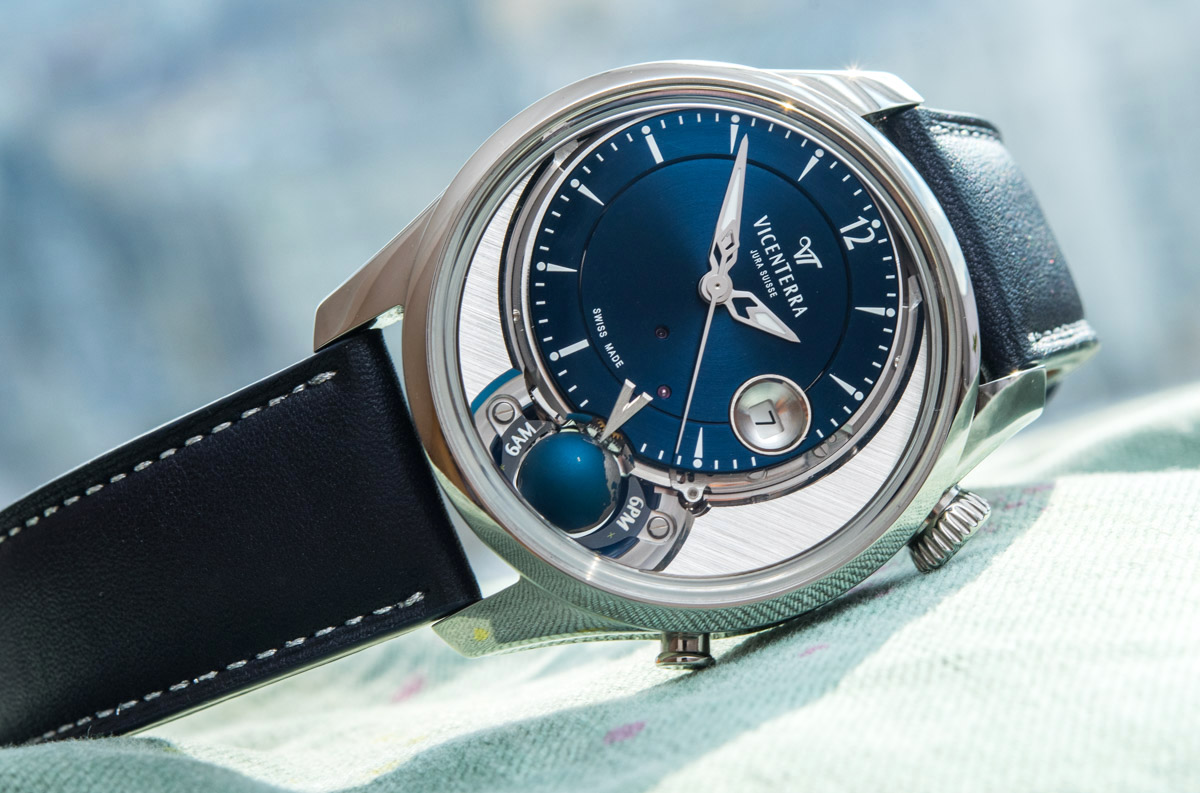
Before we discussed the time dial itself, we must note how the rest of the face of the watch is executed because this, all on its own, is truly remarkable as well. The appreciably three-dimensional globe sits in its own little space, with its suspending axle barely visible, and this space is further enlarged by the aforementioned 6AM and 6PM transparent platforms. Now, placing a round dial and this extension into a round case caused some basic geometric issues, which required the use of some “fillers” in the space that opened up between the bezel and these two main elements. Vicenterra opted for two large, metal pieces that are beautifully shaped and elegantly brushed on their top to fill in this excess space. Their edges feature some very thick and very shiny anglage that works with the shiny case and some dial elements beautifully. I cannot, no matter how hard I try, think of any big brand to have done something as creative, as tasteful, and as high quality as these two pieces alone. Let me know if you recall anything from recent years (or ever), at this price point.
Even the base of the dial/top of the movement features more beveled and polished edges, so that when you try to peek under the dial and find some corners cut, it’s a massive, beautiful, polished edge that winks back at you. Beyond the execution of these elements, their proportions deserve a lot of praise as well. Quirky-complex watches like this – even with dizzying price tags – often end up looking no more elegant than a semi-melted scrapyard, with all dial and case elements just randomly thrown on the dial as their movement engineering necessitated them to be. Here, however, the diameter of the dial, the space visually reserved by the globe and its surroundings, the diameter of the bezel and case, as well as the size and shape of these “filler” elements are all beautifully harmonious, something that may not even stand out at first as one is busy looking at the more prominent features of the watch. This coming together of such an unusual layout, features, and design elements is just inspired.
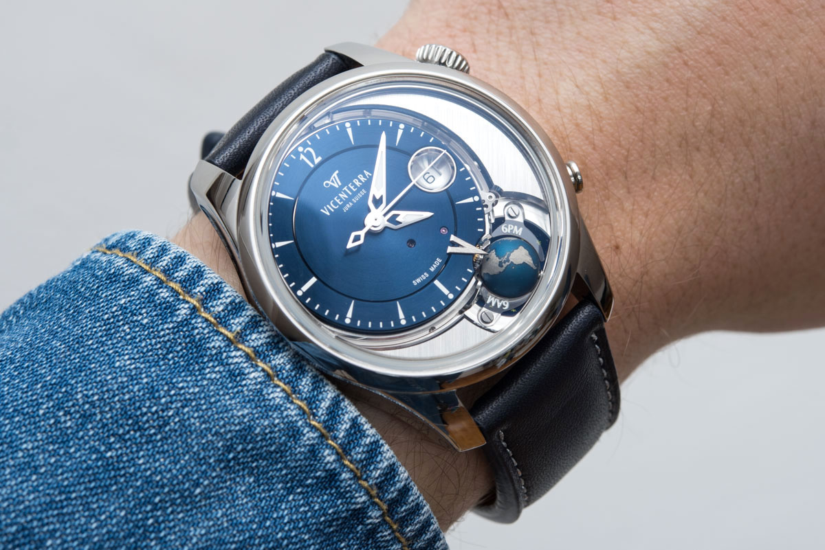
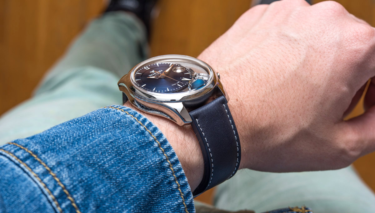
The main dial itself is deep blue, but none of that lacquered, cheesy nonsense – it’s more of a high-tech, coated blue, rather, that I find a lot less boring and tame as I do most blue dials these days. The tier right by the indices is an elegant solution to adding a bit more weight and complexity to this sub-dial, while the white printed indices are large and creative enough to make you forget they are printed and not applied. I’d go so far as to say that they’d possibly take too much of one’s attention away from other, more important features, were they all applied. I particularly like the Arabic 12 index, something that really helps one read the time more easily as orienting the hands becomes less of an effort compared to a round dial with the same indices all around. A neat detail that I also enjoy are the two exposed jewels, a rare treat almost never seen on solid dials elsewhere. The trick here is that I don’t even see them about 95% of the time when looking at the watch – so they don’t bother me at all, and in that 5% of the time when I do spot them during one of those occasions when I keep staring at the watch for longer, I find them to be a fun piece of design.
The hands are the correct shape and size to aid legibility and do under all circumstances contrast well enough against the blue dial – possibly because, as I said, the dial isn’t lacquered but rather coated, so the dial is not a shiny, illegible mess that so many others appear unable to resolve. The hands are just a tad thinner than I’d ideally like, but they are high quality, nicely made hands. I presume they couldn’t be any longer or thicker or else they, paired with the titanium globe, would cumulatively put too much strain on the movement. Although arguably not entirely necessary, I do appreciate the running seconds.
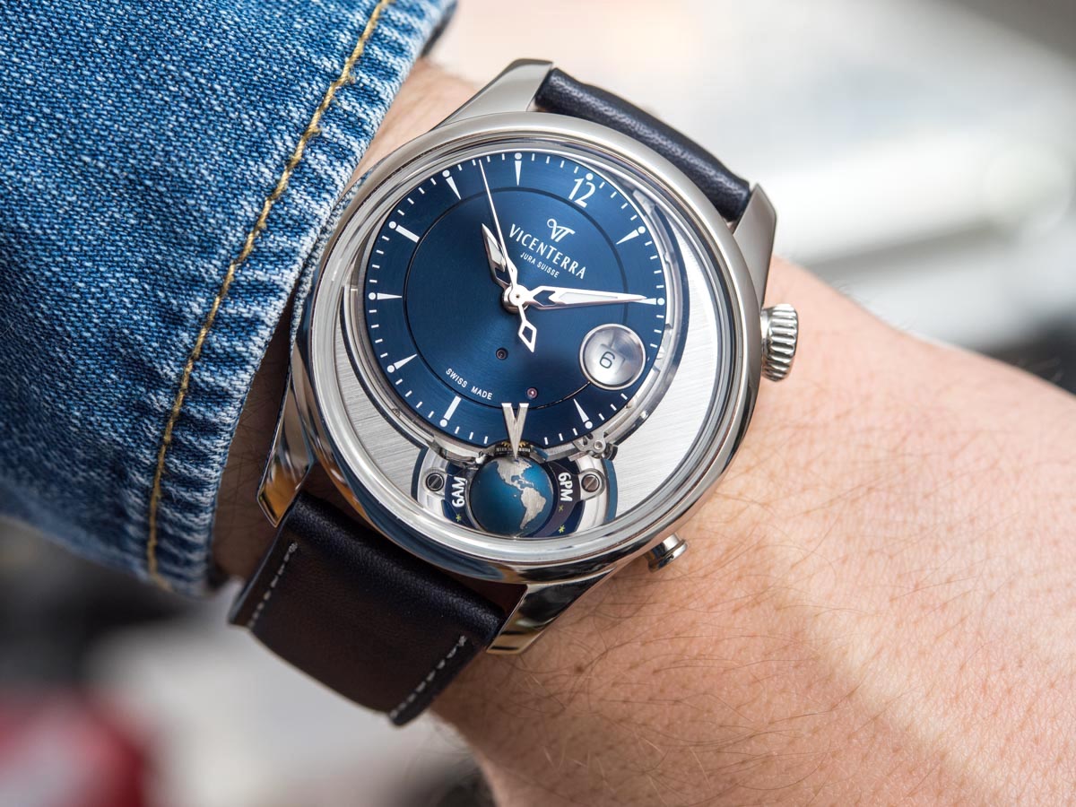
The date at 3 is rather special too: it is sitting at the bottom of a bowl, like the V-index, also entirely crafted from solid 18kt white gold. I believe this was done out of consideration for proportions: a smaller date window would be an annoyance, whereas this one is more of a “feature” that works well in tandem with the other ones on the unusual dial side of this Vicenterra. I like the idea of having this chunk of white gold on the dial, but what I like even more is that it’s telling me thought, design (this is not an off-the-shelf component by any means), and a care for the balance in its visual weight all went into it. I don’t think I’d like the watch quite so much without it.
Case Execution & Wearability
The Vicenterra Tycho Brahe Tome 2 Blue comes in a grade 5 titanium case that is 42.80mm wide and 11.70mm thick. I’d venture saying it wears much more like something with a 41mm case both in terms of how it looks and how it feels on the wrist – in fact, I’m quite surprised by the near-43mm figure. The case is water-resistant to 50m, so you need not be afraid if you are pushed into the pool with this watch on – but you probably won’t want to willingly wear it under water. The front crystal is “boxed” as in it isn’t flat and flush with the bezel. Don’t confuse it however with the typical boxed crystals: this one raises from the plane of the bezel near the edge in such a way that it appears to have more of an extra angled edge or veneer, than a steep edge. This also works with the beveled edges that I mentioned previously on the dial side, even if one’s eye can’t really pick up where this other layer of refinement is coming from. Both this and the two caseback sapphire crystals have been amply anti-reflection coated.