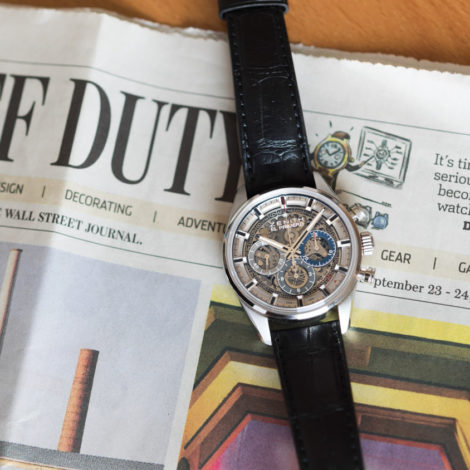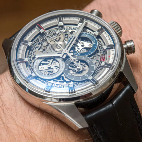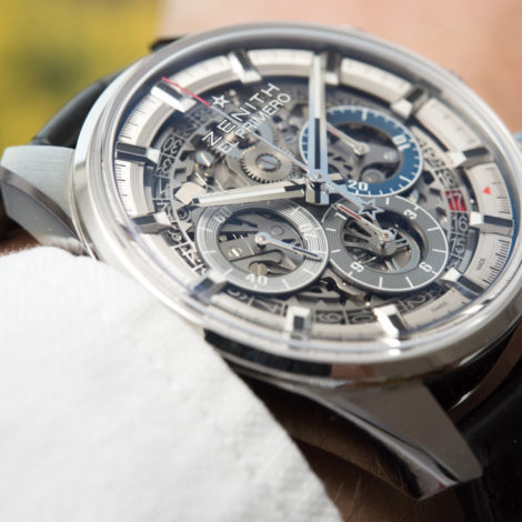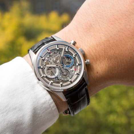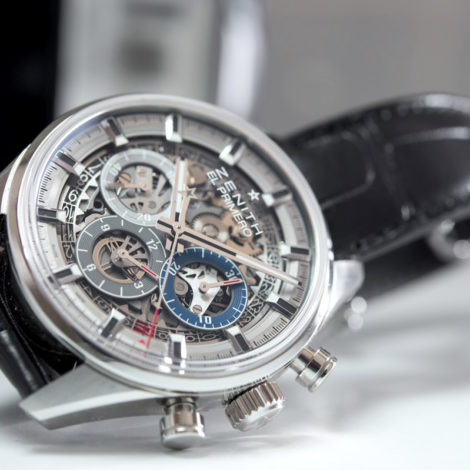
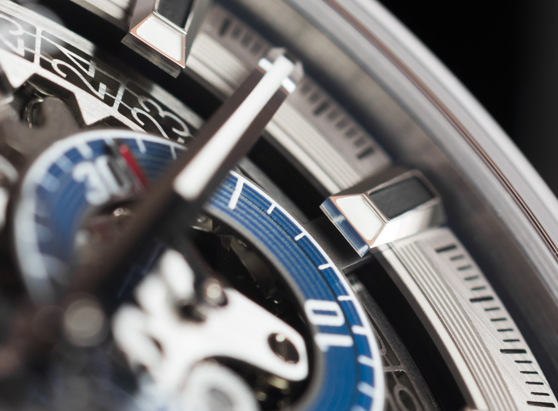
Legibility
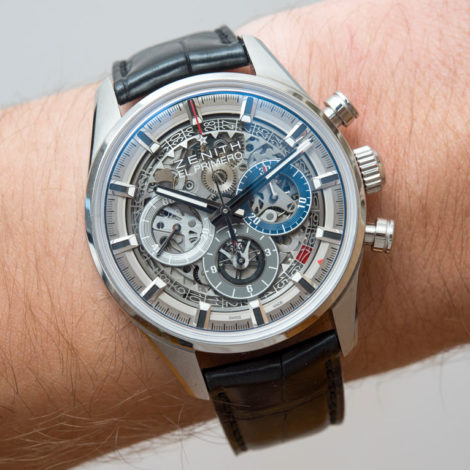
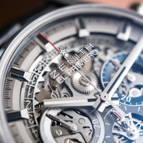
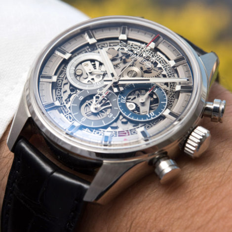
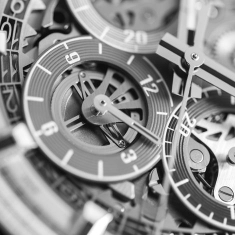
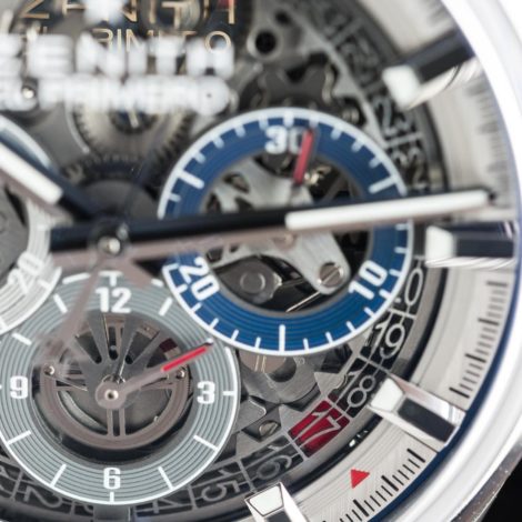
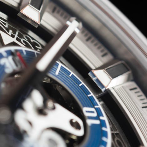
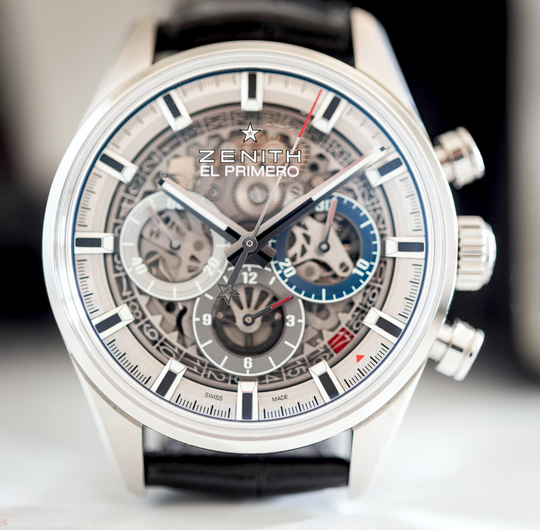
For a “full open” watch to remain tasteful, it must remain legible – i.e. maintain its core functionality as a timekeeper – and this iteration of the El Primero does a good job at all that. The hands remain absolutely massive, amply wide, and super long, as the minute hand reaches over the minute track on the very periphery of the dial. What sort of sorcery is this? Why can’t all watches be like this?
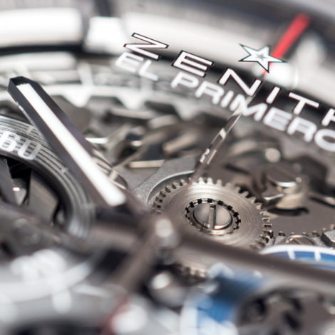
Not sure if you have noticed, but the hour and minute hands are essentially exactly the same as the ones on the steel Rolex Daytona 116520 (reviewed here) – I’ll eat my hat if they’re not from the exact supplier. The only difference to note is in the length of the white lume strip in the center, and that the hands in the Rolex Daytona are in white gold. Two iconic watches rock basically the same main hands – and, guess what, I bet neither of them would have lasted this long if they had measly, miserable, tiny little hands.

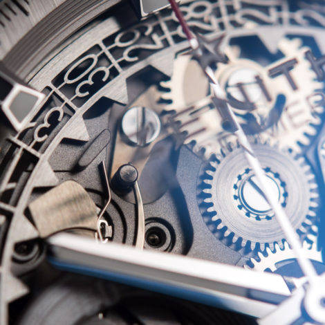
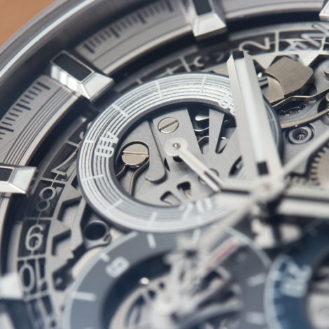
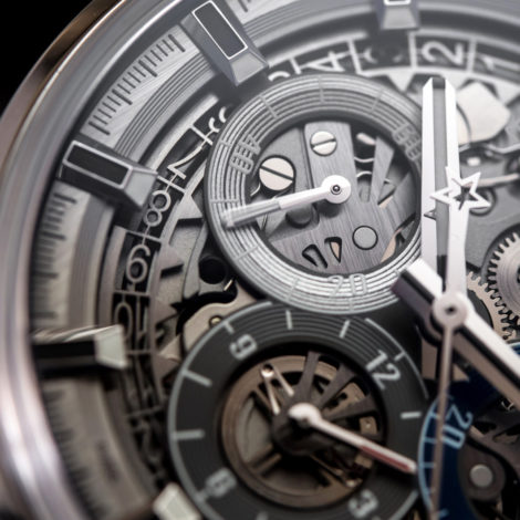
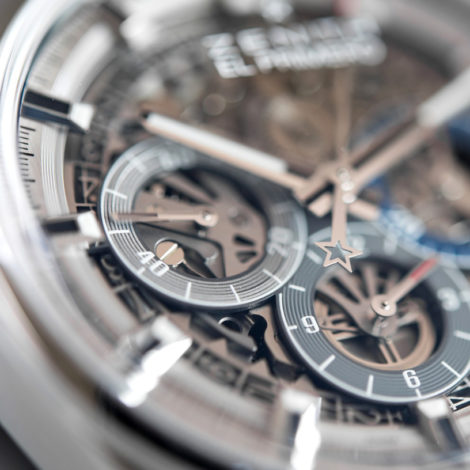
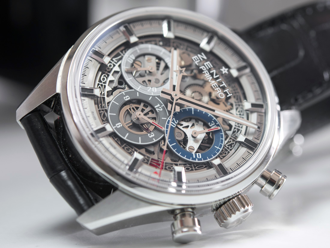
Equally large, wide, long, and blocky applied indices go with the main hands beautifully, adding weight and substance to a dial otherwise dedicated to incredibly small and reflective parts. All this makes for an excellent balance between the delicate full open appearance and the masculine, powerful aesthetic of the original El Primero – great work there.
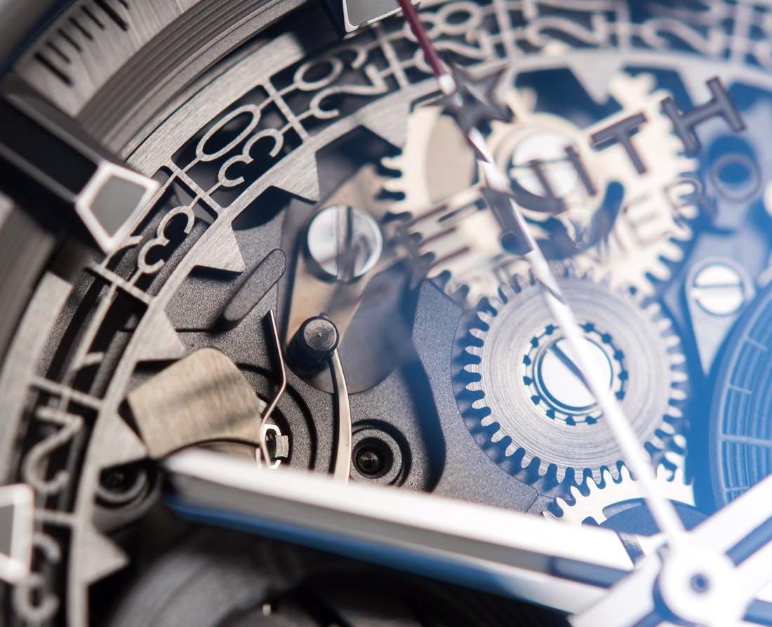
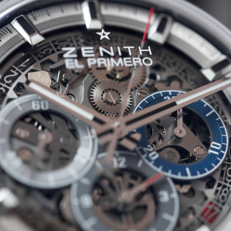
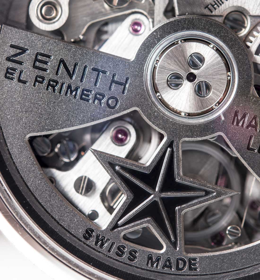
A fun element is the Zenith El Primero logo printed on the underside of the front crystal – I already love how purists will not refrain from making themselves look ridiculous again by flipping out over something this. In reality, it adds a lot of depth to the dial that doesn’t have any space whatsoever for this logo on it anyway. I understand that the open dial gives plenty of stuff to marvel at, but trust me, a few months into owning a watch (any watch) it is these unexpected details that you will grow to appreciate. Last, but not least, if you’re so against it but otherwise like the watch, I’m sure the crystal from the solid dial version will fit just fine.
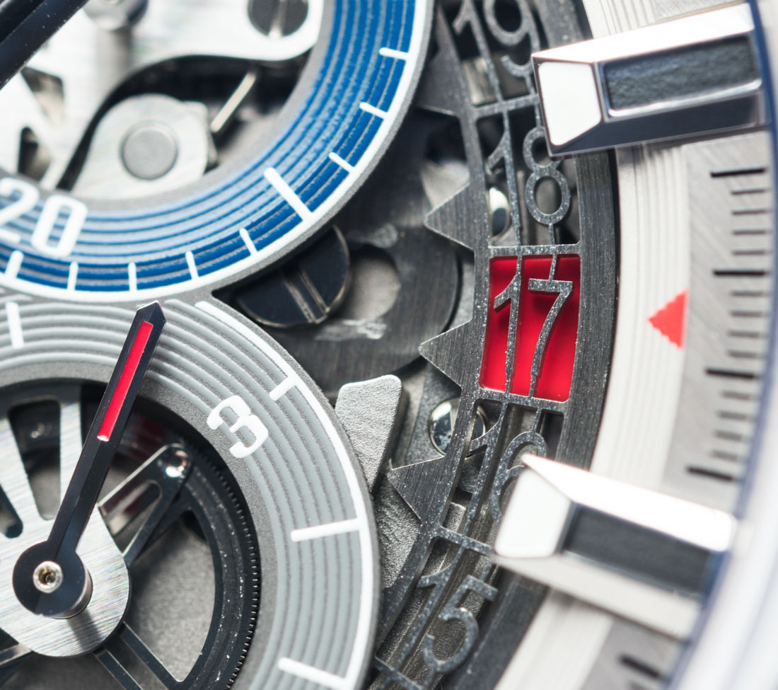
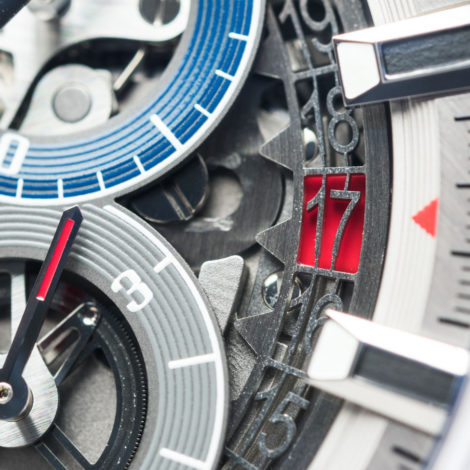
The date remains at the 4:30 position, but is now indicated by a skeletonized disc over a red block – there is even a small red triangle that points at it that isn’t present on the image of the watch that Zenith presently uses on their official site. I can really appreciate seeing a big brand like Zenith proving to be flexible and making such adjustments to a design even after the original launch, in an effort to further improve on legibility and user-friendliness.
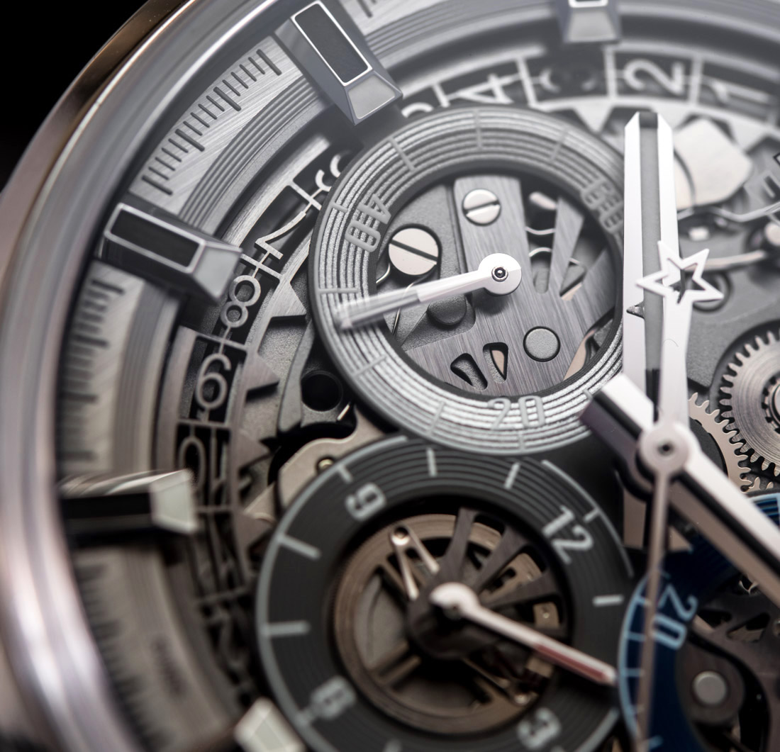
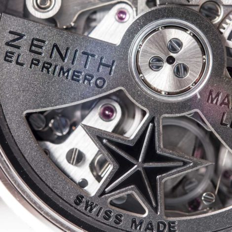
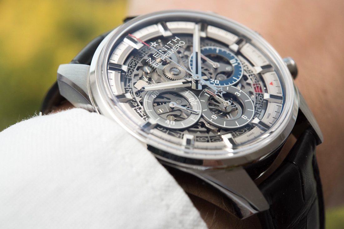
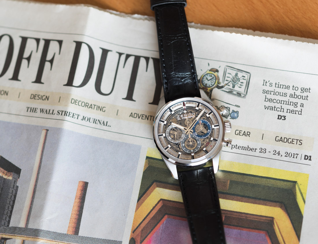
In summary, legibility remains OK for a watch with essentially no dial. If your near-sight is poor, then you’ll have trouble reading the sub-dials, but that comes more from this being a 38mm wide watch with three sub-dials, than from there not being a solid backdrop behind the sub-dial hands. A nice touch is how the frames of the sub-dials represent the original sub-dial colors of the El Primero, coming in at silver, grey, and dark blue – just like the large hands and indices, these also help preserve the El Primero look.

Proportions
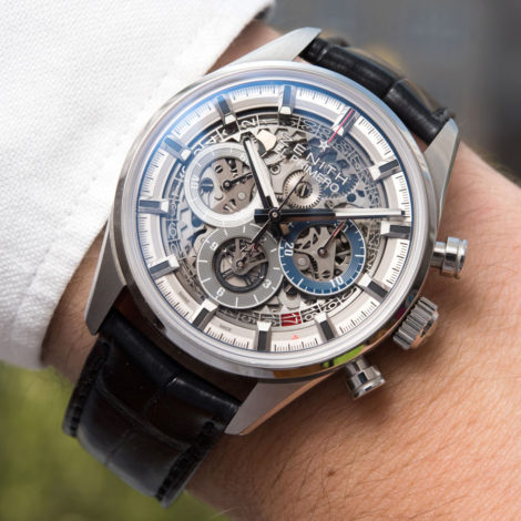
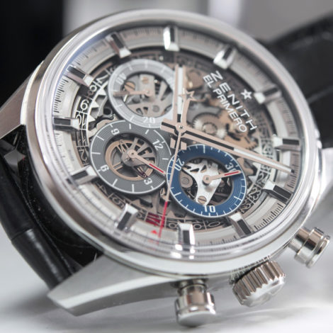
My favorite attribute of the Original 1969 was its spot-on proportions – looking at that small, 38mm wide watch with its large sub-dials was an oasis to my eyes in a world so full of visual and aesthetic pollution. In the metal and on the wrist, it was just right. I can’t bring myself to feel the same about the Zenith Chronomaster El Primero Full Open. At some sections of the dial, to my eyes at least, there appears to be too much space, like above the plane of the sub-dials. Then, the minute track on the periphery is a bit too thick and pronounced, even if, after a close comparison, I could see how this flange ring actually is considerably narrower than on the solid dial version.
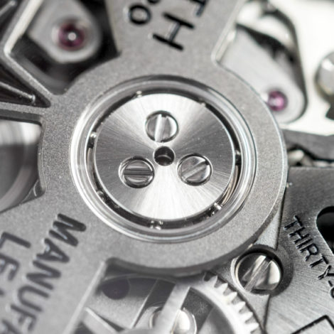
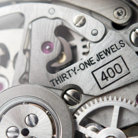
As I have noted above, I have come to appreciate all the separate dial elements – the hands, the fantastic variety of exposed movement components, the large indices, the sub-dial frames, and so on – but once put all together, they just don’t add up as nicely as they do on the solid dial version. I’m ready to admit that maybe I just like the Original 1969 variation too much; and I also can’t stress enough that the way the proportions and overall design of a watch works is for everyone on their own to decide – and there’s no better way of doing that than by trying it on.
Conclusions
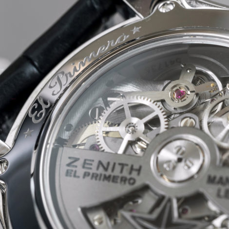
If you miss the usual history segment or the one on wearability and further details of the movement, may I suggest that you check out my review of the Original 1969 variation, which, as I said in the beginning, is essentially the same watch, at least as far as those attributes are concerned.

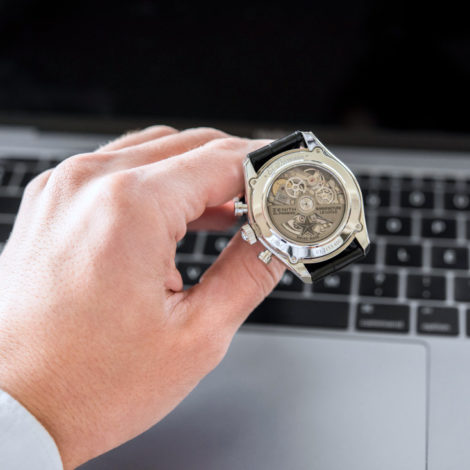
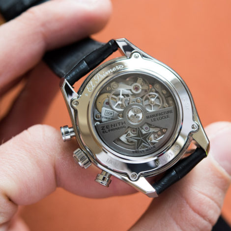
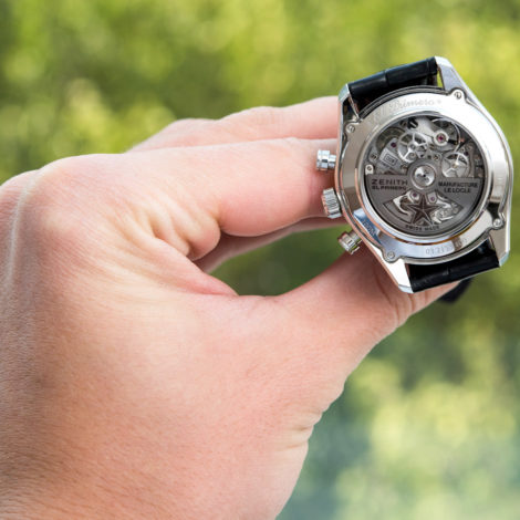
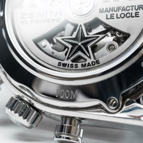
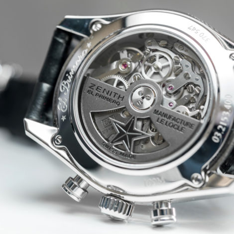
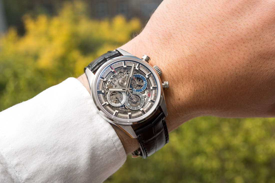
Overall, I genuinely wanted to see the Zenith Chronomaster El Primero Full Open 38.00 in the metal, as I was curious how an open dial El Primero would appear and wear in real life. Overall, I can say that it, to date, puts the absolute majority of other chronographs in its segment to shame thanks to its beautifully designed case, great wearing comfort, nicely executed movement (both on the back and the dial side) and… it’s a 38mm wide El Primero, which is hard to beat. Too bad this strong package comes at a rather steep price.
The Zenith Chronomaster El Primero Full Open 38.00.00 (reference 03.2153.400/78.C813) is priced at €9,600 or around $11,200. zenithwatches.com
Necessary Data
>Brand: Zenith
>Model: Chronomaster El Primero Full Open 38.00.00 (reference 03.2153.400/78.C813)
>Price: $11,200 USD
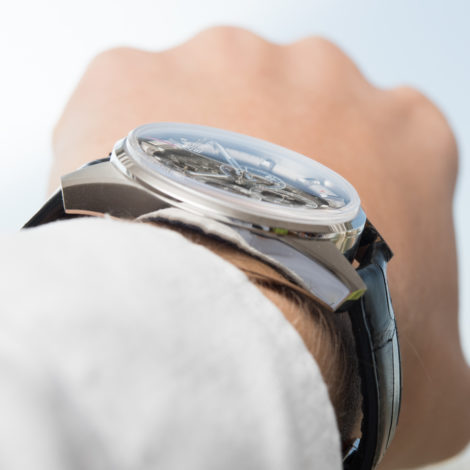
>Size: 38mm wide, 12.45mm thick
>Would reviewer personally wear it: Sometimes.
>Friend we’d recommend it to first: Fan of open-dial watches but wants it in a smaller, more wearable sized watch.
>Best characteristic of watch: The 38mm I think is still the best size for the El Primero. Good job by Zenith on getting the “full open” details right on the dial.
>Worst characteristic of watch: Proportions could be improved as that of the Original 1969 is hard to find here, despite the case being the same. Rather audible movement may be annoying to some.