
So, if it isn’t technically new and isn’t a tour de force either, then what is the Blancpain Fifty Fathoms Bathyscaphe Quantième Annuel? Is this supposed to be quirky-cool? I mean, sure, in every luxury product category imaginable it’s a thing that a certain type of widely recognized and excessively expensive model of a major brand gets accoutered in stylistic elements or functionalities that are fair and square a total misfit for it. Think of track-use focused SUVs, or, you know, luxury sports watches with tourbillons and complex calendar functions.
I like to think that I have an open mind and would even call my taste more “accepting” than conservative when it comes to luxury watches, so you can imagine my confusion from finding myself basically sitting here, telling myself that I should be liking this Bathyscaphe more – especially since I do like the Bathyscaphe in general. I just can’t, however, stop feeling that the overall execution of the annual calendar is as lazy as the “let’s throw our annual calendar in the Bathyscaphe!” idea itself.
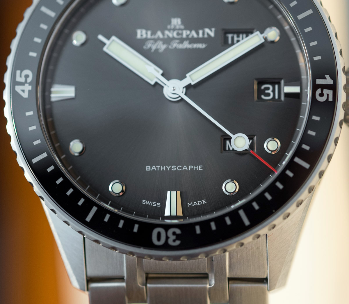
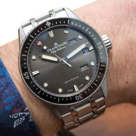
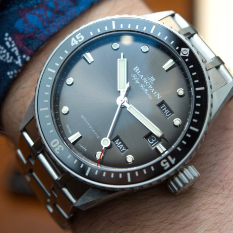
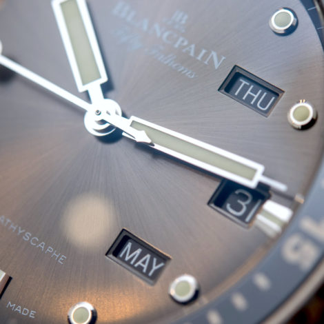
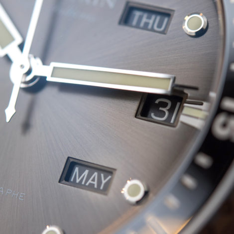
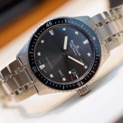
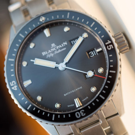
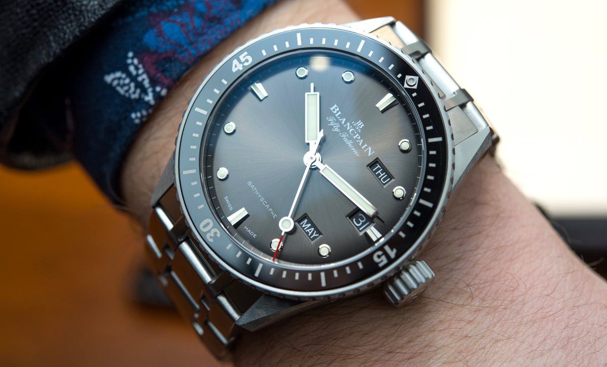
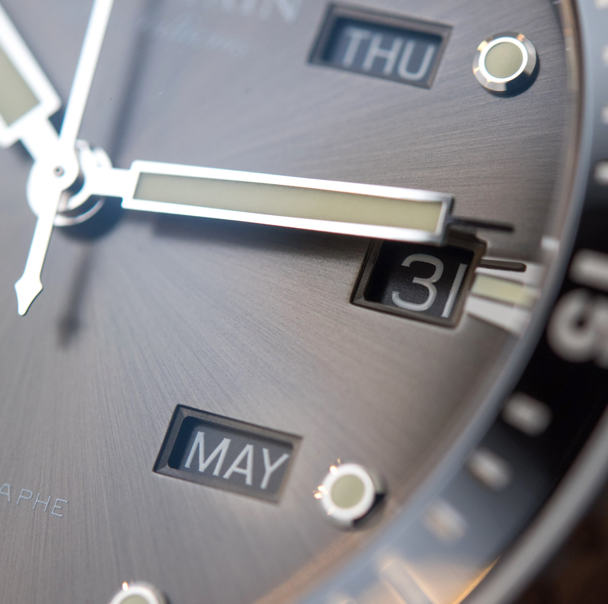
For starters, the day and month indications are not that legible, which is only made worse by the wide (and awesome) hands that were designed to be this large and that, consequently, end up blocking at least some of the calendar indications a lot of the time. This just shows that it’s no wonder that such complex indications primarily belong on dressier watches where the more refined, delicate hands don’t hide so much of the indications so much of the time. On dress watches the hands often are even skeletonized to minimize the time they spend blocking any of these extra displays, but that isn’t something you can or should do on a dive watch.
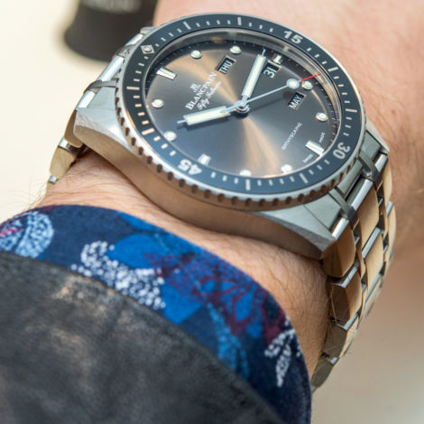
Beyond legibility issues lies the integration of the complication into the overall, much-loved design of the Bathyscaphe. I’m not sure if the 2-3-4 indications are supposed to be funny or refreshing – but they come across as neither to me. The rectangular apertures clash with the neat, rounded indices as much as they do with the curve of the bezel that flows right next to them – the three windows stand out more than they should, I think.
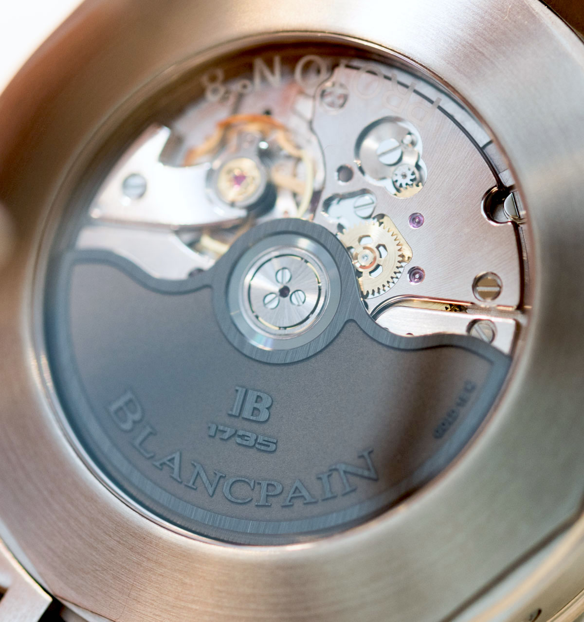
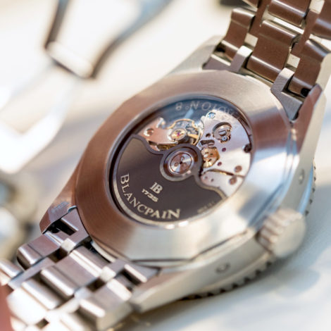
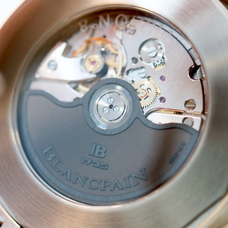
The 6054.P caliber – based on the brand’s 1150 base caliber – impresses with features, but not with looks. It has three days of power reserve, a variable moment of inertia balance wheel, a gold, albeit blacked-out winding rotor as well as some neatly executed anglage. Overall, however, I think that the movement itself is a missed opportunity to do something that would enforce the quirky/cool/fun aspect of this annual calendar dive watch. Although the caseback itself lacked some engravings and showing off that the final pieces will have, the movement itself is rather dull – and don’t expect that to change for the final version.
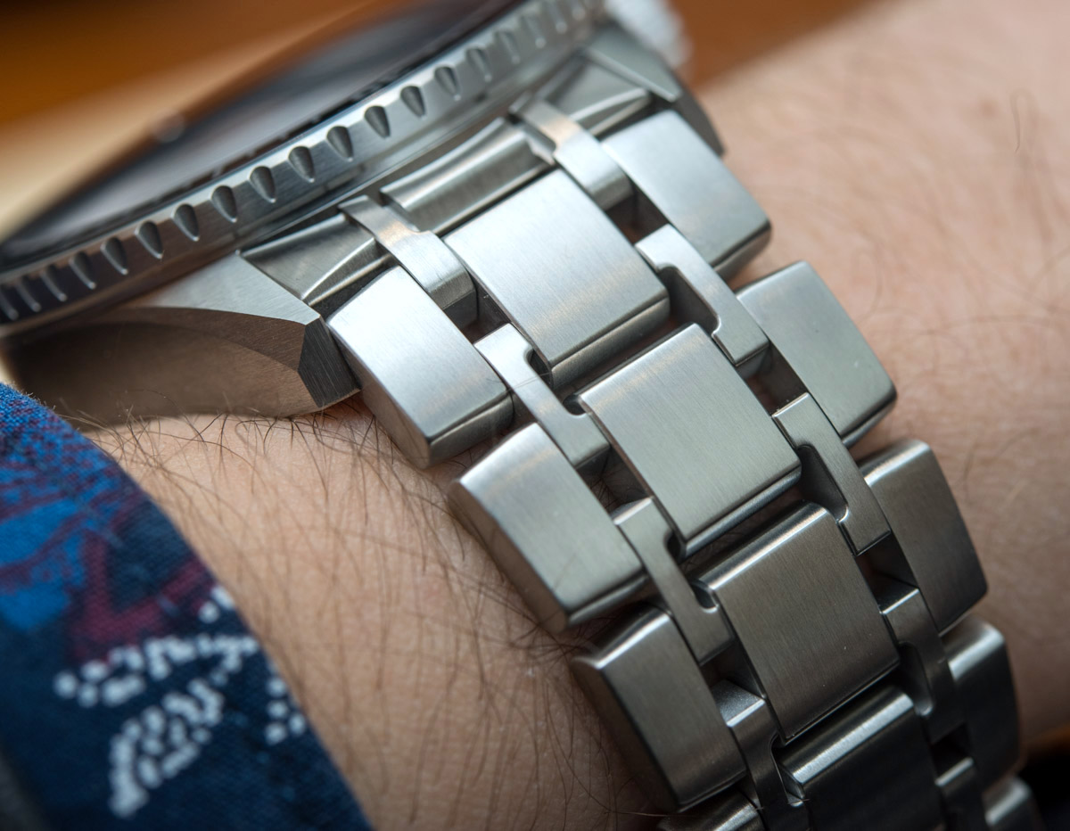

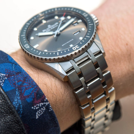
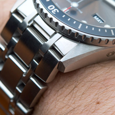
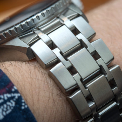
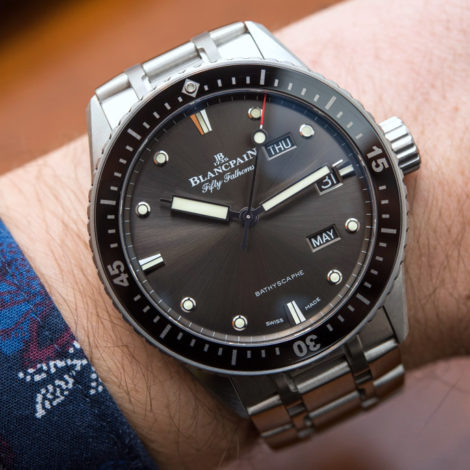
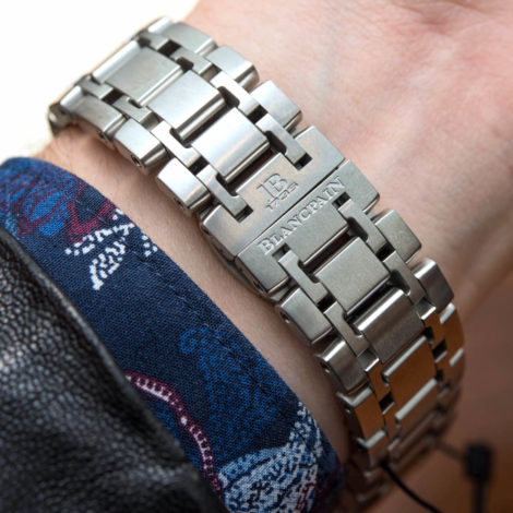
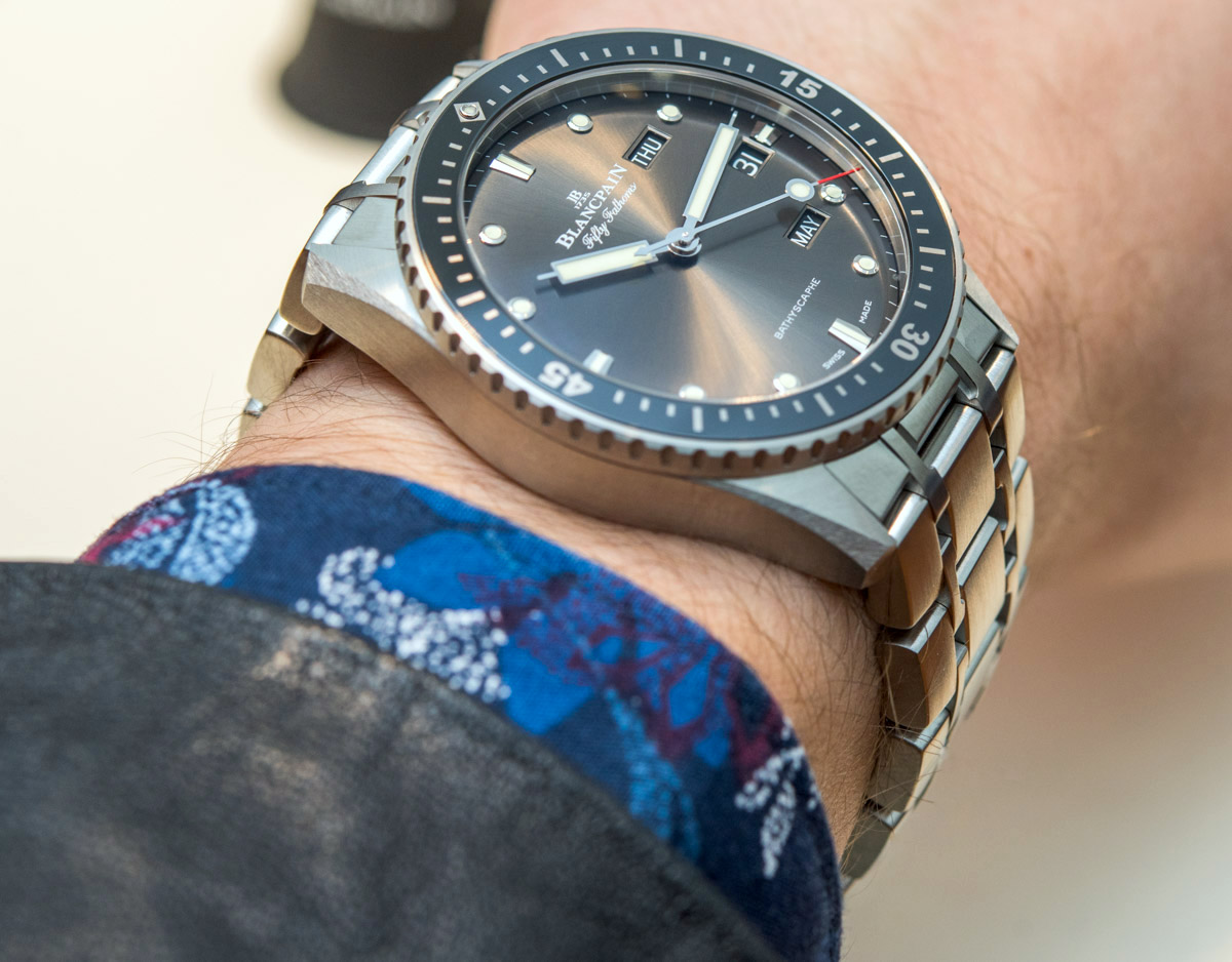
A redeeming feature? I’d say the quality of execution seen on the case and bracelet definitely remains one of the strong points of Blancpain. Every external component feels like a single block of unobtanium, they feel and look impressively heavy and dense, and indicate that even in all-brushed a watch’s exterior can look expensive and high-end. The bracelet is also over-the-top in an appreciably fun way with its C-shaped links, and I’ll glance over the clasp not closing with a flush, even gap (seen above) because this was a non-numbered prototype. The whole thing adds up to a very, very heavy watch though. The case and the bracelet are all steel, and that makes the Blancpain Fifty Fathoms Bathyscaphe Quantième Annuel rather heavy – as you can imagine if you’ve ever worn an all-steel watch about 43mm wide and 13.50mm thick. For this sort of money, even if not Blancpain’s awesome ceramic, at least titanium should have been used, especially since this thing is so heavy I can imagine the weight itself being a deal breaker for some.
All in all, I have enjoyed and, come to think of it, even fallen in love with many watches that made as little sense as this Bathyscaphe… actually, sometimes even less sense than this. However, for that to happen, the funny/impressive/novel/unexpected part of said watches had to be executed and integrated in an absolutely stellar way – and I can’t make myself think that’s the case here. Furthermore, even if you disagree with some of my assessments about this piece, I think we can all agree on this: these things cost way too much to be half-good jokes or half-good entertainers – and an annual calendar diver is basically poised to be both of these things. I rarely agree with Audemars Piguet on anything they are up to lately, but their cliché slogan is in fact true: if you want to break the rules, you must first master them… And I’m not exactly sure this Bathyscaphe displays a coming together of mastered design elements.
Oh, and the price for this half-good entertainer? Well, the Blancpain Fifty Fathoms Bathyscaphe Quantième Annuel costs 24,500 CHF on a sail canvas strap and a whopping 26,900 CHF on the bracelet… in steel. blancpain.com