“A-grade stuff from Schaffhausen.” Loosely translated, that’s what Probus Scafusia, the motto of watchmaker IWC Schaffhausen, stands for. It’s difficult to have any form of interaction with IWC without being reminded of it – the IWC Pilot’s Watch Chronograph 41 reviewed here has it on its crown in intricate relief. With that in mind, let’s now see how successfully this A-grade mentality has transformed ideology into matter with the Pilot’s Watch Chronograph 41.
The number of luxury watch brands currently offering more or less historically inspired pilot’s watches can be counted by the dozen – but among those few with an undisputed authenticity in this field lies IWC. From rather accurate reinterpretations of the early 3705 through almost dressy Mark XVIII’s to immediately recognizable perpetual calendars or chronographs, such as this one… The IWC Pilot’s Watch seems to have always existed and seems to exist forevermore.
What’s in the recipe for such mass appeal? If I were to make an educated guess, I’d say that the recipe certainly includes generous doses of high-contrast legibility, immediate recognizability, and a no-nonsense attitude toward design and functionality. Whether it’s for better or worse is for everyone to decide, but the IWC Pilot’s Watch Chronograph 41 appears to have spiced things up a little, drifting away a bit from that original taste. We’ll focus on these more subjective elements in closing, but first let’s do a proper review on build quality, functionality, and value proposition.

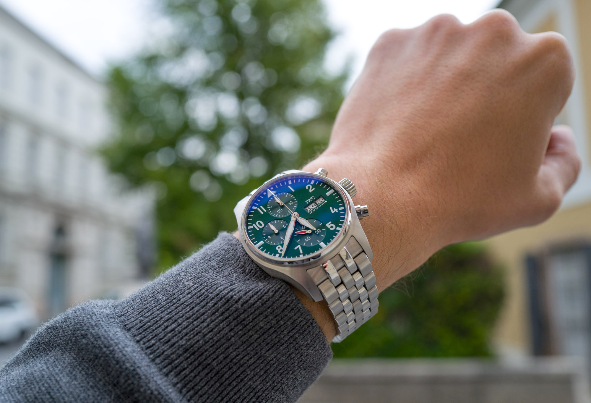
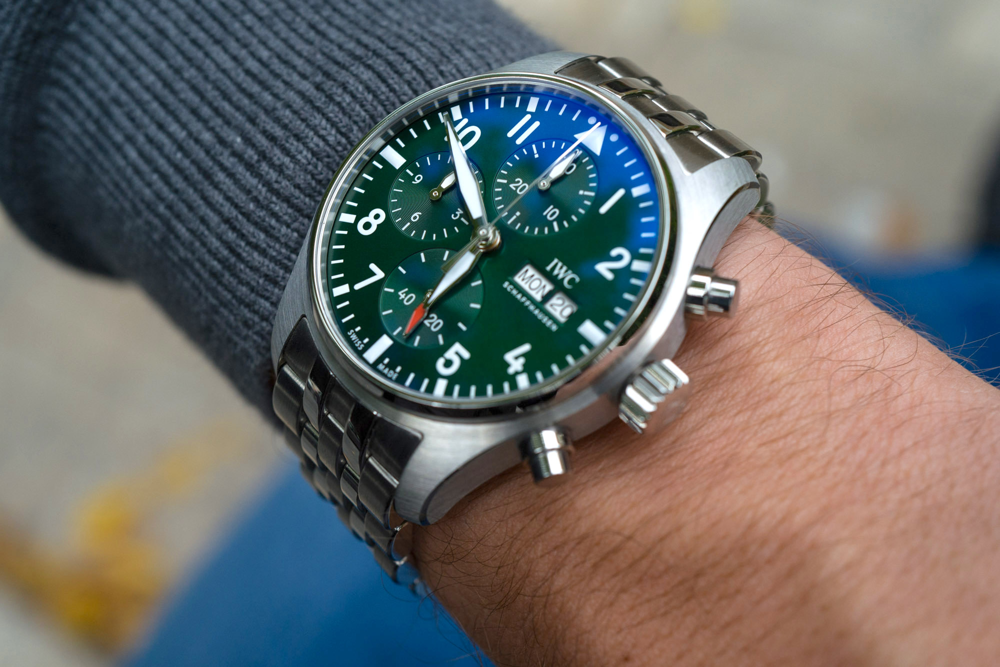
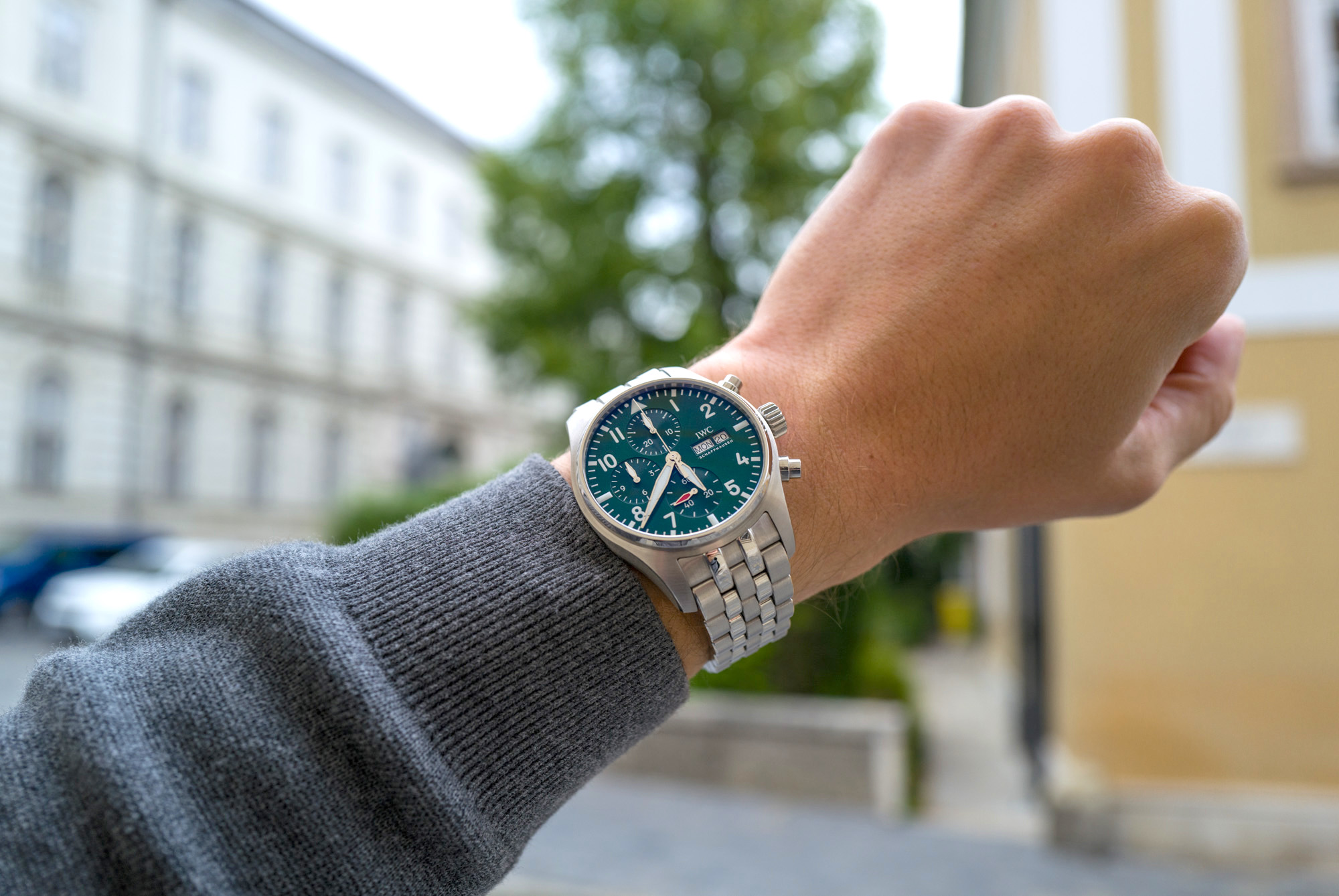
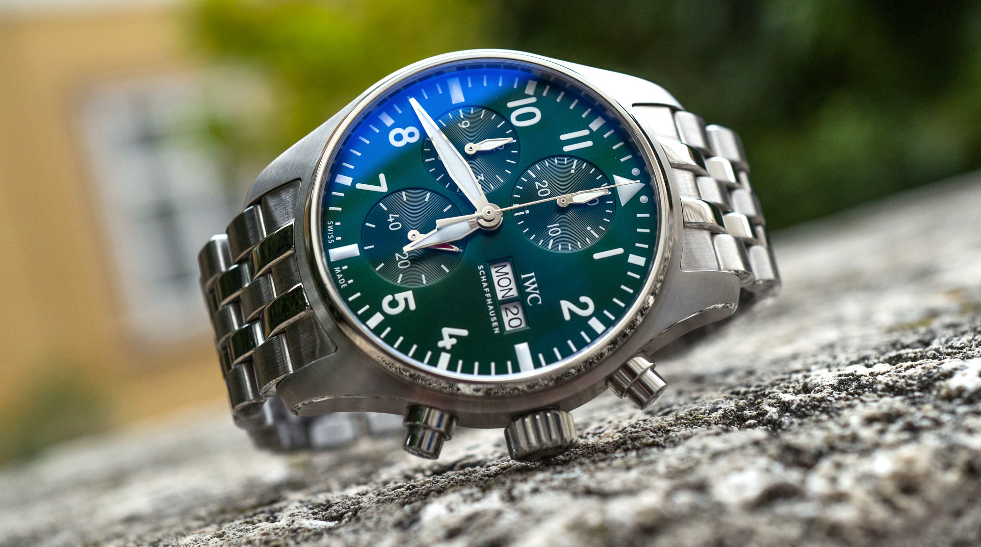
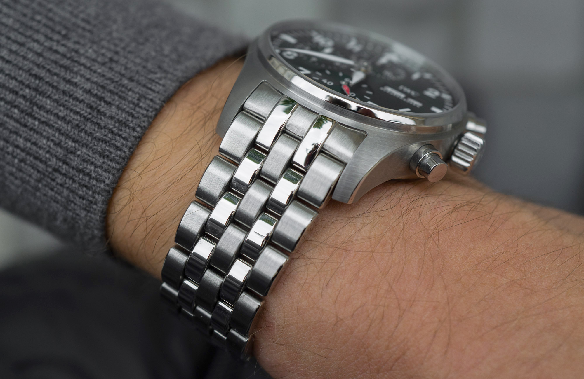
Described over the phone, everything sounds as good as it can get: 41mm case (right on trend), all-steel exterior, five-link bracelet, polished bezel, 100m WR, large pilot’s watch hands, a green dial, and an in-house column-wheel chronograph movement with pawl winding. It’s great to see IWC not waiting for everyone else to solidify the ongoing trend of downsizing in watch case sizes. We’ve been saying for years that it’s going to come – and it’s happening faster than we anticipated. Whereas the Big Pilot remains a 45mm beast of a watch that’s instantly recognizable on celebrities, athletes, and actors from a mile away, the 41mm version will prove to be a lot more wearable for many of us with narrower wrists looking for something to comfortably wear not only under the spotlight but also on a daily basis, year after year.
Better still, when scrutinized up close, with the watch in hand, the individual components seem to have been designed and manufactured with “Probus scafusia” in mind: everything feels solid as a rock, down to the rather hilariously named EasX-CHANGE [sic!] tool-free strap-changing system. More on that in a bit. The all-steel construction is complemented by a few limited alternatives in bronze and black ceramic, but it’s easy to imagine that steel versions will outsell other variations.
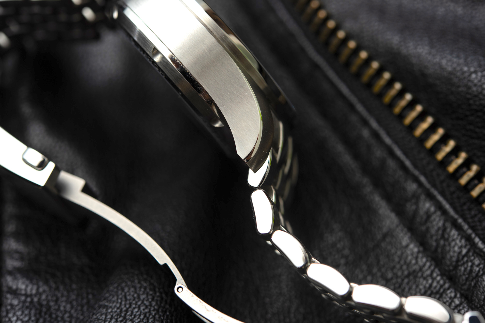
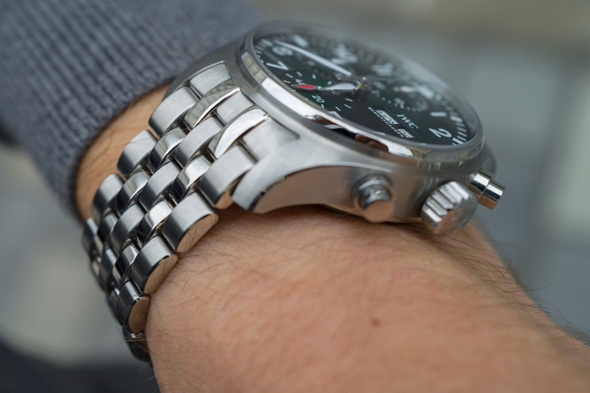
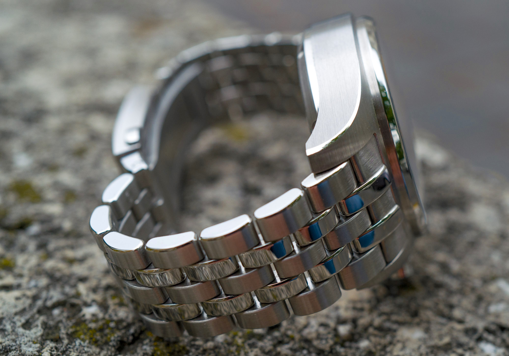
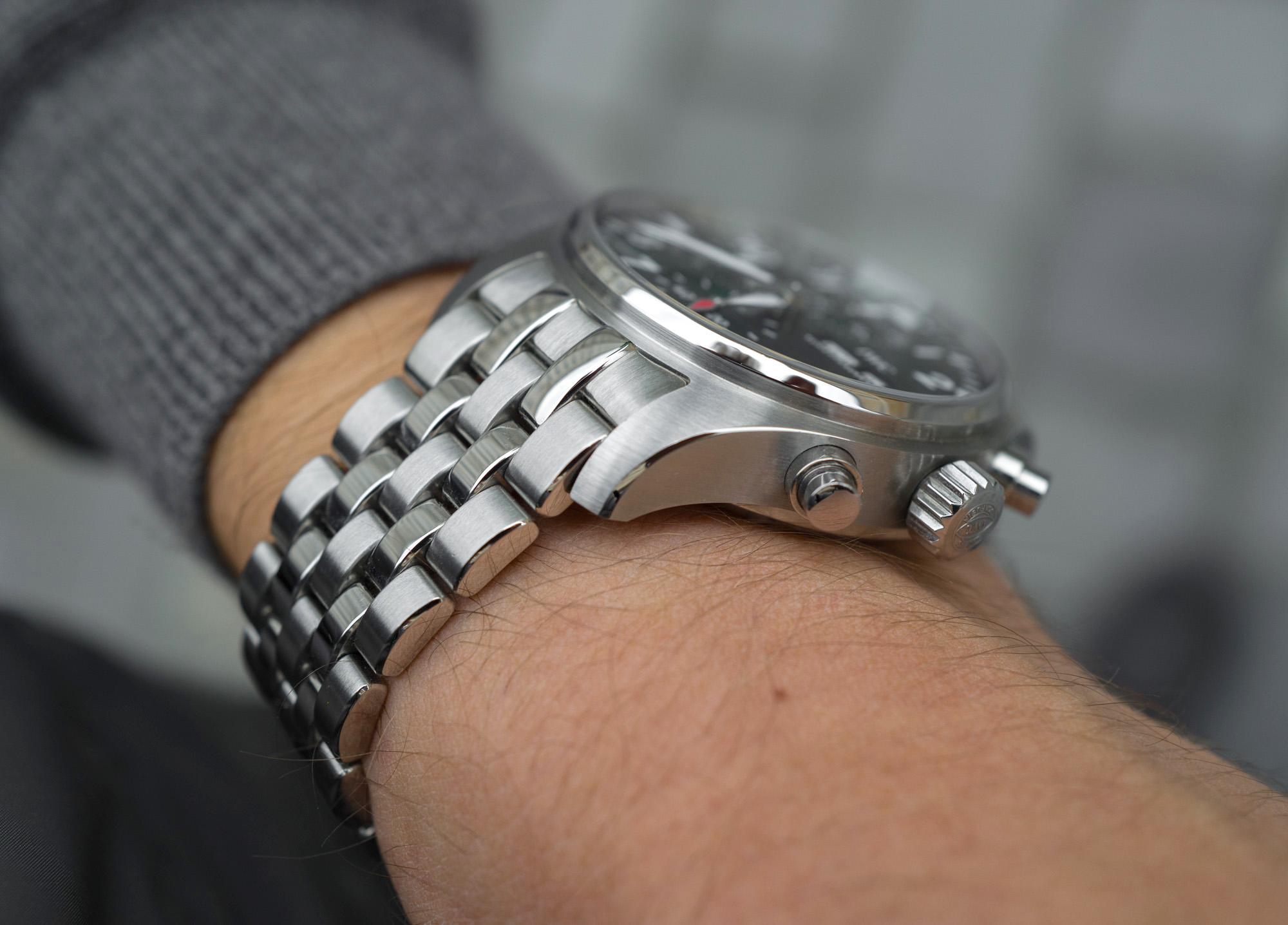
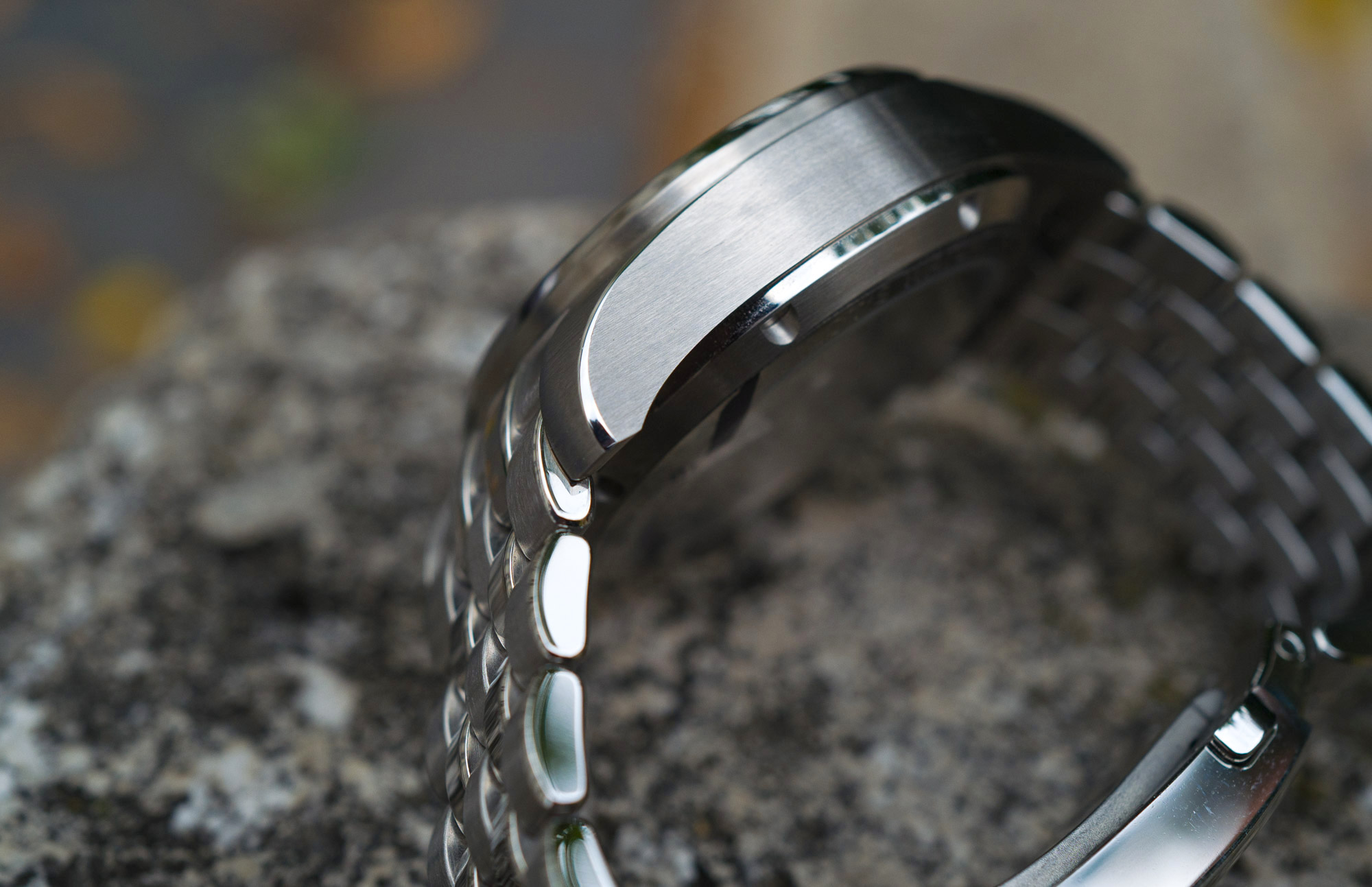
The five-link bracelet, although IWC’s official images don’t illustrate this too well, is beautifully finished with alternating links: the narrower second and fourth row of links is high-polished, while the odd ones are brushed, with top-tier finishing on their outer sides, all beautifully polished by hand. The same can be said about the top of the lugs and the side profile of the case: all brushed, with a thin polished bevel that actually widens toward the tip of the lugs — a surprisingly intricate little detail that stands out in the sea of despicably boring steel luxury watch cases in this sub-$10k segment.
What’s not so great – which is putting it mildly (something that’s been bugging me ever since I first laid eyes on this execution quite a while ago) – is the inconsistency between lug and endlink finishing. When looking at the watch, the top of the lugs show a circular brushed finish that more or less follows the curvature of the bezel. This in itself isn’t all that pleasing to the mind; it just doesn’t look as elegant as vertical brushing on the lugs. The real aesthetic hindrance, however, is that the first, third, and fifth end-link of the bracelet has a vertical finish, so the vertical lines merge into the circular finish on the top of the lugs.
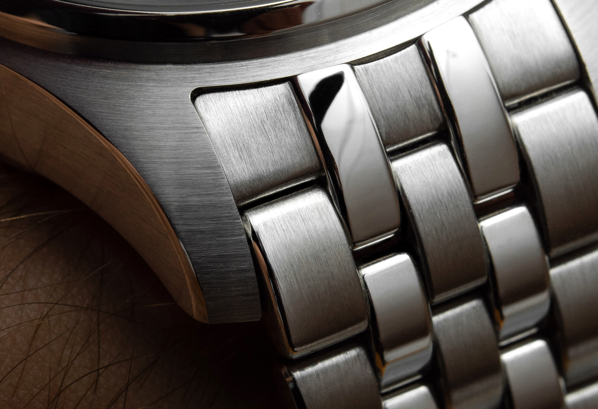
I imagine that, for the grand majority of fellow watch enthusiasts, this is a total non-issue, but to my eyes, it makes either the bracelet appear as an afterthought or the case finishing as over-simplified. It’s still a lot better than the ultra-low-effort “satin” finish, a mish-mash of nothingness that many luxury brands have started to broadly apply to their luxury watches… But still, mismatched directions in surface treatments would be easier to take in if a zero were missing from the end of the $7,200 price.
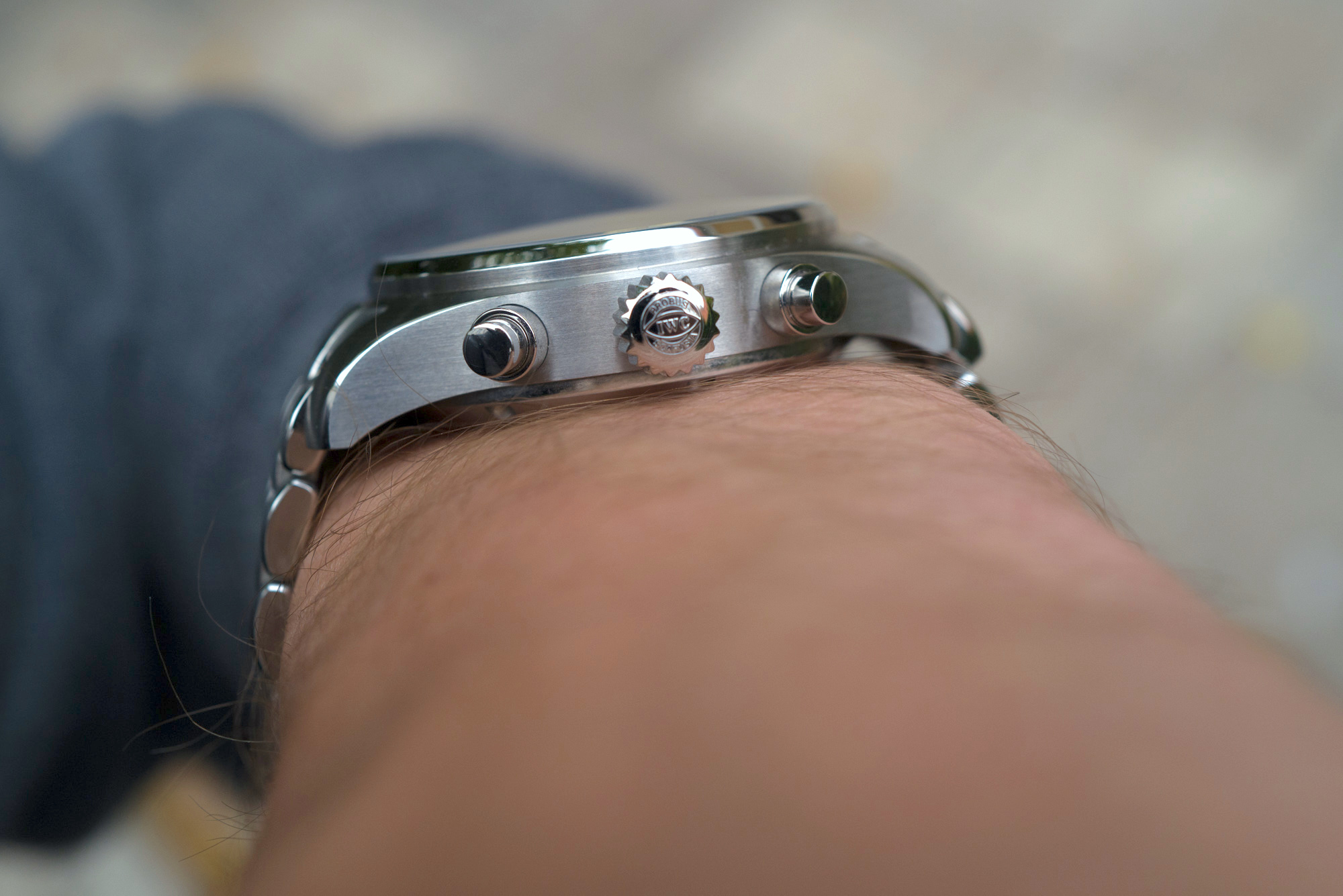
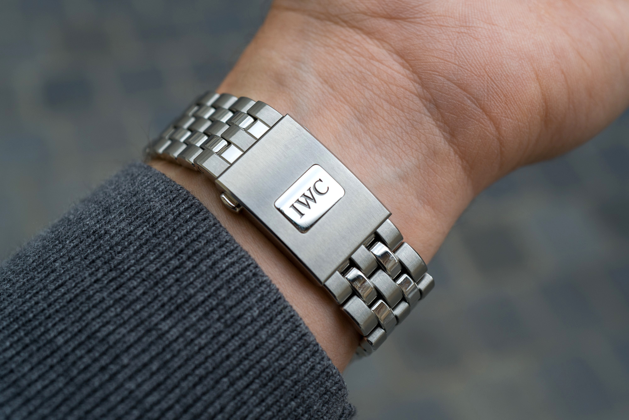
This is a shame all the more because the bracelet itself is both beautifully finished – among the best in the segment as far as intricacy is concerned – and comfortable. Generally speaking, bracelets with smaller links tend to be more comfortable because they more willingly follow the shape of the wrist. I experienced no hair pulling, either. The clasp follows suit and is neatly finished: The icing on the cake really is the integrated micro-adjust that’s so elegantly disguised as the polished IWC logo. Press down on this rectangular button and the ratchet system allows a generous amount of adjustability. What’s not so comfortable is the action of pushing the bracelet back against the ratchet with just one hand, for when the wrist contracts, but this is a very small price to pay for the superb extra comfort provided by this substantial extra adjustability on the go. Then, there is the EasX-CHANGE quick strap change system, which is chunky and beautifully made and is integrated into the underside of the endlink.
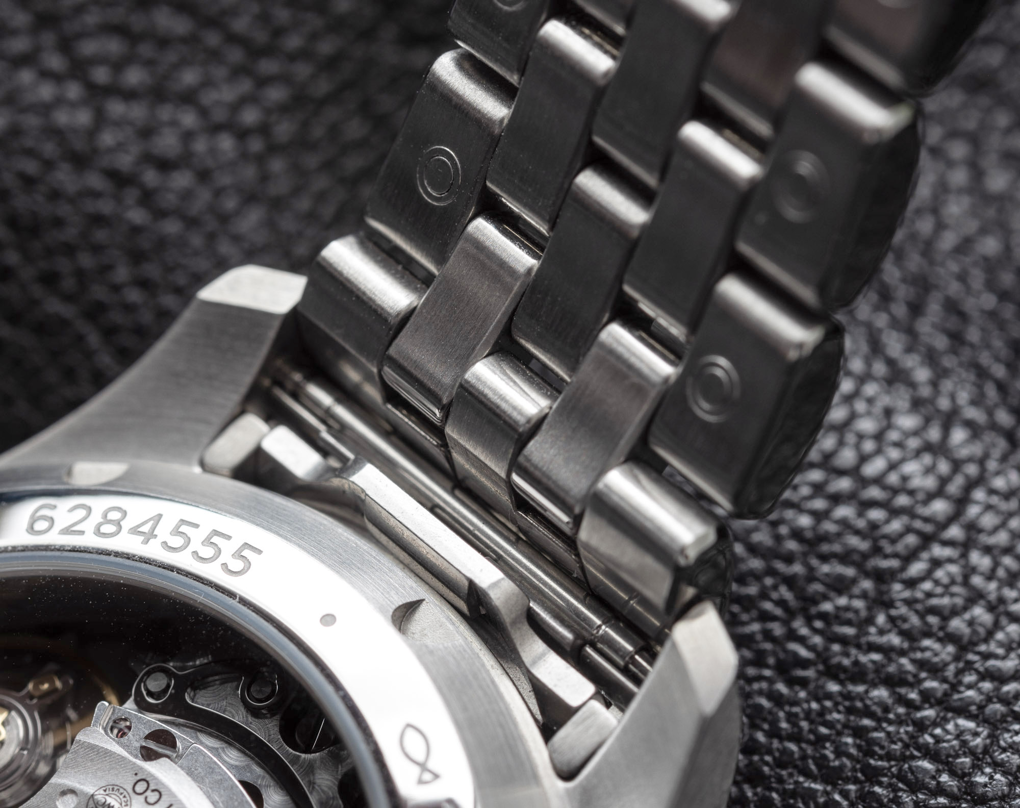
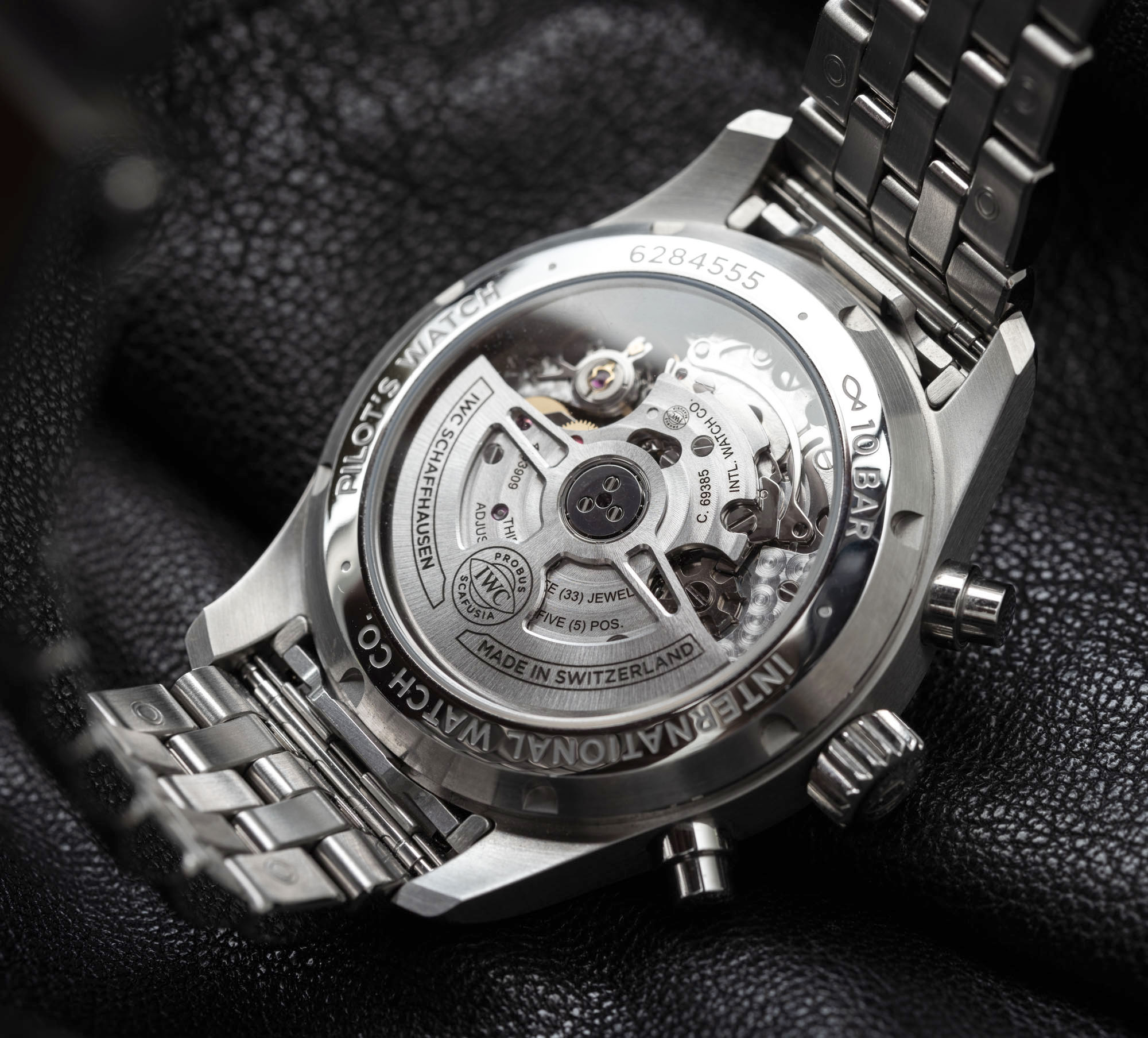
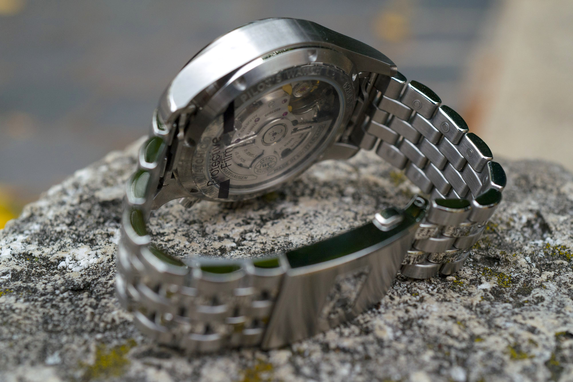
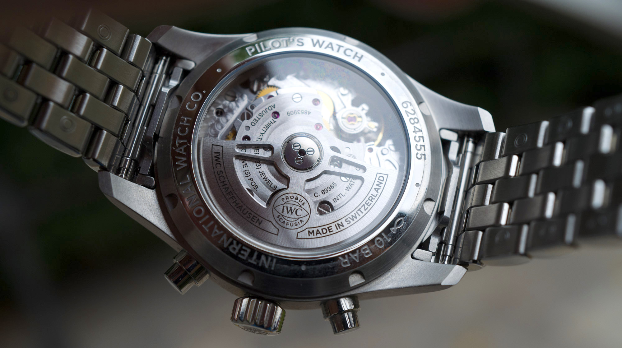
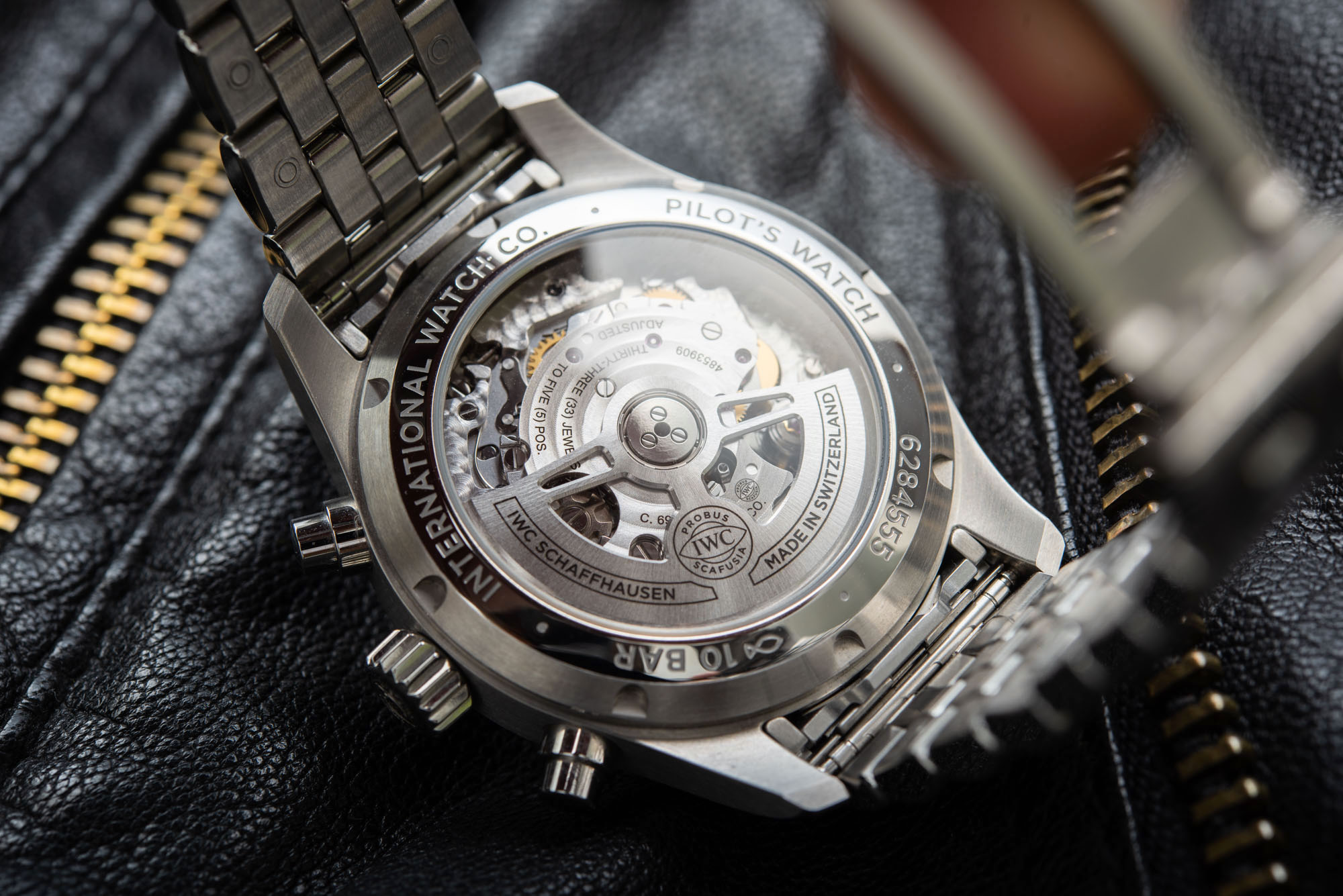
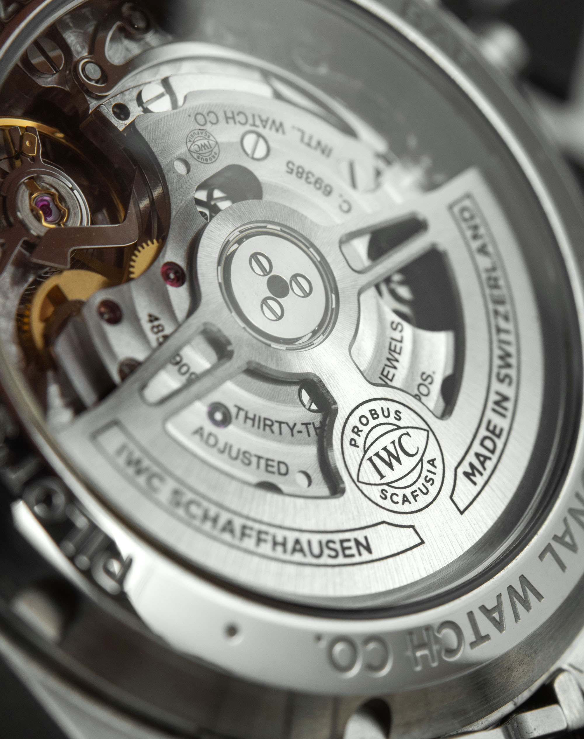
As we have established, the case is beautifully finished. The caseback features the 100m WR designation right along with the fish symbol – back after a trademark battle with Swiss federal agencies more or less about Christianity itself, on which SJX has done some excellent reporting here. On the front, the case ends in a slim, yet neatly finished, faceted bezel, all polished up. Now, the legitimacy of high-polished elements on a pilot’s watch could be argued against, as pilot’s watches tend to be all-matte so as to not literally blind their wearer up above the clouds where the sun always shines. For us mortals living our lives down on the ground and not in the cockpits of fighter jets, the nigh-on ostentatious light show put on by these polished elements is, let’s be honest, often preferable to the dullness of all-brushed steel. As such, the IWC Pilot’s Watch Chronograph 41 looks expensive and stunning under direct sunlight – if only it didn’t have that mismatched end-link treatment. Doh!

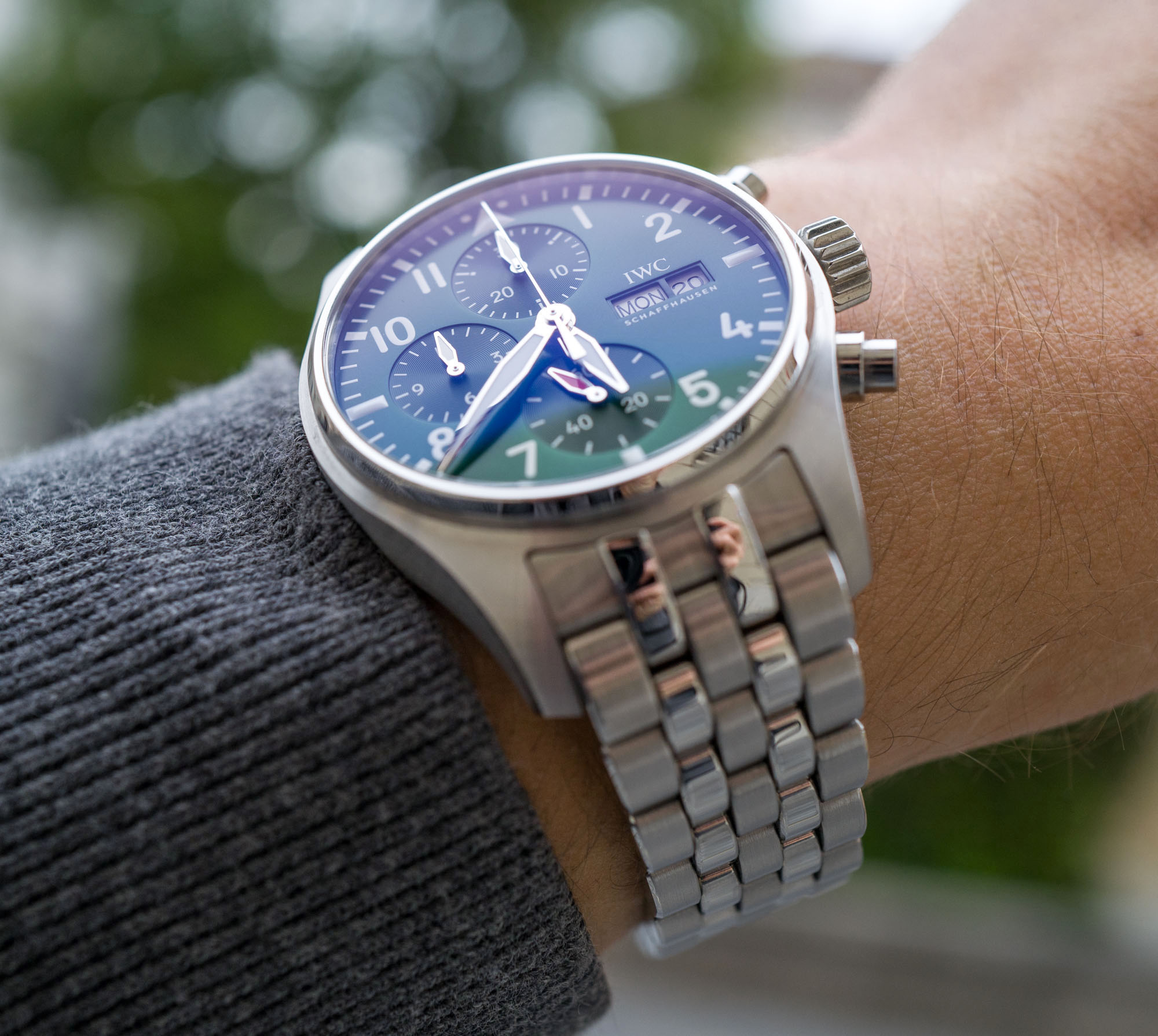
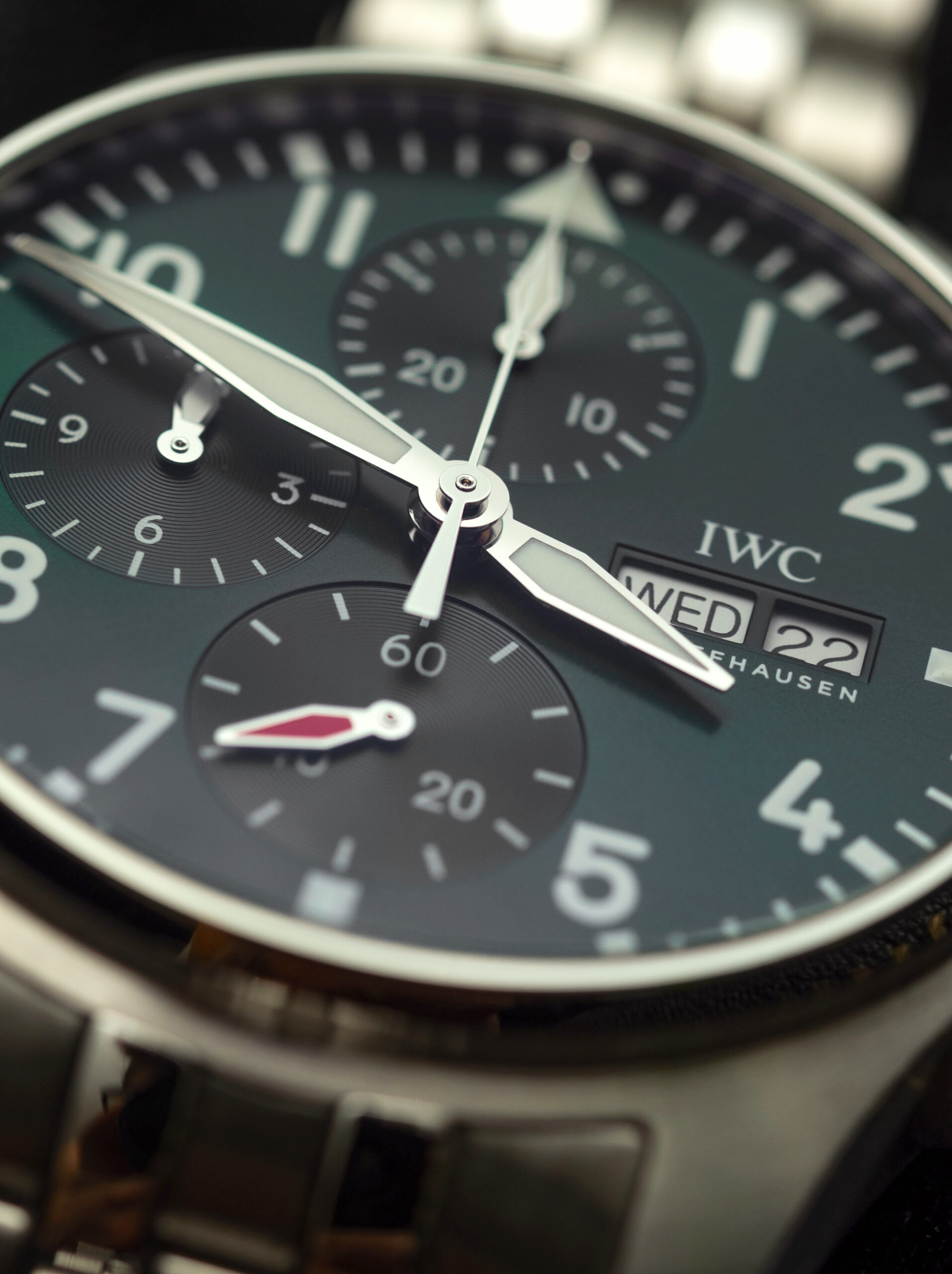
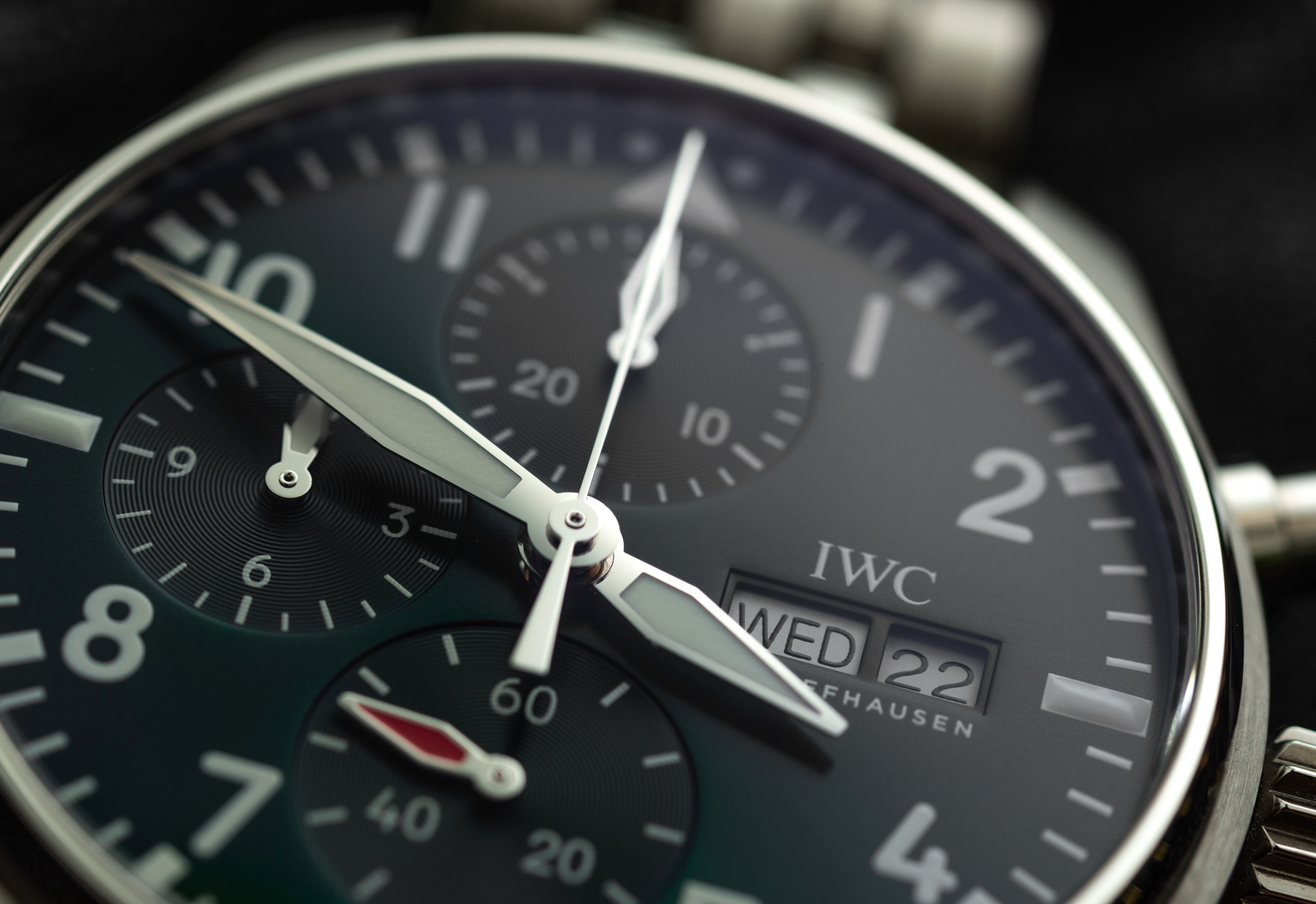
Blue is the new black, and green is the new blue. Yes, we all know by now that green dials have been all the rage, recently – which is ironic since Rolex retailers in some parts of the world just a few years ago couldn’t give green-dial gold Daytonas away. But here we are, with black turned blue and blue turned green. That said, the green on this IWC reference IW388104 just doesn’t feel that special. It’s just green. It’s intricately produced with a sunburst pattern on the greater dial and radial grooves in the subdials – but the overall effect lacks that punchiness that comes from the matt green dials of Panerai or the outrageous beauty of Grand Seiko dials. Another minute detail that will drive “form follows function” maniacs up the wall is the orange-red running seconds hand. The color just looks off against the green and it is used to highlight probably the most futile and uninteresting feature of this chronograph. It just looks odd, this orangey blob (that looks red when the blue anti-reflective coating kicks in) at 6 o’clock without any connection to any other design element or function on the watch. A dash of color can go a long way – but in this case, I’d be tempted to see a white- or black-filled hand on there instead.
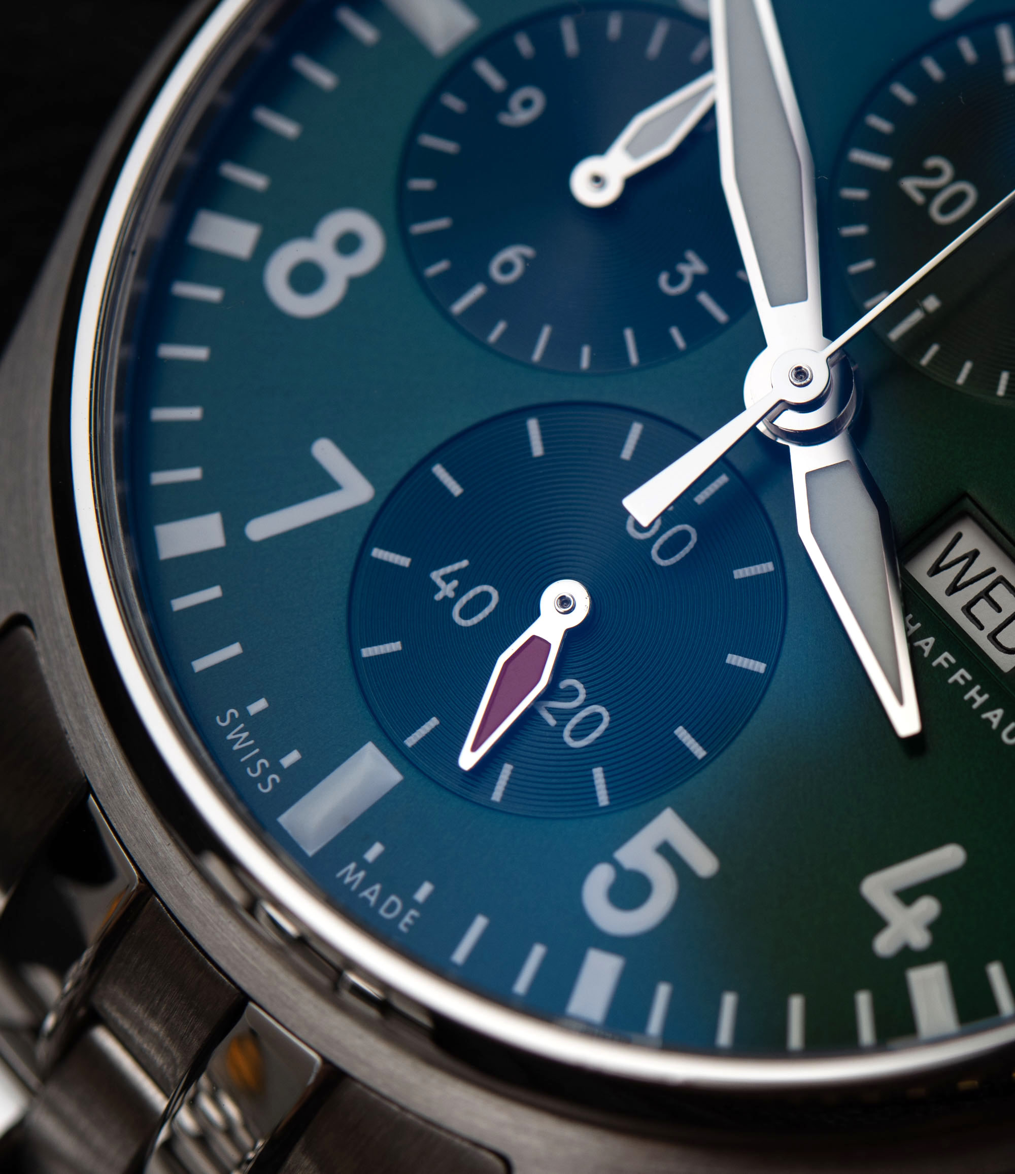
Speaking of the anti-reflective coating (AR-coating for short), it gives a blue hue to the sapphire crystal. It so happened that I had the IWC Pilot’s Watch Chronograph 41 in one hand and a Corum Admiral’s Cup in the other. Full disclosure — the latter was a tourbillon, but that shouldn’t make any difference in what I’m about to say. The Corum had a crystal so perfectly AR-coated that I genuinely pressed my finger against it to see that it was there. By contrast, in the exact same environment, the Pilot’s Watch had a blue hue to it. To see a literally crystal clear front and a blue one next to each other powerfully illustrated why the industry (and especially the luxury brands) should be much keener to upgrade from these shortcomings. And blue reflections over a green dial – it’s an odd look at best, but one you will see every time you are in a bright environment.

The last oddity that, again, indicates a bit of a drift away from purpose-driven design is the application of luminescent paint – or lack thereof. The only lumed elements are the main hands and the 12, 3, 6 and 9 o’clock markers which is much more of a head-scratcher than having polished elements on the case and bracelet. I know this is not new to the collection, but still, it’s worth mentioning. While I guess we all like to dream about being pilots pulling negative Gs, we will trade some dogfight functionality for design and outright prettiness. I don’t, however, see how trading low-light legibility for a cool(-ish) design makes any sense even for us wingless earthlings. It genuinely makes telling time a lot more difficult, which is all the more annoying when there is no apparent difference between lumed and non-lumed indices when viewed during daytime. During the day, they all look the same – but only a few of them light up in the dark. Please don’t tell me it’s done so that the watch will remain low-key when performing nighttime missions above the Gulf in your General Dynamics F-16 Fighting Falcon, or I’ll pull your ejection handle for you.

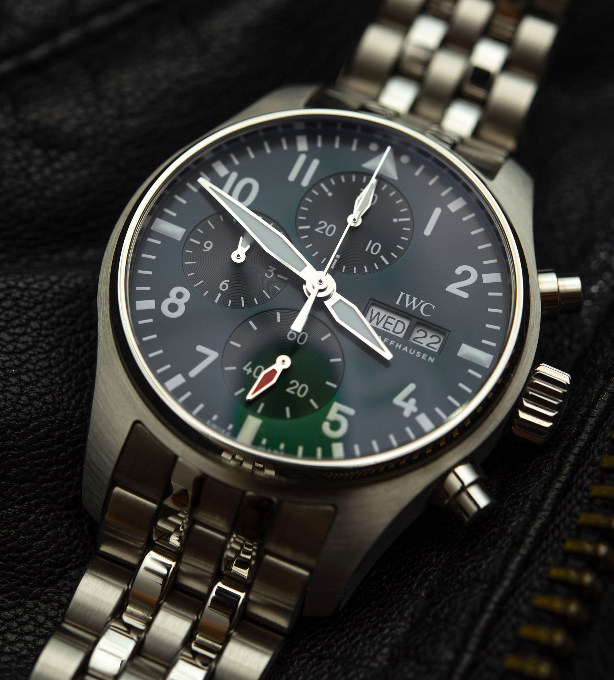
Daytime legibility is excellent, and those big hands just look ace from up close and afar, alike – and by “afar,” I mean from across a restaurant. The curved numerals are also a developed taste, as they look rather tame and unlike those probably more often associated with cockpit instruments and pilot’s watches, in general. But they’ve been the look for the IWC Pilot’s Watch for some time, and they sure help take off the wanna-be pilot edge and further push this review unit towards a daily wearer in terms of aesthetics.
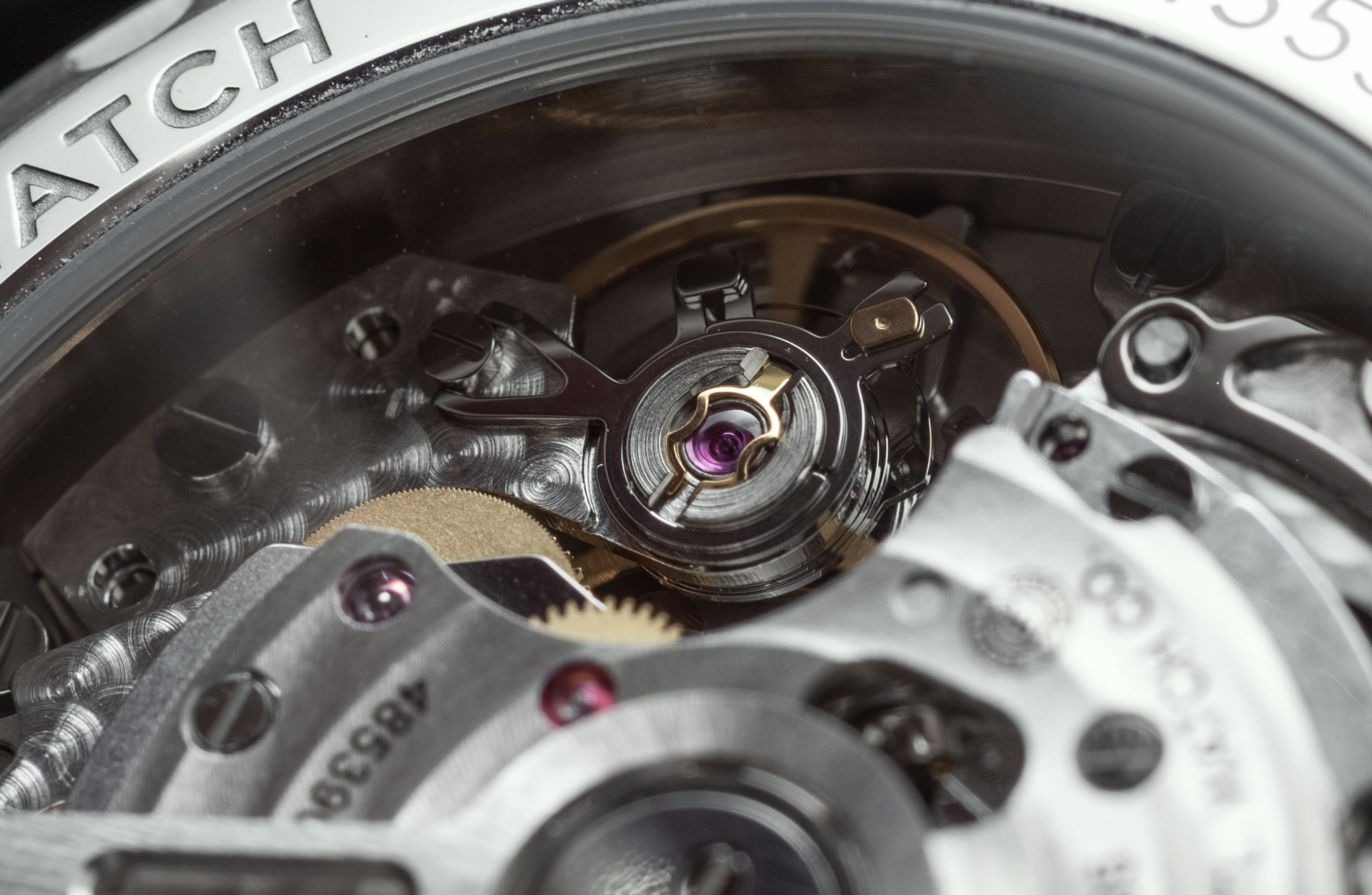
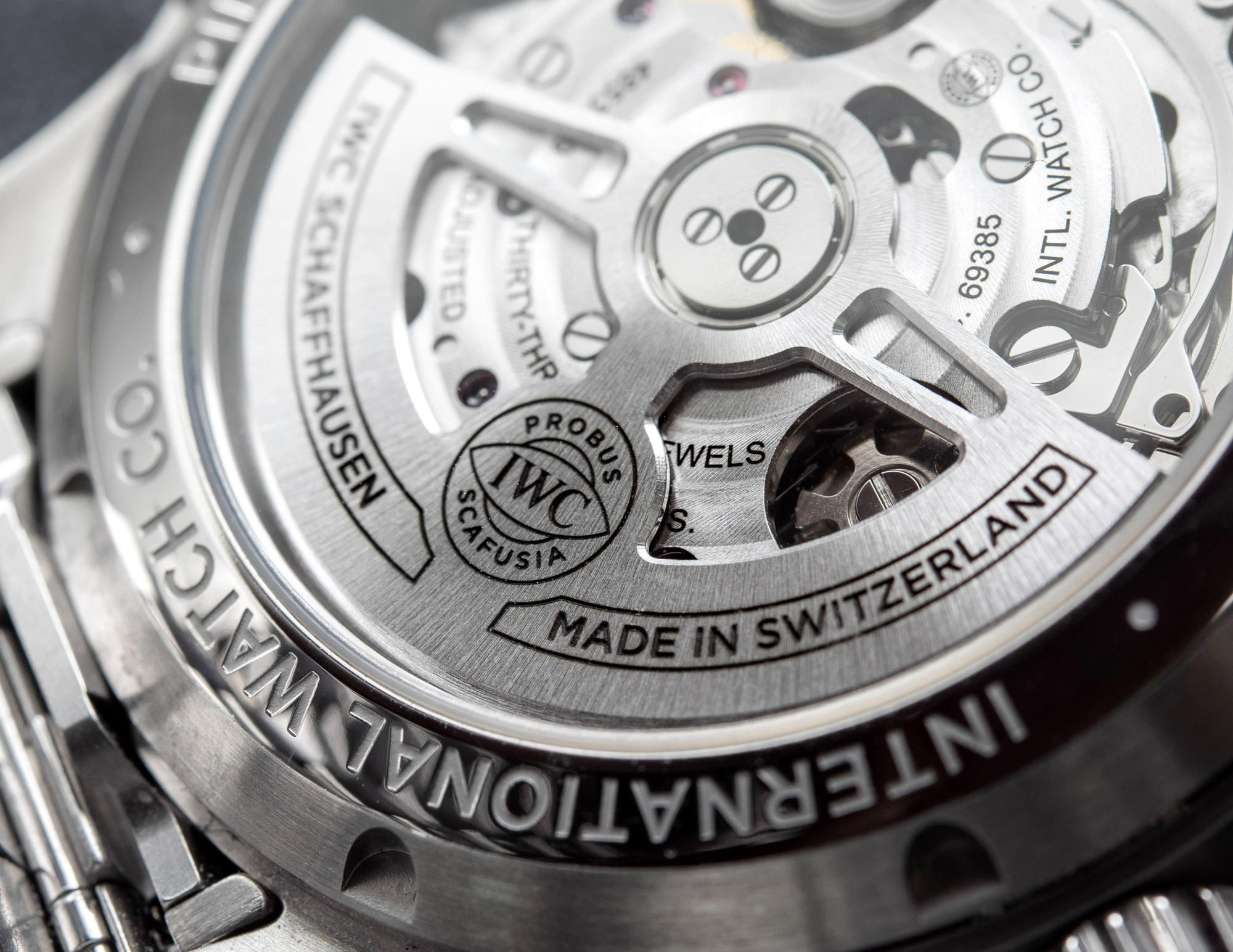
The movement is revealed by a see-through caseback: it’s the “IWC-manufactured” 69385 calibre. In terms of specs, it is very close to the 7750 chronograph that it has come to replace – through a series of developments and other calibres, IWC has arrived at the 69385 that offers 46 hours of power reserve, 4 Hertz operating frequency, 231 components, some acceptable finishing, and a big, beautiful, chunky self-winding rotor attached to a pawl-winding system. I believe this is different to the Pellaton system found in the 89-series of movements, but it nevertheless winds in both directions. It’s a chunky movement, just like the 7750 was, at 7.9mm – something the overall case design hides rather effectively. There is a day and date window at 3 o’clock, a bit of appreciable extra functionality.
Despite the nits that can be picked by us hardcore nerds, inside and out, on or off the wrist, the IWC Pilot’s Watch Chronograph 41 with green dial still is one heck of an impressive watch. The movement looks robust and cool, the green dial adds a touch of personality, and the case, bracelet, and clasp all look and feel very expensive, even to the untrained eye. On a personal note, I wish the Pilot’s Watch would do away with some of the unnecessarily cartoonish elements like the ugly orange-red seconds hand, the crosshair-style lume (that’s cool for $495, but not for a timeless luxury watch), and the somewhat childish typeface for the hour markers.
Click on this image to see more horological artworks in the aBlogtoWatch Store.
That said, none of those things will be deal-breakers, and it is easy to see how those same elements will certainly be found fun and charming by many others. Overall, the “Probus Scafusia” build quality is still very much there – so much so that it outshines the somewhat apologetic design elements found in some places.
The IWC Pilot’s Watch Chronograph 41 with green dial reference IW388104 is priced at $7,200 on the bracelet and reference IW388103 on a brown leather strap is priced at $6,500. Both are solid value for the exterior and interior quality on offer.
IWC Pilot’s Watch Chronograph 41 Watch Specifications:
>Brand: IWC
>Model: Pilot’s Watch Chronograph 41 reference IW388104 / IW388103.
>Price: $7,200 USD
>Size: 41mm-wide, 14.5mm-thick, and 50mm lug-to-lug distance.
>When reviewer would personally wear it: Would make for a great daily, though I’d probably go for the IW387907 in bronze.
>Friend we’d recommend it to first: IWC fan looking to upgrade for the latest with better proportions, better bracelet and IWC movement.
>Best characteristic of watch: Is more beautifully made, inside and out and from up close, than what’s generally offered in this segment. Feels robust and durable.
>Worst characteristic of watch: Odd deviations from “form follows function” with the seconds hand and lume. Case and bracelet finishing could be better matched.