
I feel excited writing this review because in my opinion this Porsche Design Flat Six P’6310 is a fantastic watch. I just love it and find myself wearing it for perhaps all the right reasons. Now, a bit of background and disclaimers so that you know what this timepiece is all about and aren’t confused if you are trying to look for it. What you see is (at the time of writing) the previous generation Flat Six Automatic watch model. The current generation is called the P’6300, which yes, is a lower number. Don’t ask… To make things more confusing, currently on the Porsche Design website the P’6300 or P’6310 part of the watch names have been totally removed.
It seems as though Porsche Design has recently totally abandoned their longstanding product naming scheme of “P’XXXX” when it comes to their watches. At least that is a fact on the website at this time. Plus, even though the name on the dial of the current generation watch says “Flat Six,” Porsche Design seems to have renamed it to be “Flat6” on the website. Having said that, if you search for the models on Google, the official website doesn’t show up very quickly. Let’s get those fantastic designers you have to work on your corporate site Porsche Design.
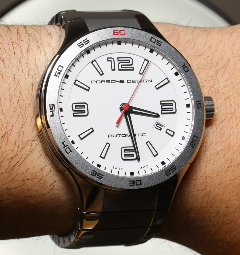
Because we are huge fans of Porsche Design products we aren’t going to dwell on the fact that their website currently sucks. Let’s focus on this very unsucky watch. Personally, I like the previous generation Flat Six (or Flat6) model more than the current one, but that is a matter of taste. The Flat Six Automatic is probably Porsche Design’s entry-level mechanical timepieces, but you do feel as though you get a lot for your money. Further, for me it is all about this version with the white dial on the bracelet.
I don’t know if you’ve noticed, but watches with perfectly white dials are rare, especially sport watches. When I think of other sport watches with a white dial I pretty much only think of certain versions of the IWC Aquatimer (which are also very well done) and the Rolex Explorer II. Aside from those and maybe a few other examples, you simple don’t see high-end white dialed sport watches. Which is a total shame because when white faces are done well, they look fantastic. There is a good reason though why you see few white faces on watches: legibility.
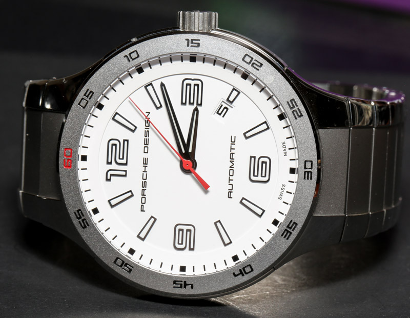
While black is a color that absorbs light, white is a color that reflects it. That means that unless you have extremely high-contrast matte-finished black elements, the dials are going to suffer when it comes to reading them in many lighting situations. Which brings me back to the Rolex and IWC models I just mentioned. What do these and this Porsche Design model all have in common? White dials with very crisp black elements that offer excellent contrast. They also go an important step further by offering luminant. So you basically have white dials, with white lume. The only way this is done correctly is by outlining the hands and hour numerals in black. And this is precisely what all three of these sport watches do. It sounds simple, but getting the colors, textures, and materials right requires a lot of patience and testing.
I mention all this to explain not only why you don’t see many white sport watches, but also why you should appreciate ones that are well done. I fell in love with this model a few years ago when I first noticed it, and it was not until now that I’ve been able to really understand why that was. There is more about the dial than just the white color that is appealing. A huge attraction with this watch is the Porsche Design philosophy and aesthetic. In a sense this isn’t a sport watch. It isn’t a formal watch either. It sits in some ambiguous “casual” gray area for very versatile timepieces that are simply hard to categorize, but nevertheless work so well.
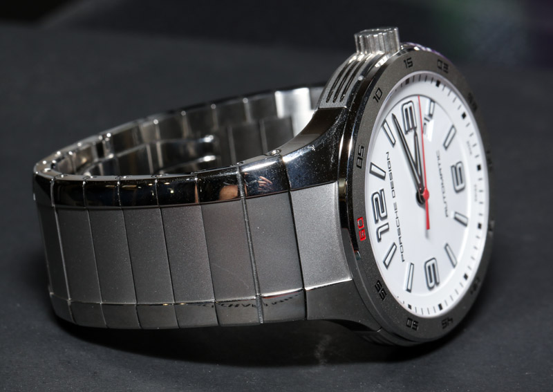
Porsche Design’s take on design is simplicity, beauty, and of course functionality. Yes, that is super Germanic and I would consider what Porsche Design is today to be a modern version of Bauhaus. The dial features large applied hour indicators that are raised off the face and exist in a relatively clean “inner sanctum” of the dial. There you also have the date window – which is a wonderful element itself. It is only outside of this ring that you have a minute and seconds scale, followed by a numeric minute scale on the bezel. This “triple scale” approach is not new, but it fascinates me to see how it has been done both beautifully and horrendously depending on some simple design differences from watch to watch. The result is a lot of legibility and precision reading, but also a relatively clean look that offers a dial that does not appear to be cluttered or busy.