This one’s a straight-forward Grinding Gears with a head-on title, coming to you less from my watch writer self and more from the watch customer/enthusiast that I also am. It’s been not months but years that I’ve been waiting for brands, small and large, to improve their websites, all in the hopes that they would make it more enjoyable for me to appreciate, crave, learn about, or just simply find watches on their official websites. My gears have been grinding for long enough, so here we go.

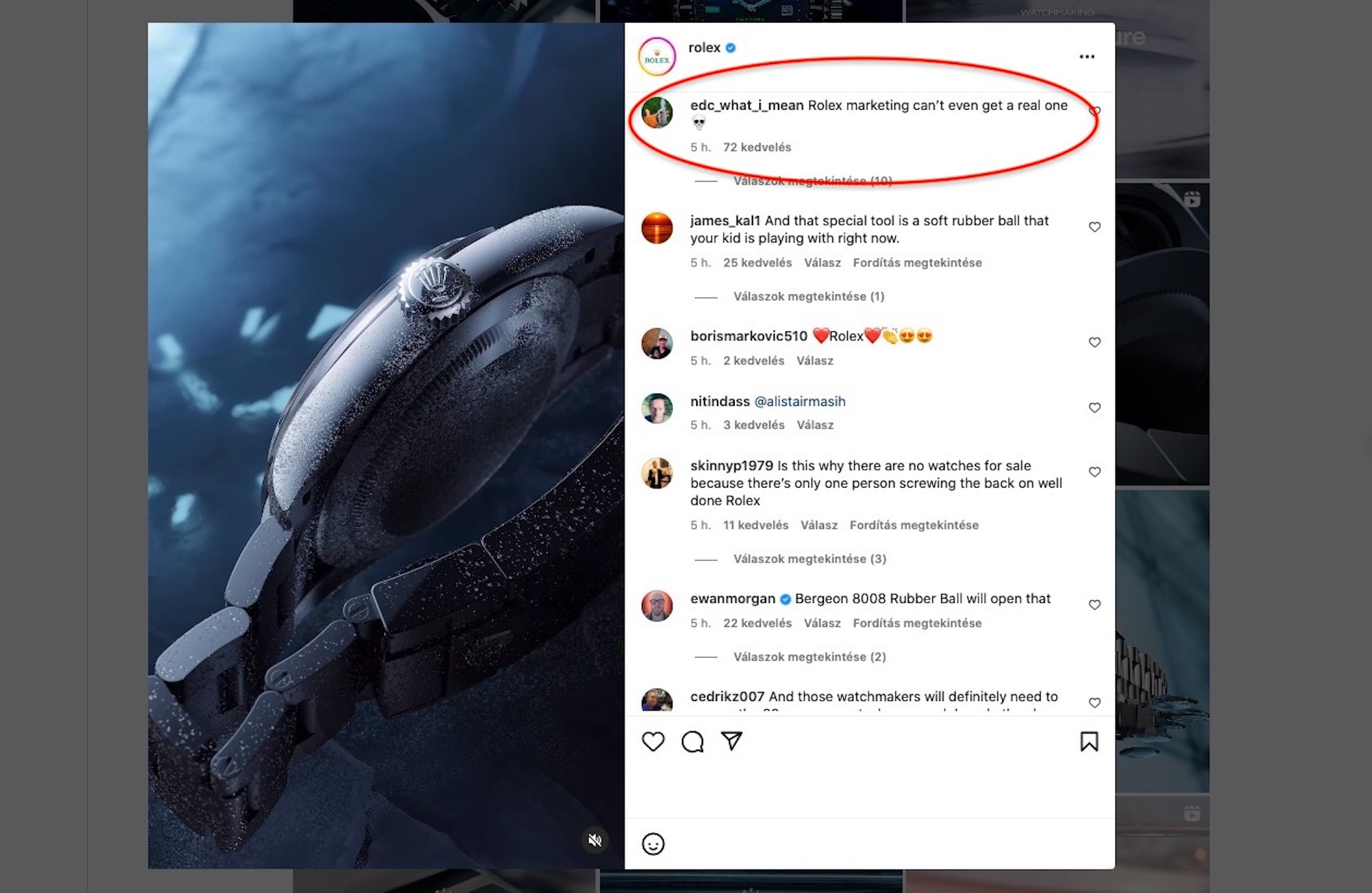
So much for “#Perpetual” — every last trace of a watch Rolex discontinued just a couple months ago has been erased from the official website.
Finding Watches on Official Brand Websites Is Either a Hassle or Impossible
This issue is at least twofold because it concerns currently available watches and discontinued ones. Let’s begin with the latter. Brands are understandably proud of their archives from decades (and sometimes centuries) ago, for it is their own treasure trove of documentation enforcing their reputation and status, not to mention the pedigree of their products. With very few exceptions (with Omega absolutely taking gold medal here with this basic, yet extensive archive), watch brands do not have anything that would even remotely resemble a searchable online archive. What’s worse, one might get the impression that among their motives is to keep their old products well out of sight. From odd product names to sexist advertising campaigns to blatant copying of competitors and other poor design decisions, many dedicated professionals have been hard at work to wash their company clean of even a whiff of such missteps. This would be all well and good, even understandable, but it appears to have also barred them from having anything other than current production models and very carefully curated bits of their history as part of their online presence.
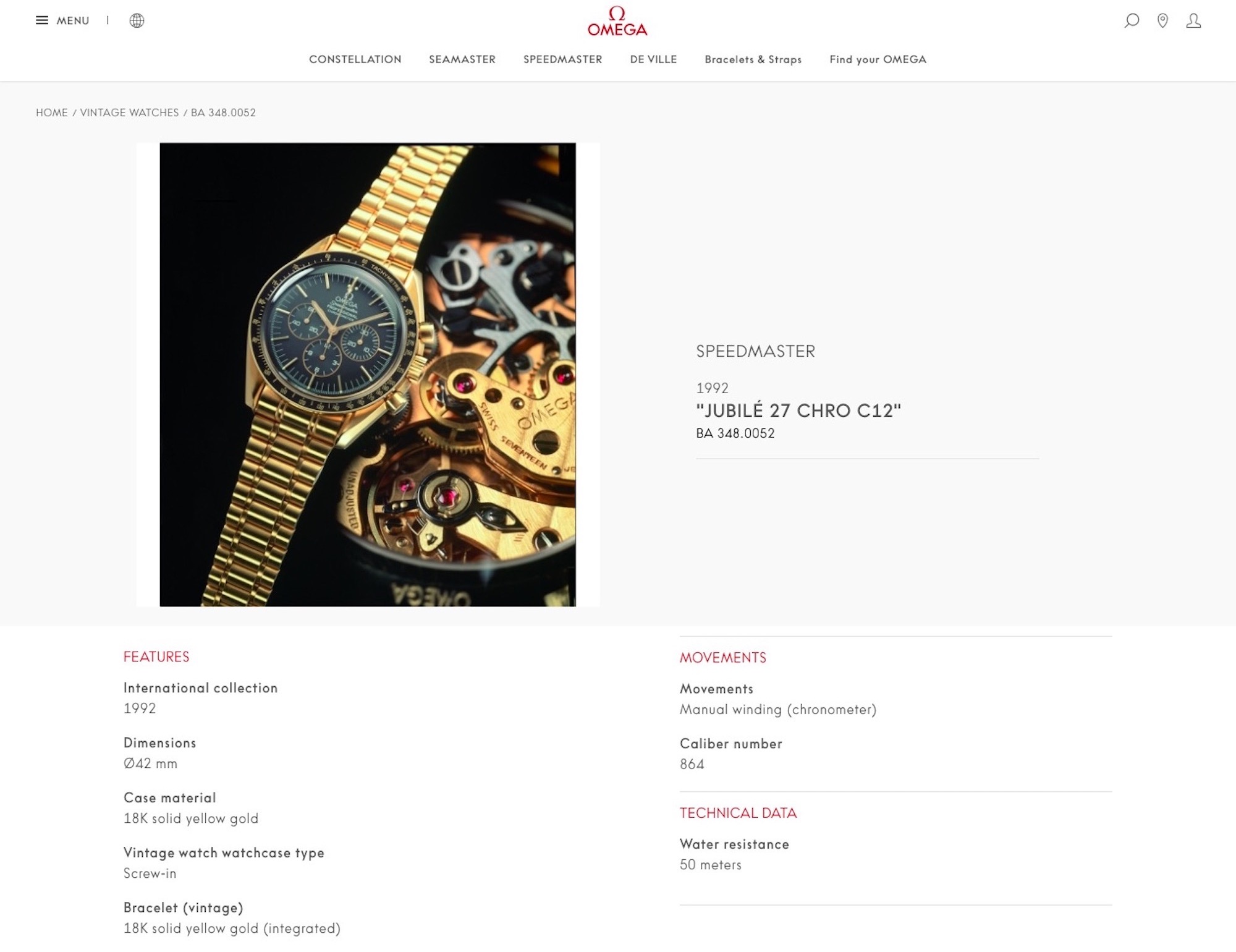
A randomly chosen vintage watch from the official archives freely available on the Omega website. Not much information, but a whole lot more than what’s offered by the competition.
If you have an old watch — maybe only a few years old — that is out of production, chances are that you will never again find any information whatsoever directly from the company that made and sold said product about its specifications, presentation, story, or engineering details, not to mention its retail price, alternative model variations, and other nuances that current and future prospective owners might be reasonably interested in learning about. Companies in other industries such as automotive or consumer electronics don’t do brilliantly in this sense, but it’s fair to say the watch industry is impressively precise in the efficiency and accuracy with which it erases even the faintest memory of the overwhelming majority of its recently produced and sold items.

Not a trace of one of the most impressive Jaeger-LeCoultre creations — the same applies to discontinued run-of-the-mill references.
This is problematic for both the customer and the brand. When manufacturers offer little or no traceability for their discontinued products, the wiggle room that scammers, “frankenwatch” manufacturers, flippers, and dubious resellers have greatly increases when it comes to replacing worn or damaged parts on cheaply sourced items with sub-standard parts. Such sub-standard used items are difficult enough to identify by design, but having a searchable, detailed, and nicely illustrated official archive could potentially help masses of customers and collectors experience that particular brand positively. Not doing any of this backfires in the sense that second-hand watches, often just a couple of years old, cannot be traced back through an official website, which, in turn, might imply shady business strategies or simply the fact that the brand one is about to “enter” wants to hide its recent past. We could dwell on the negatives of this often planned and desired absence of searchable official archives, but those are deserving of a Grinding Gears column of their own.
Instead, let’s switch to the daunting task of browsing currently available watches where, I’m afraid, the situation is often just as bad, albeit for different reasons and in different ways. Major brands can have anywhere between 200 to around 1,500 (at the time of writing, Omega lists 1,480 watch references and model variations on its official website as currently available), and yet, more often than not, their search functions and “filters” are infuriatingly useless at helping us — enthusiasts, fans, and prospective customers — find what we are looking for.
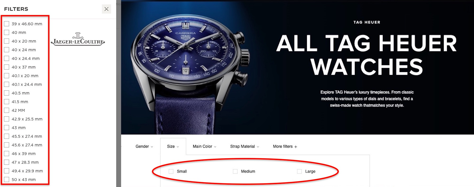
Maybe a happy balance could be found between Jaeger-LeCoultre’s exhaustive options and TAG Heuer’s amusingly broad grouping of watch case sizes.
This includes specifications cobbled together in ranges that are far too wide to be useful for anyone but the most basic window-shopper. A prime example is how watch sizes are not searchable per individual millimeters but in ranges, say, “42mm and larger” (as on Omegawatches.com), or, worse, as “mid-size” (as on Rolex.com) or “medium” on Tagheuer.com and dozens of others. Friends and family members around me with barely any interest in watches — and zero in watchmaking — without any help from me at all, consistently seem to have worked out an ideal watch diameter size, and, as often as not, even link that size to a specific model. They seem to know that they want a 35mm watch, or a 41mm version, but if they want to find exactly that, they are invited to browse through sometimes several hundreds of watches and references in sizes they are simply not interested in. Seasoned watch enthusiasts like those reading these words will have kept track of case size changes, down to a single millimeter, and would certainly appreciate the brands trusting them with the choice of a specific millimeter, as opposed to something along the lines of “large.”
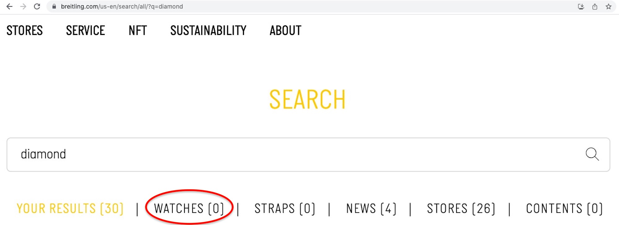
Search functions on brand websites are also notoriously bad, often not simply because the search function itself is poorly integrated into the website, but also because the database on the back end of the search is either incomplete or contains incorrect information. I’ll give you an example. A close friend, again, not that into watches, was considering rewarding herself with a Breitling watch for her hard work and achievements and she wanted to have a dial with tiny diamond hour markers. If she searched for the word “diamond” or “diamonds” on the official site, there were zero results, even if the brand offers and successfully promotes a large variety of watches with said indices on social media, and elsewhere. This is to say that the marketing team is doing its part, but somebody somewhere handling the website is not. To be fair, the Breitling website is among the better ones out there, and a search function that operated in such a broad spectrum is extremely rare in the world of watches.
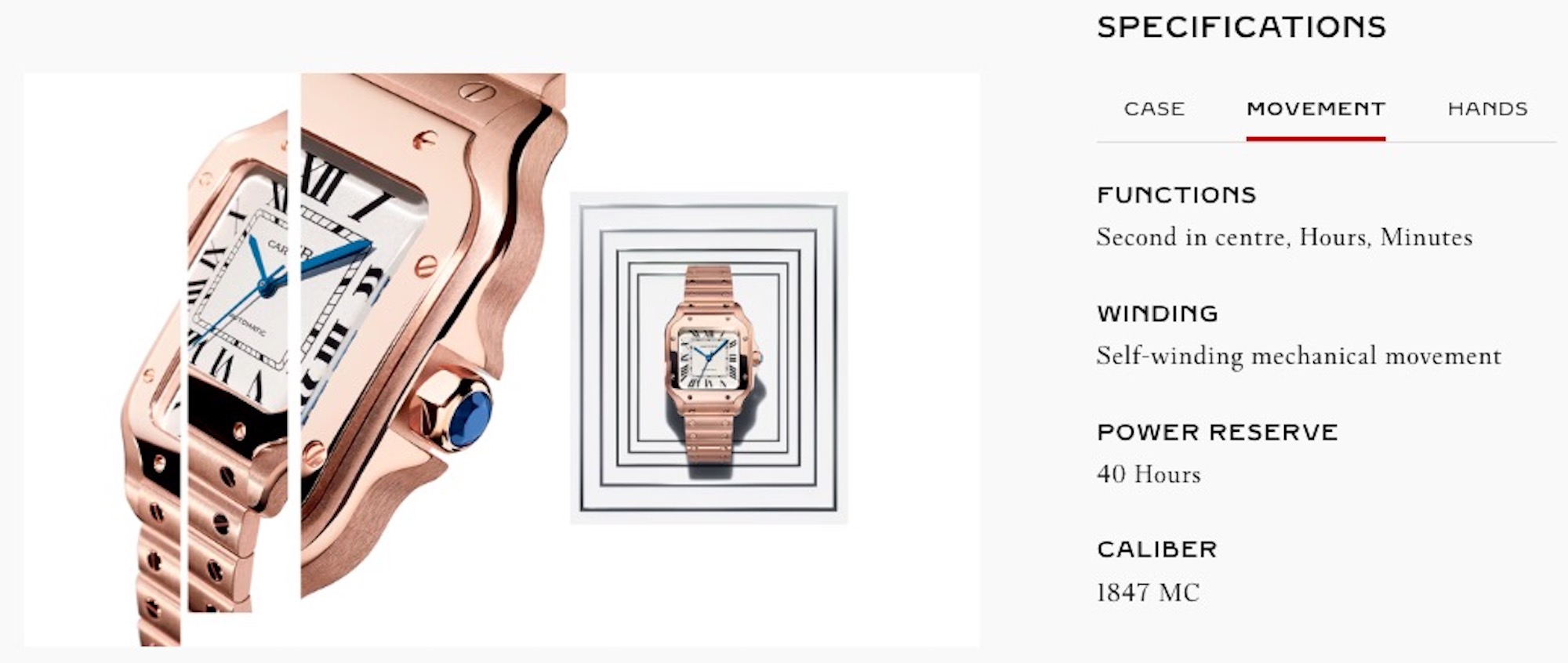
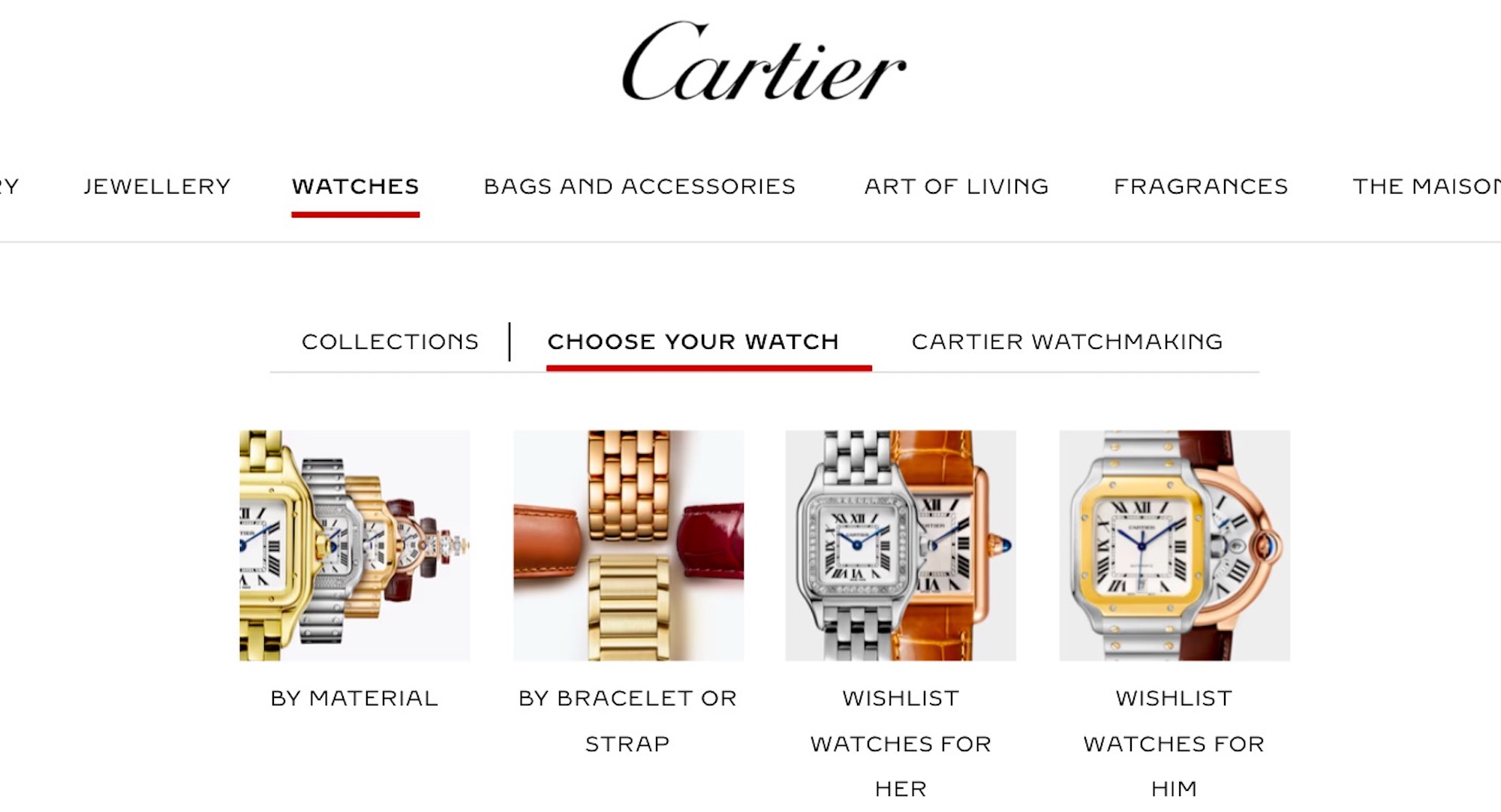
These are all the specifications Cartier provides on the product page of an $11,600 watch — although the image next to the spec sheet is of a significantly more expensive version.
Finding Specifications & Price
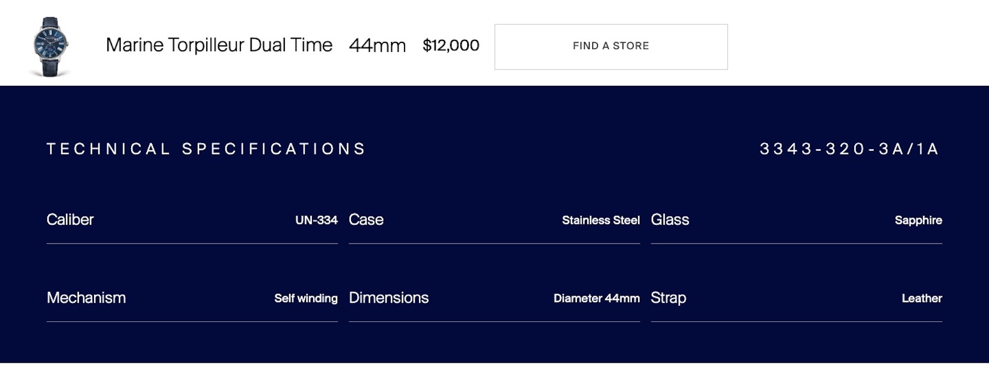
Brands across every price range have considerably sped up their watch release schedules, with new watches debuting not just once or twice, but monthly, even from some of the biggest and slower companies, making their beautiful, printed catalogues more useful as collectors’ items than anything else. Keeping track of novelties, then, is only possible through the official websites, unless new catalogues were printed every month. Sadly, Swiss watchmakers have somehow taken it upon themselves to perpetuate one of the famous (and proudly advertised) national values of their motherland: secrecy. It boggles the mind just how cryptic, hard-to-find, and often willfully secretive watchmakers are when it comes to the exact specifications of their products, including crucially important details such as case size, materials and surface treatments used, movement details including basic performance indicators like operating frequency and power reserve, and, of course, pricing.
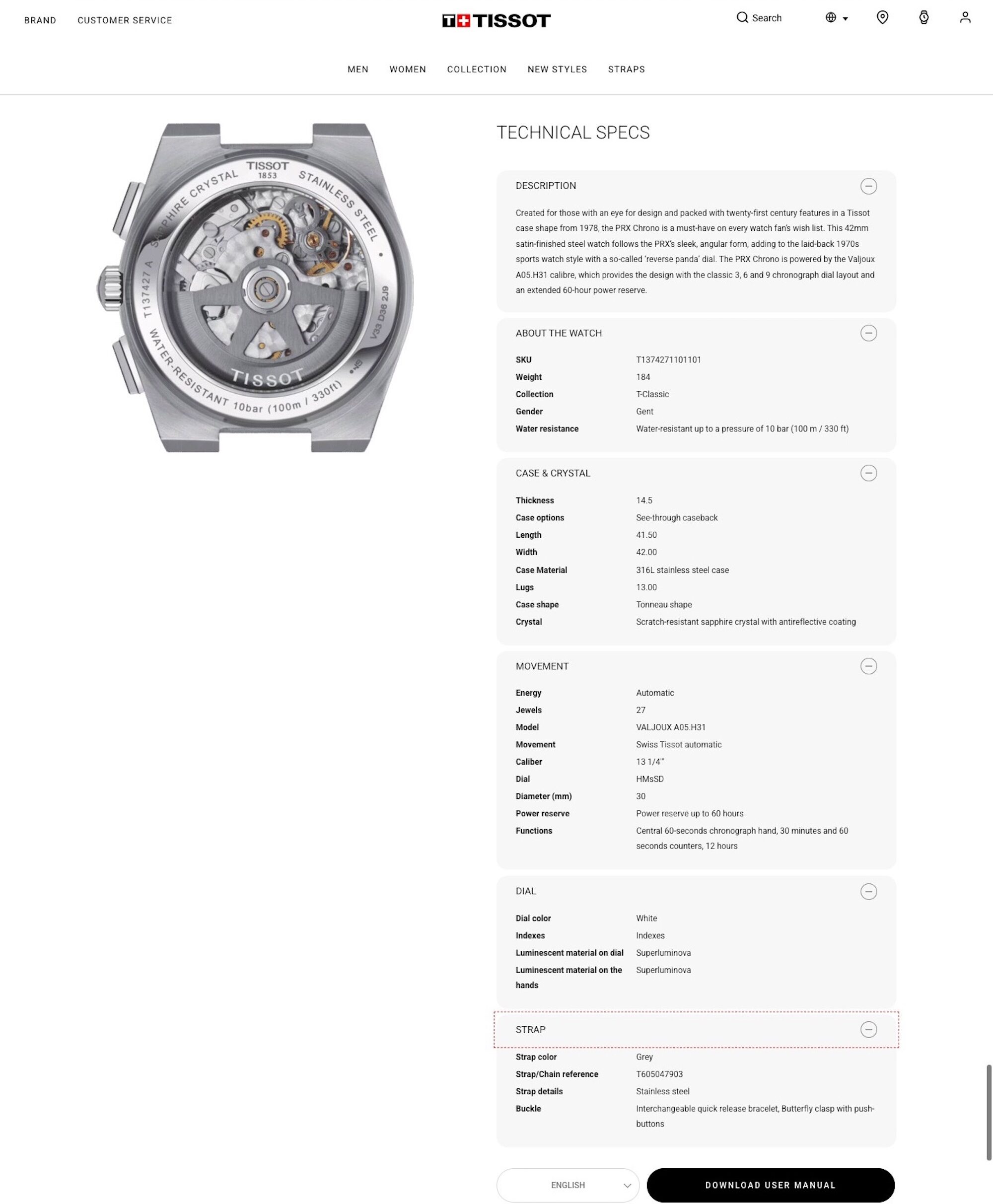
Let me bring you two contrasting product presentations, one from Cartier, pictured a bit further above, and the other from Tissot, directly above. Tissot is certainly among the best examples one can find today when it comes to product descriptions and presentations — and Cartier is among the worst. To focus on the positive, Tissot admirably lists the case diameter, lug-to-lug size (as “length”), thickness, and even the lug width, giving folks a solid idea on the exact measurements of the piece. The movement is not listed under some re-branded pseudonym but as a Valjoux A05.H31, allowing one to more easily research its provenance and performance. Even the bracelet’s reference number is provided, a little detail that will come in handy when comparing different model versions.

A disclaimer taken from the Panerai website, a brand that tends to present its products with a computer-generated image of the front and the rear — and nothing else.
Appreciating Watches and Their Details
“All primates, including humans, are highly visual creatures. We rely heavily on visual cues for basic adaptive behaviors such as finding food, mates, and shelter, as well as more complex behaviors such as parental care and the formation of social hierarchies” (2014, Kaas and Balaram). Although studies on how the vision of primates reacts to watch brand websites are few and far between, it’s probably safe to say that better illustrations — meaning higher in quantity and quality — will help their provider sell more watches. Strangely, anyone who’s researched vintage watch advertisements will know that the watch industry has not forever been oblivious to the science and, indeed, art of photography.
Sadly, computer generated images (CGI) and videos have all but taken over the visual portfolio of many watch brands. Real-world photography is great because it is just that: real. It is more honest and stays true to the needs and desires of human vision, while CGI appears to be skipping that bit and aims to just tickle the brain directly instead. Rolex was among the early adopters of CGI stills and videos because it was the only tool that would allow the company to achieve the frankly eerie levels of sterility that it is so very fond of. On a personal note, perhaps the most entertaining evolution of this detached Rolex environment was when first Rolex stopped showing watchmakers in its videos (even the massive parking lot is always perfectly empty on the official imagery showing the massive manufactures) and then presented a video where a watch box set up inside the manufacture magically opened itself to reveal the watch inside. A complete and utter absence of any and all human interaction has defined Rolex imagery for years (although the company has been slowly reintroducing actual human beings into its presentations), something that is made possible in a computer-generated parallel universe where Rolex has long implied its watches are made.
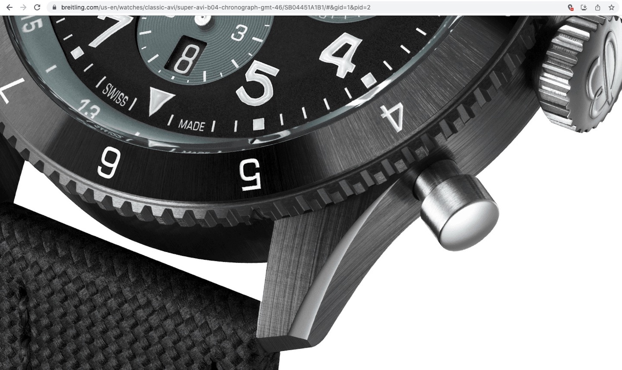
Breitling does well with its illustrations: Multiple angles show the watches and their details, and one can even make out the curvature of the crystal here. Such details can hardly ever be made out on other brands’ product page images.
Consciously or subconsciously (perhaps we’ll never know), leading Japanese brands have spent much of the new millennium competing with one another on who can provide the lowest resolution, worst, and indeed most useless illustrations for their new releases. A single image that is just a few hundred pixels-wide (i.e., that of a mobile phone’s display from the mid-2000s) with plenty of excess white space to make the actual watch even smaller and more pixelated—this has for years, if not decades, been the way Seiko, Casio, and Citizen have presented thousands upon thousands of new watch models. Whether they were afraid of counterfeit producers using their images as references or they all somehow got really bad deals with their server space providers, we’ll never know. To their credit, leading Japanese brands tend to be much more specific, detailed, and honest with regard to the specifications of their watches (including accuracy ratings, even if as unfavorable as -20/+40 seconds per day), and they have also improved somewhat when it comes to official illustrations. That said, Casio still operates more websites, micro-sites, and localized sites than one could ever manage to count, and so finding a certain G-Shock, for example, with the correct price and availability information, is virtually impossible.
Here’s What the Ideal Watch Brand Website Does & Offers
In a nutshell? The ideal watch brand website should provide detailed specifications including measurements (diameter, lug-to-lug, thickness, lug width, and preferably the weight of the watch, too), the exact reference number of the piece, precise list of materials and surface treatments used for the exterior (e.g., PVD, as opposed to “black”), water resistance, movement specifications (base caliber, complications and displays, operating frequency, power reserve, component count, size, list of movement decorations, exact movement reference, list of other watches from the brand with the same movement), dial details including exact surface treatment, type and material of hands and indices, strap material including origin and bracelet reference number, type of buckle, warranty, and (here’s a big one!) recommended service period for the watch.
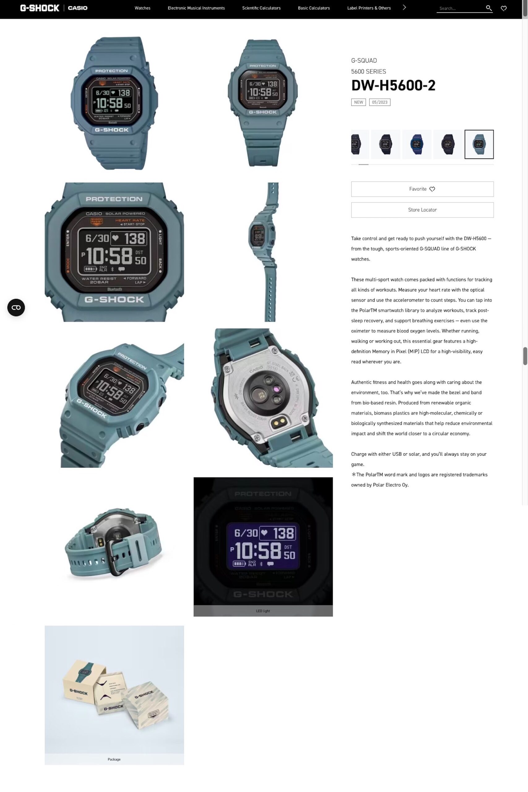
Proof that even an affordable watch can have appealing and useful illustrations (including a “lume” and a buckle shot), although not all G-Shock/Casio watches are presented quite so lavishly.
The list of images provided should ideally include several wrist shots — something that’s missing from the overwhelming majority of official watch websites — and photos presenting the watch from every angle, including straight-on, at various angles to show the thickness and construction of the case, caseback, and buckle, as well as various closeups showing the case and dial surface treatments and details, and a photo of the uncased movement, especially if the watch is sold with a solid caseback. A wrist-roll video that shows how the watch sits on the wrist is also a courteous detail that many would certainly appreciate.
We could dwell on the shortcomings and misleading details of official watch websites for a whole lot longer, but the point is clear: The shocking majority of official watch websites under-deliver when it comes to product traceability, watch appreciation, and education. Although we aim to improve when it comes to the consistency of detailed watch case measurements and other important details, our small team here at aBlogtoWatch has, for 16 years, been hard at work showing watches in their full beauty while also presenting as many of their nuanced and often enigmatic details as possible.
What are some of the features you like or dislike the most on official watch brand websites, and what are some of the details or features you’d like to see implemented on aBlogtoWatch? Let us know in the comments below.


