
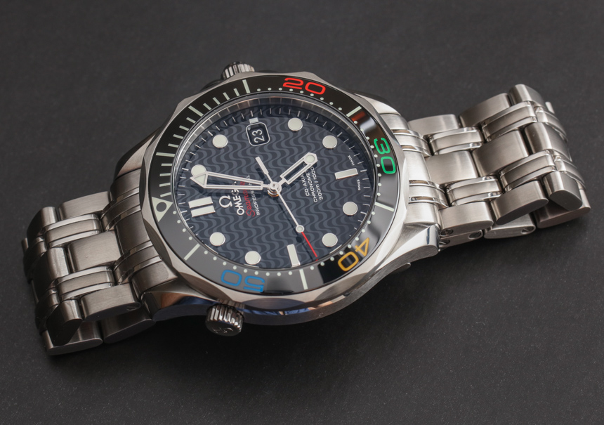
The Omega Seamaster Diver 300M five-link polished/brushed bracelet was designed as a sort of diver version of the Speedmaster bracelet with some more curves and a diver’s extension bracelet. It’s a darn comfortable bracelet with a bit of modern retro charm that will bring 1990’s nostalgia to anyone who was a watch lover in that decade. The bezel and dial are totally fresh and have remained thematically the same since the original Seamaster 300M came out.
Omega Seamaster Diver 300m 212.30.41.20.01.002
Omega Seamaster Diver300m 212.30.41.20.01.003
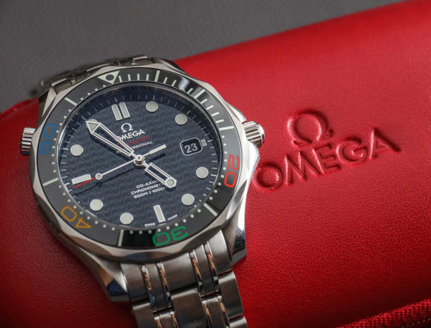
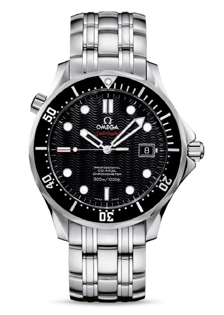
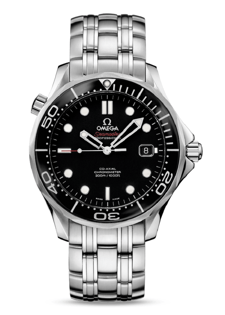
One thing that was actually discontinued a few years ago was the wave-style texture on the dial of the original Co-Axial Chronometer Seamaster 300M (debuted 2005 or 2006) that came on the reference 212.30.41.20.01.002. Today’s standard reference 212.30.41.20.01.003 version that was released in 2011 or 2012 has a solid lacquer dial versus a textured one and moved from an aluminum bezel insert to a ceramic one. A lot of collectors miss that wave-style dial look, which is one reason the Omega Seamaster Diver 300M Rio 2016 edition model should be so cool to at least some people.

Sidewalk wave pattern at Copacabana beach in Rio de Janeiro, Brazil. Image credit: CCTV
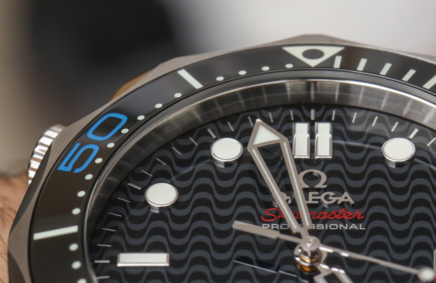
Look closely at the black dial and you’ll indeed see waves. Not just any waves, but rather a wave-style pattern borrowed from the design found in some public sidewalk areas of the famous Copacabana beach in Rio de Janeiro. Nearby this iconic ground texturing was one of Omega’s more special fixtures during the Rio Olympics known as the “Omega House.” This special installation has Omega watch-themed rooms and is among the more interesting venues visitors and residents were able to see during the Olympic games.
I don’t claim to know much about Rio de Janeiro – and I didn’t get to see much of it this time around. The topography of the city (not the largest in Brazil) is a picture of urban sprawl and energy. Very densely populated, Rio residents seem to build on top of one another, with Lego-type (both in color and style) buildings framed by electrical wiring and set against a backdrop of dramatic mountains.
As a limited edition, the Rio Olympics theme on this Omega Seamaster Diver 300M Rio 2016 is thankfully light. People at major watch brands like Omega seem to have gotten the message that customers don’t want kitschy limited editions with overly emphasized connections on the dial to whatever associated event a limited-edition watch is meant to honor. Really, all that makes this watch unique are the bezel numeral colors and the special pattern on the dial. What you also have which is cool is an engraving of the Rio 2016 Olympics logo on the rear of the case done in relief. It’s quite tasteful, to be sure. But is the watch appealing to those that didn’t go to the Rio games?

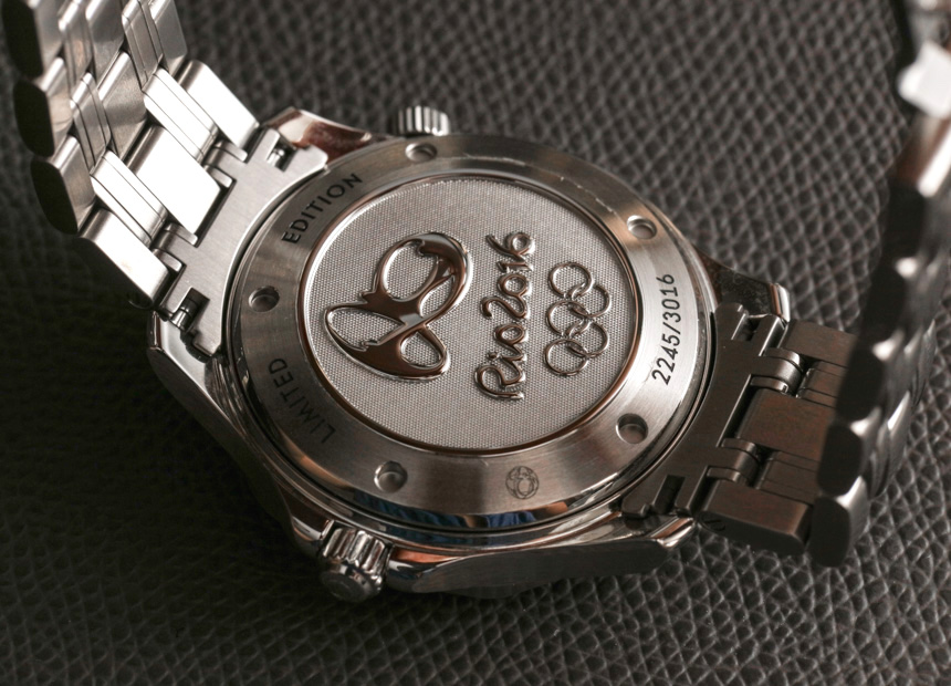
I would say “yes.” The reason is that the watch is cool independent of the relationship to the Olympics. The engraving on the back of the watch actually tells you around when the watch was released (which is a nice reminder for you or future owners years from now), and the design differences (such as the ring logo colors on the bezel) are a reminder of how important the Olympics are to the brand. Thus, while this is a Rio 2016 watch, it is also generally just a cool Omega Seamaster Diver 300M that also seizes the opportunity to take some design influence from the Olympic world.
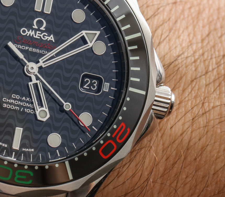
Not everyone will like the colors printed in lacquer on the otherwise black ceramic bezel. With the black of the bezel itself you have all the Olympics colors found in the well-known interlocking rings logo which also includes blue, yellow, red, and green. The added color does take away a bit from the cold determination of this timepiece as a tool, but it does give some extra character to a classic. Adding a bit of unexpected color is a time-honored way of giving a fun little twist to something otherwise familiar and conservative – that makes it appealing to existing fans (and even new ones) all over again.

Brazil also happens to be a place that is all about color. From the famous Carnival event held annually in Rio de Janeiro to so much of the culture, colors in Brazil are both appreciated and demanded. In fact, it’s something you find all over the world in more tropical environments. Even Rio’s poorest corners have buildings painted in bright, friendly colors. You even see it in the city’s vast array of graffiti art (which to a large degree is much more artistic and visually appealing than that which you see in the United States).


One thing I knew about Brazil prior to ever going there was that the country has a lot of serious watch lovers and collectors. The pride of the people is a force to be reckoned with, and for years aBlogtoWatch content has received significant attention and feedback coming from Brazil. I’m proud of that, even though much of the country doesn’t seem to speak even rudimentary amounts of English. Not that I have any Portuguese language skills to speak of, but I would have guessed a bit more English was spoken in at least Rio. That’s something English-speaking people like me traveling there should know – even though a great many highly educated and traveled people who speak English (among many other languages) populate the city.